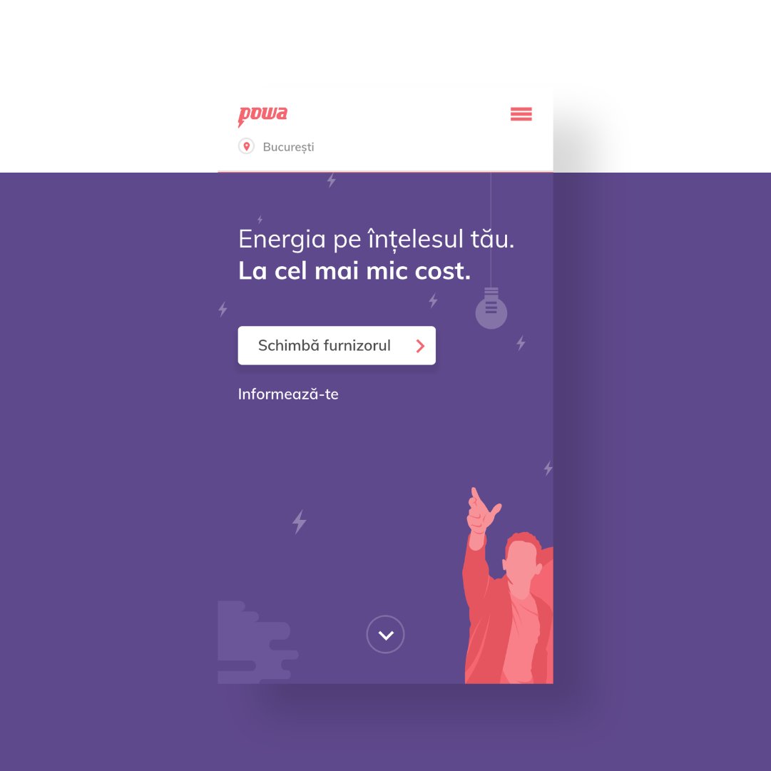
Next in line is a project we did for Liveguide, a secure live chat solution developed by Netop, a Denmark based company with offices in the US and Romania.
We #redesigned their #website from the ground up. This is how we approached it and the final result.
https://t.co/l3bis6Kg1R
Cuptorul Moldovencei's new #website went live recently. We worked on the #design and #development with one thing in mind: to visually tell the story of a local brand that everyone loves and help them continue to write it.
Have a look at the process below. https://t.co/DsKlWuB3Wl
A while back, we worked together with @thinslices, a company we admire so much, on the #UX/#UI design and #development of their new website.
You can check below the case study for the project and visit https://t.co/c6M1HYvNKF for the final result.
https://t.co/TGL9wtVRQb
Today #Elementor Extras comes with a new useful and unique widget. The Switcher #widget is a design pattern that will enhance your landing pages and make content more engaging for visitors.
More about it: https://t.co/n3eVFnns0c
Update and let us know what you think.
Jaques is our newborn. He came into this world as an all-caps #typeface, with the purpose of beautifying your #packaging, #posters, #signage and lots more.
See it in action on Behance — https://t.co/uU2kGelpVF
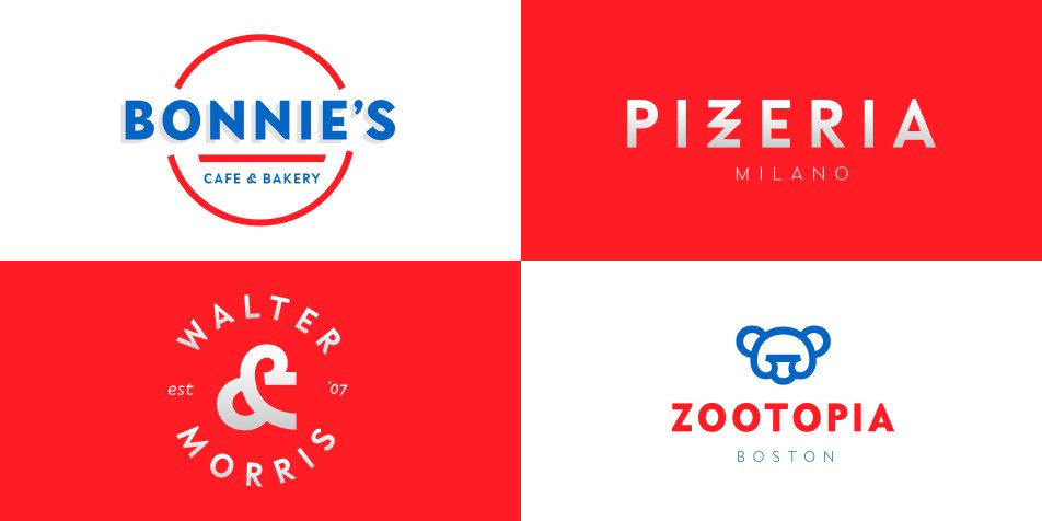
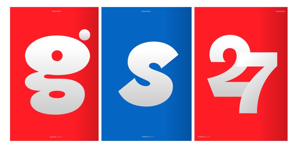
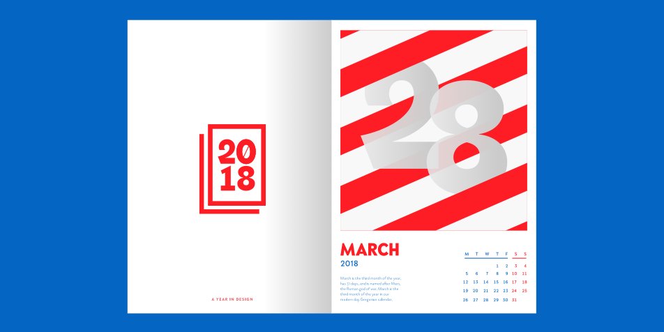
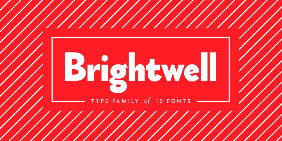
Brightwell is a sans-serif #typeface consisting of 6 upright weights and 6 italics, It's on its best behaviour in any #graphic design and #branding projects, print and #motion graphics. Use it in web and mobile #projects to show off your headings in style. https://t.co/nK2Kmi1OSi
Brightwell is our newly released #font family, a sans-serif #typeface with 6 upright weights and 6 italics, following the grotesque-geometric forms popular during the 1920's. Check it out here https://t.co/siG2ladb8a and let us know you thoughts!
If you love someone, set them free, they say. Well here’s our very own Willie, a quirky #display#typeface, as a Christmas gift to show we’re very #font of you guys! 😀
Download — https://t.co/tC6YBopAhZ