The market is treating $SUI like a finished story
The chart says it’s still in the first chapter
Current price: ~$0.70
Above price sit three major historical resistance zones:
🎯 $2.00
🎯 $4.50
🎯 $5.50
These aren’t arbitrary targets
They’re the exact levels where previous rallies stalled, liquidity was absorbed, and sellers took control
Now look at the downside
After a brutal correction from the highs
$SUI is sitting near the same region that repeatedly acted as support throughout its market structure
That’s what creates asymmetry
Risk is defined
Upside is massive
From current levels:
$2.00 = ~3x
$4.50 = ~6x
$5.50 = ~8x
Most traders spend their time chasing green candles after they’ve already moved
The biggest opportunities usually appear when a chart looks boring, sentiment is weak, and nobody is paying attention
That’s exactly where $SUI is today
If the broader crypto market enters another expansion phase
reclaiming $2 would likely open the door toward $4.5 and eventually a retest of the $5.5 cycle highs
The market loves making people buy late
The chart rewards those willing to look early
$ONDO might be showing one of the CLEAREST accumulation-to-expansion transitions in the market
Most people are staring at the ATH.
I’m watching what happened after the collapse.
Price spent months bleeding lower, then finally found a floor around the $0.20 area.
Not once.
Twice.
That double-bottom structure is what changed everything.
The second touch wasn’t weakness.
It was confirmation.
Since then, $ONDO has started printing higher lows while holding above the reversal zone that ended the entire downtrend.
That’s how major trend reversals begin.
Not with euphoria.
With a quiet shift in market structure.
The interesting part?
The previous all-time high sits around $1.16.
Current price is still trading dramatically below that level.
If the reversal continues to develop and buyers keep defending the new higher-low structure, the chart has a very obvious magnet above it.
The old ATH.
Markets have a habit of revisiting important levels.
And ONDO has already done the hard part:
It stopped going down.
Now the question becomes how aggressively it starts moving up.
$ONDO looks like it’s transitioning from accumulation to expansion.
$DASH might be one of the most overlooked setups in crypto
The chart has spent years compressing after a brutal bear market
but the important part isn’t where price is today.
It’s where price has repeatedly reacted in the past
🎯 Target 1: $148
🎯 Target 2: $284
🎯 Target 3: $477
Notice something interesting
Each major cycle left behind a clear liquidity level
The 2021 peak
The 2021 breakdown
The final distribution zones before the collapse
Markets rarely forget these areas
They revisit them
Not because of nostalgia
Because that’s where unfinished business remains
At current prices, $DASH sits far below every major historical level that once attracted aggressive participation
If capital rotates into forgotten large-cap altcoins, the path of least resistance isn’t a new prediction
It’s a return to the levels the market has already validated.
Sometimes the biggest opportunities aren’t hidden
They’re simply ignored
$NEAR is one of those charts that looks boring until you zoom out.
Then suddenly you realize it’s been building the same roadmap for years.
The market loves chasing new narratives.
But some of the biggest moves come from assets that spend years quietly preparing for them.
Right now, the chart highlights three major historical levels.
The first target sits at $7.45.
This zone marked a critical reaction point during the previous cycle and represents the first major test for any long-term bullish continuation.
Reclaiming it would signal that the current recovery is no longer just a bounce from the lows.
It would be the beginning of a much larger structural move.
The second target stands at $9.03.
Historically, this level acted as a major supply zone where rallies struggled to maintain momentum.
Breaking above it would remove one of the last significant resistance barriers before the chart opens toward higher valuations.
But the real prize sits much higher.
Target three is located at $20.59.
This is where previous cycle euphoria accelerated and where some of the strongest buying pressure in $NEAR history appeared.
Revisiting this area would place the asset back among the strongest performers of the market cycle.
The roadmap is simple:
$7.45 - Target 1
The level that confirms the recovery is becoming a trend.
$9.03 - Target 2
A major resistance zone that could unlock the next expansion phase.
$20.59 - Target 3
The long-term objective and the level that would put $NEAR back into the spotlight.
What makes this setup interesting is how compressed the current valuation still looks compared to previous cycle highs.
Markets spend most of their time building bases.
They spend very little time moving between them.
If momentum continues to build, the move from Target 1 to Target 3 could happen much faster than most participants expect.
The crowd usually starts paying attention near the end of the move.
The chart suggests $NEAR may still be in the stage where patience matters more than excitement.
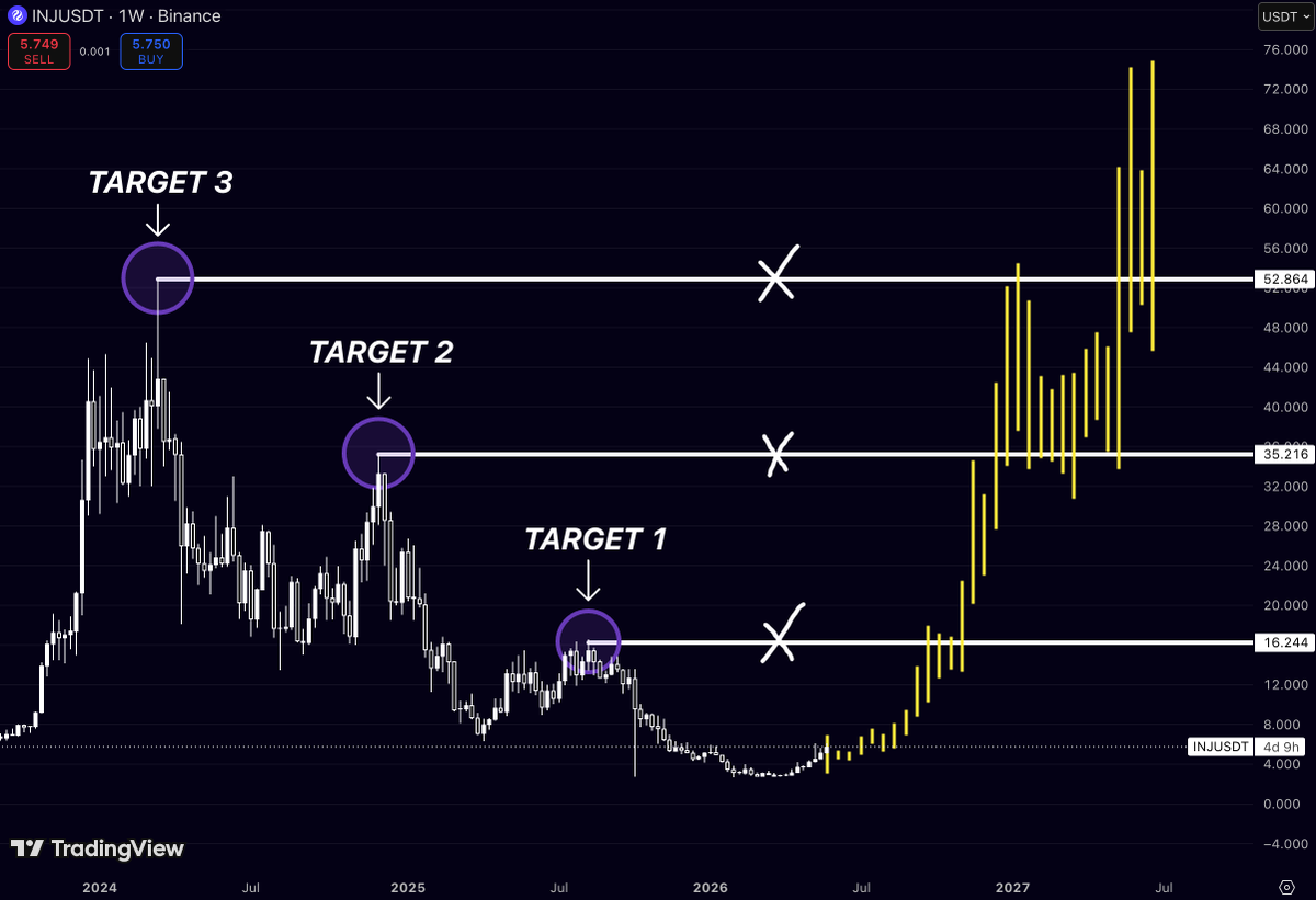
Everyone is watching AI tokens
Almost nobody is watching what $INJ is building
That’s usually where the biggest moves come from
The chart tells a pretty simple story
Every major Injective rally eventually found its way back to the same liquidity magnets:
🎯 $16.4
🎯 $35.1
🎯 $53.0
Right now price is sitting around $5.
Not $35.
Not $53.
Five.
And that’s exactly why this chart is interesting.
Most traders only become bullish after a coin has already delivered a 500% move.
They need confirmation.
Then more confirmation.
Then a YouTube thumbnail with 17 arrows.
Then maybe they’ll buy.
Meanwhile, $INJ is quietly building a structure that looks very similar to the one that launched previous expansions.
If buyers keep stepping in, the path is obvious:
$5 → $16
$16 → $35
$35 → $53
The funny thing about crypto is that everyone wants the 10x…
But nobody wants to sit through the part where it still looks boring.
$INJ might be giving that opportunity right now.
Patience is usually the hardest trade.
And the most profitable one
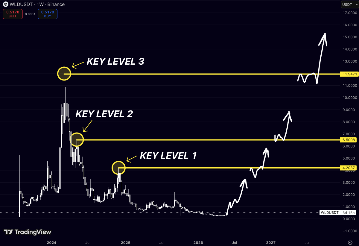
$WLD is one of the most hated charts in crypto right now
And honestly?
That’s exactly what makes it interesting
The market spent months turning early believers into exit liquidity
Every rally got sold
Every bounce got faded
Every “bottom” found a lower bottom
Eventually people stopped talking about it
That’s usually when charts start becoming dangerous
Right now, $WLD is sitting around $0.50
Meanwhile, three massive historical levels are waiting above:
🎯 $4.20
🎯 $6.50
🎯 $11.95
Think about that for a second
Most traders are busy searching for the next shiny token that launched yesterday
$WLD is already sitting on one of the strongest brands in crypto, trading more than 95% below its former highs
Nobody wants it
Nobody believes in it
Nobody cares
Until price starts moving
Then suddenly Twitter transforms into a documentary called:
“I was bullish the whole time.”
Crypto has the memory of a goldfish
$ONDO just completed the move most traders were waiting for
Now the question is simple:
How much higher can this trend go?
Most people are chasing the breakout
What matters now is understanding where the next major historical resistance zones are located
The chart highlights three key levels that previously acted as major turning points:
Target 1 - $0.4864
Target 2 - $0.7043
Target 3 - $1.1711
These aren’t random price targets
Each level comes directly from previous market reactions where momentum stalled and sellers regained control
What’s interesting is that $ONDO has already reclaimed Target 1 and Target 2
Both resistance zones have now been broken and flipped into support during the current advance
That’s often how strong trends develop
Former resistance becomes support
Then price begins targeting the next major liquidity zone higher
Right now, all attention shifts toward $1.1711
This is the most important resistance level visible on the chart
It’s the area where a major distribution phase began during $ONDO previous expansion cycle
Markets have a tendency to revisit the exact levels that defined their history
And when multiple resistance zones are reclaimed one after another, the probability of testing the next untouched level increases significantly
The structure is difficult to ignore:
Reclaim Target 1
Reclaim Target 2
Attack Target 3
If momentum continues building and buyers maintain control above former resistance
$ONDO could be preparing for a move toward one of the most important levels on its entire chart
Sometimes the biggest opportunities appear after the breakout, not before it
Most traders are watching $XLM price
But the real signal on this chart is time
Last cycle, Stellar needed 71 weeks before the move fully played out
Now the same amount of time is lining up again
The difference?
This time the projected target sits much higher than the previous peak
That’s what makes the setup interesting
Not the current candle
Not the short-term noise
The timing
$XLM already showed how powerful the move can become once the market leaves accumulation
If the cycle rhythm repeats, the next expansion could send price into a completely new range
71 weeks was the clue last time
Now the clock is running again
$ONDO is doing something most charts never get the chance to do
It’s turning old resistance into a ladder
The first step was around $0.49
Price reached it, rejected, then eventually reclaimed it
The second step sat at $0.70
Same story
Resistance became support
Now the market is attacking the final major level around $1.17
The zone that capped the strongest rally in $ONDO history
What’s interesting isn’t the breakout
It’s the structure
Every time $ONDO clears a level, it spends time building a base before moving to the next one
If that sequence continues, the chart isn’t showing three targets
It’s showing three stages of acceptance
And the market is already standing on stage three
$DEXE has one of the CLEANEST structures on the monthly timeframe right now
Not because it’s making new highs
But because price keeps respecting the exact same levels that mattered throughout its entire history
The chart highlights three major zones:
Target 1 - $13.5
Target 2 - $24.2
Target 3 - $33.0
What’s interesting is that $DEXE is already fighting around the first target area
That tells us this isn’t a coin trying to wake up from the bottom
It’s already showing relative strength while much of the market is still waiting for confirmation
If buyers can firmly reclaim and hold above the first zone
The path toward $24 becomes much easier because there’s very little historical resistance between those levels
And that’s where momentum usually starts attracting attention
The real prize sits near $33
That’s the level where previous cycle euphoria completely ran out of fuel and sellers took control
Markets love revisiting those decision points
Especially when an asset spends years building a base underneath them
The bigger the base, the bigger the potential move
Right now $DEXE looks less like a recovery chart and more like a chart preparing for another expansion phase
If the market remains supportive, those three levels become the roadmap everyone will be watching
$XLM
The funny thing about Stellar is that every cycle leaves a marker behind
2023 gave us Key Level 1
2024 delivered Key Level 2
Now the market is pushing directly into Key Level 3
Three major pivots
Three major expansions
One rising trajectory connecting all of them
And that’s why this chart deserves attention
Most people see $XLM trading around $0.25 and assume nothing has changed
The chart says otherwise
After spending years trapped in a range
Stellar has already reclaimed levels that previously launched massive moves
What we’re seeing now isn’t a random spike
It’s the continuation of a structure that’s been building for multiple years
The next test sits around the same zone where previous cycle momentum peaked
If buyers can force a clean break above Key Level 3, the conversation shifts from recovery to expansion
Because at that point, traders won’t be asking whether $XLM is in an uptrend
They’ll be asking how much room is left before the next wave of price discovery begins
Most people see $ZEC at $500 and think they missed the move
That’s exactly why this chart is interesting
Look at what happened after the breakout above the old support zone around $369
Price didn’t just bounce
It completely changed character
Buyers stepped in aggressively, momentum accelerated, and now $ZEC is trading far above levels that capped it for years
The next thing that stands out is the former ATH area around $746
That level was supposed to be resistance. Instead, the chart shows it becoming a launchpad
And that’s where things get dangerous for anyone still waiting for a deep pullback
Because once a market starts treating old all-time-high zones like support, price discovery tends to take over
The crowd is focused on where $ZEC has already gone
The chart is focused on where it could go next
$2000 suddenly doesn’t look as crazy as it did a year ago
$CHZ looked completely abandoned after losing more than 96% from its all-time high
The trend kept making lower highs
Every rally was sold
Most participants stopped expecting a recovery
But the current structure is sitting exactly where previous cycle expansions started
What makes this setup interesting:
The entire drawdown has now stretched for more than 1,900 days
Price is holding inside a historical accumulation zone
The breakout path opens into a large area with very little resistance overhead
A return toward previous cycle levels would represent a move that few are currently positioned for
The biggest opportunities often appear after years of compression when the market has already convinced everyone the asset is finished
$LUNC remains one of the most controversial assets in crypto
But from a technical perspective, the chart is showing a very clear roadmap built around historical reaction zones
The first major objective sits at 0.00017674
This area acted as a major turning point during previous recovery attempts and represents the first true confirmation that buyers are regaining long-term control
A move into this zone would signal that the current accumulation phase has evolved into a sustained uptrend
The second target is located near 0.00027979
Historically, this was one of the strongest resistance zones after the collapse, where rallies repeatedly lost momentum
If $LUNC can reclaim this level, market perception would likely shift from short-term speculation to a genuine recovery narrative
The final target stands at 0.00064646, the former ATH level highlighted on the chart
This is the most important long-term resistance zone and represents the area where previous euphoric buying reached its peak
Revisiting this level would mean a complete recovery of a large portion of the post-collapse losses and would place $LUNC back into a major market spotlight
The progression is straightforward:
0.00017674 - New Life level
The first breakout confirmation and the point where a new bullish structure begins
0.00027979 - Key Level
A major historical resistance that could determine whether the rally becomes sustainable
0.00064646 - ATH Level
The ultimate long-term target and the level that would complete the full recovery scenario
What makes this setup interesting is that $LUNC has spent years trading near depressed valuations while gradually building a base
Markets often spend far longer accumulating than most participants expect
But once momentum returns, price tends to move quickly between historical liquidity zones
For bulls, the chart suggests a simple sequence:
reclaim the “New Life” level, break the Key Level, and then aim for the former ATH zone
If that structure unfolds
$LUNC could transition from a forgotten survivor of the previous cycle into one of the more surprising comeback stories of the next one
$SEI may be one of the clearest reversal structures on the market right now
After a prolonged downtrend that erased nearly the entire move from its launch cycle, price has finally reached a zone where selling pressure appears exhausted
The chart shows a classic cycle reset:
a strong decline, a long accumulation period near the lows, and now the first signs of a potential trend reversal
The first major objective sits around $0.39
This level was an important support area before turning into resistance during the decline
Markets often revisit these zones first because they’re where many traders who bought higher begin making decisions again
Reclaiming it would be the first confirmation that the downtrend has truly ended
Above that, the next key target is around $0.73
This area marked one of the most significant rejection points during the previous cycle
If $SEI can break through and hold above it, momentum could accelerate quickly as the market starts pricing in a larger recovery rather than just a relief rally
The final target on this structure is near $1.13–$1.15
This level aligns with the major highs from the earlier expansion phase and represents the point where the full reversal thesis would be validated
Reaching it would mean $SEI has recovered a substantial portion of its previous bear market losses and re-entered a true bullish market structure
What’s particularly interesting is that all three targets come directly from historical market reactions
These aren’t random numbers
They’re levels where buyers and sellers previously fought for control, making them natural magnets for price if the recovery continues
The biggest moves in crypto often begin when sentiment is at its lowest
$SEI spent months building a base near the bottom
If this really is the reversal moment, the market may only be at the beginning of the next expansion phase
$DASH was one of the strongest performers of the previous cycle
Then it spent years fading into irrelevance while newer narratives took over the market
Now the weekly structure is starting to look very different
Price has been building a massive rounded accumulation base after a multi-year downtrend, and momentum is beginning to return from the exact zone where previous expansions started
What makes this setup interesting:
Multi-year capitulation structure already completed
Price reclaimed the long-term support area
Weekly expansion candles are appearing after years of compression
The gap between current price and previous ATH is still enormous
Most people only become interested in these charts after the vertical phase is already underway
The early stage usually looks boring
Until it suddenly doesn’t
$INJ looked completely finished after the 2024–2025 distribution phase
Momentum disappeared
Volume faded
Most traders moved on
But the current weekly structure tells a very different story
Price is rebuilding from a long-term base while reclaiming the exact zones that previously acted as major rejection levels
What makes this setup interesting:
Target 1 aligns with the first major liquidity wall
Above that, price opens into a large imbalance zone toward Target 2
Target 3 sits near the historical expansion area from the previous cycle
The move is still developing while sentiment remains relatively muted
The strongest reversals usually begin when the chart still looks “too early” to most participants
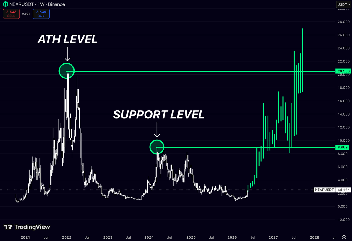
$NEAR spent almost 3 years moving sideways while attention rotated into newer ecosystems
But now the chart is reclaiming the exact weekly levels that historically triggered explosive expansions
The structure is becoming obvious:
Major support reclaimed around $9
ATH liquidity sits near $20.5
Momentum is building directly from long-term accumulation
And once high timeframe resistance starts flipping into support, volatility usually accelerates very fast
Most traders wait for confirmation after the move already happens
But the best opportunities usually appear while the market still feels uncertain
$TIA is sitting at levels where previous cycles usually start reversing
The chart is basically mapping out three major reclaim zones:
$9.2 → first momentum breakout
$11.9 → expansion phase
$21+ → full trend reversal
What stands out here is how deeply price reset after launch hype
Most weak projects never recover from that kind of structure
But $TIA still remains one of the strongest narratives in modular infrastructure
That’s why this zone matters
When an asset goes from extreme euphoria → total exhaustion → flat accumulation for months, the next move is usually violent once liquidity returns
The market already priced in fear
Now it only needs demand
If altcoins enter another aggressive expansion phase, $TIA has enough room to surprise people very fast