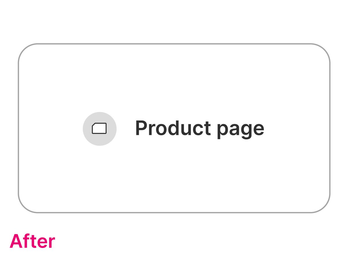
Styling an icon?
Protip: don't blow it up.
Keep it at its intended size.
Need it bigger?
No problem.
Add a circle.
Keep the border, or give it a little background.
Voila.
A bigger icon without a bigger icon.
Nailed it.
I was styling a new onboarding screen with some icons and it was just not looking right. Couldn't figure out what was going on and finally got some design help from @erikdkennedy and this super helpful tweet.
Today's @notadesignerrrr walks through that journey and how big of a difference that 1 design tip makes.
Got a cute little TLDR too 🤗 Drops in an hour!
The TLDR on forms and making them better:
❌ don't use columns to shorten the form
👭🏾 related fields ( “first name” and “last name”) are OK side-by-side
📏 set a max-width so it feels contained
https://t.co/cTvCyt55qh
One of my favorite takeaways from this issue is the power of experimenting with black and gray.
You might be surprised at how much you can accomplish without reaching for bright colors 🎨
Give it a try!
https://t.co/9JJxMAfXKO
BEFORE ➡️ AFTER
How I styled data on a banking dashboard to make it look good.
But what does it mean to look good? It's not aesthetics -- it's about helping the user get the data they are looking for quickly.
In this edition of Not A Designer:
https://t.co/brG2sFT4Zz
One minute, I'm working on a simple landing page. Next thing, I'm learning about letter spacing and its very subtle but big implications 👀
But does letter spacing really matter?
See for yourself!
https://t.co/wbVEFFeWIo
At Not A Designer, I (@saronyitbarek 🙋🏾♀️ ) create bite-size design content for devs
Subscribe to learn alongside me 🤗
Next newsletter drops soon!
https://t.co/62QwEu6Okt
What surprised me about my research on line height is it feels like an "art": you adjust typeface, font size + line length until it “feels right.”
A process like that just doesn’t work for me. So instead, I made it scientific 🤓
https://t.co/Iu87geGCK0
Loved getting to include this amazingly well-researched video in this week's drop.
Here's the premise:
1️⃣ UX designer Tim Lee picks 45 of the most popular design systems to study
2️⃣ He crunches the numbers to figure out how they approach typography
How do you pick the font sizes for your app?
If you're doing it on the fly and hoping it looks good 🤞🏾, there's a better way.
Introducing typographic scales, a set of predetermined font sizes that you can just pick from.
📢 Let's talk checkboxes. The default one isn't bad – clean, cute. But with a few tweaks, we're turning it from humble to elevated 🚀
https://t.co/zWY2lQfaYH
Today, we're going to help you decide what font sizes to use for your app.
Drop is coming in just a few hours. 🔥
Make sure to subscribe 👉🏾 https://t.co/S88KDtssEc
Determining the recipe for ideal line height can be tricky.
The answers are either a blanket 1.5 or an unhelpful "it depends."
So finding this was a relief:
https://t.co/2DDQUWOy6P
Take it with a grain of salt though, there's some controversy over the golden ratio!