Forever an excel baby cos what's all this technical jargons. I'd have finished this with my pivot tables and Excel visualisation kit.
Been on this task for hours that's after studying several materials.
Oh well, will be back with the final result. #powerbi#datacommunity
You should have heard her present this analysis. Her deep understanding of the problem, flawless execution, and exceptional recommendations were outstanding.
She has a healthcare background btw.. So I always encourage building projects where your strength lie.
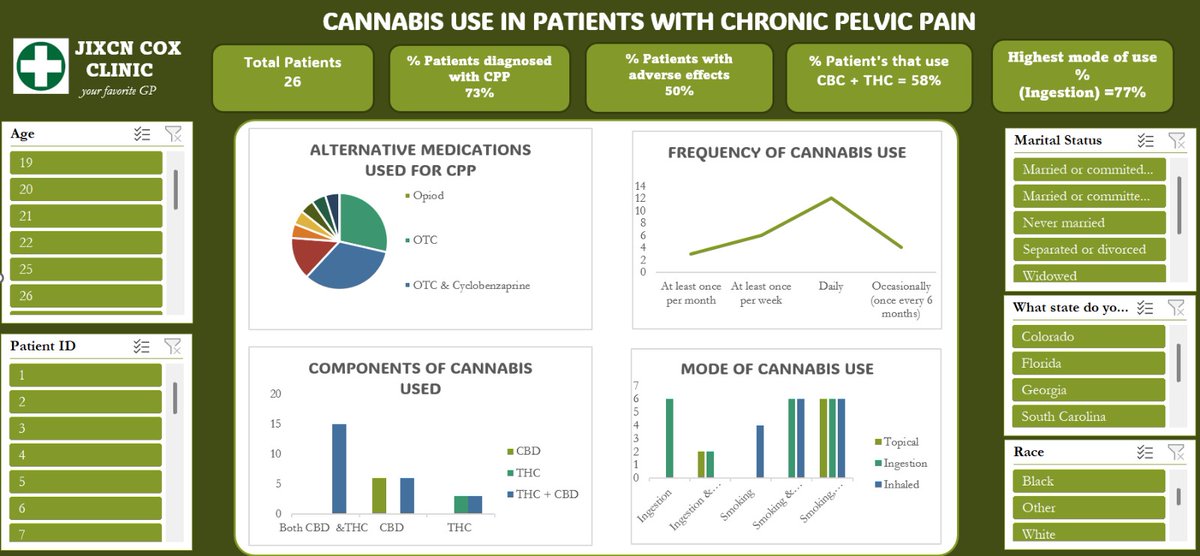
The colour theme is in line with the topic and charts easy to understand. Interactive slicers are incorporated to allow users to explore specific segments and gain deeper insights through dynamic filtering.
Sometimes "less is more"
#data#dataanalyst#researchanalyst#excel
Building dashboards is a core responsibility of data analysts, but it goes far beyond creating visually appealing charts and colors. The true purpose of a dashboard is to communicate insights clearly and effectively.
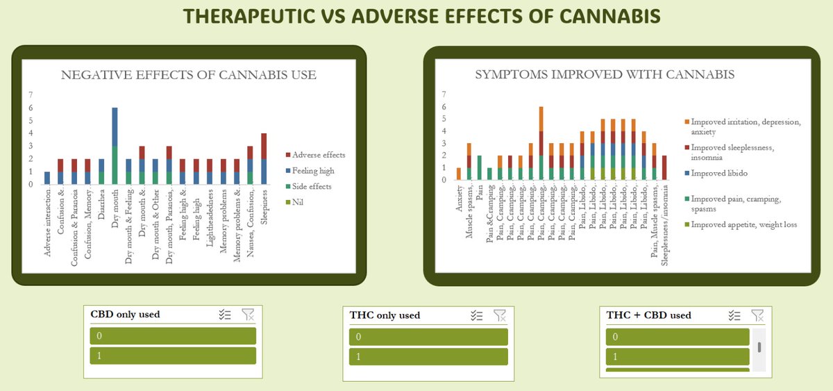
The dashboard presented below focuses on cannabis use in the management of chronic pelvic pain. It highlights key areas such as frequency of use, reported adverse effects, and the different cannabis variants utilized.
THE VALUE OF A DETAILED REPORT.
As a budding analyst I hv dedicated time 2 improve my technical skills, however, I learnt a hard lesson. My ability to explain what I have done with the tools I have allows me think, connect the dots and tell the story.#data#dataanalyst