Otherway’s new identity for The Whisky Exchange balances heritage with a more contemporary spirit.
Key takeaways:
01 Heritage lions, lightened
02 Type that shifts
03 A lavender gamble
Read the full article by Emily Gosling on BP&O → https://t.co/Fu8hJBYrtf
#branding#whisky
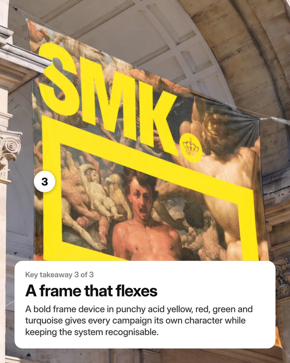
Shorter and sharper: Denmark’s National Gallery becomes SMK in eTypes’ bold new identity.
Key takeaways:
01 A shorter, sharper name
02 Type is the star
03 A frame that flexes
Read the full article by Emily Gosling on BP&O → https://t.co/0d9QpwYPUB
#branding#typography
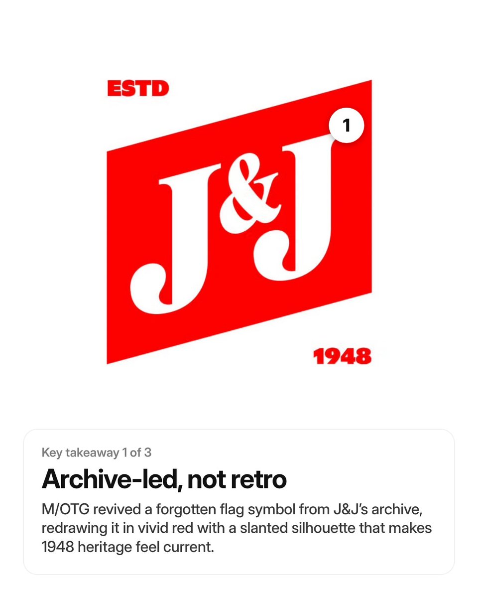
M/OTG brings a bold, timeless visual identity to heritage kosher brand J&J Dairy.
Key takeaways:
01 Archive-led, not retro
02 Type does the heavy lifting
03 One tight, flexible system
Read the full article by Emily Gosling on BP&O → https://t.co/qVQR4bA5yC
#branding
Swedes Love Fish. Just Not All Year.
Read Lisa's review → https://t.co/N88Z5k31tF
Packaging expert Lisa Cain shares her opinion on Pond Design’s visual identity and packaging for Swedish seafood brand Korshags.
#branding#design#packaging
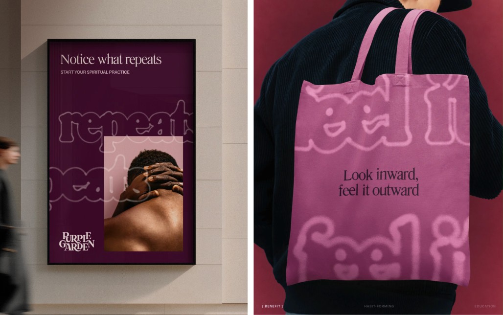
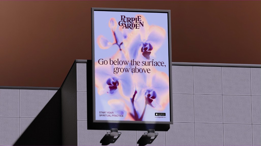
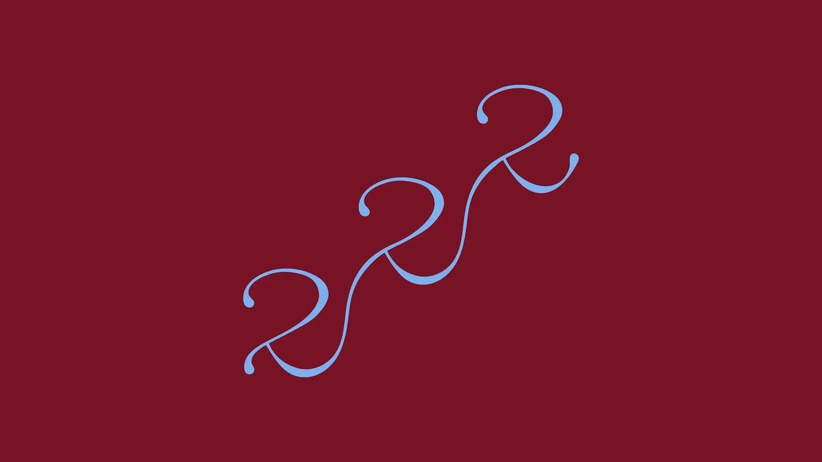
Mother Design pilfers from Y2K aesthetics and cymatic patterns in its identity for spirituality app Purple Garden. See the full project → https://t.co/mdh1S3fRSe
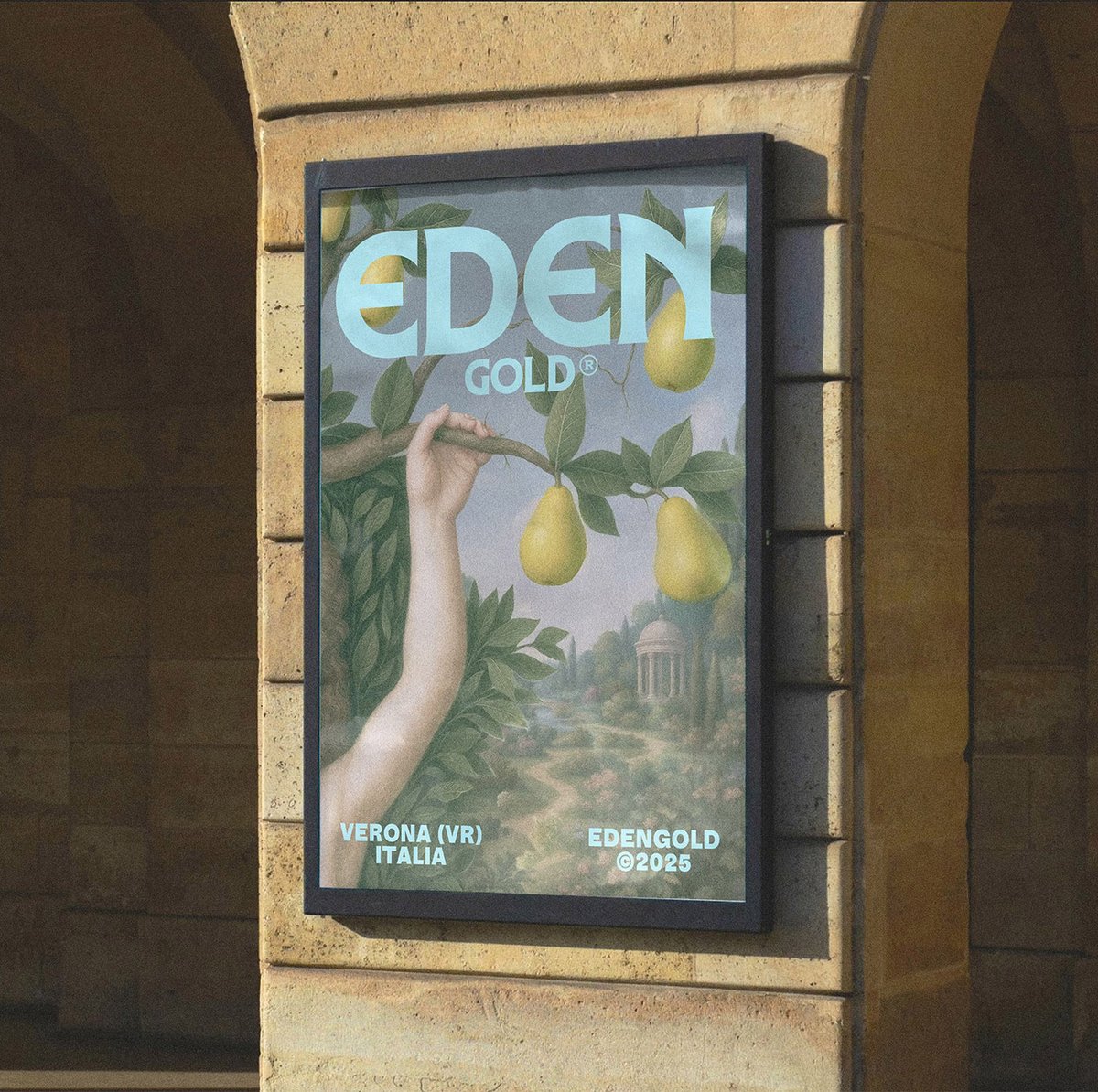
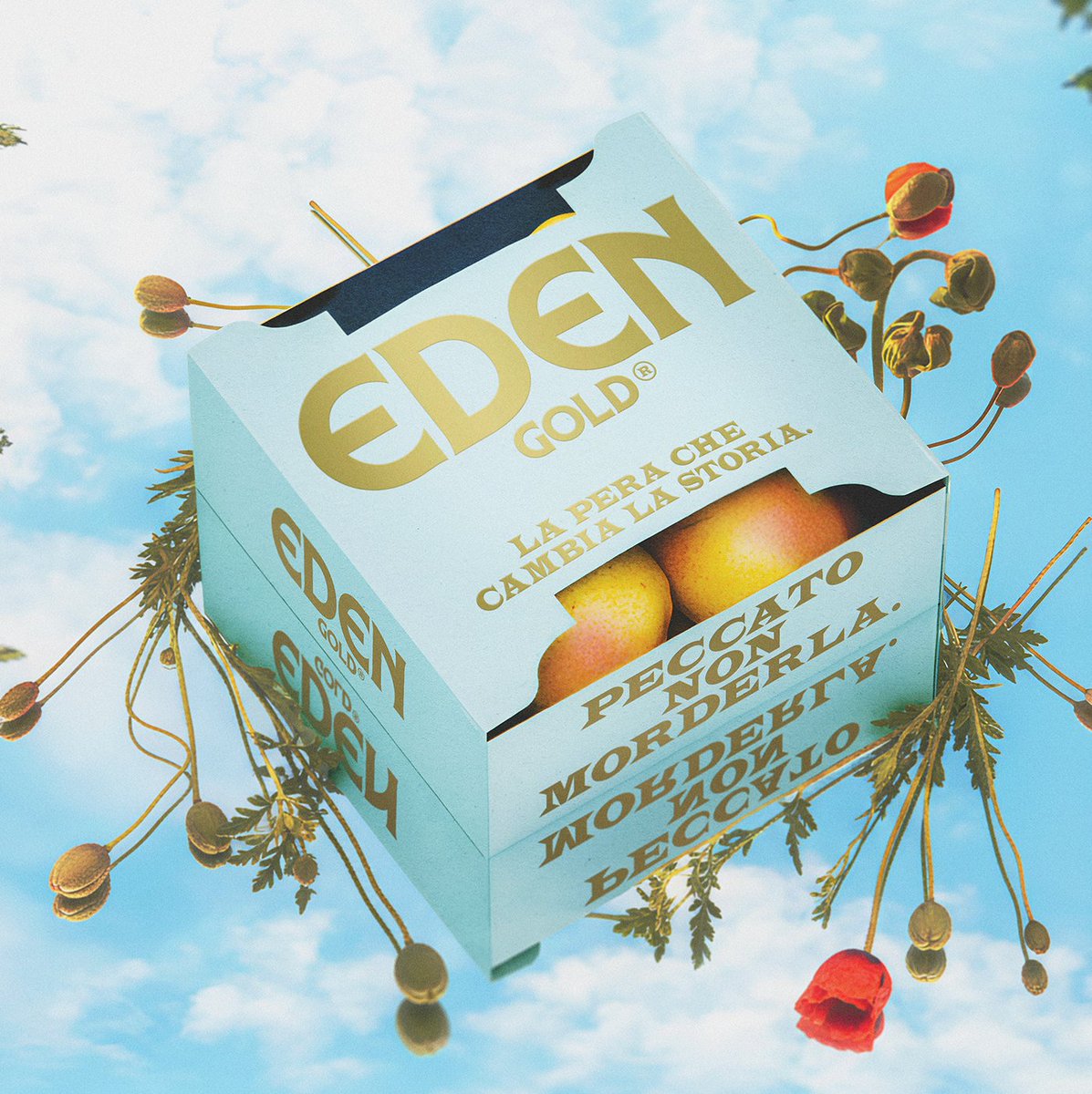
Forbidden Fruit – https://t.co/dZUPqZCbJQ
Packaging expert Lisa Cain shares her opinion on AUGE's packaging and visual identity for apple brand Eden Gold.
#branding#design#packaging#auge
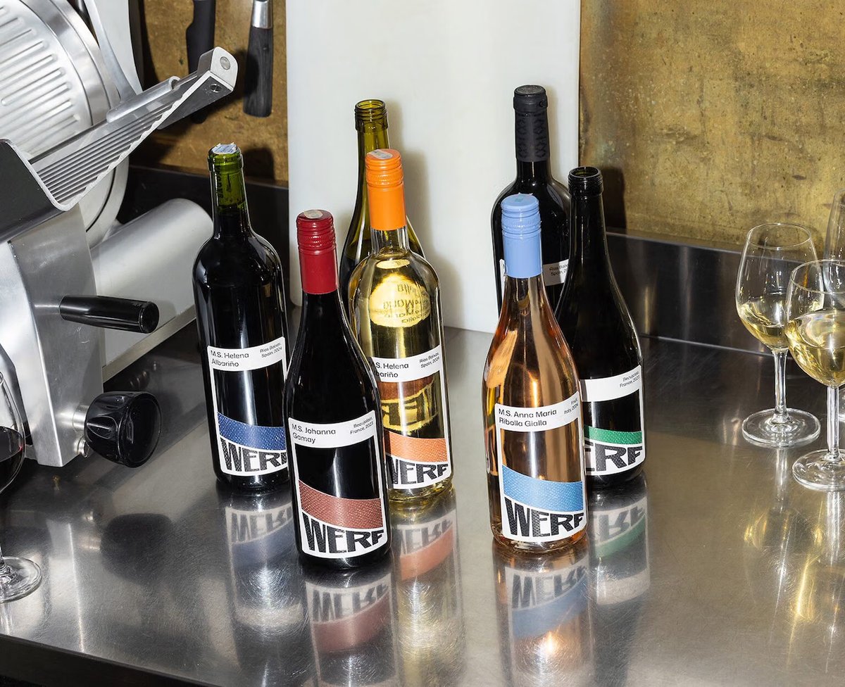
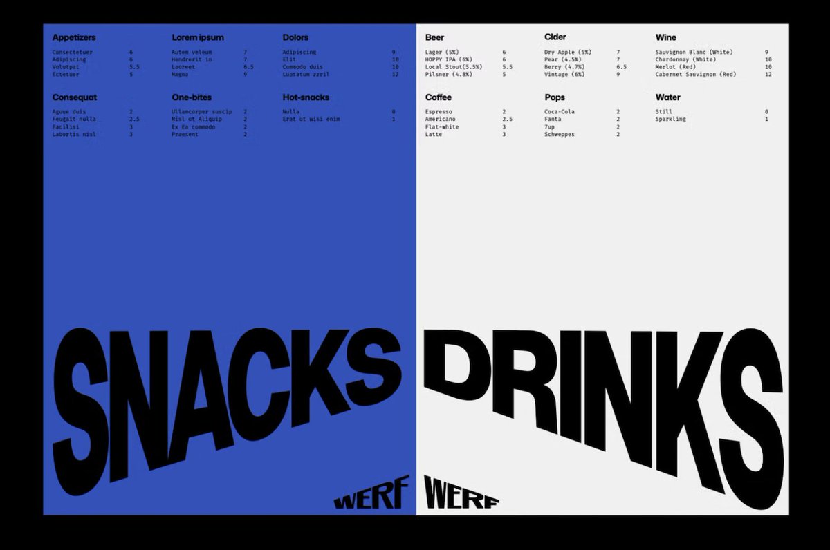
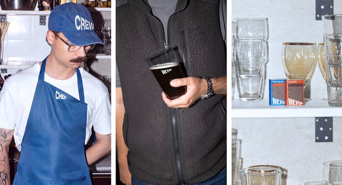
andstudio’s identity for new Rotterdam bar and bistro Werf finds a brilliant balance between graphic simplicity and conceptual depth
https://t.co/jCg4MjoQmU
#logos#typography#identity#branddesign#werf
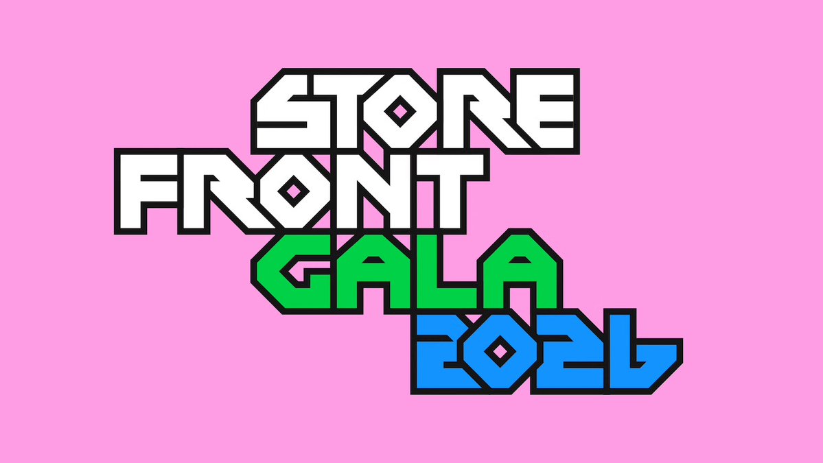
Pentagram’s identity for Storefront Gala 2026 is a sublimely chunky, vibrant typographic tribute to New York graphic design history
https://t.co/0fTKlnOV5i
#lettering#logos#identity#poster#storefrontgala2026
Pizza With A Side Of Therapy – https://t.co/qq9Jho06g7
Packaging expert Lisa Cain shares her opinion on Pentagram's visual identity for pizza place Parla.
#branding#design#packaging#pentagram
Pentagram New York’s identity for Mozilla’s Nothing Personal is a riot of colour, chunky type and playful motion design – and a reminder that the internet doesn't have to be a miserable place
https://t.co/jrfGScthRP
#graphicdesign#nothingpersonal#logos#editorial#typography