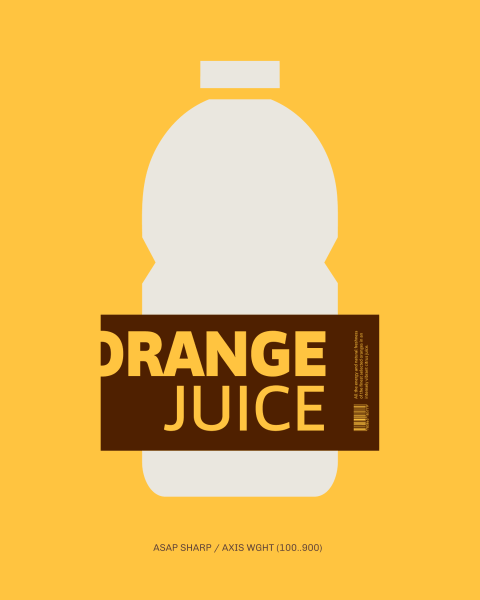
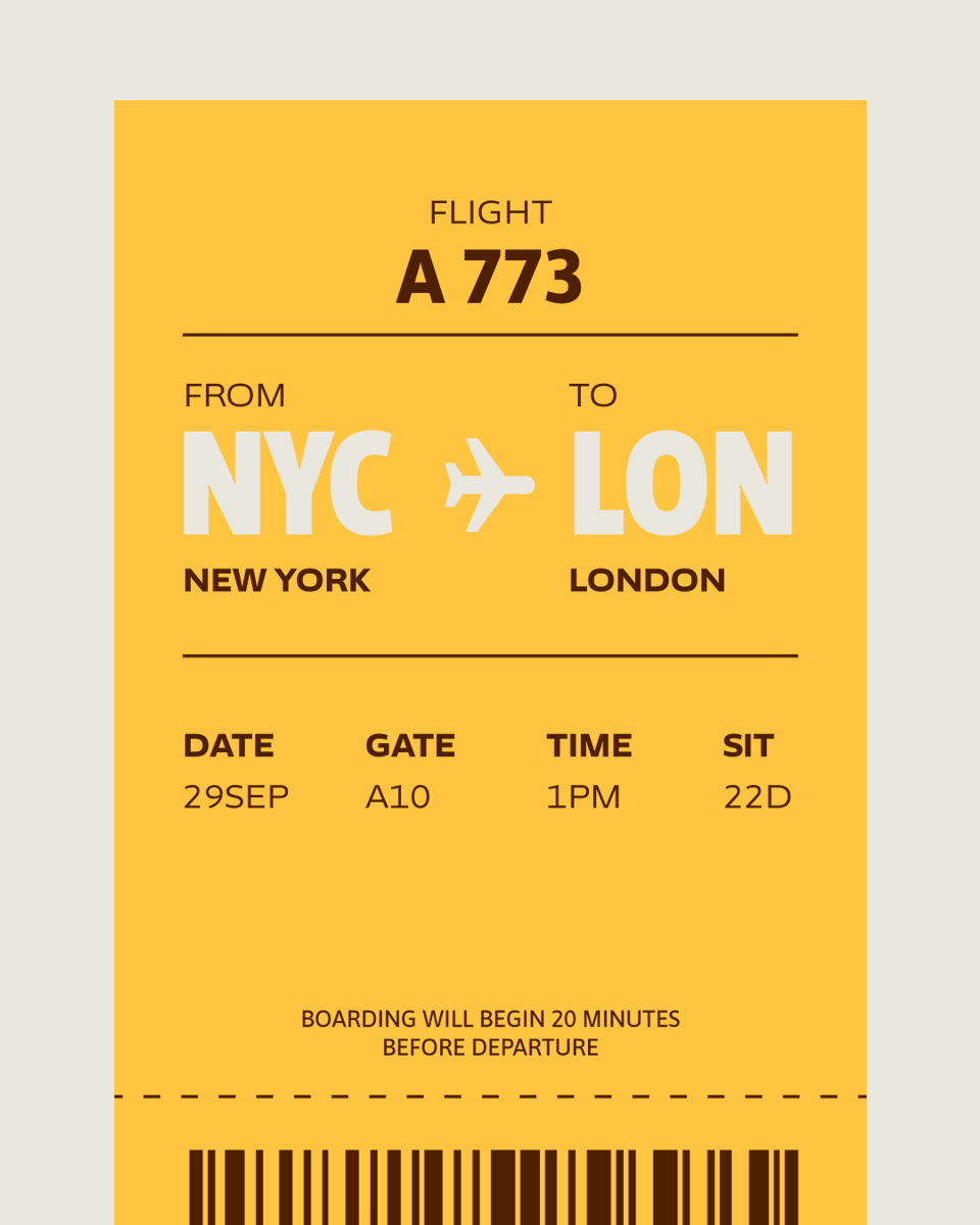
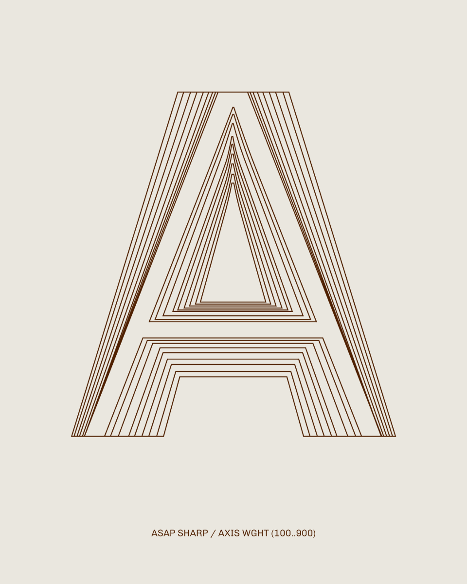
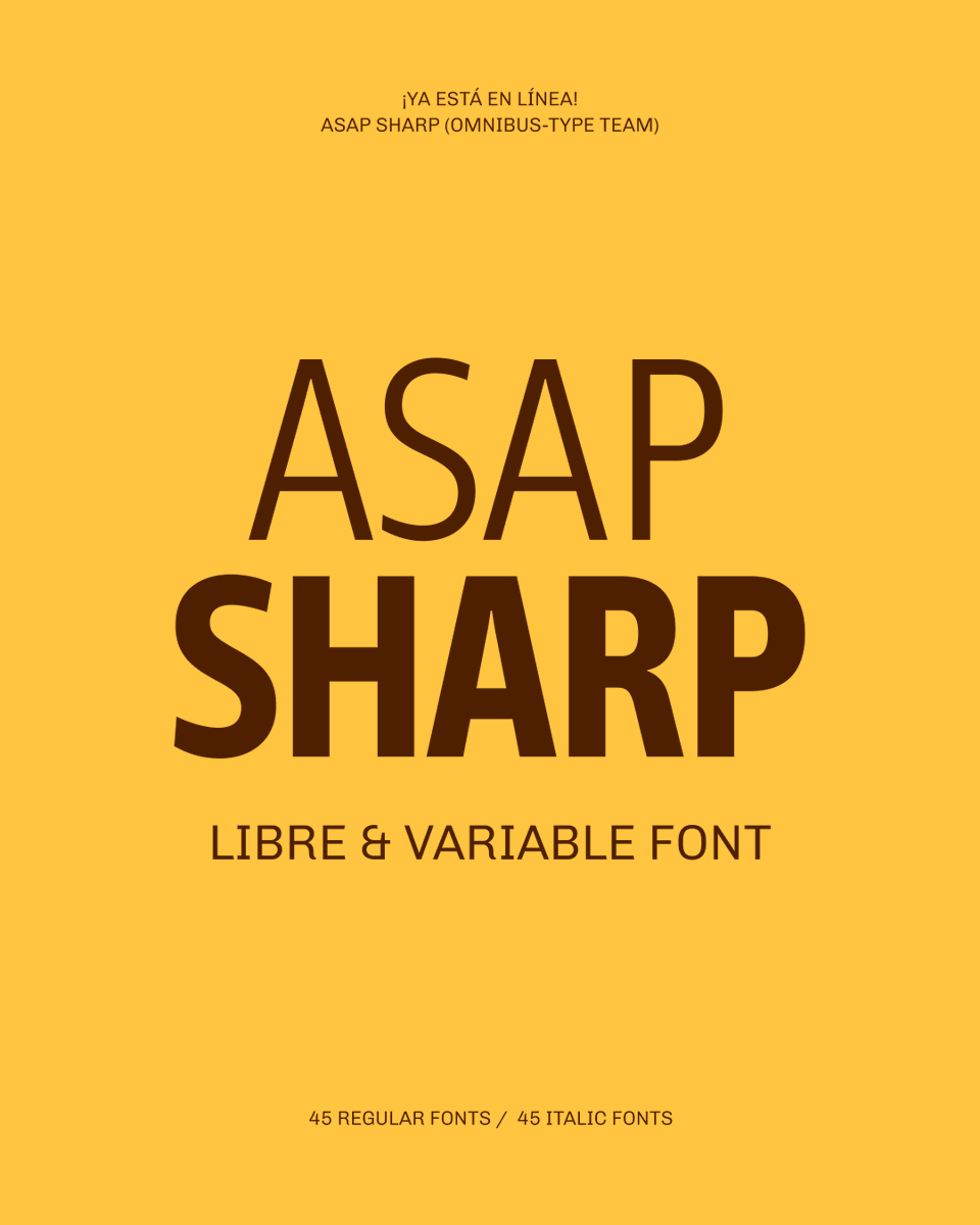
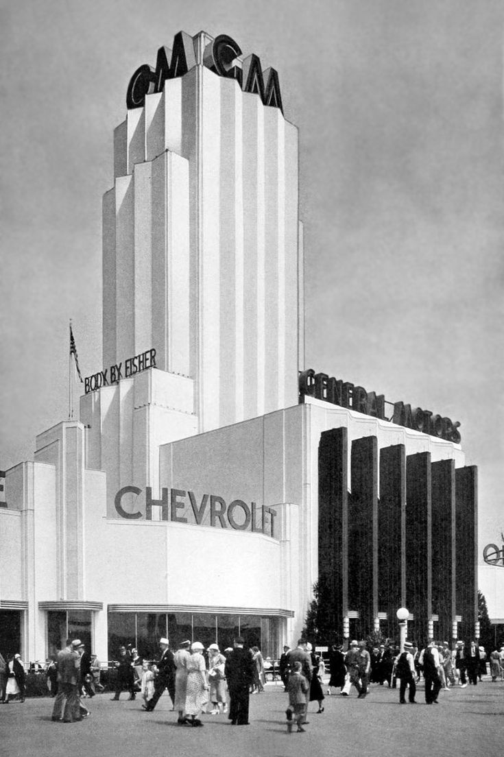
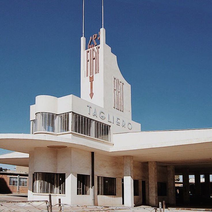
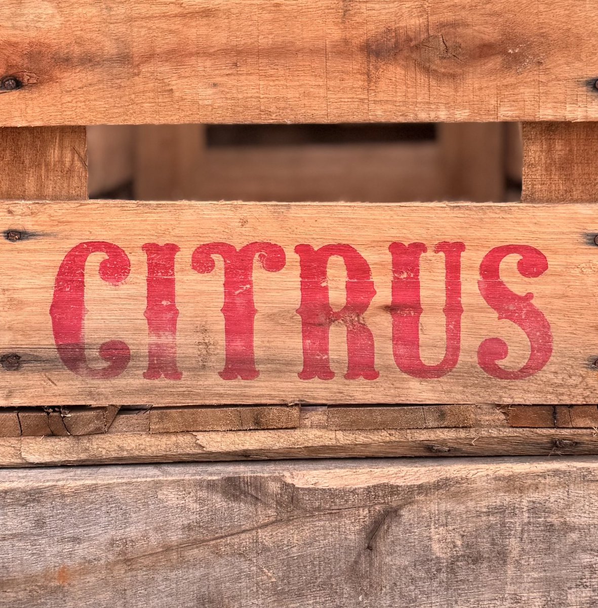
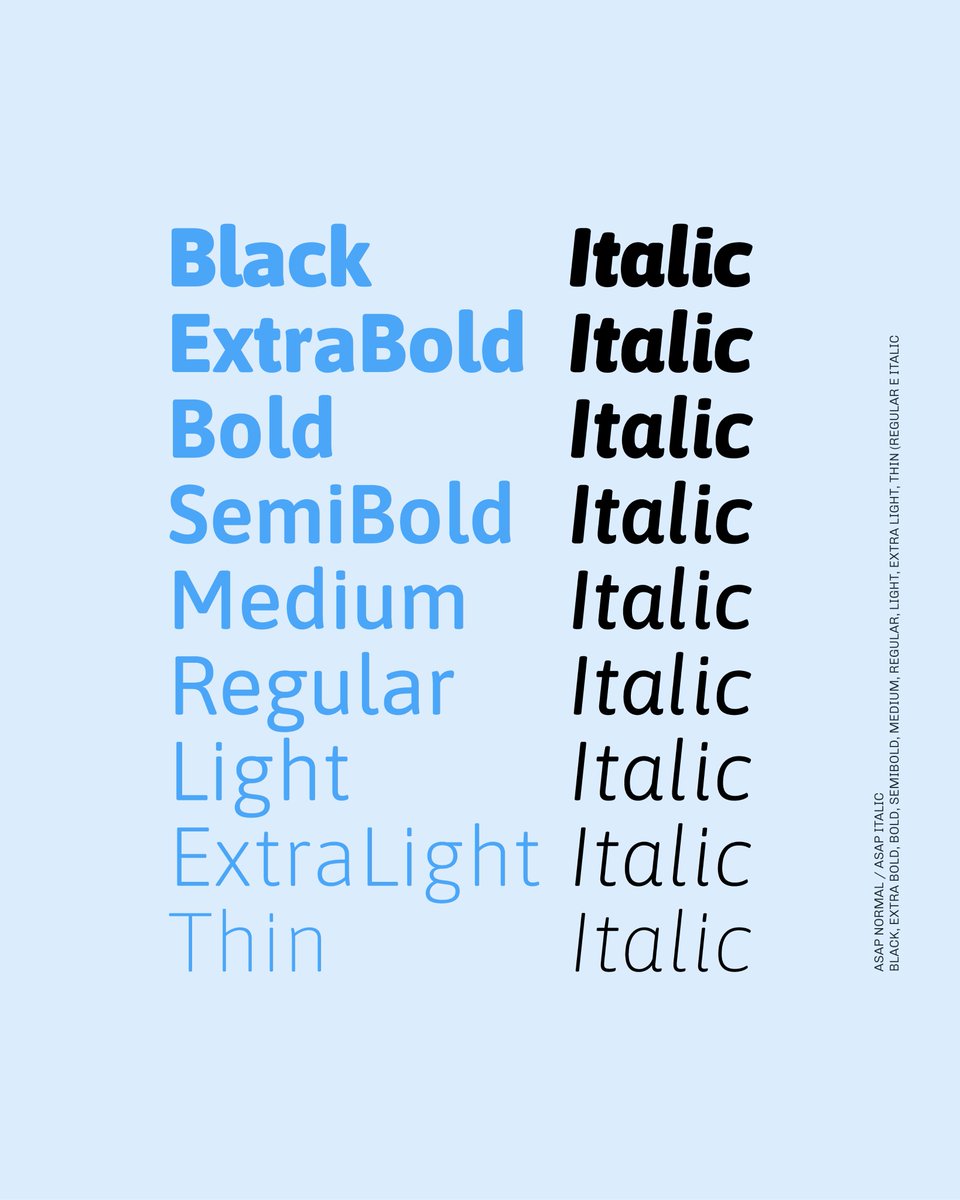
True to its heritage, Asap Sharp VF is ideal for identity, digital interfaces, signage, and editorial projects. Its open shapes ensure reading clarity, while its sharp presence elevates hierarchical compositions. Available from https://t.co/XeD9iApRGQ
New! Asap Sharp VF (the non-rounded Asap) is here. Designed by P. Cosgaya (Asap/Ancha/Patagonia lineage w/ H. Gatti), its Uniwidth system allows weight/width changes without text reflow. Tech dev by Omnibus-Type Team. https://t.co/XeD9iApRGQ
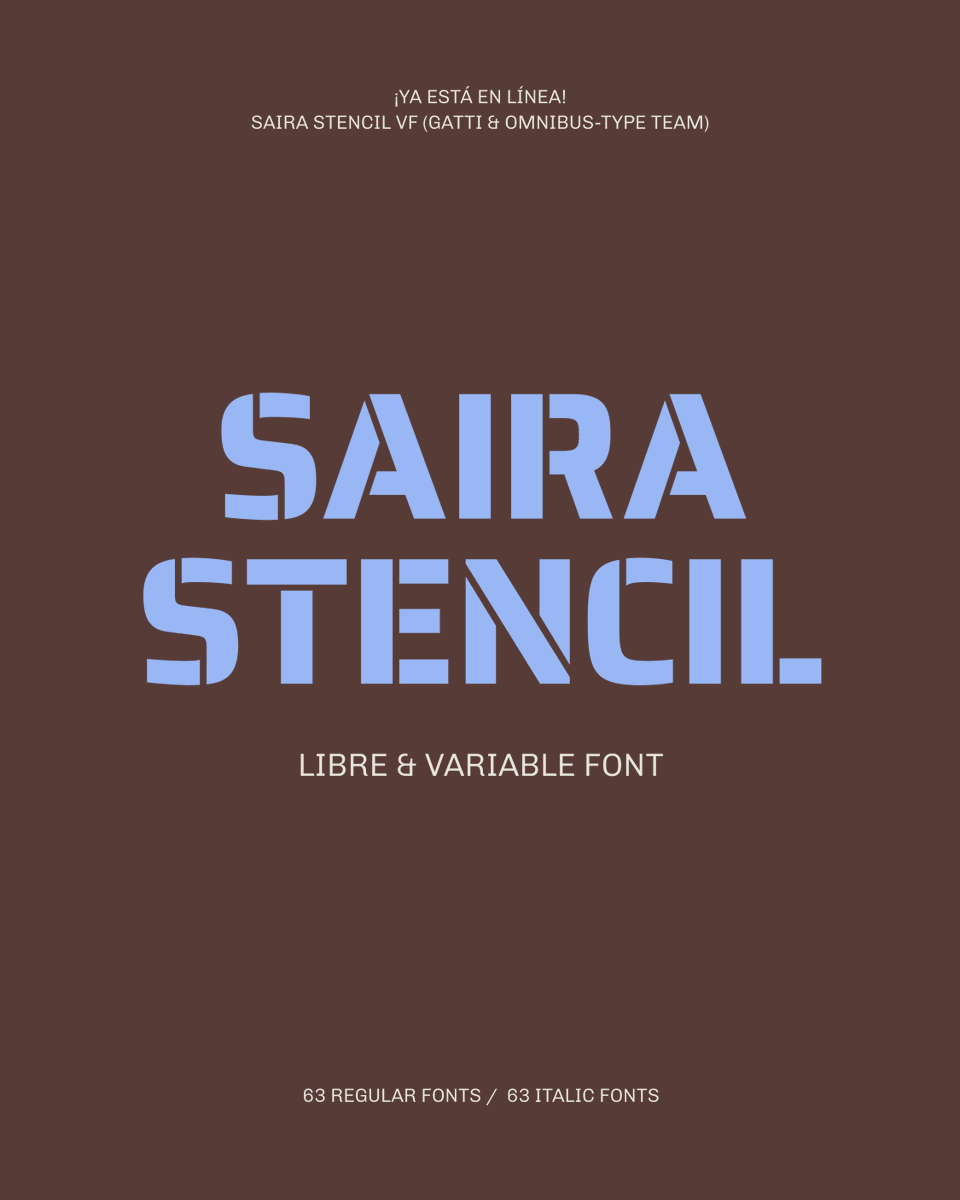
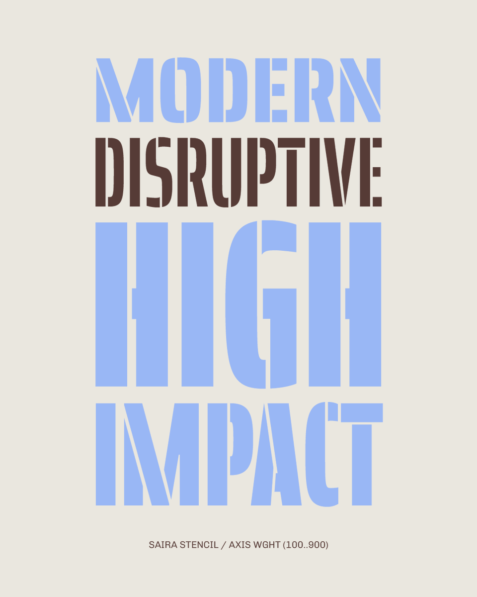
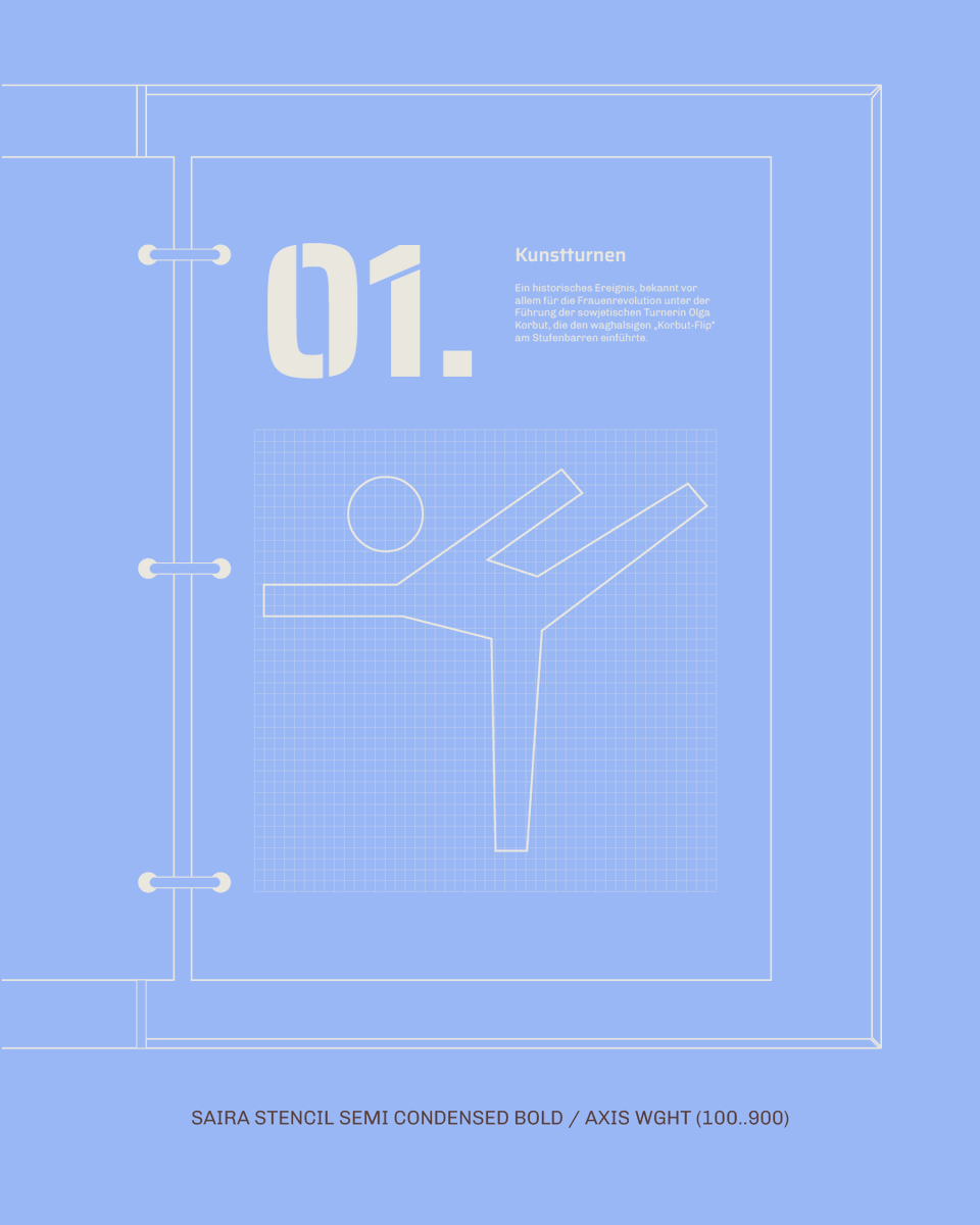
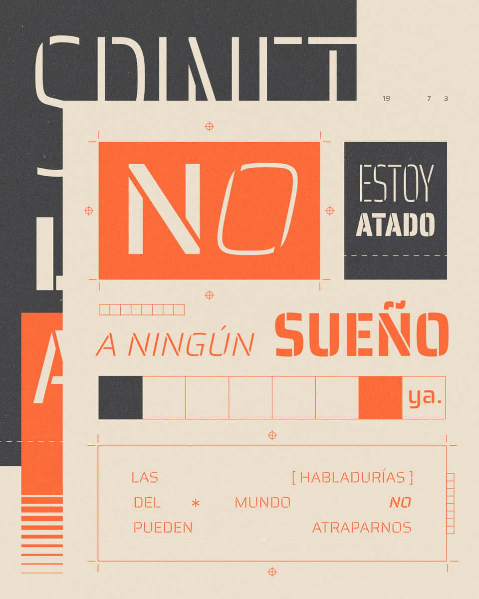
New! Saira Stencil VF –the stencil version of Saira VF family– is online. It blends deliberately unusual cuts, creating a tension between order and disruption. A contemporary sans with high visual impact. 🎨✂️ https://t.co/cdkBVTNQkc
New! Saira Stencil VF offers a variable format and/or 126 static instances (7 widths × 9 weights), each with matching italics. Perfect for branding, signage, editorial, or sports. Free to use & download. 🔠💻 #Typography https://t.co/cdkBVTNQkc
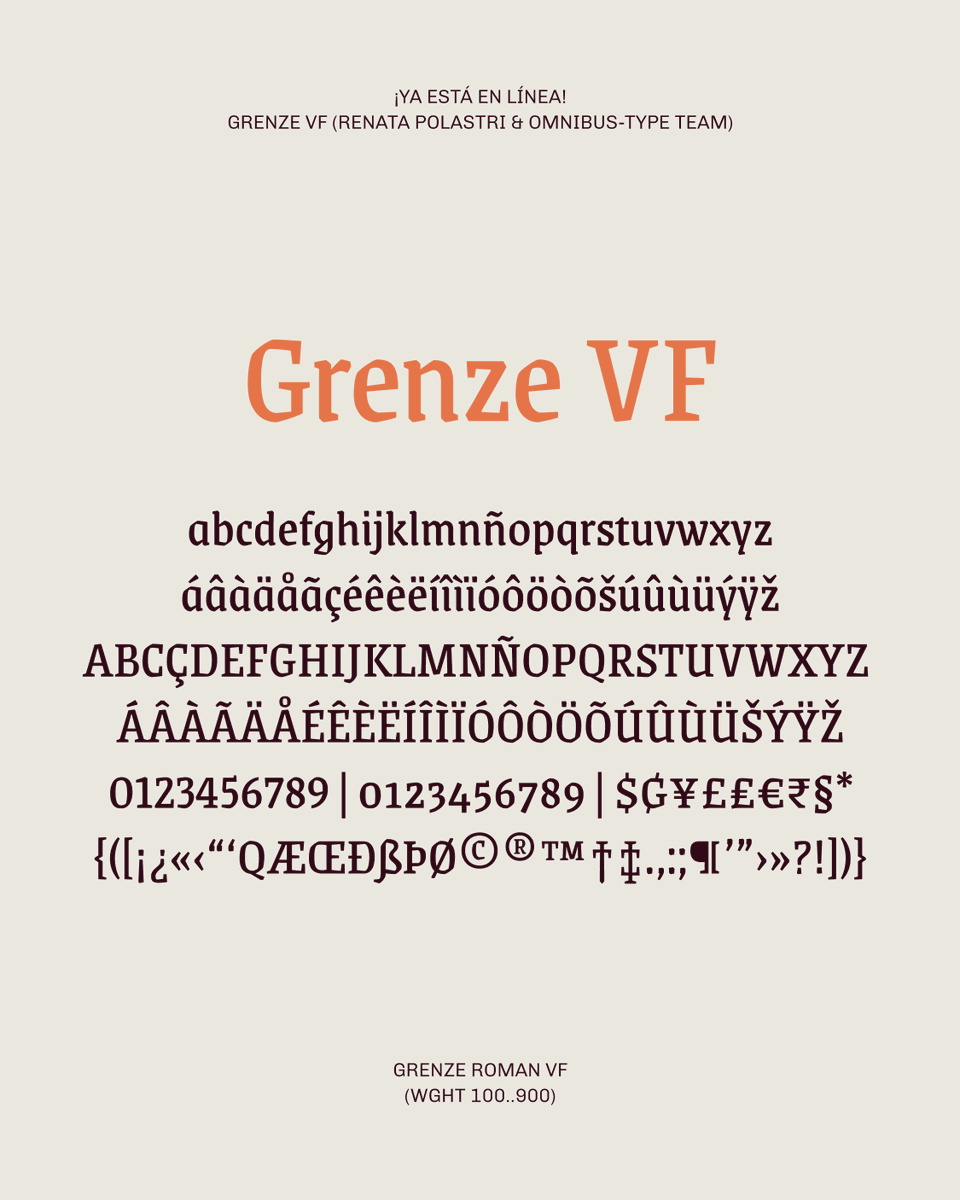
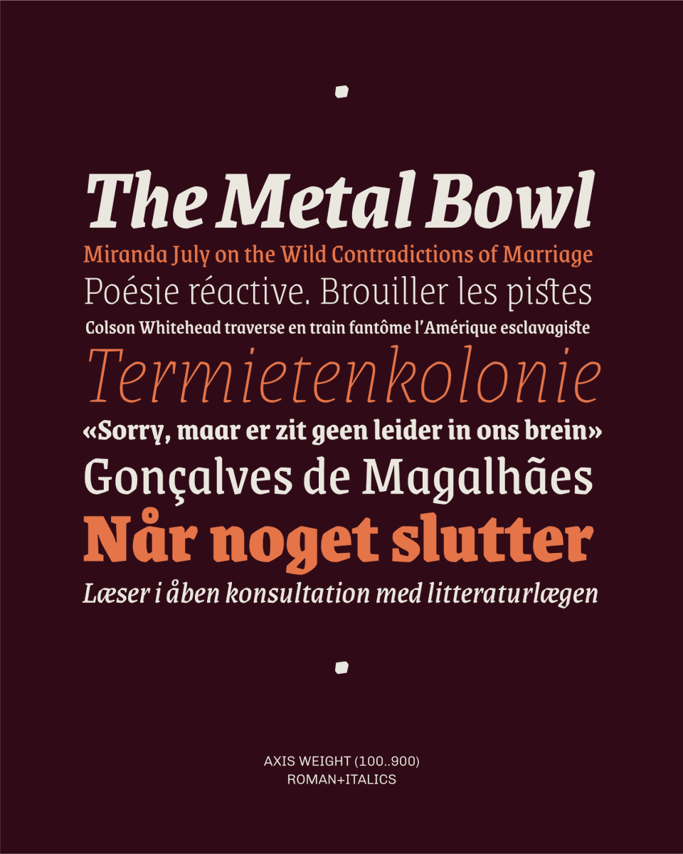
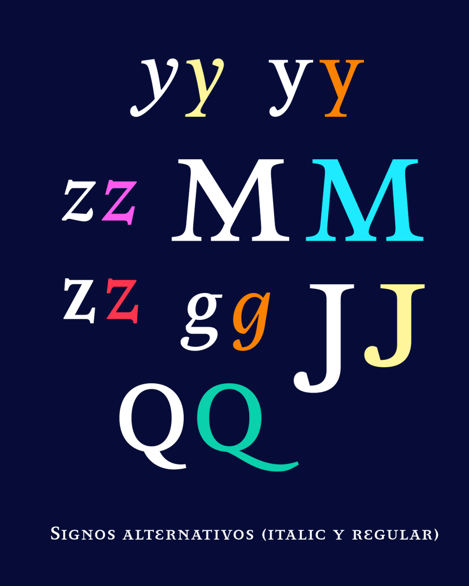
Grenze is a large text family inspirated from Roman and Blackletter typefaces. It was originally designed to be used in magazines. Fully compatible with Grenze Gotisch: https://t.co/JBD1cd9B2G
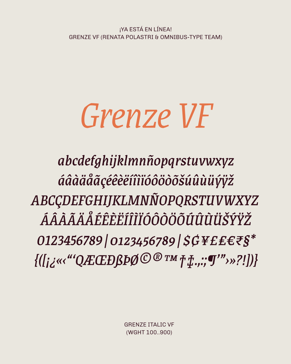
Updated! Grenze is a typeface designed by Renata Polastri inspired by Roman and Gothic styles. Now available in VF format (axis weight 100..900 both Roman and Italic) Try, use online or download from: https://t.co/MmfH0XGpJp
Testing Saira Stencil VF (cut version of Saira VF), designed by Héctor Gatti and Omnibus-Type Team. VF format with 2 axes (wght 100..900, wdth 50..125, Roman + Italic). Charset: Google Latin Plus (630 characters, 800 glyphs). Motion Graphics: Celeste Palmas 🧡🖤
El Instituto Tecnológico de Rochester otorgará el Premio Frederic W. Goudy 2026 a los creadores de @glyphsapp Georg Seifert y Rainer Scheichelbauer.
¡Vamooooo! ❤️🔥🌈✨
https://t.co/91vnnuxxdl
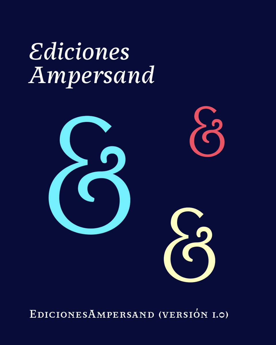
🎉 ¡Ediciones Ampersand comienza 2026 con una renovada identidad visual! 🥰 Gorricho Diseño y Omnibus-Type trabajaron colaborativamente en este proyecto que incluyó la revisión del sistema identitario y el desarrollo de una nueva tipografía exclusiva: Ediciones Ampersand 🔡🔠🔣
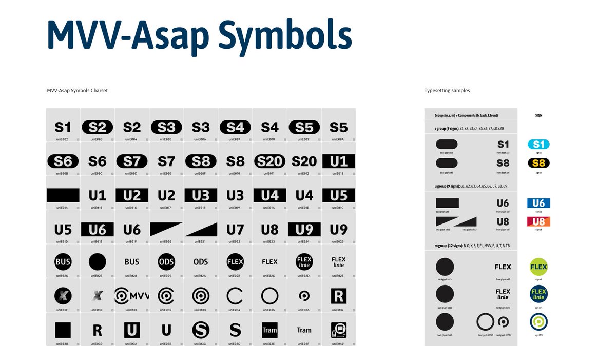
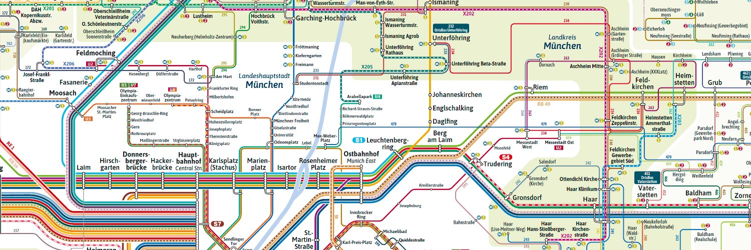
New custom type: MVV-Asap. 🎨📷Tailor-made for MVV GmbH with 8 fonts and 60+ transport symbols to simplify digital and print materials. 📷https://t.co/GefbzKnCpC #Typography#UXDesign#PublicTransport
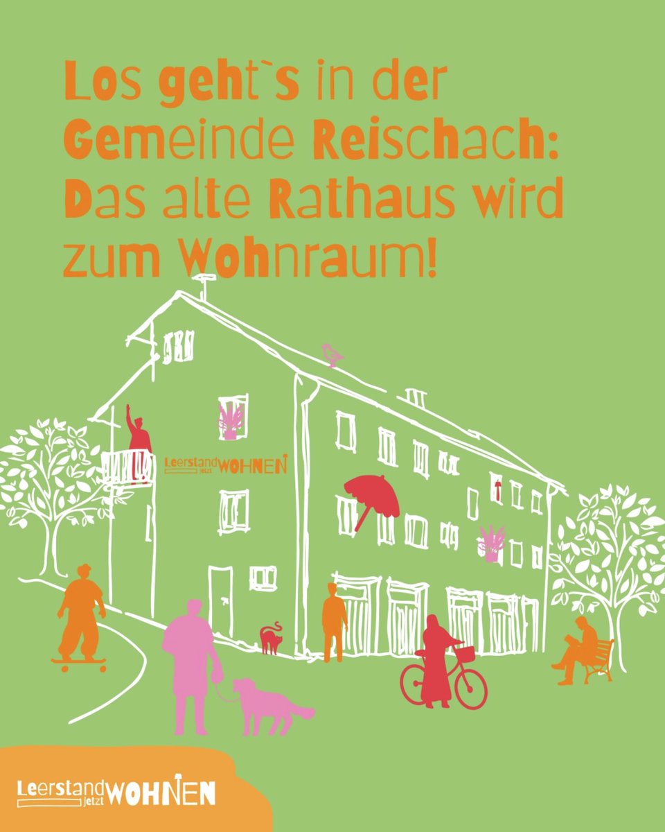
Barriecito en uso: »Leerstand jetzt WOHNEN« de @BauenBewegen (Ministerio de Vivienda, Construcción y Transporte de Baviera, Alemania). Diseño: Gruppe Drei. Más info: https://t.co/MEHnceP2be. Descargá, probá o usá en línea la tipografía libre Barriecito: https://t.co/eryJRJpHjH
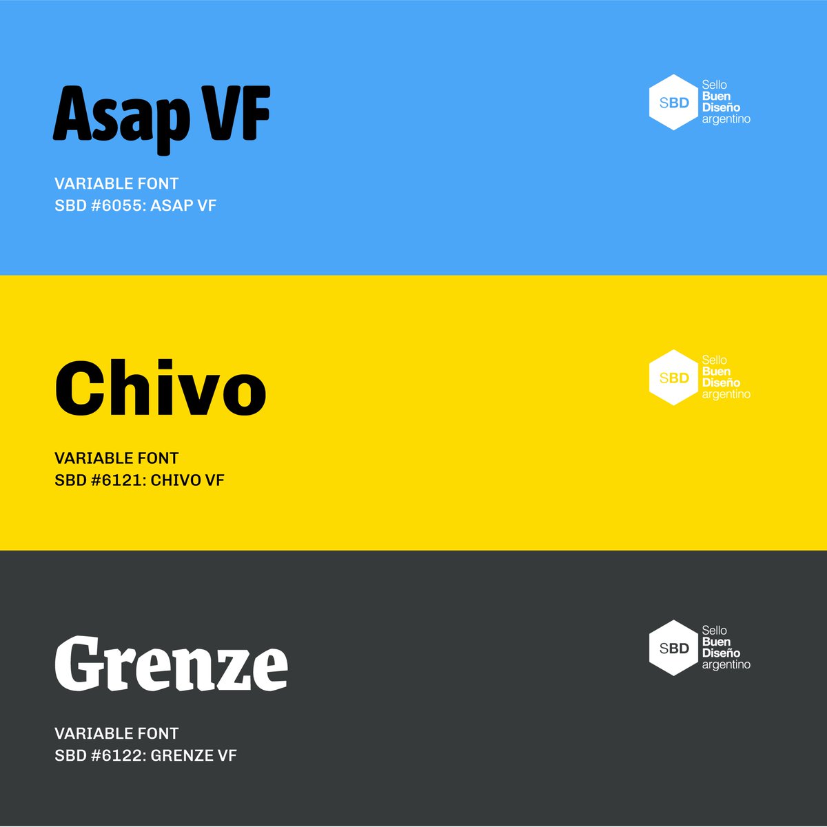
Ya está disponible el catálogo del Sello Buen Diseño (13 edición) en el que fueron distinguidas Asap, Chivo y Grenze. Gracias al Comité Evaluador por destacar nuestros productos. Gracias Seba Feinsilber por todo. Ver y descargar el catálogo: https://t.co/MquHEaJWq4
Producto tipográfico seleccionado con Sello Buen Diseño Argentino: Asap (SBD #6055). Diseño de Pablo Cosgaya y Héctor Gatti con el equipo de Omnibus-Type. Gracias al Comité Evaluador por destacar nuestros productos. Gracias Sebastián Feinsilber por todo.