Switching back and forth between R and external AI tools can be inconvenient and time-consuming.
The ellmer package brings AI directly into your R workflow, allowing you to work with LLMs without leaving your R session.
With ellmer, you can:
🔹 Chat with LLMs directly in R
🔹 Generate and explain R code
🔹 Analyze text and documents
🔹 Work with image inputs
🔹 Connect to different AI providers through a single interface
🔹 Build AI-powered workflows in your R projects
🔹 Use a package that is part of the tidyverse ecosystem
Getting started is straightforward. You can create a chat session in just a few lines of code and immediately begin interacting with AI models from your R environment.
I have just released a new module in the Statistics Globe Hub in which I explain how to chat with LLMs directly from R using the ellmer package. The module covers the main features of ellmer, different chat configurations, image inputs, prompt engineering techniques, and practical examples using fully reproducible R code.
The Statistics Globe Hub is an ongoing learning program focused on practical skills in statistics, data science, AI, and programming with R and Python.
More information about the Hub: https://t.co/NA2b7UAXJ4
#RStats #DataScience #ArtificialIntelligence #MachineLearning #RProgramming #Tidyverse #StatisticsGlobeHub
Want to visualize between-group comparisons with added statistical insights? The ggbetweenstats() function from the ggstatsplot package is designed for exactly that. It combines violin and box plots to show group distributions while seamlessly including statistical test results directly on the plot.
✔️ Clear Group Comparisons: Visualizes data distributions across multiple groups using a mix of violin and box plots, effectively highlighting mean values and differences between groups.
✔️ Statistical Details Built-In: Automatically includes statistical test results, effect sizes, and confidence intervals in the subtitle, offering key insights without the need for extra steps.
✔️ Flexible Plot Design: Choose between a violin plot, box plot, or a combination of both, depending on how you want to present your data.
✔️ Seamless Integration: Works directly with ggplot2, so you can customize and extend your plots with the familiar syntax.
The visualization shown here is from the package website, illustrating how ggbetweenstats() makes it easy to compare groups with detailed statistical information: https://t.co/kQ1KUseS6u
Ready to master ggplot2 and its powerful extensions to create stunning, insightful visualizations? Enroll in my online course, “Data Visualization in R Using ggplot2 & Friends!” See this link for additional information: https://t.co/ztlEzoEDWv
#Statistical #tidyverse #ggplot2 #database
Convocatoria abierta para estudiar Inteligencia Artificial, Análisis de Datos, Ciberseguridad, Nube y Java
¡Los cursos son completamente GRATUITOS!
▪️ 5 meses intensivos con certificaciones de instituciones públicas: @InfotecMexico y @TecNM_MX y de Google, Microsoft, Meta, AWS, Oracle, Axity, Tata Consulting, SAP, Softtek, Kyndryl, IBM y Salesforce.
▪️ Formación integral con inglés y habilidades socioemocionales
▪️ Acceso a un red de empresas con oportunidades de empleo
▪️ La modalidad es híbrida y con clases presenciales en planteles del Tecnológico Nacional de Ciudad de México, Mérida, Morelos, Morelia, Nayarit, Oaxaca, Puebla, Tijuana, Tamaulipas y Veracruz
Regístrate antes del 6 de diciembre y forma parte de la primera generación del Centro Público de Formación en Inteligencia Artificial
→ https://t.co/sp6ct96xa5
🚀 Final Tutorial Series: Calculating SPI & SPEI in R
Calculating a full suite of climate-based indices — including SPEI, SPI, etc, using R.
▶️ Watch the full tutorial here: https://t.co/xAMakD3iZk
Grateful to @milosmakesmaps for his insights.
#Climate#rstat#PhD
Adding statistical metrics to your plots can transform your visualizations from basic to highly informative. With ggplot2 in R and its versatile extensions, incorporating features like p-values, confidence intervals, and regression lines becomes both straightforward and visually appealing.
These are my top 5 packages for adding statistical metrics in ggplot2:
1️⃣ ggstatsplot: Combines statistical analysis and visualizations, displaying p-values, confidence intervals, and effect sizes directly on your plots.
2️⃣ ggpubr: Simplifies the process of adding p-values, statistical comparisons, and summaries to boxplots, bar charts, and more.
3️⃣ ggsignif: Adds significance brackets with p-values to plots like boxplots and bar charts, making statistical comparisons easy to interpret.
4️⃣ stat_poly_eq: Annotates regression equations, R² values, and p-values on scatter plots, ideal for showcasing relationships in linear models.
5️⃣ gghighlight: Highlights specific data points or groups in plots, drawing attention to key statistical trends or outliers while maintaining context.
With these tools, integrating statistical insights into your ggplot2 visualizations becomes both effective and effortless. In the graph shown here, you can see examples of how these packages enhance your plots: a density plot with group means marked by vertical lines, a crowded line plot with selected series highlighted for clarity, a violin-boxplot hybrid with p-values annotated for group comparisons, and a scatter plot featuring a regression line, confidence intervals, and marginal histograms for added context. These enhancements demonstrate the power of ggplot2 extensions for making statistical insights visually accessible.
If you’d like to learn how to use ggplot2 and these extensions, join my online course, Data Visualization in R Using ggplot2 & Friends. I’ll guide you step-by-step to create visualizations packed with statistical insights!
Take a look here for more details: https://t.co/ztlEzoEDWv
#ggplot2 #programming #VisualAnalytics #DataAnalytics #RStats #datavis #Data #tidyverse
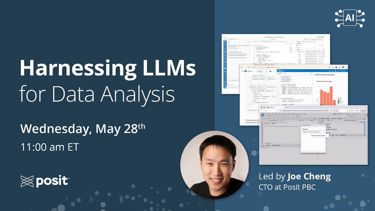
🧠 Cómo aprovechar los LLMs para el análisis de datos
Por Joe Cheng (CTO de Posit)
Los LLMs han cambiado la forma en que desarrollamos, pero en análisis de datos su verdadero valor no está en analizar datos directamente, sino en generar el código que lo hace posible.👇🧵
#stats
Hola🤠 Comparto la #Clase3 de #R
Vemos: cómo aplicar una #regresiónLineal con datos de #WDI
Qué hacemos en el script:
➡️ buscar y descargar datos
➡️ Limpiar
➡️ Correlación
➡️ Regresión
🔗Disponible aquí https://t.co/rnqMQeLo5t
Survival analysis is a statistical approach used to predict the time until an event of interest occurs, such as the failure of a machine or the recovery of a patient.
Properly applied, it can provide deep insights and guide crucial decisions in healthcare, engineering, and various other fields.
Challenges:
❌ Misinterpretation Risk: Without proper handling, survival analysis can lead to incorrect conclusions, affecting decisions and outcomes.
❌ Complexity: Survival data can be complicated by censored observations (when the event hasn’t occurred by the study's end), requiring sophisticated methods and expertise.
❌ Data Quality Dependence: The accuracy of survival analysis heavily relies on the quality of the data. Incomplete or biased data can skew results, leading to unreliable predictions and potentially harmful decisions.
Benefits:
✔️ Improved Decision-Making: By analyzing time-to-event data, survival analysis helps organizations make informed decisions, whether predicting patient outcomes or optimizing maintenance schedules.
✔️ Cost Efficiency: Early identification of risks or failure times can save significant resources, especially in healthcare and industry, where preemptive actions can prevent costly failures.
✔️ Targeted Interventions: Understanding survival probabilities allows for the customization of interventions, ensuring that resources are directed where they are needed most.
The following visualization, based on a survival tree image from Wikipedia (link: https://t.co/nqxLXZwM0R), illustrates how survival analysis can categorize patients based on their risk of survival, guiding treatment strategies. A survival tree is a decision-tree-like model used in survival analysis that splits data into groups based on factors affecting the time to an event, such as patient survival. This visual aids in understanding how different factors impact patient survival times, emphasizing the importance of nuanced analysis.
Implementation in practice:
🔹 R: Use the survival and rpart packages for conducting survival analysis and creating survival trees.
🔹 Python: Leverage the lifelines and scikit-survival libraries for survival modeling and tree-based analysis.
To explain this topic in further detail, I collaborated with Micha Gengenbach to create a comprehensive tutorial.
Click this link for detailed information: https://t.co/sOaxxBO5uj
#statisticians #coding #Rpackage #database
¡Hola comunidad de #Rstats!
Les invitamos a nuestro próximo evento virtual. No necesitas experiencia previa, solo ganas de aprender y compartir. 💜
📅 Domingo 31 de agosto de 2025
🕔 17:00 hrs (CDMX)
💻 Evento virtual y gratuito
Registro abierto en: https://t.co/D7TRMreI3f
👩🏽💻
New book from @PacktDataML >>
"Building Neo4j-Powered Applications with LLMs: Create LLM-driven search and recommendations applications with Haystack, LangChain4j, and Spring AI"
Available at https://t.co/Zk1QzJclnK
Deep Learning Specialization
Become a Machine Learning expert. Master the fundamentals of deep learning and break into AI. Recently updated with cutting-edge techniques
https://t.co/Le5pnR6xv7
AI For Business Specialization
🧠 AI Fundamentals for Non-Data Scientists
💼 AI Applications in Marketing and Finance
👥 AI Applications in People Management
🏛️ AI Strategy and Governance
https://t.co/OX6XAYo2vA
📖 GUÍA PRÁCTICA: ¿CÓMO FORMULAR BUENAS PREGUNTAS DE INVESTIGACIÓN?
❓Sin una pregunta clara y específica, los resultados pueden ser confusos, irrelevantes o incluso engañosos. Para evitar esto, sigue una metodología estructurada que garantice preguntas precisas y útiles. 👇🧵