I've always cared more about product thinking than pixels. Understanding users, questioning assumptions, simplifying decisions. AI didn't change that. It just made it possible to ship those ideas myself.
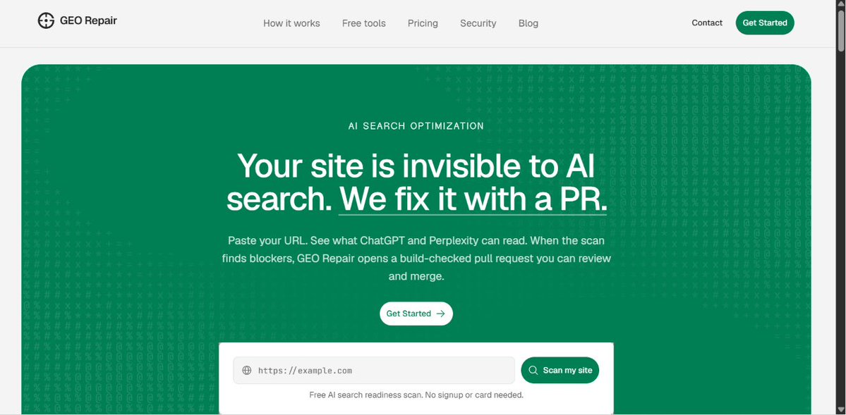
This landing page hero satisfies everything a good hero must have. But more than the copy, they have really focused on nailing the offer.
Their offer is simple. They took a painpoint of the customer and said that they will fix it with something their ICP considers as the shortest effort for them to make. I know that giving access to the codebase is a very big thing but still once we make them go through that, it becomes so easy for them. This company has actually simplified it as much as possible..
This is a great example of refining with first principles to make a thing work..
@forgebitz i saw this with my app taro. it had too much constants fixed. it assigned constant to how much quantity a shelf must have. i still have no idea why. once i removed it, multiple functionalities started working. ofc i used ai to find it
Loading states honestly are like the best inventions in B2B SaaS? Wdym that the user can wait cuz the app is slow (due to some technical reasons) & users aren't angry about this (not to be misused)
turns out humans hate uncertainty & some apps need to have perceived waiting time..
Today I spent way longer than I'd like to admit staring at numbers.
In my warehouse simulator app (Taro), every storage location displayed 1, 2, 3 to represent the Z-levels where products were stored.
It was technically correct, so I never touched it.
But something about the warehouse always felt... wrong.
I thought what would happen if I removed those numbers. Then, I realized that nothing will happen even if we remove the numbers.
The coloured indicators already communicated everything the numbers were doing. The numbers were just repeating information.
Then I thought...
Should I remove the coloured indicators too?
And yea, I almost did.
But unlike the numbers, the colours actually served a purpose. At a glance, they let users see whether a particular shelf contained products or not.
Removing them would've made the warehouse cleaner... but also less informative.
So I kept the colours and removed the numbers.
Instantly, the warehouse felt calmer. Easier to scan. More polished.!
I've always been an advocate for deleting useless features in an app if it doesn't serve any purpose.
I just proved to myself the same..
A small design decision I made in Taro, my warehouse simulation app:
Hover feedback.
Looks like a tiny detail, but it removes a constant question from the user's mind: "Is this the thing I'm about to interact with?"
That little cue reduces hesitation, improves confidence, and makes the interface feel more responsive.
@AathilOfficial@louszbd my app was crashing often. I was using deepseek flash in opencode Go but it just wasn't able to find the root cause. GLM 5.2 entered and found the culprit. When I fixed it, my app suddenly became super fast.
I think progress bar is a UI decision many overlook.
It does so many things at one time:
- reduce users' uncertainty: they make them feel that the thing they think is long is not.
- Goal Gradient Effect: The closer people feel to a goal...the harder they work.
- Zeigarnik Effect: Humans dislike unfinished tasks. Once they start something, they want to finish it
- Endowed Progress: People love getting "free progress." Yes. That's true.
- Small wins: They release dopamine
- reduces abandonment: As we are applying all these psychological techniques, it makes sure that the user doesn't abandon their task what they are supposed to do
And yes, it is just a small UI element
Design = Psychology
I have to say this thought loud after seeing the post.
This is really a great post from @tibo_maker.
I think that all of these problems can be solved through one thing called onboarding. Yes. Onboarding.
Most people think that onboarding is just for getting the users' first win. Nah.
I think it is more than that.
Here are all the things you can be doing in your onboarding which you might not have thought of:
1. Personalization: Collect information that improves future experiences so that you can make their future interaction with the more relevant to what they are, and what they need.
2. User Segmentation: Don't confuse this with personalization. Instead of changing the UI, you're deciding which user journey they belong to. Now, you can send different emails, show different templates, prioritize different features, recommend different upgrades and what not...
3. Setting Expectations: Most people churn because they had different expectations with the app or they expected something in the app but they didn't knew it existed. If you make your onboarding right, you can nail this.
4. Creating Commitment: If someone spends 2 minutes configuring something... They're more likely (not applicable to all) to continue. But still it matters how much work you make them do.
5. Speeding Up the First Win: This is the juice. The most important one. Everything in the onboarding should answer: How do we get this user to experience value as fast as possible? And if you nail it properly with the above points, you can actually make their first win worthwhile.
I can keep saying other points (Teaching the Mental Model, Permission Collection, Data Collection, Building Trust, etc) , but I don't want to overload you.
Please make your onboarding good.
I am not saying onboarding is everything. But.. it matters more than you think..
I've built and sold 2 saas for $8m. now I run a saas portfolio doing $1m mrr
churn has cost us more growth than anything else
so I made my team a list of 12 reasons users churn. sharing them here too:
1. you sold to bad-fit customers. that churn was booked the day they signed. write down the 3 traits your best accounts share and disqualify leads who miss them, even when you need the cash
2. onboarding never hits the aha moment fast enough. find the one action that predicts retention and rebuild onboarding so every new user does it in session one
3. failed payments cause 10-20% of churn and nobody's watching. add dunning emails, card-expiry reminders, and smart retries. it's the easiest churn you'll ever win back
4. silent churn. they went quiet months before cancelling. build a health score from logins and core-feature usage and get pinged the moment it drops
5. usage isn't value, results are. define the outcome each customer came for and measure whether they hit it, not whether they logged in
6. "budget" is never the real reason. it's the polite version of "I stopped seeing value." when someone leaves on price, dig one layer down and close the value gap
7. you watch net retention and ignore gross. expansion hides a leaking base for a year. if the retention curve never flattens, fix the product before you spend another dollar on ads
8. no expansion revenue, so normal churn drags you backward. add one upsell or usage-based lever that lets good accounts grow, not just renew
9. the product stopped evolving. their needs moved, yours didn't. talk to churned power users and ship against what they outgrew
10. cancelling is all or nothing, so they pick nothing. offer a pause, a downgrade, or a heavy discount, plus a prompt asking why. save who you can, learn from who you can't. read every cancellation reason weekly and then act on it
11. no win-back motion. nearly half of returning customers come back within 30 days. fire a sequence the week after they leave and lead with something they never saw, a new feature or workflow
12. shallow usage means zero switching cost. drive adoption of a 2nd and 3rd feature until you're wired into their weekly workflow. depth is the moat
hope it helps 🙏
I think this is the UX feature which nobody notices but if it disappears, everyone will become frustrated.
@googledocs's Saving.. feature.
In apps like older versions of Microsoft Word, your mental model looked like this:
Write
↓
Remember to save
↓
Keep remembering
↓
Computer crashes
↓
Lose work
Notice something?
The user had an extra job: "Protect my work." That job had nothing to do with writing.
Google Docs focused on making the user do only the task. Write → Keep writing. That’s it.
The rest was owned by the product.
While autosave is a huge feature for the users, the UX magic is in that tiny status text which lies above.
Saving... → Saved to Drive
But why to even show it? Because users have decades of conditioning. They have learned that if they don’t save, they’ll lose everything (thanks to Microsoft).
That tiny message answers the invisible question.
Imagine if the status never existed. You'd probably press Ctrl+S anyway. Many people actually did when Docs first launched. The little status slowly retrains you. Eventually your brain just gets this. And that’s when trust forms.
Turns out that just a small status indicator was responsible for the trust of millions of users.
One small UX detail I added to Postmortor, my AI incident postmortem generator.
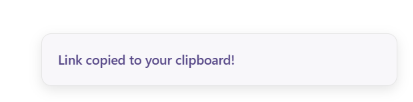
When users click Copy Link, a toast appears saying: "Link copied to your clipboard!"
It seems tiny, but it's solving an important UX problem. That’s why you will see this in many apps.
Copying to the clipboard is an invisible action. Nothing changes on the screen. Without feedback, users are left wondering: "Did it actually copy?"
That uncertainty often leads to repeated clicks or users pasting somewhere just to verify. The toast closes that gap.
It tells the user that it did what they asked and they can move on.
What's interesting is that the feedback doesn't interrupt the workflow. I didn't use a modal or force users to dismiss anything. A lightweight toast communicates success while letting them continue with what they were doing.
I think a good rule of thumb is:
The less visible the system's action, the more visible its feedback should be. If a card gets deleted, users can see it disappear. If a node moves, they can see it move.
But if an action happens behind the scenes, the interface needs to acknowledge it.
This is something I never knew existed. That too in the 1970s.!
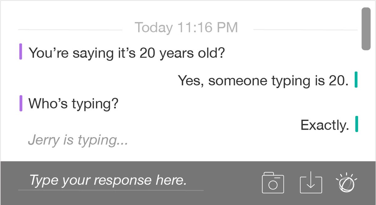
In 1973, David R. Woolley, a student at the University of Illinois Urbana-Champaign working on the Talkomatic introduced something called live character streaming.
The idea was that: treating chat like thinking.
For example as you typed Hello, it used to show:
H
He
Hel
Hell
Hello
Feels cool, right? No it wasn’t. You'd witness every typo, correction, and abandoned thought.
Imagine seeing someone type:
I think you're wr...
I think you're wrong.
Actually...
Maybe...
You'd witness every typo, correction, and abandoned thought.
Even though it was revolutionary technology, it wasn’t good UX.
Then came 1997. Two engineers from IBM: Jerry Cuomo and Richard Redpath.
Instead of showing what the users were typing, they thought that they can just add a tiny state like X is typing...
The good thing here was it gave feedback to the end user that the other person is doing something.
It also gives the other side that their thinking privacy is in control.
That tiny signal dramatically reduced uncertainty.
IBM even patented aspects of this interaction because they recognized it as a meaningful innovation in real-time communication.
After that, many apps like MSN messenger, Whatsapp, Slack all adopted this tiny UX mechanism which they use still to this day.
And it all started from a student who had a small idea.
In my portfolio, you can notice this small UX principle:
Not every CTA is primary.
For one project, I have both a case study and a working prototype. The case study is what I want visitors to read first, so it gets the primary button. The prototype is still important, but it's secondary.
For another project, there's only a case study. So there's only one CTA.
For a project that's still in progress, I only expose the GitHub repository. Since it isn't the main artifact yet, I intentionally style it as a secondary CTA.
The button style changes based on what I want users to do next.
We humans are bad at one thing (me included): spotting changes in large amounts of information.
Now imagine spotting changes in huge codebases.
@github has became a leader by solving this exact problem.
Imagine your teammate says: "I changed the authentication system." There are 50,000 lines of code in the project.
Now answer this: What exactly changed?
??
Without a comparison view, you'd have to open the old file, open the new file, scroll, compare them mentally and hope you didn't miss anything..
That’s why instead of showing the code, GitHub shows the change. Only the thing that changed.
Old line
New line
Green means added. Red means removed.
That’s it.
This is a very good way to answer the exact question the user asks: "What changed since the last time I saw this?” And.. Github optimizes for that exact question.
Many people think that Github is a code viewer. But in reality, it is a change viewer. And there is another thing which I really like in there:
Instead of just showing the changes/changed line, it also shows a few unchanged lines above and below them.
Example:
function login() {
validate(user);
+ return false;
- return true;
}
Without the surrounding context.. you'd have no idea where the change happened.
Too much context is overwhelming. Too little is confusing. GitHub gives just enough.
And the best part is that it scales.
Whether you have changed 1 line or 100 or 1000 or 50000, the interaction stays almost the same.
To me, this is good UX.
One thing I really care about when designing is matching the interface to the order in which users naturally ask questions.
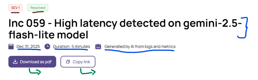
I applied that thinking while designing the header for Postmortor, my AI incident postmortem generator.
The first thing you see is the incident title. It's intentionally the largest element because the user's first question is always: What happened?
Above it are two small badges: Severity and Status.
They answer the next obvious questions:
How bad was it?
Is it still ongoing?
Even though this is a postmortem (so the incident is usually already resolved), users still want that reassurance immediately before reading further.
Below the title comes the metadata.
Date, duration, and author are things engineering teams almost always check. They provide context without competing with the title for attention.
Since the report is AI-generated, I also wanted to be explicit about where the AI got its information.
Simply saying "Generated by AI" raises another question: "Based on what?"
So instead, it says "Generated by AI from logs and metrics."
That small line helps establish trust by showing the AI isn't making things up. It's synthesizing evidence from production data.
Finally, the primary actions.
After reading a postmortem, most people don't edit it. They share it. So, the CTAs reflect that workflow:
Download as PDF
Copy Link
Instead of designing around features, I tried to design around the sequence of questions users naturally ask.