Nikhil Shivdikar needed a mark that captured both craft and spirit. We built his identity by blending the sound “Ni” from his name with the form of a camera. It’s a logo that sees and speaks at once — simple. A design where meaning and memory click together, shot with identity.
Anchor Realty came to us seeking a logo that anchored their brand in strength and identity. We crafted a design that blends the silhouettes of three towering buildings with an anchor, symbolizing stability in real estate. Simple yet impactful, it’s a mark that stands firm.
Crafted at speed and embraced at once, Anand Karir’s logo is a story of swift creativity and sharp execution. The design merges a play icon with his initials ‘A’ and ‘K’, while nine arrowheads capture his many directions as a director.
The Photographic Society of India. The name says it. The logo shows it. A camera held in the arch of the Taj Mahal—simple, strong, and Indian to the bone. We built it to last. Built it to speak without shouting. The brief was clear: respect the past, speak to the present.
WYN STUDIO
Bringing stories to life. Stories matter. We helped WYN Studio show it. WYN—short for What's Your Narrative—stands for voices that need to be heard. The logo, marked by a watchful eye, captures the power of a story well told. It pulls you in. It makes you stay.
The logo takes the classic theatre faces—joy and sorrow—and strips them down to something fresh. Bold. Modern. A twist on the old. It doesn’t mimic tradition. It plays with it. The mark speaks of stories that swing between light and dark, laughter and loss.
Stories told whole. That’s the promise. The logo—a hand cradling a sphere, forming an “F”—says it all. A symbol of care, connection, and completeness. Fullcircle crafts communication strategies that hold everything together—ideas, people, purpose. Stories that come full circle.
Insia made ice cream with her hands. No chemicals. No machines. Just fresh fruit, good milk, and love. She needed a brand that felt like home and tasted like truth. We gave her a heart-shaped bowl and a spoon that said, “Come in.” A logo warm as her kitchen.
For A Glass of Whisky, we crafted a calligraphic emblem that tells a story of dedication and craftsmanship. Inspired by the condensation ring of a whiskey glass, the logo captures the brand’s luxurious essence.
We began where all good things should—with purpose. “A Bright Future, Together” wasn’t just a line, it was a quiet revolution in a category crowded with clinical coldness and empty promises. We shaped a strategy around hope, not procedures; partnership, not prescriptions.
LADIDA | Comfort is cool
Second store in Hyderabad. Alhamdulillah.
We believe in what we stand for. From day one, the challenge was clear—how do you advertise innerwear and lingerie without nudity?
We found the answer in mannequins.
#ComfortIsCool#Ladida#SecondStore#Hyderabad
THE TRIBAL TASTE
They came from the forest. The hands, the stories, the pickles. Honest jars filled with time and care. We gave them a name that tasted old and true. A logo drawn like memory—in postal stamps and handcrafted lines. The forest opened on the cap, quiet but alive.
WHY NOT
Guts made visible
A production house based in Mumbai, sought a brand that represented its core value—daring to venture where others haven’t. We broke that mold with a bold, abstract spiral logo inspired by intestines, symbolising the “gut feeling” that drives creativity.
They sat for us, one by one. Some smiled. Some didn’t. Most didn’t know what their eyes would say until the shutter fell. We gave them frames, sure—but we gave them space too. Space to be themselves. To look out, to look in. And in those still moments, something changed.
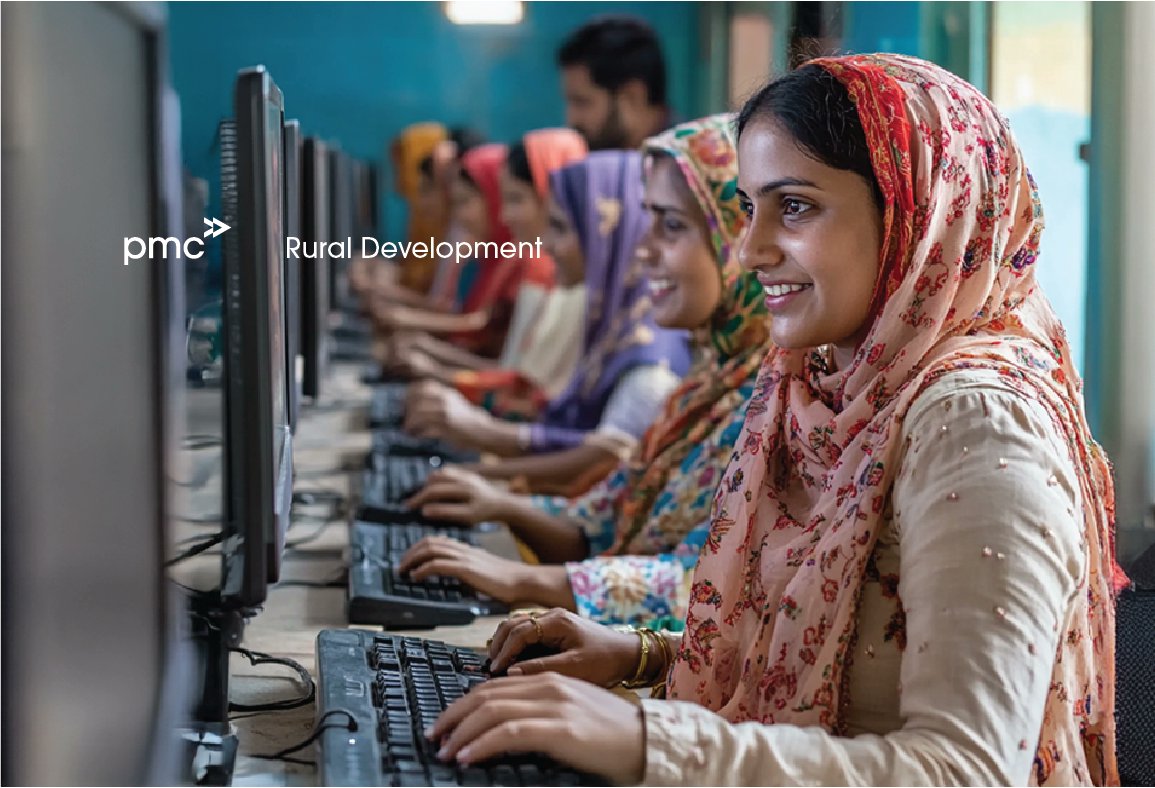
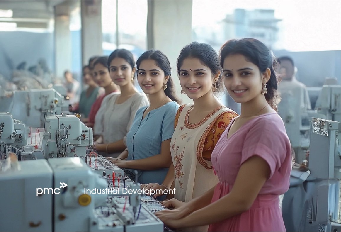
A nation grows when its people do.
From empowered professionals to eco-smart cities, we’re building a better tomorrow, together.
Let’s shape the future of India—brick by purpose-driven brick.
#UrbanDevelopment#SmartCities#IndiaGrowth#PMC
Every great story has a first page. This is yours.
Welcome to Positive Mantra Consulting — where purpose meets action, and growth is the plot.
#NewBeginnings#PositiveChange#RealResults
Carry the Change.
In your hands, on your back, in your choices.
Because every step forward needs someone to take it.
#CarryTheChange#PMC#ProgressInMotion
Call it a Double Arrow. Or a Double Engine. We call it our Double Advantage — knowledge that guides, and keenness that drives. That’s the PMC way.
#BrandDesign#LogoLogic#ForwardTogether