At a festival with events happening over a week and over a whole city? Dilara Bozkurt explores temporal navigation for festival maps on mobile devices, working out how to incorporate space and time on a small screen like a mobile phone https://t.co/PpWAo8nMPw #GISchat#OpenAccess
This edition of the Data Vis Dispatch takes us from the ocean to the moon and beyond!
See the week's best data visualizations on our blog: https://t.co/MUOQqzoDIn
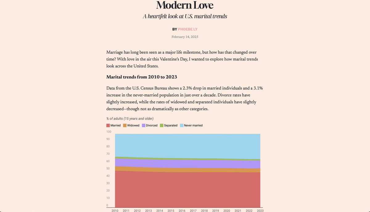
I made something for #ValentinesDay that explores the #US marital trends in the last decade. No matter what your relationship status is, love takes many forms.🩷 I had fun customizing a heart waffle (herzwaffeln) chart! Other charts made with @Datawrapper. https://t.co/9dSr669Vxu
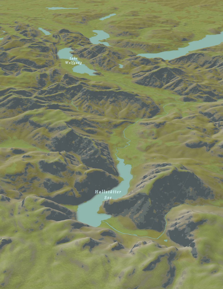
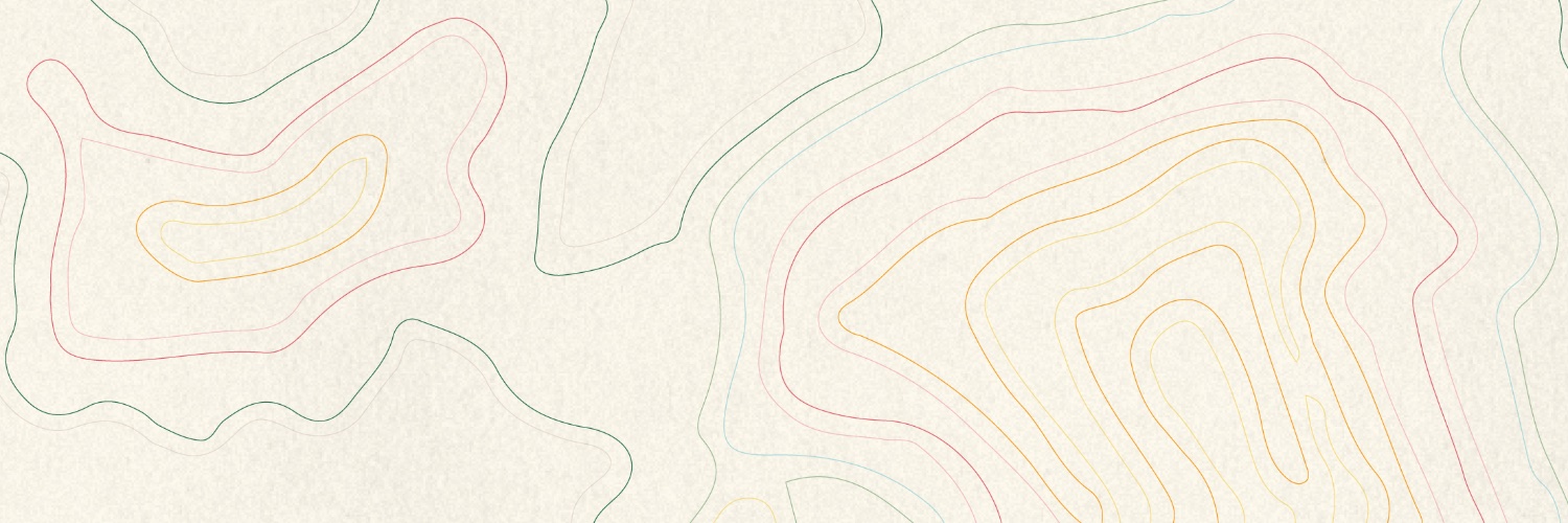
This time I was going for a more natural style. It's not the smoothest terrain and hillshade since I used the default #Mapbox DEM but I'm quite liking it! #maps#cartography
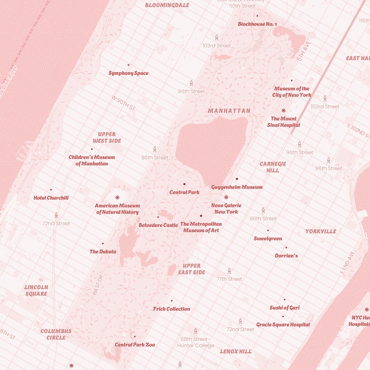
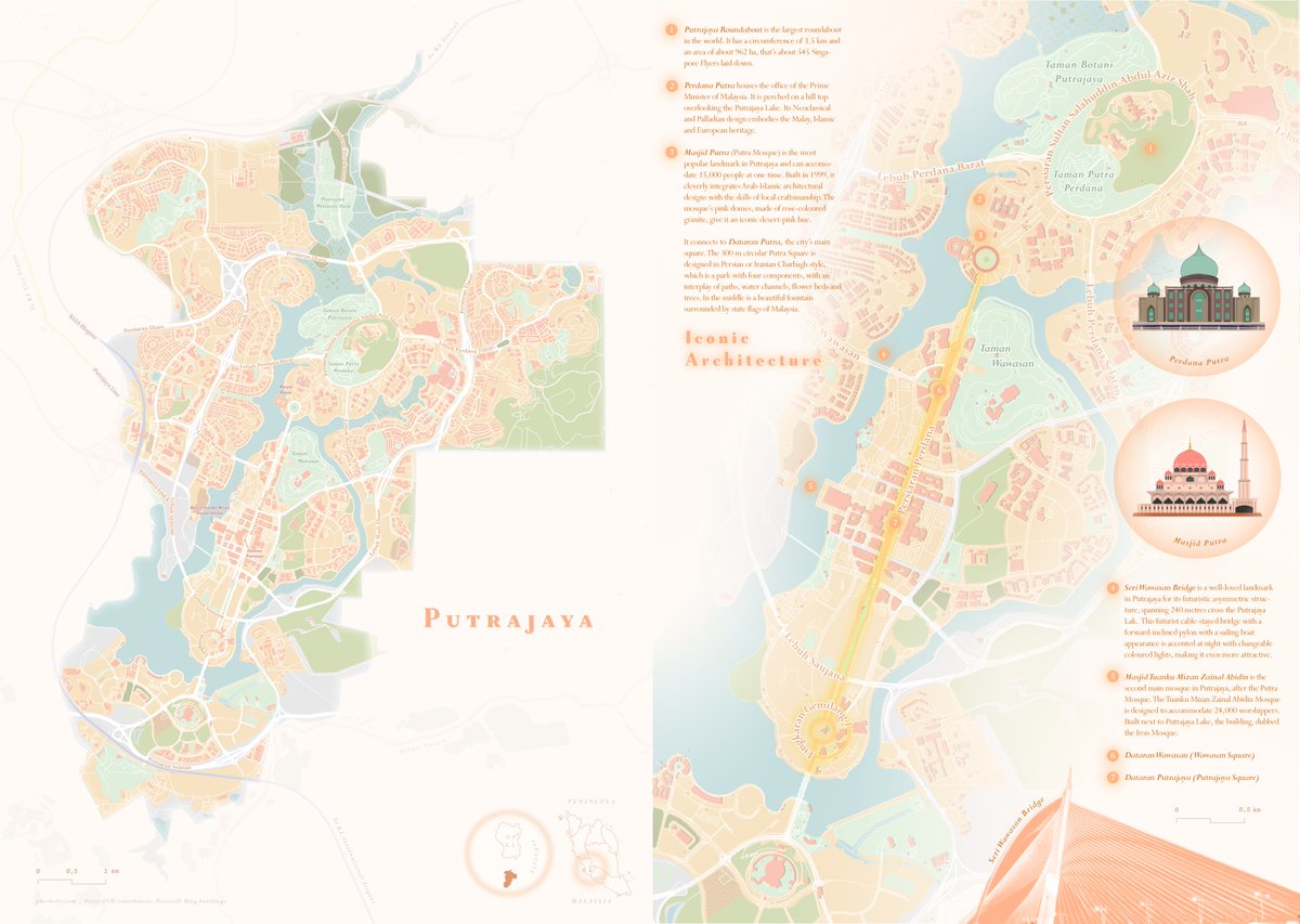
2nd #map for my #PastelMapSeries is #Putrajaya, the 3rd federal territory of #Malaysia. The last time I visited this city was last year, I was quite in awe of it's beauty and how much potential MY has in urban planning (unlike KL lol). I'm glad to be back for a bit tho! :)
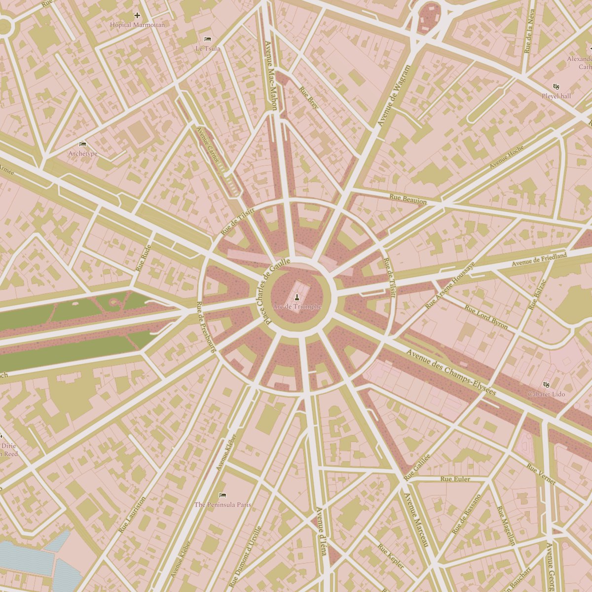
Why does #qGIS ALWAYS reduce the saturation for my exports??? Is there a setting I'm missing? Left: Before export, Right: After export. It's worse with raster data...
#gischat#help
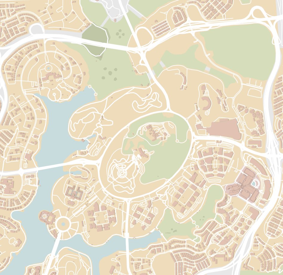
I wanted to experiment making a series of #maps with pastel colors. I lived in ATX for 9 yrs & spending time in Lake Travis was always a blast! The first map is a map of Lake Travis in #Austin, TX. I spent quite some time playing with the hypsometric tint & the shaded relief.
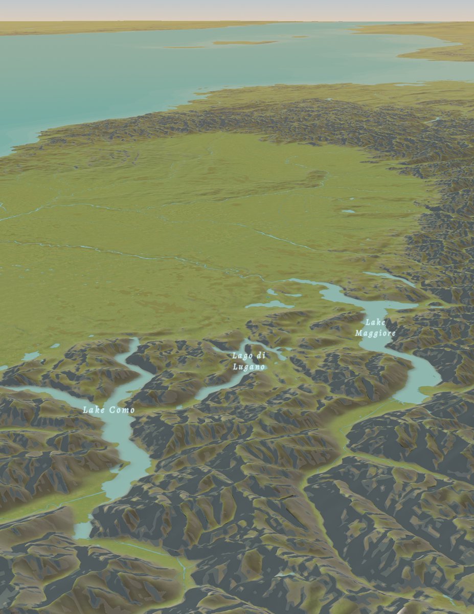
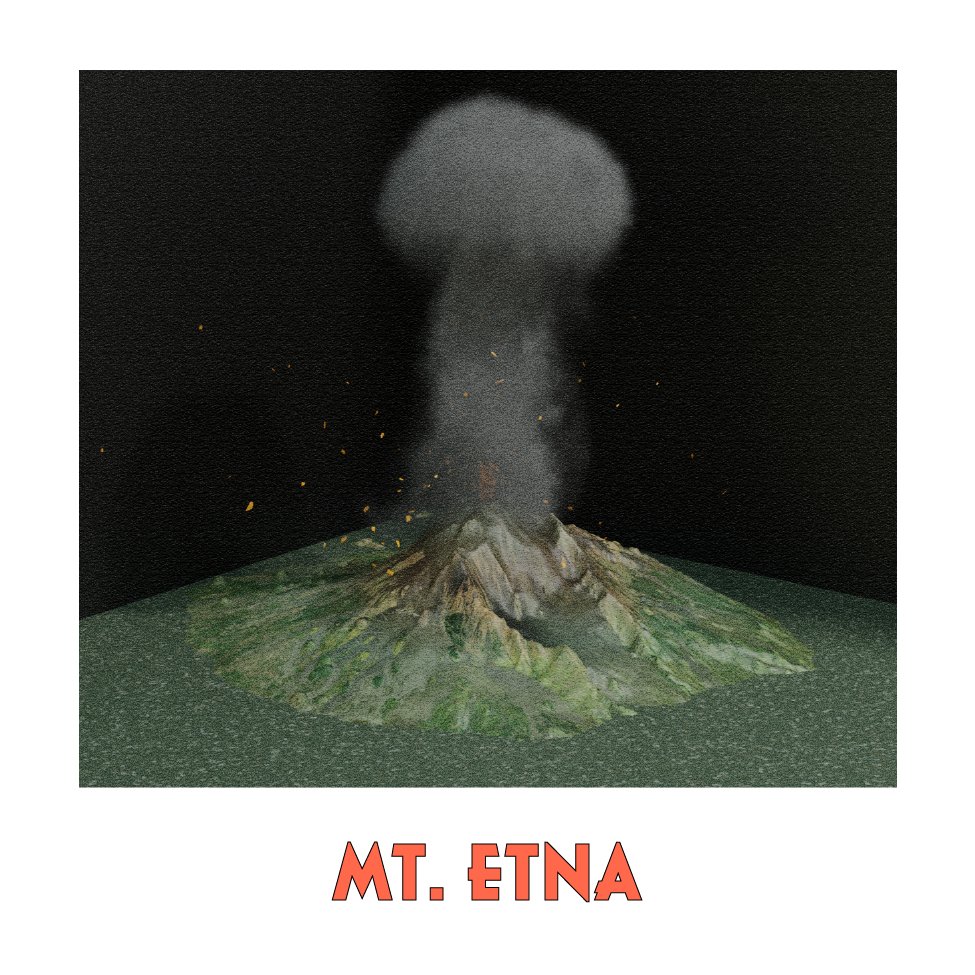
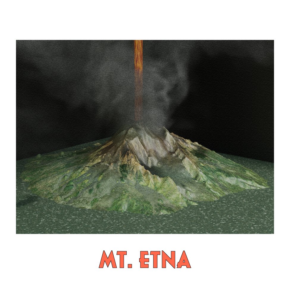
Day 25: Heat. 🌋 I recently visited my first #volcano, Mt. Etna. Although I didn't see the main active crater, the geologist in me was nerding out! Is this a map? Idk but it was made with Copernicus DEM and ESRI imagery using qGIS, #Blender, Illustrator. #30daymapchallenge#3d
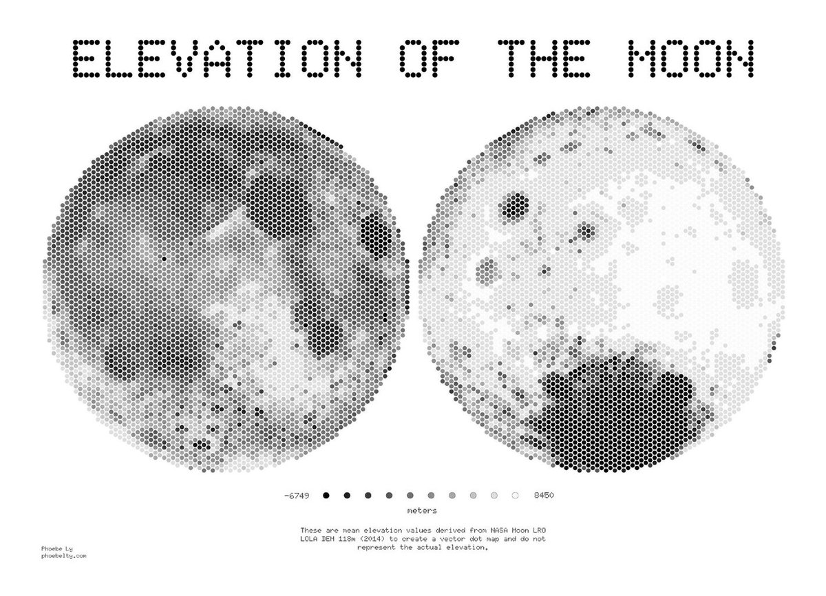
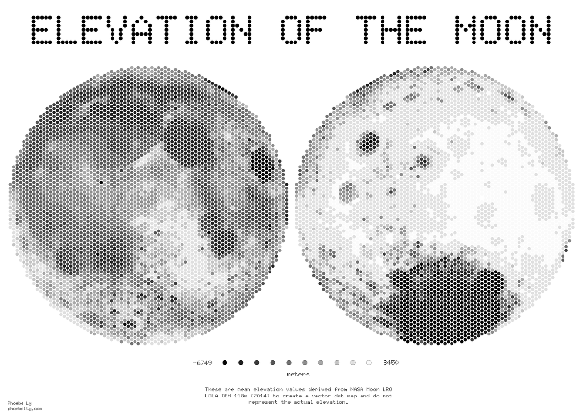
@saar__reshef Good question! In the NASA data I used, the elevations were referenced to a sphere with the lunar radius of 1737 km. So the values are the distance above or below the reference sphere.