Hi, #PortfolioDay!
I'm Phellipe, a curious freelance designer who loves to explore typography and feel the colors. I’m also a front-end developer ✨
Find me at 💻 https://t.co/SEU5vJ6iLb
Drop me a line 💌 [email protected]
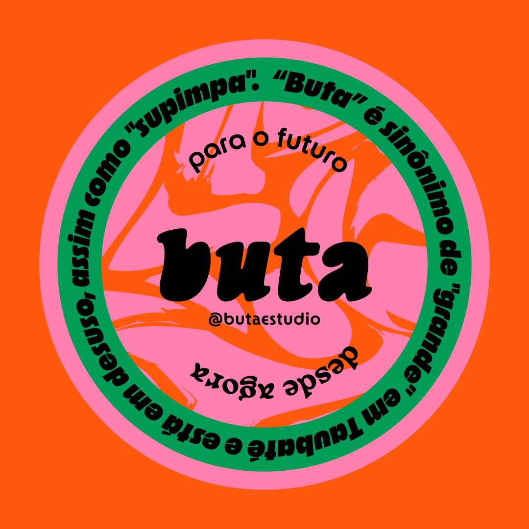
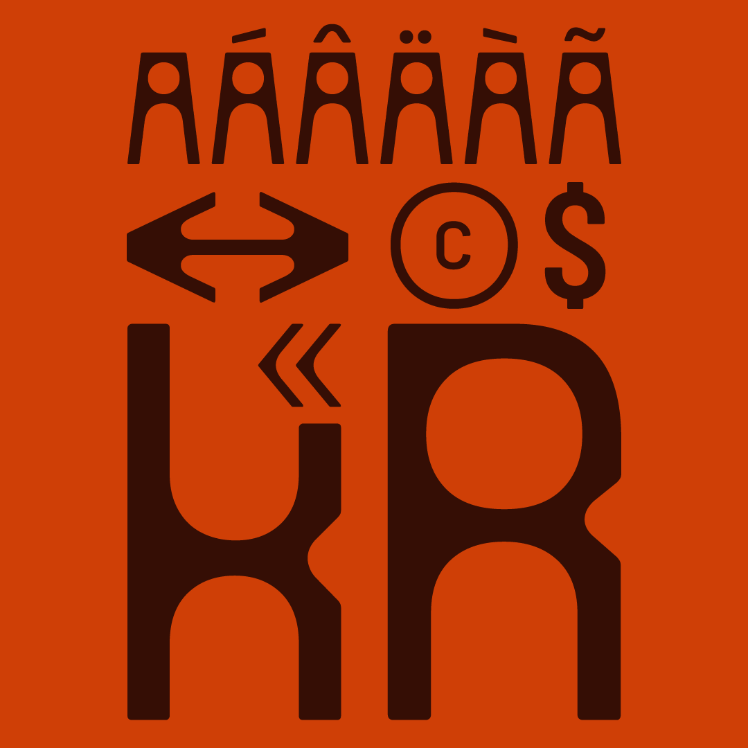
Aoba! Pessoal que viu o tweet sobre a Tijolo, vou explicar rapidinho: a Tijolo é uma fonte feita por mim e pelo Pedro Araújo e está na reta final para ser lançada no começo de Maio. Ela vai ser lançada pelo Buta, que é minha fundidora/estúdio de tipografia (link nos comentários)
Everyone’s missing the real story here.
Meta’s Ray-Ban glasses need human data annotators to train the AI. When you say “Hey Meta” and ask the glasses to analyze something, that video gets sent to Meta’s servers, then routed to Sama, a subcontractor in Nairobi, Kenya. Workers there manually label objects in your footage. They see everything you recorded, intentionally or not.
7 million pairs sold in 2025 alone. Every single pair generates training data that flows through human eyes in Kenya. Workers told Swedish journalists they see people undressing, using bathrooms, having sex, and accidentally filming bank card details. One worker said “we see everything, from living rooms to naked bodies.”
Meta’s automatic face anonymization is supposed to protect people in the footage. Workers say it fails in certain lighting. Faces that should be blurred are sometimes fully visible. The person you recorded without knowing? A stranger in Nairobi can identify them.
Buried in Meta’s terms of service is one sentence doing enormous legal work: the company reserves the right to conduct “manual (human) review” of your AI interactions. That’s the legal cover for routing intimate footage from Western homes to a $2/hour labor force operating under NDAs, office surveillance cameras, and a strict no-questions policy. Workers say if you raise concerns about what you’re seeing, you’re fired.
This is the same company, Sama, that TIME exposed in 2023 for paying Kenyan workers $2/hour to label graphic content for OpenAI while being billed at $12.50/hour per worker. Workers described the experience as torture. Sama ended that contract, then pivoted to labeling Meta’s glasses footage. Same workforce. Same rates.
Meta markets these glasses as “designed with your privacy in mind.” The privacy design is a tiny LED light on the frame that most people don’t notice. The data pipeline behind it routes your bedroom footage to a contractor with a documented history of worker exploitation, failed anonymization, and union-busting lawsuits.
And the next generation of these glasses? Meta is planning to add facial recognition. The same system that can’t reliably blur faces in training data wants to start identifying them on purpose.
The LED light on the frame is doing about as much for your privacy as the terms of service nobody reads.
As perguntas finais foram:
- Diferença Dapper e Entity Framework
- Programação assincrona e sincrona em .NET
- O que é um middleware
- O que é injeção de dependencia
- o lifetime de uma DI (scopped, singleton e tal)
A super simple letter-tracking cheatsheet for junior designers. Bookmark it now, escape junior design mode later.
Rule 1: All-caps text needs to breathe.
Caps-to-caps text is geometrically honest and optically brutal. When you remove ascenders and descenders, every letter becomes the same-height block. If you set labels like START NOW or SUBMIT on buttons — or eyebrow text (the small label above a headline) — with default tracking, they almost always look cramped and nervous.
Rule of thumb:
For any small all-caps text,
loosen tracking by +5% to +10%
≈ +0.05em to +0.1em (or +50 to +100 in “tracking units”).
Rule 2: The bigger the type, the looser it looks
At large sizes, white space starts to dominate perception. Counters inflate. Gaps feel wider. Headlines and wordmarks start to look like they’re slowly dissolving.
Rule of thumb:
Above ~48pt, tighten tracking by –1% to –3%
≈ –0.01em to –0.03em (or –10 to –30 in “tracking units”)
These numbers are not laws. Your eye is still the judge.
But they’re very good starting coordinates.
(btw, I built this whole layout in @framer — making Working Notes interactive is dangerously fun)
minha interação preferida 💘
display grid com instanciamento dos pontinhos pela posição do mouse dando esse efeito shockwave + svg estático por cima feito com base no mesmo grid
@bxxtinho é um mundo delicioso ainda mais pra quem se entope de café o dia inteiro e não quer fazer um rombo na barriga KKKKKK (comecei moendo no liquidificador e dava super ok)