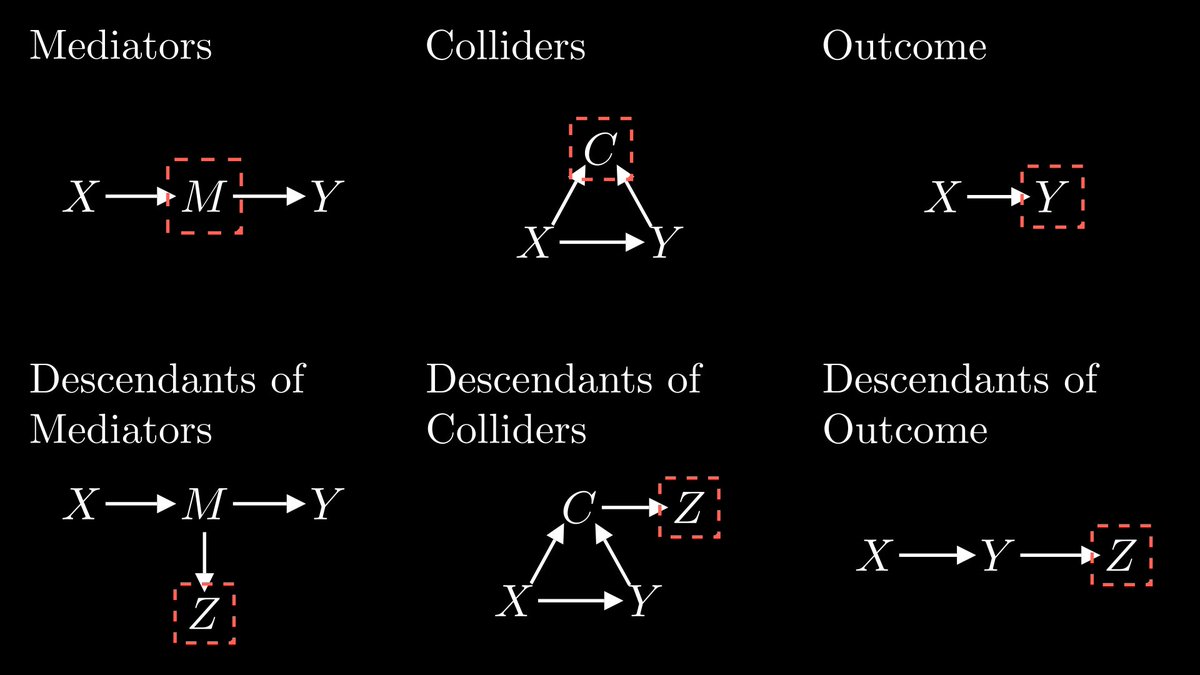
Since this topic is in the air, here's an image from a video I'm working on about causal inference. You should *not* control for these types of variables:
If you want to learn Causal Inference from one of the best and most productive researchers on the area, I have some good news for you!!
@pengding00 lecture notes are here 👇👇👇
https://t.co/TyXkzbhlpp
Thanos: 🫰
(3 seconds later)
Surviving economists: We exploit quasi-random variation induced by the snap to measure the impact of social ties on job search
If you want to learn SQL, here is a great tool powered by ChatGPT:
https://t.co/ZxpHMiIACh
You can type your queries and use ChatGPT to learn and fix any issues.
Here is an example where I'm trying to display a column that doesn't exist.
I can have ChatGPT fix this:
Recommendations for learning the Mathematics of Machine Learning.
I picked 2 resources for each of these topics:
• Probability and Statistics
• Linear Algebra
• Multivariate Calculus
The first link is simpler. The second offers a more in-depth perspective.
Let's start ↓
In statistics, people try very hard to convince you that their model is just telling you what’s in the data. Nothing more.
In ML, people go out of their way to convince you their models can “generalize” the data, maybe even attain sentience which is definitely not in the data.
Trying to make sense of three basic facts about our macroeconomy:
(1) Fed has tightened substantially over past 15 months.
(2) There are essentially no visible effects in the labor market.
(3) Price inflation has fallen.
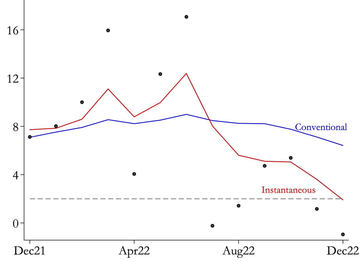
I don’t think people fully appreciate that high inflation in the US and the Euro area is over. We are back at 2%
Part of the high inflation perception today is measurement: instantaneous inflation in December is 2% instead of the conventional measure of 6.5%
1/9
The single most undervalued fact of linear algebra: matrices are graphs, and graphs are matrices.
Encoding matrices as graphs is a cheat code, making complex behavior simple to study.
Let me show you how!
Next time you're creating a bar plot, try using a lollipop chart. They're a lightweight version of bars.
With #rstats, lollipops are easy to create by replacing:
geom_col()
⬇️
geom_point() + geom_segment()
Full code: https://t.co/2RM9jb1ycV