...Some of the most creative people I’ve worked with have been in engineering and in marketing, not just design. And some of the most dogmatic people I’ve met have been in marketing, design, and engineering...
We see you creatives!
https://t.co/gA2mx2pGLd
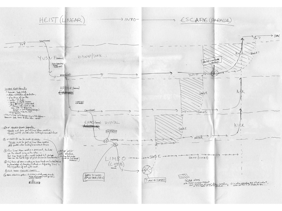
Designers often annotate flows for developers, but we try a different approach. We map all possible flows & outcomes. 🕵️♂️ A great way to present a complex UI's many scenarios. What's your take, #DesignCommunity? #UIUX#DesignDiscussion
Buzzing with excitement as we work on a new case study! We're talking about a B2C startup aiding retailers in delivering top-notch shipping experiences. It's all about angles here - consumer app, retailer app, driver's app. 🎉 Case study inbound, stay tuned!
In the search for fresh inspiration, we'd love to know about the latest modern icon libraries you're using or have come across. Always eager to discover new, innovative work in the design community. Share away!
We worked closely with LifeWeb on their onboarding flows. Main goal, close the gap between creating an account and posting content. KPIs → increase retention, increase adoption.
Full case study:
https://t.co/FFGORqtU7K
Lots of new AI (read ChatGPT wrapper) companies dealing with churn and retention. This despite a variety of use cases under the same tech umbrella. Thoughts? Could this be part of the challenge? #AI#Churn#Retention
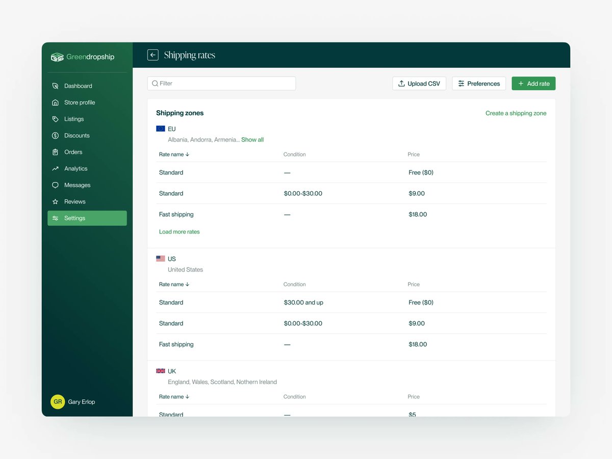
E-commerce shipping policies just got easier! 👏 For Greendropship, we designed a UI to streamline shipping rate policies - across regions, methods, and prices.
Interested to learn more? Visit the full case study:
https://t.co/a87fZ3UTYm
Lost in the creative process of Daft Punk crafting a track on 'Random Access Memories'. Fascinating how they weave lyrics with melody on the fly! Check out this behind-the-scenes look: https://t.co/B1L5PpDFBd #DaftPunk#MusicCreationProcess
Back with Deliverr! 📦 We tackled a complex UI, jam-packed with vital shipment tracking info. Segmentation was our secret weapon for clear, user-friendly design.
To delve deeper into this case, visit:
https://t.co/ZABn7XOJCq
This font is 🔥. It's called Instrument Sans, and it's readily available as open source on Google Fonts. It's refreshing to see other creative agencies sharing their brilliant design work with the community, at no cost!
Take a look here: https://t.co/a3oCUS5oVf
#Throwback to our project with Deliverr, before their whopping $2B acquisition by Shopify. Our mission? An easy-to-read dashboard for users often multitasking on multiple tabs. 🖥️🔍
Want a deeper dive? Explore the full case study here:
https://t.co/ZABn7XOJCq
Moving forward with our MyFBAPrep case study, let's take a look at the design guidelines we created. These guidelines ensure consistency and unity in their visual language across Canva, Google Slides, and Figma.
Full case study, visit: https://t.co/xMrpDOCJ9W
As we progress through our MyFBAPrep project, let's take a look at some of the illustrations we created to add life to some of the pages.
Learn more:
https://t.co/xMrpDOCJ9W
Not all 'deliverables' need to fall into the traditional parameters of our professions. For instance, a designer's work isn't confined to static mockups or a director's creative output isn't just a script.
https://t.co/TlfQEBKByH
Finnish brand Jokilaakson Juusto turned to Studio Hellsten to create a new, more premium packaging system. The pairing of light blue and bright yellow hues with strong, bistro-inspired illustrations creates a packaging system that's highly contemporary. https://t.co/rgtfHbe11b
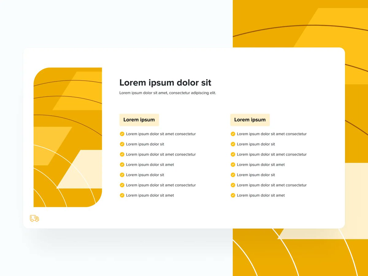
Working with MyFBAPrep, we incorporated graphic elements into our deck slides. Like this checklist, these elements help break down info and make it engaging.
Take a closer look at the full project here: https://t.co/xMrpDOCJ9W
#UI#UX#designinspiration
@tylerthecreator In design, inspiration is all around us, even in a music album. What's an unconventional source of inspiration for you? Share with us!
In our design team, we have a weekly ritual where a team member shares something that inspired them. This week, our focus was on @tylerthecreator album 'Call Me If You Get Lost.' Here's what we took away, viewing it through a design lens:
🧵👇🏽
@tylerthecreator 4️⃣ Inspired Creativity: Tyler's aesthetic, while inspired by Wes Anderson, becomes uniquely his own.This shows how designers can transform existing ideas into original creations.