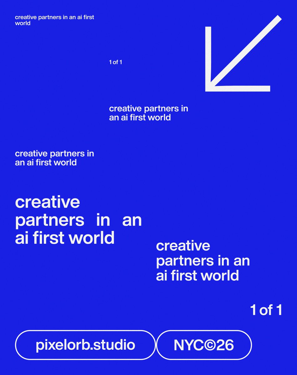
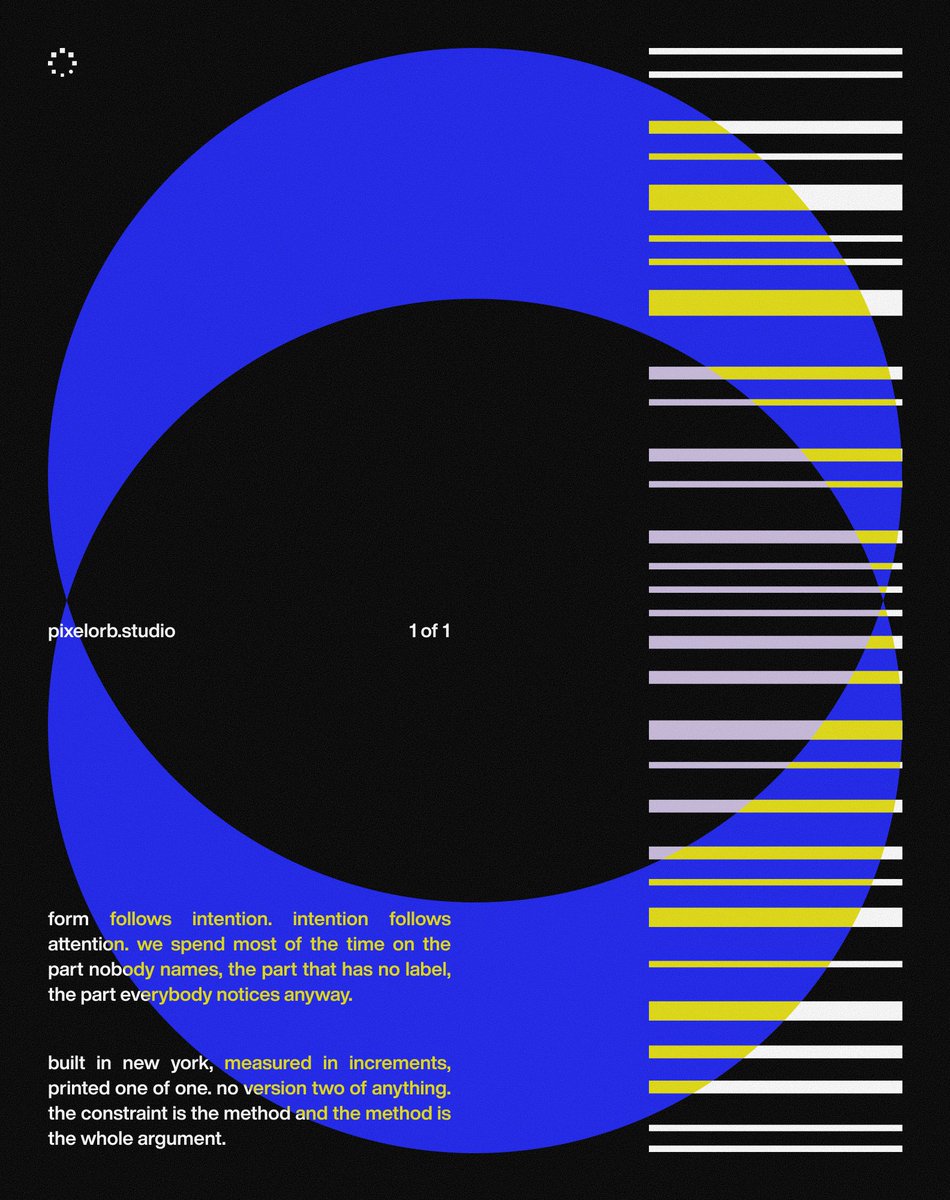
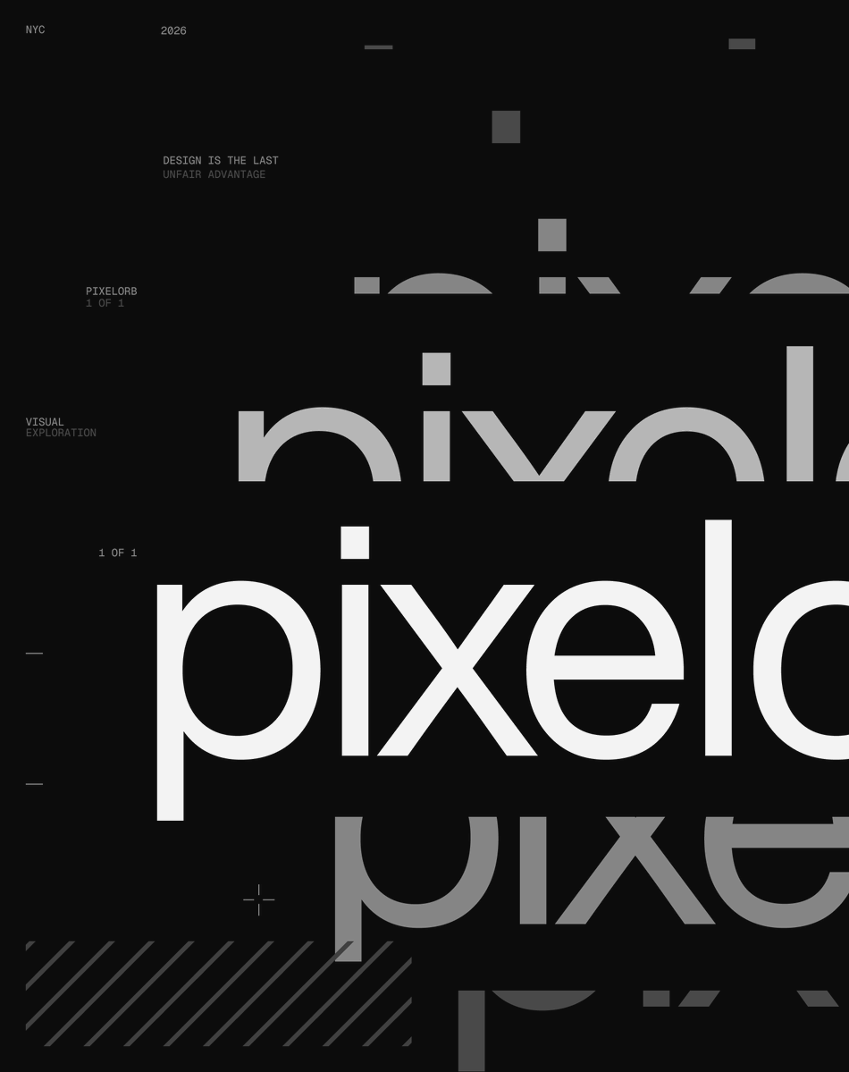
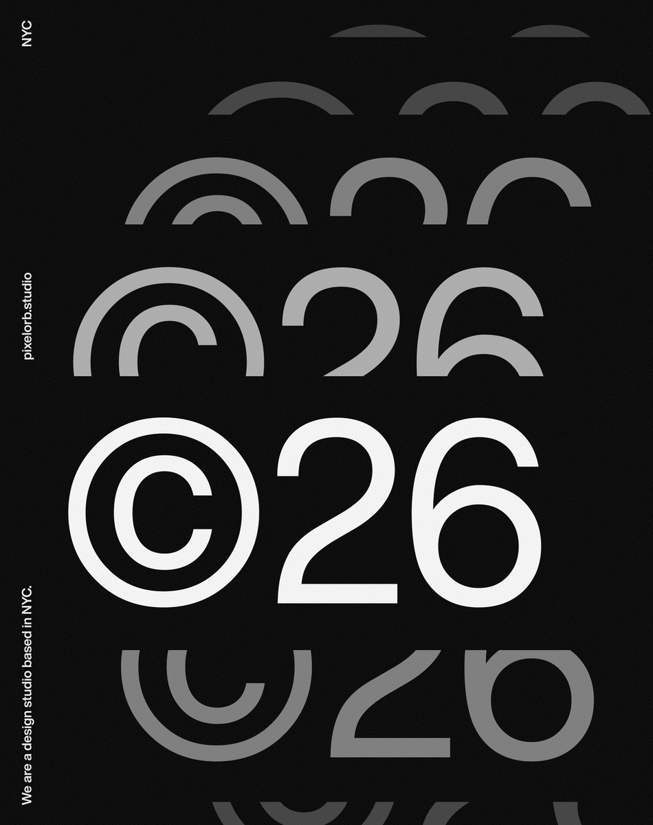
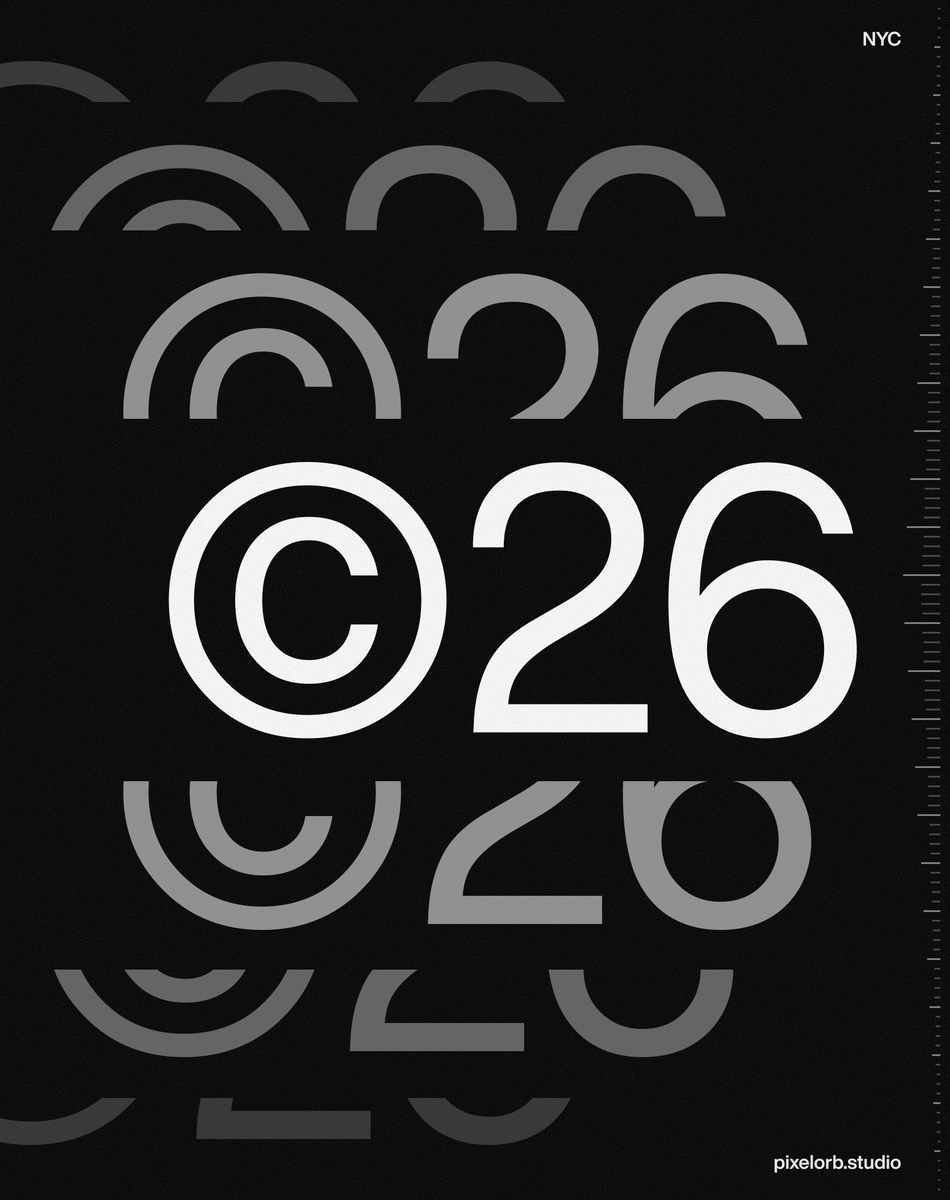
Too many technical AI products look the same.
Nobody wants to build them a world, or spend the time making people feel something about software.
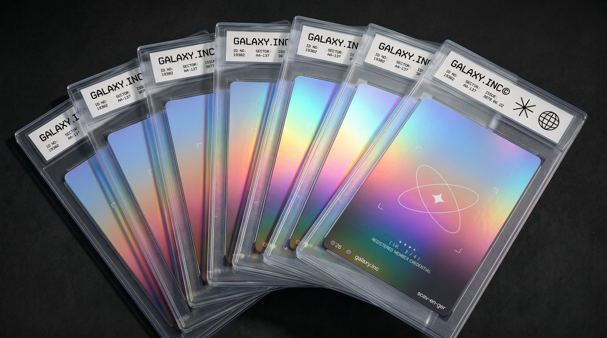
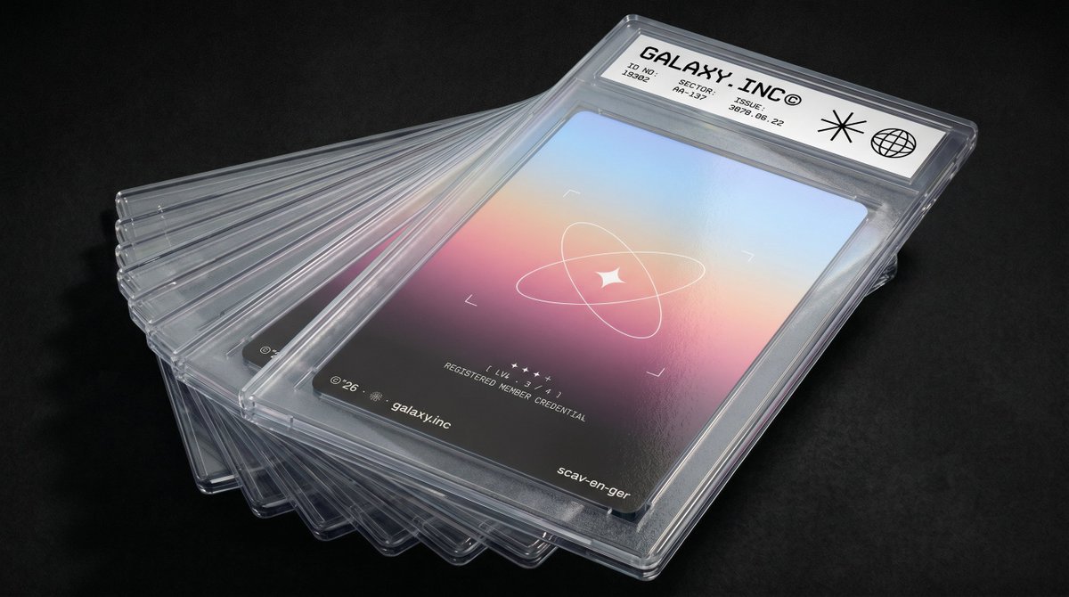
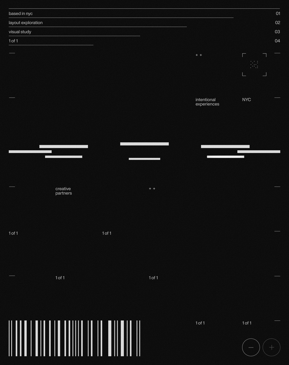
We spent weeks on research, moodboards, and directions before landing on Runline's brand and web identity.
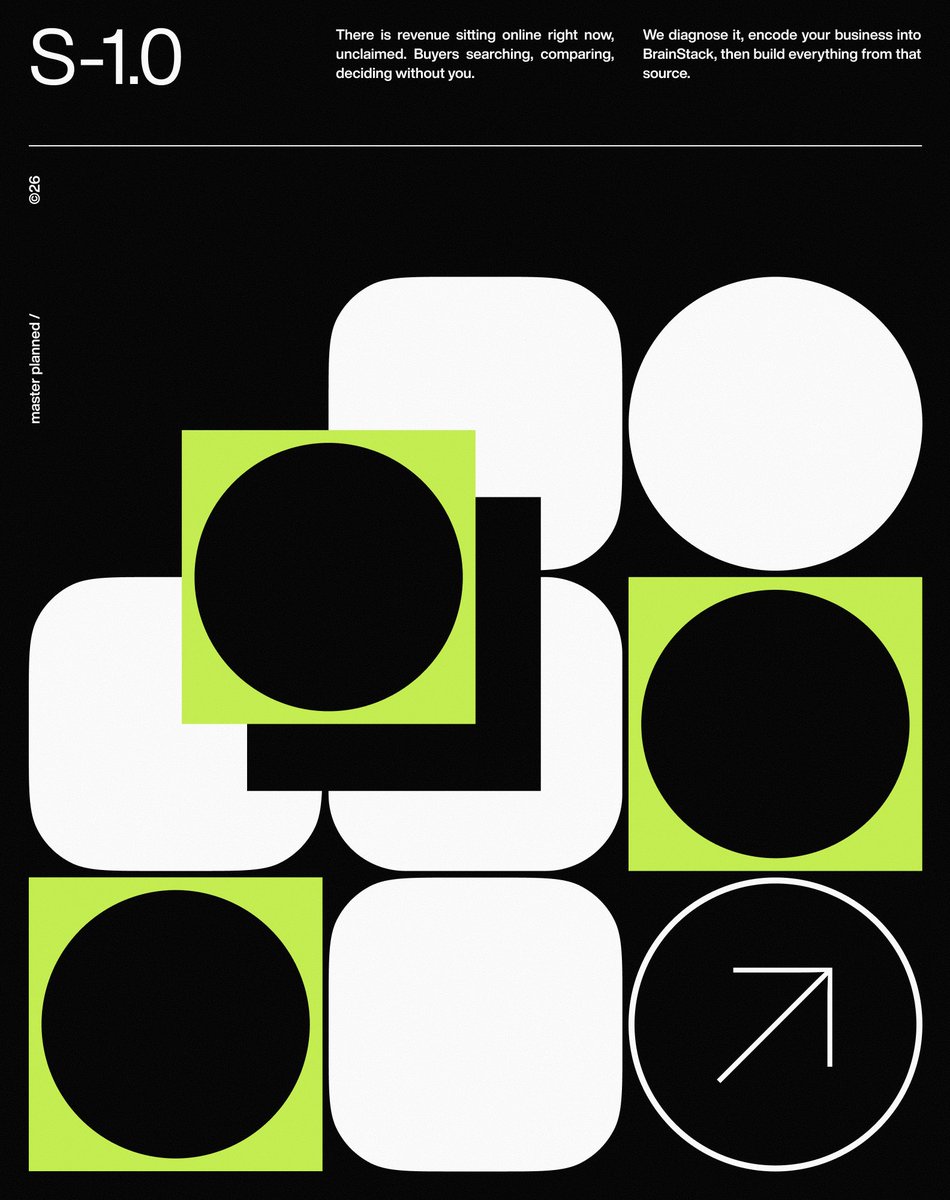
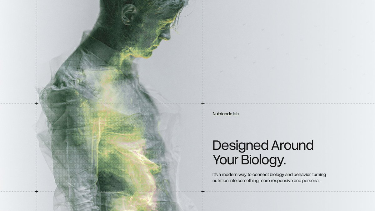
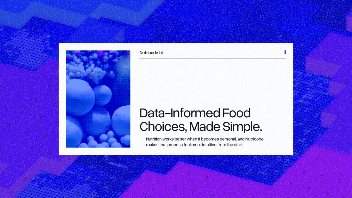
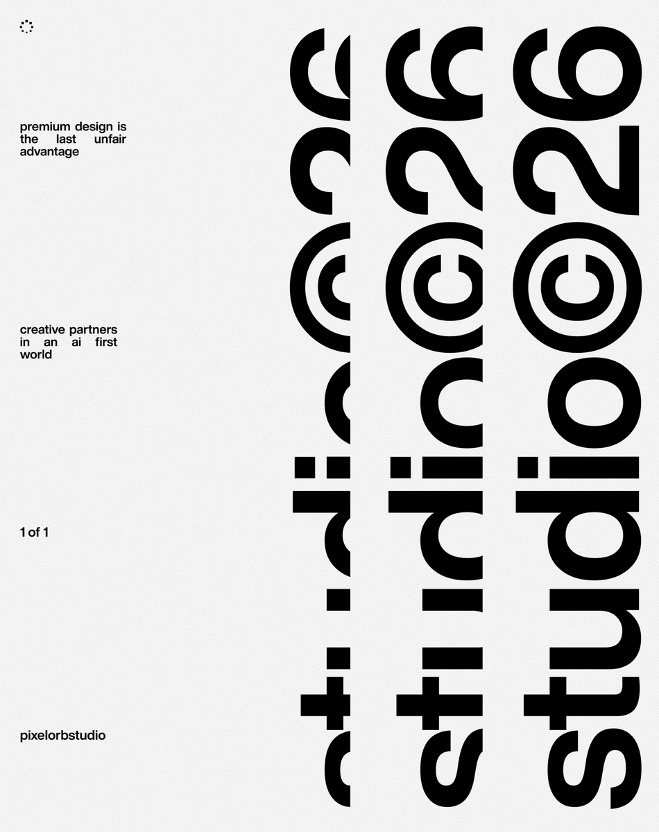
Here's a look into some of that world we built ↓
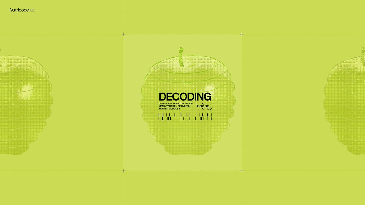
This screen is one of those, where visual balance is more important than mathematical precision. Because of the apple's shape had to move the text like 20px right, to keep it look centered.