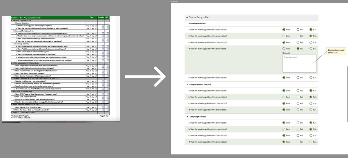
Form enhancements #figma (1) More breathing room between questions (2) Alternating row colors for better distinction (3) Dynamic input box when needed.
@figma thanks. also want to add that in some cases, users are not familiar with the pages on the left side. they don't know how to expand that section. with a specific link, they can land on that page w/o worrying about the sidenav.
feature suggestion for @figma -- when you invite someone into your project, might be valuable to provide a link or page where you want them to land. currently, it's taking new invitees to the very 1st page which is usually the cover.
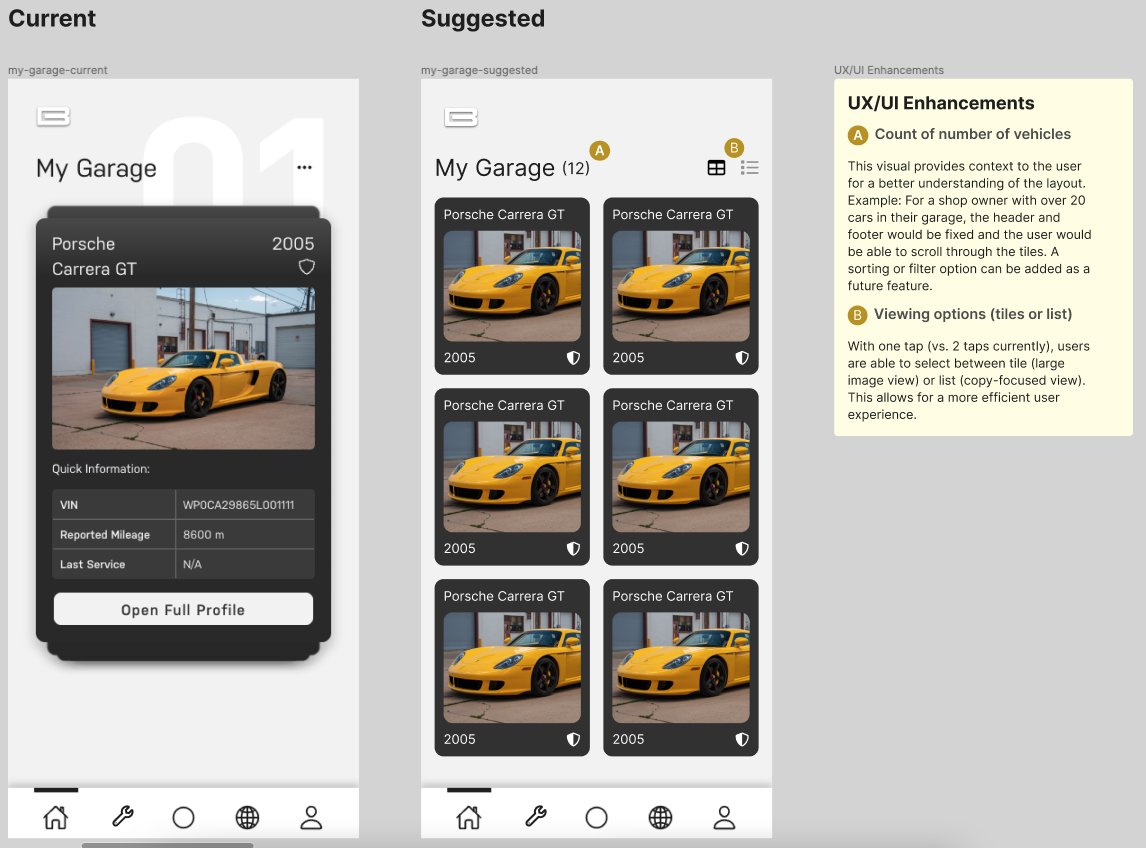
@AutoTrader_com This view is helpful to put emphasis on the card CTAs. It also might be valuable to also have a list / table view so (1) the main CTAs don't look repetitive and (2) you can see more buyers (you can iconicize the CTAs on the row).