So pleased to launch https://t.co/ZrHtZBWRph yesterday at @stbridelibrary together with fantastic speakers Martha Scotford, @ratwoman, @BriarMade, Fiona Ross and of course @alicesavoie who I designed the website with. Dive in & learn about women's contribution to type history.
We’re thrilled to welcome you to our new home and jewel box of a gallery for Bauhaus Typography at 100! The show explores the school’s unique legacy in graphic design through over 150 pieces from our permanent collection. Learn more and get your tickets: https://t.co/iBqe12LtcG
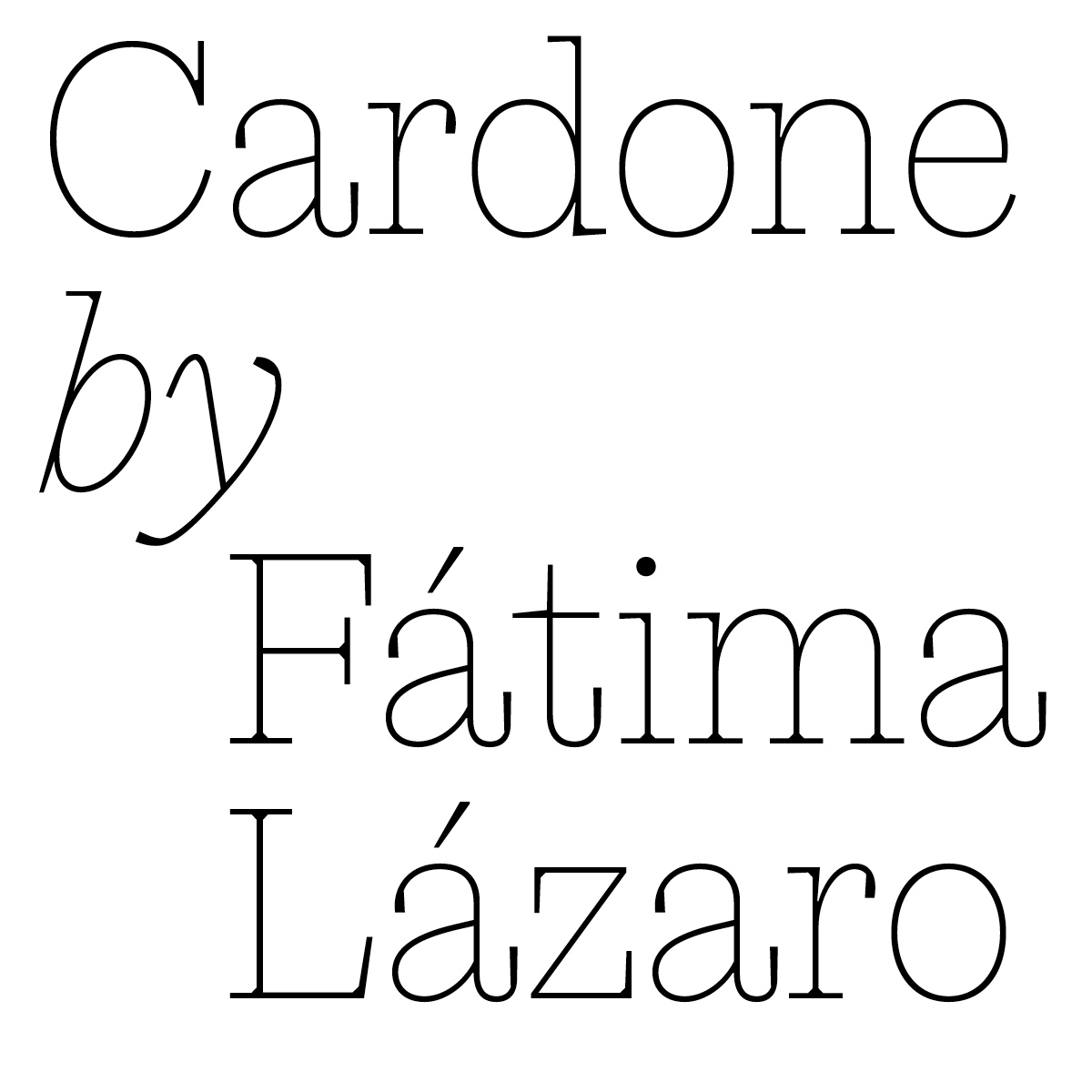
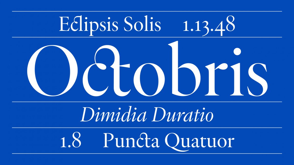
New release tomorrow! Cardone by Fátima Lázaro is a singular interpretation of early so-called Scottish modern faces, later called Scotch Roman #205TF#FatimaLazaro#Cardone@fatimalazaro___
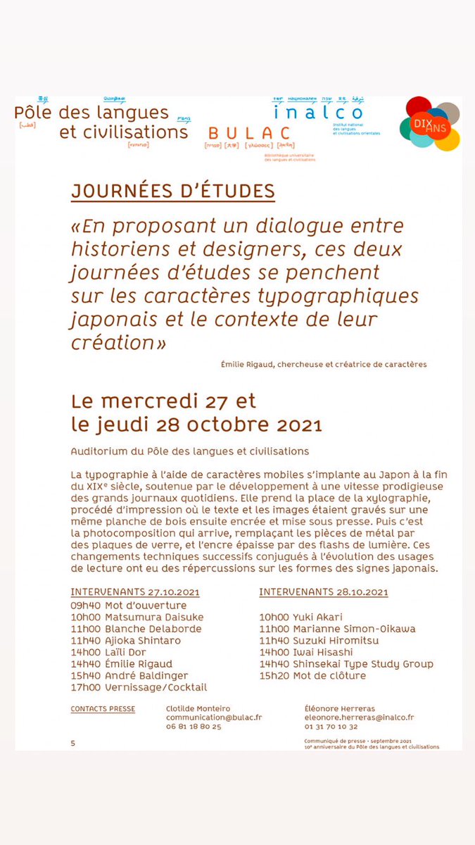
Événement rare en France : deux jours de conférences sur la typo japonaise! Organisés par moi-même et André Baldinger, les 27 et 28 octobre, dans l’auditorium de l’Inalco à Paris. 11 intervenants : 5 français et 6 japonais!
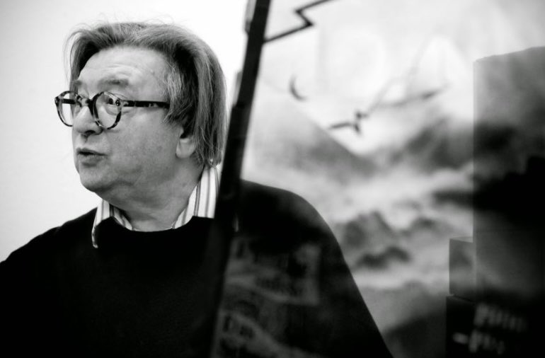
Sad to hear legendary designer and typographer Wolfgang Weingart has passed away. He was a true trailblazer. The world is a duller and more ordinary place without him…
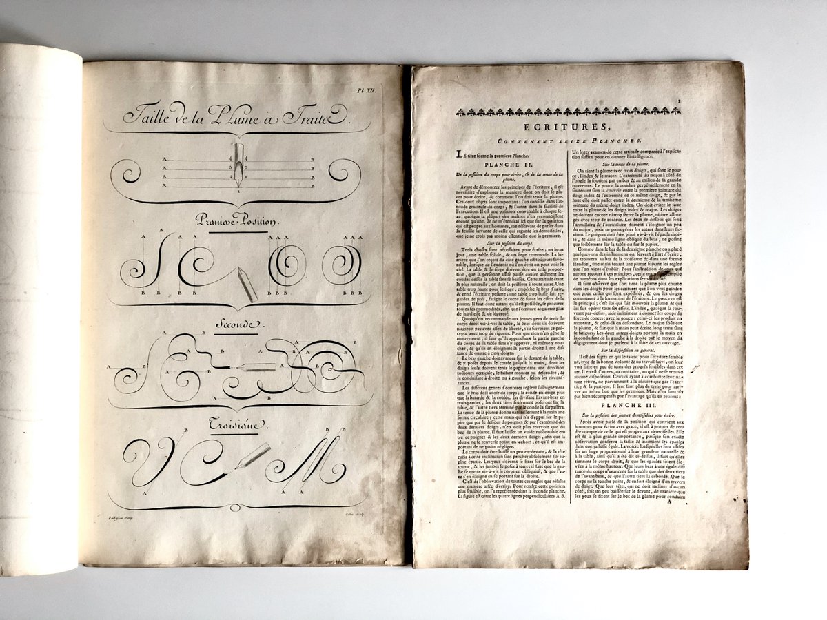
#thread The chapter L’Art d’écrire published in the Encyclopédie des sciences, des arts et des métiers (1751- 72) by Denis Diderot and Jean Le Rond d'Alembert was written and designed by Charles Paillasson. The latter explains:
Maxime Fittes lance Ma-Ma Type, une nouvelle fonderie typographique.
Quatre familles sont déjà disponibles :
La Fork, la Markus, la Packer et la Ziggy.
https://t.co/reuViJuC64
CALL FOR APPLICATIONS!
ANRT 2021
Nancy FR
ANRT offers a 24 months post-master course, and PhD programs with partners.
A strong connection between research and practice is required, interdisciplinary projects are encouraged.
APPLY ONLINE UNTIL JUNE 20th
https://t.co/3GyFvVzUCR
New font! News Reader by @productiontype is a #variablefont with axes for weight (ExtraLight to ExtraBold) and optical size (6pt to 72pt). 🦆 https://t.co/JBx4ABlRAs
New release: Heliuum by Damien Gautier
https://t.co/6AbOWtuqdJ
—
Heliuum is not just a single font, it’s a playful typographic program. Behind simple but strong shapes, this typeface contains seven different character sets.
—
#Heliuum#DamienGautier#205TF
I wrote a NEW article about Japanese typography.
Entitled « Kilograms of sonograms », it presents the beautiful complexity of the Japanese writing system, as well as the debates about it that took place at the turn of the 20th century.
https://t.co/iNaFaIBSHX
Hey everyone, I'm planning on sending out a monthly design history newsletter with articles, shop items and updates on my artefacts. You can subscribe here: https://t.co/kX3wBInGCK
Ce soir nous avons le plaisir d’aller à la rencontre de Christina Poth de l'Atelier Valmy!
À partir de 19h en live-talk sur Insta.
#designgraphique#typedesign poke @ANRT_type
https://t.co/7eO2LCumEu
https://t.co/NYfjgKe7Cb