🎯 [TIP de R - PAQUETE 📚] ¿Querés asegurarte de que tus PDFs sean accesibles?
{pdfcheck} te permite validar la accesibilidad de tus archivos PDF.
Este paquete de R usa la potencia de verapdf (una herramienta de código abierto) para analizar tus PDFs y generar reportes detallados sobre cualquier problema de accesibilidad. Así podés estar seguro de que tus documentos son inclusivos y que todas las personas puedan acceder y entender su contenido.
✔️ Beneficios:
✔️ Validación fácil y automática de accesibilidad PDF: No tenés que ser un experto, el paquete hace todo el trabajo pesado por vos.
✔️ Reportes detallados: Obtené información precisa sobre los problemas de accesibilidad encontrados para solucionarlos.
✔️ Mejorá la inclusión: Asegurate de que tus PDFs sean accesibles e inclusivos para todos tus lectores.
🔥 Tip: Instalá primero verapdf usando la función `pdfcheck::install_verapdf()` antes de usar el paquete.
↪ https://t.co/QhtJcEgzAp
¿Ya usaste {pdfcheck}? Contanos tu experiencia 👇
#RStats #RStatsES #Rtips #DataScience
nlmixr2—an R-based, open-source nonlinear mixed-effects modeling package that can compete with commercial pharmacometrics tools and support regulatory submissions—now supports inter-occasion variability (IOV).
https://t.co/kfSggsdK8e
#rstats#submissions#pharma
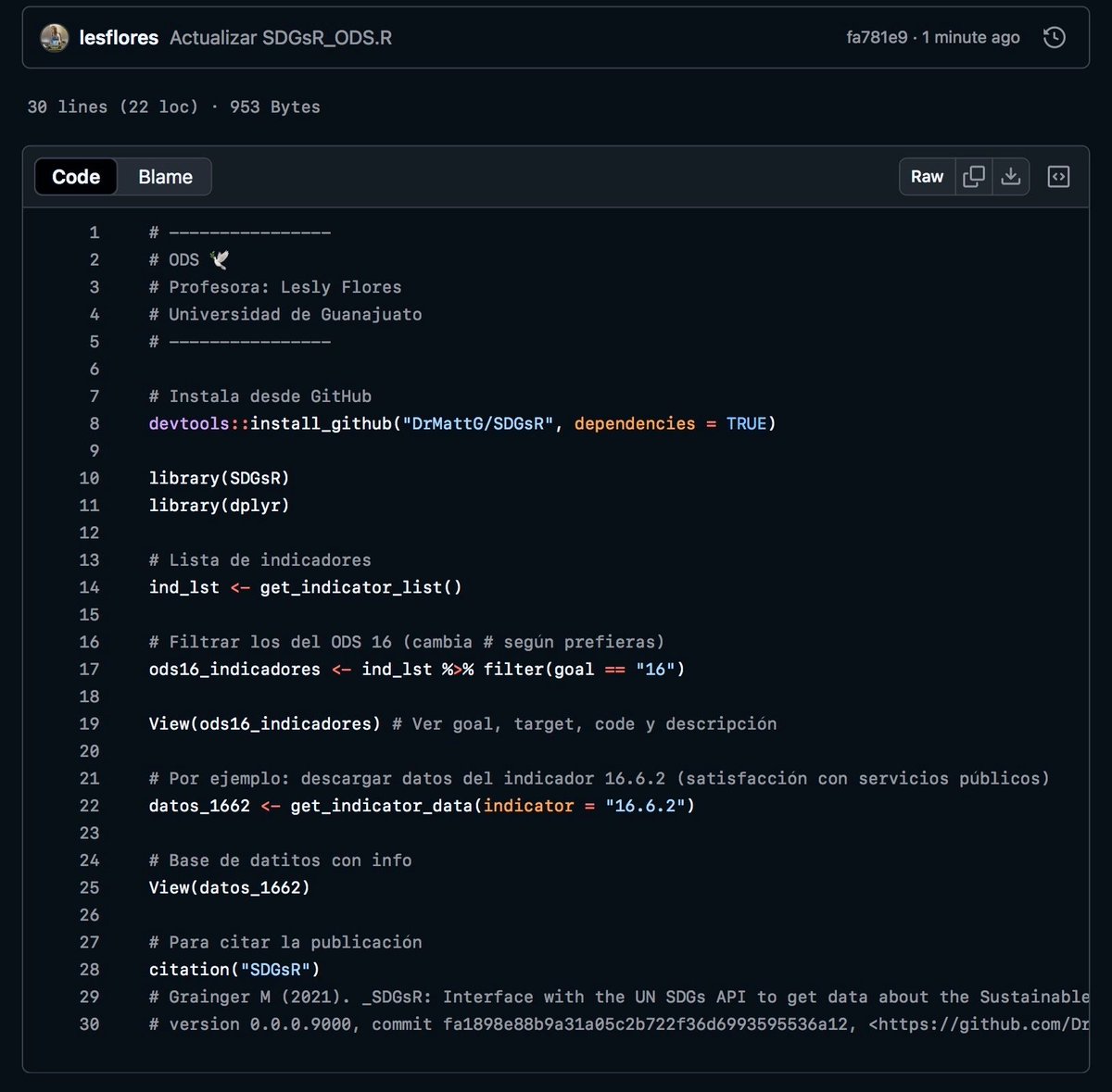
Hola🤠 Estoy bajando datos de los #ODS🌎 desde #R usando la #API de la #ONU🕊️
Por si es de interés, aquí dejo cómo descargarlos con #SDGsR⚙️ y cómo acceder a indicadores (ejemplo 16.6.2 satisfacción servicios públicos💜)
🔗https://t.co/IMy5MxRVoy
#CódigoDeTodxs#Data4good
🚨 No todos los outliers se detectan igual ni se manejan igual.🚨
La decisión depende de su tipo y del objetivo del análisis.
¿Cómo diferenciar, detectar y manejar los distintos tipos de outliers?👇🧵
#stats#datascience#analytics#estadistica#cienciadedatos
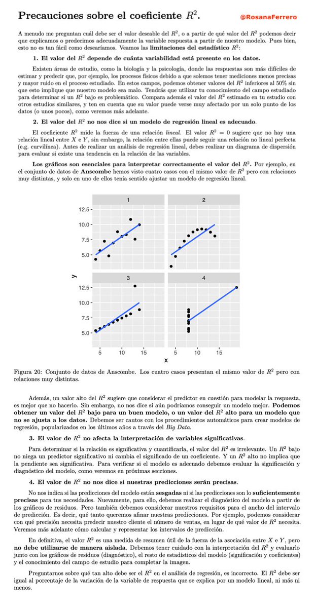
🚨El R² engaña. Más de lo que muchos admiten.🙈
Se repite como un mantra: “R² alto = modelo bueno”. La simplificación es cómoda, pero intelectualmente pobre.
Esto es lo que le enseño a mis alumnos en clase: 👇🧵
#stats#datacience#analytics#master#formacion#cienciadedatos
[COMUNIDAD 👥] - 🎉 +2 años construyendo comunidad R en Latinoamérica
Hace 2 años creamos el repositorio "Asombrosos Paquetes de R Latinoamericanos" con el objetivo de alumbrar y difundir software libre desarrollado en nuestra región.
📊 LO CONSTRUIDO
✓ Decenas de paquetes catalogados
✓ Desarrolladores de +10 países
✓ Categorías que van desde geoespacial hasta salud pública
✓ Una comunidad activa y colaborativa
✓ Visibilidad para proyectos locales Todo en un solo lugar.
Todo libre y abierto.
🌱 Y SEGUIMOS CRECIENDO
Más paquetes, desarrolladoras y desarrolladores se unen. Cada año, la comunidad se fortalece. Pero esto solo funciona si participás.
💡 CÓMO SUMARTE
📍 USUARIOS: Explorá paquetes que resuelven problemas latinoamericanos Apoyá el trabajo de desarrolladores locales
📍 DESARROLLADORAS y DESARROLLADORES: Agregá tu paquete (sea grande o pequeño). Gana visibilidad en la comunidad
📍 TODAS Y TODOS: Compartí el repo con tu red. Proponé mejoras y nuevas categorías. Ayudá a difundir el talento regional
🔗 https://t.co/lOiQDiOhTh
Dale ⭐ si te parece útil.
Compartí si conocés a alguien que debería verlo.
Después de 2 años, esto es más que un repositorio. Es una comunidad.
¡Contanos qué paquete consideras que debería estar que lo sumamos!
#RStats #LatinAmerica #OpenSource #Community #DataScience #EstacionR
If you're still using raw R outputs for presentations, it's time for an upgrade! Tools like gtsummary bring your statistical results to life, making them much more digestible for non-technical audiences.
While base R functions like summary(fit) work well for statisticians, they can be too complex for stakeholders who aren’t familiar with the detailed output. The tbl_regression() function from gtsummary makes it easy to present regression results clearly.
In addition, gtsummary is highly versatile - it’s not just limited to linear regression. You can apply it to generalized linear models, survival analyses, and more. The package even allows you to include p-values, confidence intervals, and other important statistics directly within the tables, helping you to better communicate statistical results.
Here are a few standout benefits:
✅ Simplified output that’s easier for stakeholders to understand
✅ Works seamlessly with a variety of models
✅ Customizable tables with key statistics like p-values, confidence intervals, and more
The visualization included here was originally shared in a post by Dr. Alexander Krannich. Thanks to Alexander for inspiring me to create this post.
Interested in more tips on data science, statistics, Python, and R? Be sure to sign up for my free email newsletter! Check out this link for more details: https://t.co/X93SeCe0rb
#Rpackage #DataScientist #datastructure #RStats #Statistical #Python #database
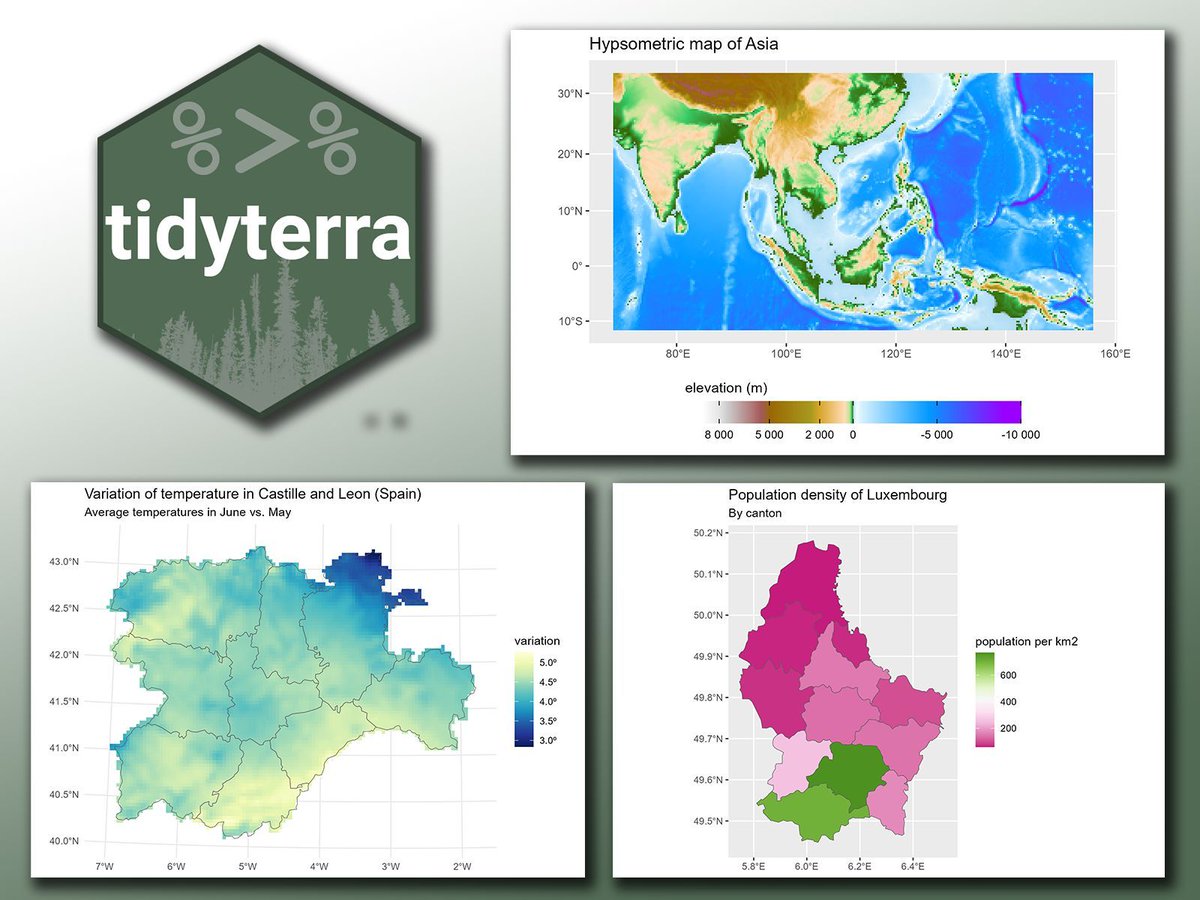
Looking to create stunning, data-rich maps in R? The tidyterra package makes it simple to integrate spatial data with ggplot2, bringing the power of the tidyverse to geospatial analysis. With tidyterra, you can work with spatial data just like any other data set in ggplot2.
✔️ Ease of Use: Simplifies map creation by integrating with ggplot2, using familiar functions and syntax, which reduces the complexity of working with spatial data.
✔️ Flexible Visualizations: Supports a variety of geospatial formats, allowing you to combine spatial data with other data sets, and work seamlessly with both raster and vector data.
✔️ Efficient Data Handling: Leverages dplyr-like functions for filtering, summarizing, and joining, which streamlines data processing and enables smooth integration between spatial and non-spatial data.
✔️ Beautiful Maps: Create detailed, customizable maps with less code and more flexibility, using the grammar of graphics you already know from ggplot2.
The visualizations shown here are taken from the package website and demonstrate how tidyterra simplifies creating detailed maps using ggplot2: https://t.co/s6TmHyj0oc
If you’d like to learn more about ggplot2 and how to create stunning visualizations, check out my online course on “Data Visualization in R Using ggplot2 & Friends!” Take a look here for more details: https://t.co/ztlEzoEDWv
#coding #RStats #R4DS #datastructure #ggplot2 #Statistics #DataViz #datavis #tidyverse
🧩 [TIP] – {ggcompare}: comparaciones estadísticas sin esfuerzo
¿Tenés que comparar varios grupos o distribuciones? Con {ggcompare} podés hacerlo de forma rápida y visual, sin escribir pruebas estadísticas manuales.
✔️ Genera gráficos de comparación con anotaciones automáticas de p-valores.
✔️ Integra directamente con ggplot2 para mantener tu estilo visual.
✔️ Ideal para estudios clínicos, encuestas o análisis de grupos experimentales.
💡 {ggcompare} te ahorra pasos: combina visualización y estadística en un mismo flujo, mostrando diferencias y significancia sin ensuciar el código.
🔗 https://t.co/itxSUpiFuo
#RStats #Rtips #ggcompare #DataViz #Estadística
🚀 Nuevo ggplot2 4.0.0: un gran salto en visualización de datos en R
El mes pasado se celebraron los 18 años de ggplot2 con su versión 4.0.0, que trajo cambios estructurales y mejoras pensadas tanto para usuarios como para desarrolladores.
🔹 Te cuento las principales novedades🧵
I’ve started an ongoing project to collect all the datasets which economists can use, all in one place, organized by topic. Started with 50, further suggestions are extremely welcome. It will grow considerably.
By request: Same #rshiny app → native #electron desktop app now on #Windows11
shinyelectron::export() → #rshinylive → installer → app.exe
[Worth the Parallels license to record this from my Mac]
Still no #rstats dependencies for end users. The cross-platform dream lives.


![estacion_erre's tweet photo. 🧩 [TIP] – {ggcompare}: comparaciones estadísticas sin esfuerzo
¿Tenés que comparar varios grupos o distribuciones? Con {ggcompare} podés hacerlo de forma rápida y visual, sin escribir pruebas estadísticas manuales.
✔️ Genera gráficos de comparación con anotaciones automáticas de p-valores.
✔️ Integra directamente con ggplot2 para mantener tu estilo visual.
✔️ Ideal para estudios clínicos, encuestas o análisis de grupos experimentales.
💡 {ggcompare} te ahorra pasos: combina visualización y estadística en un mismo flujo, mostrando diferencias y significancia sin ensuciar el código.
🔗 https://t.co/itxSUpiFuo
#RStats #Rtips #ggcompare #DataViz #Estadística](https://pbs.twimg.com/media/G2ax4k2XwAAx_9a.jpg)


![estacion_erre's tweet photo. 🎯 [TIP de R - PAQUETE 📚] ¿Querés asegurarte de que tus PDFs sean accesibles?
{pdfcheck} te permite validar la accesibilidad de tus archivos PDF.
Este paquete de R usa la potencia de verapdf (una herramienta de código abierto) para analizar tus PDFs y generar reportes detallados sobre cualquier problema de accesibilidad. Así podés estar seguro de que tus documentos son inclusivos y que todas las personas puedan acceder y entender su contenido.
✔️ Beneficios:
✔️ Validación fácil y automática de accesibilidad PDF: No tenés que ser un experto, el paquete hace todo el trabajo pesado por vos.
✔️ Reportes detallados: Obtené información precisa sobre los problemas de accesibilidad encontrados para solucionarlos.
✔️ Mejorá la inclusión: Asegurate de que tus PDFs sean accesibles e inclusivos para todos tus lectores.
🔥 Tip: Instalá primero verapdf usando la función `pdfcheck::install_verapdf()` antes de usar el paquete.
↪ https://t.co/QhtJcEgzAp
¿Ya usaste {pdfcheck}? Contanos tu experiencia 👇
#RStats #RStatsES #Rtips #DataScience](https://pbs.twimg.com/media/HAeWjWlW0AAQNzF.jpg)





![estacion_erre's tweet photo. [COMUNIDAD 👥] - 🎉 +2 años construyendo comunidad R en Latinoamérica
Hace 2 años creamos el repositorio "Asombrosos Paquetes de R Latinoamericanos" con el objetivo de alumbrar y difundir software libre desarrollado en nuestra región.
📊 LO CONSTRUIDO
✓ Decenas de paquetes catalogados
✓ Desarrolladores de +10 países
✓ Categorías que van desde geoespacial hasta salud pública
✓ Una comunidad activa y colaborativa
✓ Visibilidad para proyectos locales Todo en un solo lugar.
Todo libre y abierto.
🌱 Y SEGUIMOS CRECIENDO
Más paquetes, desarrolladoras y desarrolladores se unen. Cada año, la comunidad se fortalece. Pero esto solo funciona si participás.
💡 CÓMO SUMARTE
📍 USUARIOS: Explorá paquetes que resuelven problemas latinoamericanos Apoyá el trabajo de desarrolladores locales
📍 DESARROLLADORAS y DESARROLLADORES: Agregá tu paquete (sea grande o pequeño). Gana visibilidad en la comunidad
📍 TODAS Y TODOS: Compartí el repo con tu red. Proponé mejoras y nuevas categorías. Ayudá a difundir el talento regional
🔗 https://t.co/lOiQDiOhTh
Dale ⭐ si te parece útil.
Compartí si conocés a alguien que debería verlo.
Después de 2 años, esto es más que un repositorio. Es una comunidad.
¡Contanos qué paquete consideras que debería estar que lo sumamos!
#RStats #LatinAmerica #OpenSource #Community #DataScience #EstacionR](https://pbs.twimg.com/media/G5kRMpgXAAEFYhm.jpg)

![estacion_erre's tweet photo. 🧩 [TIP] – {ggcompare}: comparaciones estadísticas sin esfuerzo
¿Tenés que comparar varios grupos o distribuciones? Con {ggcompare} podés hacerlo de forma rápida y visual, sin escribir pruebas estadísticas manuales.
✔️ Genera gráficos de comparación con anotaciones automáticas de p-valores.
✔️ Integra directamente con ggplot2 para mantener tu estilo visual.
✔️ Ideal para estudios clínicos, encuestas o análisis de grupos experimentales.
💡 {ggcompare} te ahorra pasos: combina visualización y estadística en un mismo flujo, mostrando diferencias y significancia sin ensuciar el código.
🔗 https://t.co/itxSUpiFuo
#RStats #Rtips #ggcompare #DataViz #Estadística](https://pbs.twimg.com/media/G2ax4k8XwAA6IRv.jpg)