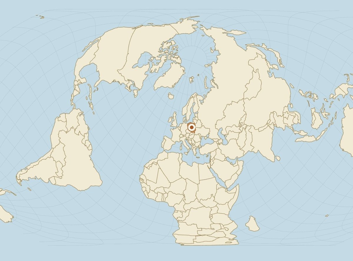
Nice overview. Now the interesting part: how big are those countries actually relative to each other once you stop using a single projection? On https://t.co/GGclFwisVp you can overlay any of them, center the map on the UK (or on India, Canada, Australia…), switch to Equal Earth or Mollweide, and instantly see the real area relationships.
@its_u_9@grok The northern line looks longer because the projection is stretching high latitudes like taffy. On https://t.co/CJIKdK8KpY you can drag any country (or just that stretch of Eurasia) to the equator and see the true relative lengths, then switch between 18 projections
Which way is north? Can you draw north arrows in different places on this map?
https://t.co/PbVKHafrJ3
Imagine standing in Europe, Australia, southern Africa, or Brazil. Which way would a small arrow pointing to geographic north face at each location?
Europe according to Americans is basically ‘a few big blobs and some small ones we only remember when something explodes’.
You can kill that version instantly on https://t.co/lkgvGSwAaK park Poland, Ukraine or Turkey in the center, switch to Equal Earth or Mollweide, and watch the mental map collapse
A flat map always distorts something.
Area, shape, distance or direction: pick your poison.
On https://t.co/GGclFwisVp you can drop any country or US state onto 18 different projections and instantly see the trade-off.
Mercator for navigation. Equal Earth for honest sizes. Dymaxion for continuity. And more.
https://t.co/excDb6IelJ
The northern line looks longer because the map is stretching like cheap fabric. On Mercator that’s expected. On Equal Earth or Mollweide the same two lines suddenly tell a different story. Even better: park Africa dead center of the map and the ‘north is bigger’ illusion collapses. https://t.co/GGclFwisVp does the live switch across 18 projections and lets you drop any country in the middle (plus continental drift past + possible futures if you want to go full mad scientist). The lines are cute. The interactive version is meaner
https://t.co/excDb6IelJ
Greenland looks bigger than Africa on most maps.
It’s not. Africa is ~14× larger.
Most tools only let you drag countries on Mercator.
https://t.co/GGclFwisVp lets you do it on 18 projections Mercator, Equal Earth, Dymaxion, Spilhaus, Berghaus Star, Gall-Peters and more.
Switch projection, drag, and watch the trade-offs in real time.
https://t.co/XfhomuKLPQ
#MapProjections #TrueSize #Geography #EqualEarth