The ultimate design guide, created & presented in Figma. Created by @ultralinx and @michaelfilipiuk. Get the guide now with a special introductory discount!
🎉 Launch Day 🎉
Pre-order for @redesignmanual is now LIVE!
RedesignManual is a brand new, unique learning experience for all designers - both beginners and pros. It's a design course created and presented in Figma.
Learn more & pre-order here:
→ https://t.co/6mjWBPlH5W ←
UI Design Tip ✨
When designing forms, mind the label spacing.
Make sure that the label is closer to its field than to the field above it.
#uidesigntip#designtip
UI Design Tip ✨
Please stop using default shadows!
They look dirty and harsh. Just reducing the opacity and increasing the blur should do the trick.
#uidesigntip#designtip
UI Design Tip✨
Nothing screams for attention more than a huge, red button.
It’s better to have subtler buttons for very negative/dangerous actions.
#uidesigntip#designtip
UI Design Tip ✨
When designing cards, use just one CTA button.
Cards should narrow down the selection and make the choice easier. If you need to, add a small button in the top right corner.
#designtip#uidesigntip
UI Design Tip ✨
If you rely only on color to highlight a selected element - you’re making the UI inaccessible.
Use more than just color.
#uidesigntip#designtip
UI Design Tip✨
It's the pre-order launch day, but we're not slowing down with the tips!
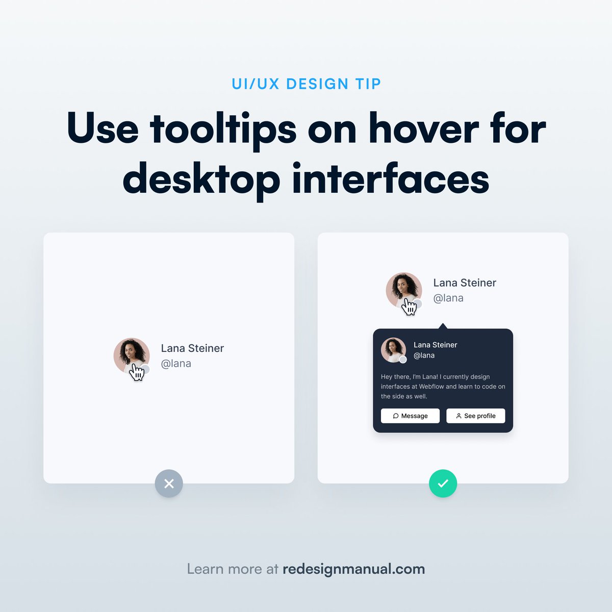
Hover tooltips are a simple way to improve the UX of desktop digital products.
Just hover on our profile picture above and see how Twitter does it!
#uidesigntip#designtip
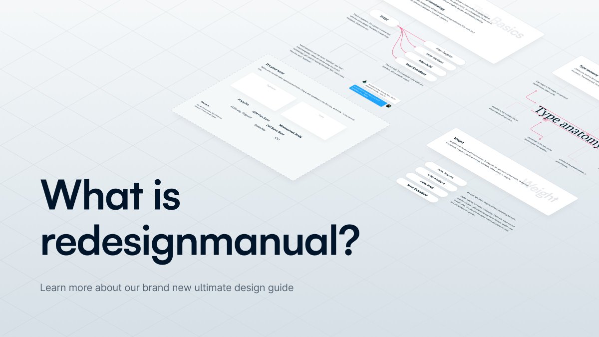
RedesignManual is much more than a set of quick UI tips.
It's the ultimate design guide, created and presented in Figma.
Learn more about what we're building 👇🏼
But there's something that makes RM better than other learning materials...
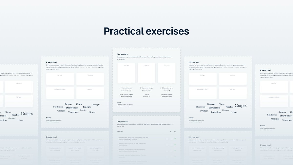
exercises!
You'll get to test your skills with over 30 precisely crafted exercises, designed to help to skyrocket your skills.
UI Design Tip ✨
Center-aligning text might seem tempting. After all, it’s symmetrical.
It’s also harder to read, especially for long chunks of text. Use it only for relatively short paragraphs.
#uidesigntip#designtip
UI Design Tip ✨
Designers frequently forget to design empty states, which results in empty screens with no functionality.
Always design empty states. Even a short paragraph of text is enough to let the user know what’s going on.
#uidesigntip#designtip
UI Design Tip✨
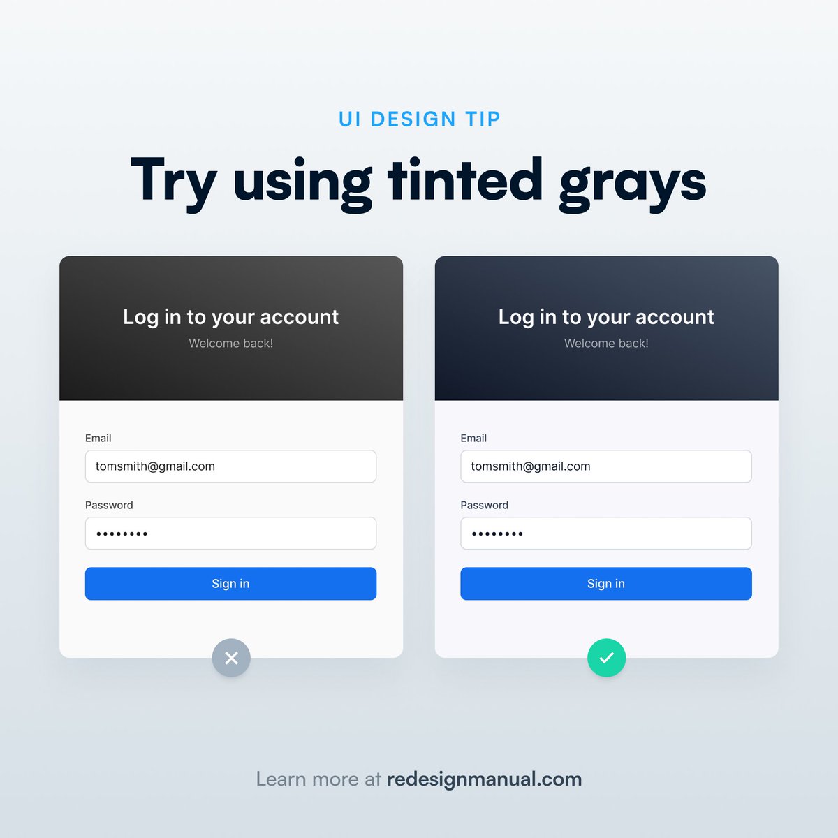
Adding a slight tint of blue into your grays can make them look a lot better.
This applies to the whole grayscale, not just the darker grays.
#uidesigntip#designtip
A small disclaimer:
Not many things are "right" or "wrong" in the design world. Most of them depend on the context.
Same here. Tinted grays won't fit every brand out there.
UI Design Tip ✨
Using line length that’s too high negatively impacts readability.
Ideally, keep the line length between 50 to 75 characters.
#uidesigntip#designtip