@glyphe @jpamental Just finished watching this episode and really enjoyed your chat with Jason.
Since I don’t use variable fonts that often yet, especially the outlook at the end with upcoming loading improvements was quite interesting.
Always nice to listen to typography-lovers :).
@AdhamDannaway Just to give additional info on this topic. I think you don‘t need to follow this as a dogma when the background color of the input field has enough contract to the page background itself. But on your example with the light page background this suggestion makes sense.
@UseMorning Thanks for the answer :). Yeah it would be really cool to see the next X events because it’s sometimes the case that we have no entries today (or they are already done) but want to see what’s going on tomorrow or the day after.
@UseMorning Hey, since you’ve pushed an update lately I like to ask for a feature request again :).
On the „Events“ widget it would be nice to have a similar behavior like the iOS calendar homescreen widget to also see the „next events“ and not only the ones from today.
@SaraSoueidan I can really relate to this. I started my career when NPM, Webpack, etc. didn’t exist and still love to build sites and apps without a lot of dependencies and only maybe Vue.js from CDN without a build process.
Makes my mind free and I can concentrate on the code not the tools.
@SaraSoueidan Thanks for your tweet about the accessible font „Atkinson Hyperlegible“ recently. This was new to me and I looked more into this topic.
So I just wanted to share this study on how these kind of fonts perform in the real world:
https://t.co/o2tMIBYLNj
@glyphe Wow! Hab mir grad beide Videos angesehen. Wirklich interessante und spannende Erkenntnisse, die ich so nicht vermutet hatte.
Ein Bekannter von mir ist Legastheniker. Da könnte ich mal eine 1-Mann-Studie machen ;).
Vielen Dank, dass du die beiden Links rausgesucht hast :).
@glyphe Falls du mal auf Themensuche für „Pimp my Type“ bist, fände ich es interessant Fonts unter die Lupe zu nehmen, die speziell für gute Lesbarkeit bei Sehschwäche gestaltet wurden wie z.B. https://t.co/nlA6j1Q5Z5
Bin grad selbst dabei mir die mal näher anzuschauen :)
This is assignment week 3 with one weight and two point size. With every new assignment the parameters will broaden up.
I think I like the black one the most 🤔
#typography#layoutdesign
I’m trying to improve my typography skills and taking an assignment where I have to use all of the pre defined text with restrictions on point size, weight, color and shapes/lines.
⠀⠀⠀⠀⠀⠀⠀⠀⠀
This is assignment week 2 with the restrictions two weights and one size.
It’s really a challenge to find a website on https://t.co/lWiZBVAMIn where the scrolling isn’t hijacked when looking for inspirations.
Sure, the designs are beautiful but as soon as the scrolling is hijacked I no longer want to visit a site.
#badUX
@doomdesign Da wir es vor ein paar Monaten ja davon hatten wie nervig workarounds sind, wenn es doch eine so elegante Lösung gibt. Es wird wohl so langsam mit dem Browser Supper ;).
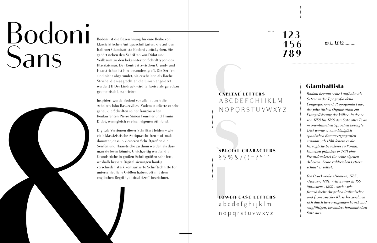
To improve my #typography skills I took @thefuturishere Typography 01 course. This is the result from an assignment where I had to create a type specimen sheet.
I've chosen Bodoni Sans. Not exactly an insider tip, but I really like the font :P
Any ideas for improvement on this?
@glyphe Paying attention to the closed shapes was a great tip. Some time ago I made a label for a local honey using Helvetica Neue.
The client wanted quite a lot of text, so I had to use a small font size. Now I would use another font for better readability on small sizes :).