We are now hosting office hours! Click here https://t.co/0TITg03i2W to set up a Zoom appointment using Calendy.
Office Hours:
Mon: 12pm-2pm
Tues: 9am-11am, 12pm-2pm, 5pm-7pm
Wed: 9am-1pm
Thurs: 9am-11am, 5pm-7pm
Fri: 9am-12pm
We hope to see you there!
@bmutt46 i really like the changes you made! is there any way you can make the tweet in the report easier to see... maybe larger? love the color scheme! #engl318mu
@Alicia35808214 i used canva! it's a free design software that is sort of like indesign but is much more user friendly to someone like me who has little experience with design programs #engl318mu
@english_mbryce i plan on doing the same thing! my key points will go on the slide and i'll explain them in detail in my voice-over. i'll use the pages of my report as headers in the presentation and use the visuals i create as the content #engl318mu
@JoannaBarninge1 i need to focus on the connections as well! in my first paper, i isolated the key concepts in body paragraphs and didn't relate them as much as i could have. #engl318mu
@KatieWe53788347 i like the contrast of the yellow and dark blue! it might be easier to read the labels if the font color was lighter? i would probably change it to white! also, maybe title the graph so the reader knows the purpose immediately? #engl318mu
my plan for developing the web analysis presentation is finishing my report and highlighting the important aspects/key points on a powerpoint #engl318mu
@JoannaBarninge1@GroftAlexa i love canva!! i'm using it to design my entire report--i think it's much more user-friendly than word and gives templates/design ideas. #engl318mu
@lea_web instead of just captioning the image "photo", you could provide a little more context? Also, maybe put a boarder around the visual--i couldn't tell at first if the header at the top was your writing or attached to the visual. hope this helps! #engl318mu
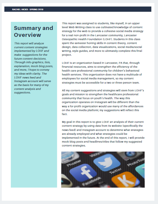
if i added a table of contents to this page, would the page look too cluttered or text-heavy? should i make a whole table of contents page? i'm open to any other suggestions as well :) #engl318mu
@Mikie53585867 becasue you have so much white space, maybe consider making the font larger? i would suggest tightening the space between the sections/numbers in your table of contents so it's easier to read. i like the layout though! #engl318mu
@Alicia35808214 Maybe create a pie chart that shows the amount of posts that contain text? Maybe add screencaps of the most "successful" posts and explain why you think they worked so well? I am also working on creating graphics from a chart... let me know what you decide!! #engl318mu
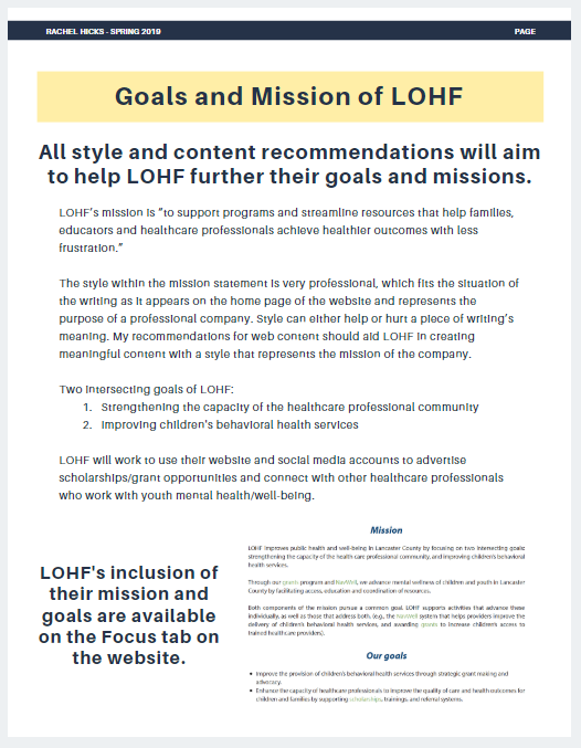
my draft of the LOHF project was not designed at all... the first thing on my revision list is transitioning my lists and paragraphs of text into a report that is well designed #engl318mu
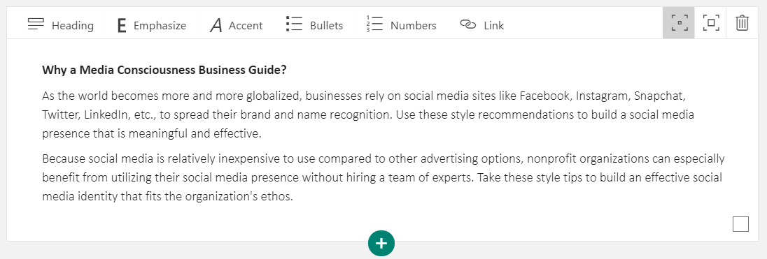
@CMurgEngl318mu this looks nice! could you embed the link instead of putting it in parentheses? then your writing will be more seamless! Also, is there any way you could separate your bullets a little more? A block of text is intimidating to a reader #engl318mu
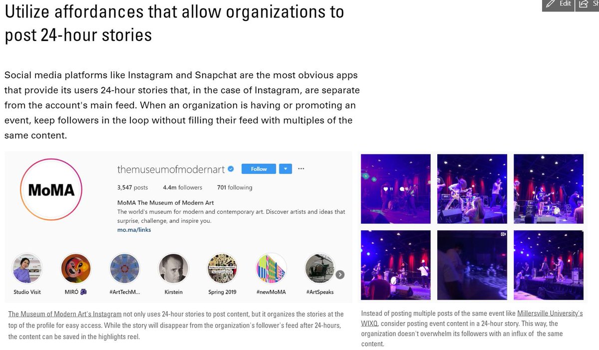
@villemadison @beard_skylar the graphics look really pretty!! but i think if i was a nonprofit looking for social media tips, i'd want more real-life examples so i could see how your ideas work in application #engl318mu