@eso_writes Don't mean to come out as rude, I'm only trying to help.
The designs are quite in consistent, and, at first glance, doesn't look like it has anything to do with skyscrapers at all. Looks more like tents to me.
Again, I'm not trying to insult you, I genuinely am trying to help
@MDANAMULSHEIKH6 Looks appealing 💖
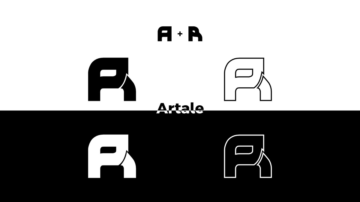
Although, it needs context. Like, what's the name of the app or what the app does.
Some colors are more catchy to certain audiences over others.
The vibe I'm getting off of this icon is for a corporate-ish app with a name like 'corpral' or something. 🔥🔥🔥