Scaling a creative team and improving the craft are different decisions.
One rewards consistency.
The other requires experimentation.
Early on, I optimized for scale too quickly.
The studio became faster.
Not always better.
That tradeoff took time to understand.
Every team wants smoother handoffs. So they add more docs, comments, and processes.
But if teams don’t trust each other’s judgment, no amount of documentation can fully fix it.
That was a hard lesson for me.
Founders often say “Can we make it cleaner?”
Usually, they don’t mean less UI.
They mean: something feels heavy, unclear, or harder than it should be.
Good design conversations start by finding what that feeling is pointing to.
Most SaaS teams optimize onboarding.
Few optimize what users return to every day.
Settings. Permissions. Configuration.
That’s where quiet friction lives.
Retention is often shaped by the boring parts of the product.
6 years + founders from 50+ countries later, one thing still surprises me is the design problems are usually similar.
The collaboration styles aren’t.
Some teams want structure, some want speed, some want relationship first, process second.
Early on I thought good design work was mostly about the craft itself.
Now I think a huge part of it is learning how different people build trust around the craft.
A lot of SaaS teams overload the first screen because they’re trying to explain everything immediately.
This approach normally ends up having the exact opposite effect.
Our latest project involved reworking the hierarchy rather than adding more features, which had the greatest impact.
Same product.
Just more emphasis on user actions.
Activation moved by double digits.
One thing working with global founders taught me: people build trust differently.
Some trust process.
Some trust speed.
Some trust relationships first.
For a long time I assumed collaboration problems came from workflow mismatches.
A lot of the time, they’re actually trust mismatches.
Three things I’ve noticed founders consistently misunderstand about design:
1. Design decisions don’t stay “visual” for long. Small UX choices quietly become onboarding friction, support issues, and retention problems.
2. A design system doesn’t automatically create clarity. It usually just scales whatever product thinking already exists.
3. Delaying design decisions compounds faster than most teams expect.
One thing founders actually get right more often than they realize: taste matters.
Even before they fully know how to explain it.
Good dashboards don't just report performance.
They help teams understand where to go next.
Zolatto a marketing dashboard built around clarity, focus, and actionable insights.
The best product presentations don't just display products.
They create a sense of place.
Avenue exploring digital showrooms through 3D motion and spatial storytelling.
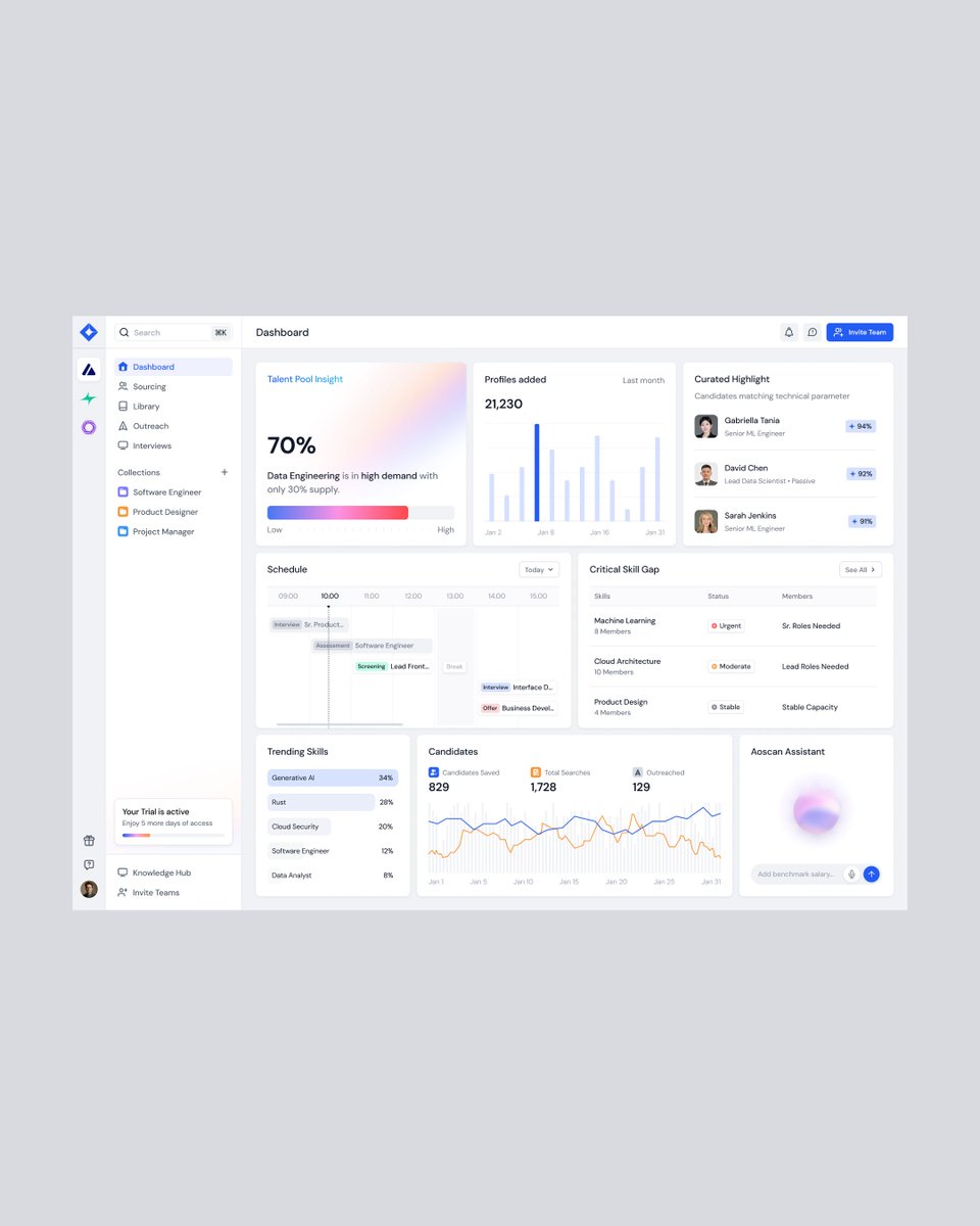
Good hiring decisions start with clear information.
Aoscan an AI recruitment dashboard designed to transform complex hiring workflows into a more structured and intuitive experience.
Complex systems need clear interfaces.
Designed to turn business operations, workflows, and analytics into a more structured and intuitive experience.
Because clarity scales better than complexity.
AI that acts needs design that explains.
https://t.co/iDZZj2fOfW - built to turn complex automation into clear, structured experiences.
Because clarity makes intelligent systems usable.
AI is complex. Communication shouldn’t be.
Ethara pitch deck designed to turn data heavy ideas into clear, decision ready storytelling.
Because clarity builds confidence.
AI is shifting from tools → agents.
And honestly, most landing pages haven’t caught up yet.
SynesthAI is interesting because it doesn’t just list features it tries to visualize how AI thinks, decides, and acts.
Feels like this is the direction AI design should be heading.
Most finance brands rely on the same symbols.
Charts. Currency signs. Predictable visuals.
But trust doesn’t come from symbols.
It comes from how clearly a brand communicates its thinking.
For us, good branding simplifies complexity not just visually, but conceptually.
A look at our component work for Cosa where strategic branding meets operational clarity. We’re pushing a clean, high-fidelity aesthetic to make supply chain data feel intuitive and authoritative.
Thoughts on this approach? Let’s cook in the replies.