Your Etsy listing images do most of the selling. A lot of buyers decide from the thumbnail before they read a word.
For printable products, this is the order I'd build the images:
1. A clear first image.
It has to work at thumbnail size. Show the product, add a short title ("Weekly Planner Printable"), keep the layout clean. Too much text becomes unreadable on a phone.
2. Show it in use.
A printed planner on a desk, a tracker half filled in. Printables are hard to picture, and a realistic mockup helps buyers imagine them.
3. Show what's inside.
A page-by-page preview: which pages, how many, which sizes.
4. Show the details.
A close-up of one page so people can see the fonts, spacing and quality.
5. Show what they get.
File format, page sizes, how the download works, how to print it. Doubts here turn into messages and abandoned carts.
6. Use the rest of your slots.
Etsy allows up to 20 photos and one video. A short video flipping through the pages helps people see how it works.
Keep a consistent look across your shop. When your thumbnails look like a set, repeat buyers recognize you.
One more thing that decides whether you can keep selling: Etsy expects original designs. Reselling someone else's template, or lightly editing resold content, can get listings removed. Build your own layout, even a simple one.
If you're building digital products for Etsy or your own store, the order I follow is in my free 7-page roadmap.
Comment ROADMAP and I'll send you the link 👇
Things I'd do differently if I started selling digital products today:
1. Check that people already buy something similar before building anything
2. Name the product after the result, not the topic
3. Put the free offer where everyone sees it, not in the last line
4. Give every post a place to send people
Which of these have you skipped?
Your product page has about ten seconds to answer one question: what happens to me if I buy this?
Most digital product pages answer a different one: what's inside.
Compare these two (made-up examples):
Before: "A 30-page Notion template with 12 databases, 6 dashboards and a habit tracker."
After: "Plan your whole week in 10 minutes instead of rebuilding your to-do list every Sunday night."
Same product. The second one sells a result.
How I'd write the page:
1. Start with the problem in the buyer's own words. If you did your research, you already have the exact phrases. Use them.
2. Say what changes. One or two sentences of before and after. Time saved, a mistake avoided, a decision made easier.
3. Then show what's inside, briefly. Features come after the reason to care, as proof.
4. Answer the obvious doubts. Who it's for, who it isn't for, what format it comes in, what the refund policy is. An honest "this isn't for you if..." line builds more trust than hype.
5. Give one button and one next step. Don't make people choose between five links.
One more rule: never invent numbers or results you can't back up. A small, specific, true claim usually beats a big vague one.
I put the whole order, from first post to first sale, into a free 7-page roadmap. Comment ROADMAP and I'll send you the link.
Etsy is a search engine first and a shop second. If your listing doesn't match what people type, it doesn't matter how good the product is.
Here's how I'd write a printable listing so it can be found:
1. Start from what buyers type, not what you'd call it.
Click into Etsy's search bar, type the first words of your product and look at the suggestions. Those are real searches. "Budget planner printable" turns into "budget planner printable for couples" or "...monthly."
2. Put the main phrase at the start of the title.
You get 140 characters, and the first words matter most for search and for what shows in a cramped result. Made-up example: "Monthly Budget Planner Printable, Debt Payoff Tracker, Couples Finance Worksheet, Instant Download PDF"
3. Use all 13 tags, and make them phrases.
Each tag can be up to 20 characters. A phrase like "budget planner pdf" usually matches real searches better than the single word "budget." Don't repeat the same phrase across five tags.
4. Fill in the attributes and category.
Occasion, audience, colors, type. They help Etsy understand the listing, and buyers use them to filter.
5. Make the first lines of the description do the work.
Say what it is, what format it comes in and how it's delivered. A lot of buyers read only that.
6. Check what's winning, then find the gap.
Search your keyword, open the top results and notice what they share. Then look for what's missing: a different style, audience or size.
Don't stuff the title until it reads like spam. A person still has to want to click it.
If you're building digital products for Etsy or your own store, the order I follow is in my free 7-page roadmap. Comment ROADMAP and I'll send you the link.
HOW TO GET SOMEONE FROM YOUR POST TO YOUR PRODUCT
1. The post gives one useful idea
2. The last line points to one free thing
3. The free thing solves a small, real problem
4. Only then does the paid product show up
I think skipping step 3 is where it usually breaks. People don't buy from a stranger on the first click.
Comment ROADMAP and I'll send you the free plan.
If you're stuck on what to do first with digital products, I put the order I follow into a free 7-page roadmap.
Comment ROADMAP and I'll send you the link 👇
Something I got wrong at the start: I thought people bought the product.
They buy what it saves them. Time, mistakes, the three hours of googling before they find a straight answer. Once I wrote my product descriptions around that, they got a lot easier to write.
How I think about pricing a digital product:
Price it against the result, not the page count. A 5-page checklist that saves someone an afternoon is worth more to them than a 60-page guide they never open.
Start lower than feels comfortable. You learn more from 20 buyers at a small price than from 2 at a big one, and you can raise it once people tell you what it's worth to them.
Most digital products fail before they're built. The idea was never checked.
Here's how I'd test an idea in one evening, before opening Canva:
1. Look for the problem, not the product.
Search the way your buyer would. Not "budget template" but "how do I keep track of wedding costs without a spreadsheet headache." Forums, comment sections and reviews are full of people describing the exact problem in their own words. Save the phrases they use.
2. Look for people already paying.
If similar products exist and sell, that's good news. It means the problem is real enough to pay for. An empty market often means nobody wants it, not that you found a secret.
3. Read what's missing.
Open the reviews of the best sellers and read the 3-star ones. They tell you what buyers wish was different: too long, too generic, hard to edit, no examples. That's your angle.
4. Describe it in one sentence.
"A one-page budget tracker for freelancers with uneven income." If you can't say who it's for and what it fixes in one line, a buyer won't understand it either.
If an idea passes all four, build the smallest version. If it fails two or more, move on. A few hours of research can save weeks of building the wrong thing.
The full order I follow, from idea to first sale, is in my free 7-page roadmap.
Comment ROADMAP and I'll send you the link 👇
What's the first digital product you'd make?
Drop the idea below. I'll tell you whether people already buy something like it, and what I'd change to make yours easier to sell.
Pinterest works differently from Threads and X. People aren't scrolling for opinions, they're searching for ideas they can use. That makes it a good fit for printable planners and trackers.
How I'd set it up for an Etsy shop:
1. Treat it like search, not social.
Pin titles, descriptions and board names are all searchable text. Use the phrases buyers would type: "weekly meal planner printable," "wedding budget tracker."
2. Make vertical images.
The standard is a 2:3 ratio, like 1000 x 1500 pixels. Horizontal images get cramped in the feed.
3. Put a short headline on the image.
Something readable at thumbnail size, like "Weekly Meal Planner (Printable)." One idea per pin.
4. Make several pins for each listing.
Same product, different images and hooks: the cover, the planner in use, a close-up of one page, a text-led pin. You find out which one people save.
5. Link every pin straight to the listing.
Not your homepage. Make the click land where the product is.
6. Build boards around topics, not only your shop.
A "meal planning ideas" board with your pins mixed in with other helpful content looks more useful than a board that's all product.
7. Give it time.
Pins can keep sending clicks for months because people search for them later, but results usually start slowly. Pin steadily, then check what gets saved and clicked.
Pinterest also tends to favor original images, so use your own designs, not stock or someone else's work.
Which part is harder for you: designing the pins or writing the descriptions? 👇
I've made $1+ selling digital products, and the biggest lesson had nothing to do with the product itself.
It was where the people come from. A decent product with a steady stream of the right visitors does better than a great product nobody sees.
I wrote down the order I follow in a free 7-page roadmap. Comment ROADMAP and I'll send you the link.
10 DIGITAL PRODUCTS YOU CAN BUILD IN UNDER 2 HOURS AND MAKE YOU AN EXTRA $3000/MONTH 💰
1. Freelance Pricing Calculators
2. Wedding Budget Spreadsheets
3. Notion Life Dashboards
4. Etsy SEO Keyword Guides
5. AI Prompt Banks for Marketers
6. Job Interview Prep Checklists
7. Social Media Content Planners
8. Airbnb Host Welcome Kits
9. Fitness Meal Trackers
10. Faceless Threads Growth Playbooks
The key isn't making a 100-page ebook. Modern buyers pay for speed and clarity. A targeted 5-page solution will out-sell a textbook every time.
My free 7-page roadmap covers the order I'd build these in.
Comment ROADMAP and I'll send you the link 👇
Everything you need to launch a $3,000/month faceless digital store is 100% free:
🔹 Claude / ChatGPT (Product outlining & market research)
🔹 Canva (Formatting & visual mockups)
🔹 Stan Store/Etsy (1-click checkout & automated delivery)
🔹 Threads & X (Algorithmic buyer traffic)
You don't need ad spend. You don't need video editing. You just need the right steps in order.
What are you waiting for? 🛠️
I put together a free quick-start roadmap breaking down this exact stack.
Comment "Interested" and I will send you the download link 👇
Every saas website nowadays is like "AI agent AI workforce AI copilot AI-native autonomous AI AI AI" and you scroll for 10 minutes trying to figure out what the app actually DOES and the pricing button just says "Book a Demo" 🥴
Most people build digital products backwards.
They spend weeks writing 100-page ebooks or building massive courses about a topic they care about, list it on a blank website, and wonder why nobody buys.
A while ago, I fell into the exact same trap. I thought value was measured by volume and effort. I assumed that if I spent 50 hours building something, people would automatically show up with their credit cards out.
They didn't.
The pivot happened when I stopped viewing digital products as "content" and started treating them as engineered assets.
When you strip away the noise, digital leverage comes down to three structural layers:
Layer 1: Reverse-Engineered Validation
Before opening Canva or drafting a single page, you need data-backed proof of buyer intent.
Instead of guessing what people want:
-> Use search analytics and keyword tools to find hyper-specific friction points.
-> Look for queries where search volume is rising, but supply/quality is low.
-> Identify the exact vocabulary buyers use when they're actively looking to solve a problem.
If you don’t validate demand upfront, even the best copywriting won't save the offer.
Layer 2: Frictionless Product Design
People don't pay for length - they pay for speed and execution.
The modern digital buyer is overwhelmed. They don't want a 100-page theoretical breakdown. They want:
Direct, zero-fluff steps.
Ready-to-use frameworks and templates.
A system they can implement in 15 minutes.
When you package your solution into a concise, execution-focused asset, price friction drops to near zero.
Layer 3: Automated Distribution
The best product with zero distribution logic is useless.
Rather than chasing viral reach or relying on unpredictable social algorithms, set up a dedicated pathway:
-> Deliver pure, high-value breakdowns on text-first channels (X & Threads).
-> Focus on system logic and architecture.
-> Use keyword-triggered automated messaging to deliver the solution directly to qualified leads instantly.
The Result
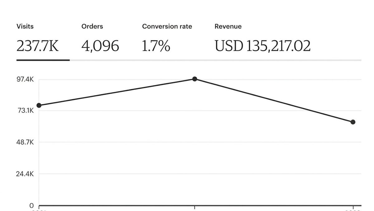
When you align high-intent demand + zero-friction assets + automated distribution, you move away from random guessing and build a repeatable proof of concept (see screenshot below).
You validate real market demand, capture organic buyer intent, and build a system where every deployed asset generates clean, measurable performance data.
The Key Takeaway
Stop trading manual hours for capped returns. Build assets once, validate them with real search data, and let distribution infrastructure handle the rest.
I mapped out this entire Digital Asset Validation & Distribution Architecture into a detailed step-by-step PDF diagram.
Want me to send you a copy?
Reply "Interested" below👇
Three things I used to believe about selling digital products:
-> That I needed a big audience first. A small one with a clear offer works better than a large one with none.
-> That the product had to be long. People pay for the result, not the page count.
-> That I had to be an expert. You only need to be a step ahead of the person you’re helping.
Which one is holding you back? 👇
Comment ROADMAP if you want the quick-start plan.
X is FREE
Threads is FREE
Reddit is FREE
Canva has a FREE plan
Claude/Gemini has a FREE plan
Stan store has a FREE plan
Gumroad is FREE
Etsy is FREE
The only thing you can’t get for free is the time you spend not starting.
What are you waiting for? 👀
Reply "ROADMAP" and I’ll send you the Quick-Start Strategy for Free 🙏🚀
Business owners obsess over getting more traffic.
Meanwhile, they’re leaking revenue from slow replies, missed follow-ups, and broken processes.
More traffic won’t fix a leaking bucket.
Hiring another employee is often a symptom of a broken process.
If the work can be automated, documented, or systemized, adding people usually just makes the chaos bigger.
Fix the system first.