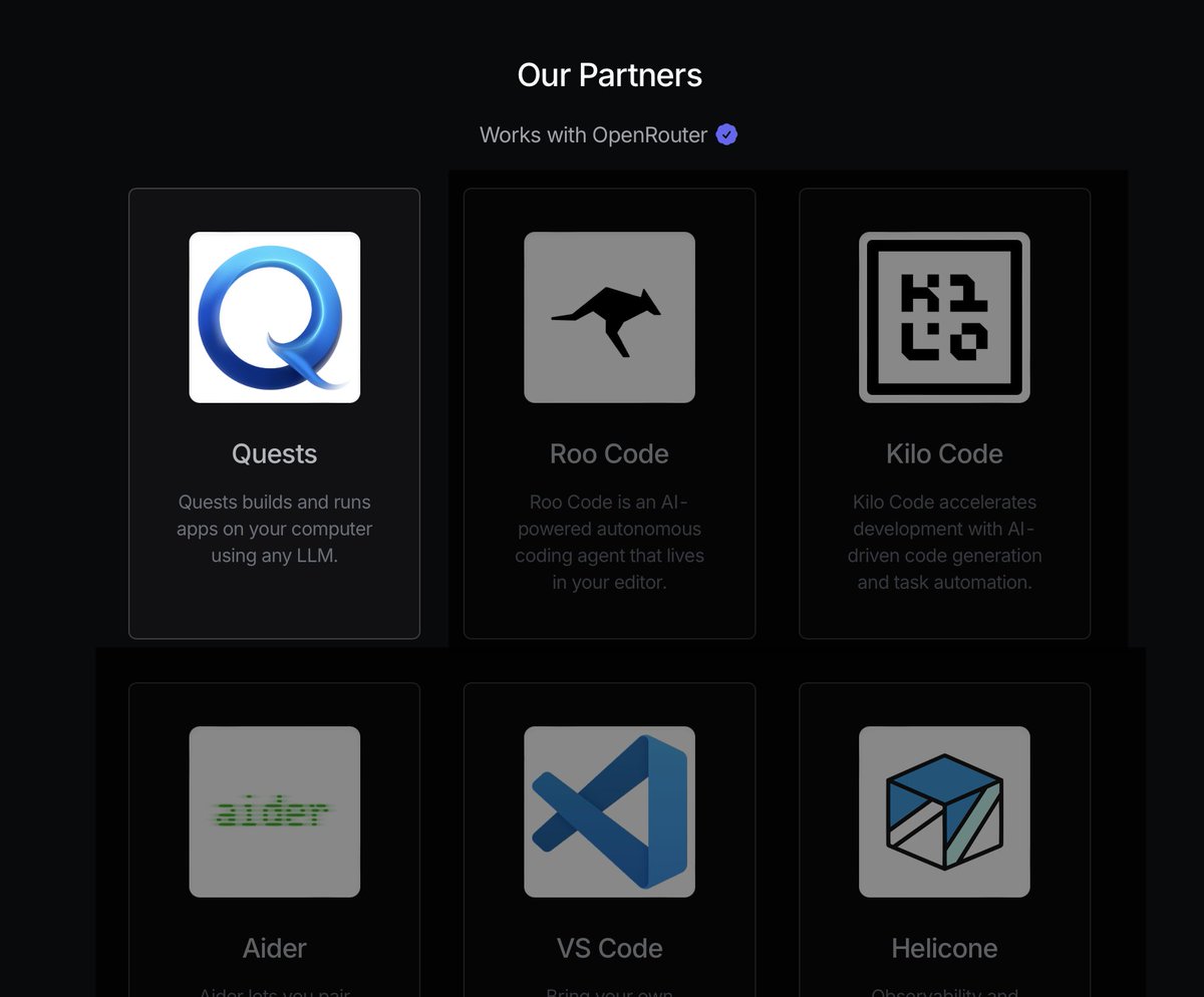
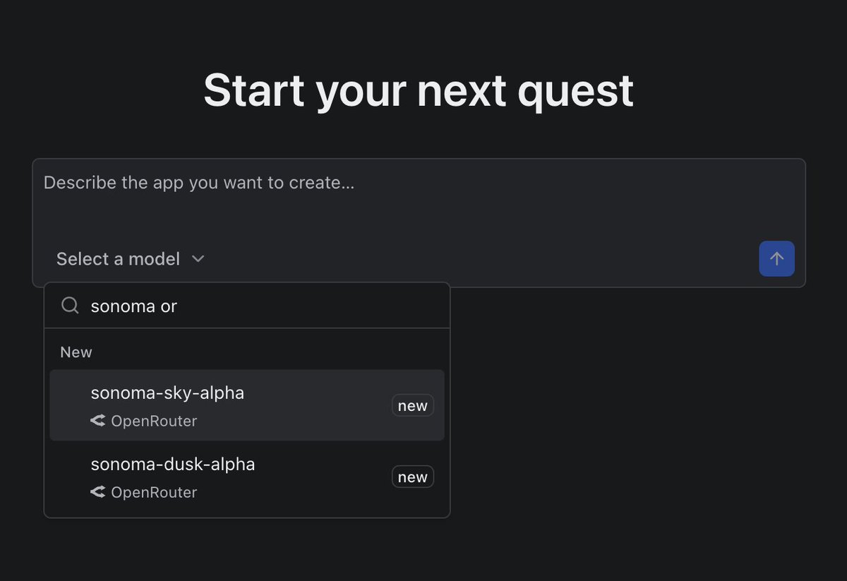
We broke 200 stars for @quests_dev on GitHub! Aaron and I don't have the largest platforms, so we weren't expecting this already. Thanks, GitHub friends.
So happy to get covered by @aicodeking. They really understand our vision for Quests. So wonderful to hear all the feature ideas too! https://t.co/yHpxYWZ1zE
The open-source app builder has arrived.
- Apps are built and run on your computer
- Desktop app with no dependencies
- Use all the major AI provider with your own keys
- Built on open-source like oRPC, TanStack, Vite, Hono, and XState
Get it now 👇
@Full_Metal_QR Minimalism is great, but your design lacks personality.
- Add color or a bold font.
- Include an image or texture in the hero's background.
- Avoid text breaking with an orphan word by adjusting the breakpoint.
@devansh_ts@arihantCodes Currently, you have two competing CTAs and a third, subtler one. Choose one clear path to guide users through your information without splitting their attention.
@vazuzu_varun Balance the font size of H1 and H2; the hero is currently top-heavy.
Top navigation icons are in a gray element, and the entire top nav has a line below it. Choose one method to separate the navigation and body for a cleaner look.
- Adjust the vertical alignment of your top navigation.
- Simplify the background to enhance text readability below your main CTA.
- Use a single font style for the short sentence to avoid implying extra meaning.
- Increase the outer box radius in your screenshot for a smoother edge.
- Remove CTAs from top navigation; they distract from the main hero.
- The white button is more eye-catching than the yellow one, so consider switching their use.
- It may be personal preference, but these two fonts don't complement each other well. Check sites like https://t.co/3WkitDMkYe for ideas.