@LinkofHyrule89@zacbowden It’s all about pixel density. Laptops still have low resolution displays which don’t allow to properly display text inside an already small icon. We’re talking about 4-6pt text to read, not accessible at all
@zeealeid I agree, at this point the Photos app should become just a photo viewer/editor. This new Gallery view is basically the old "library" feature with a nicer UI, as it works *almost* the same way - it just doesn't let you browse filtered folders
@cybrneon I agree. the forecast content is actually good looking, but the rest is awful. Especially with light mode on, that hamburger menu seems like something completely different from the app itself, and imho there's no reason to use it.
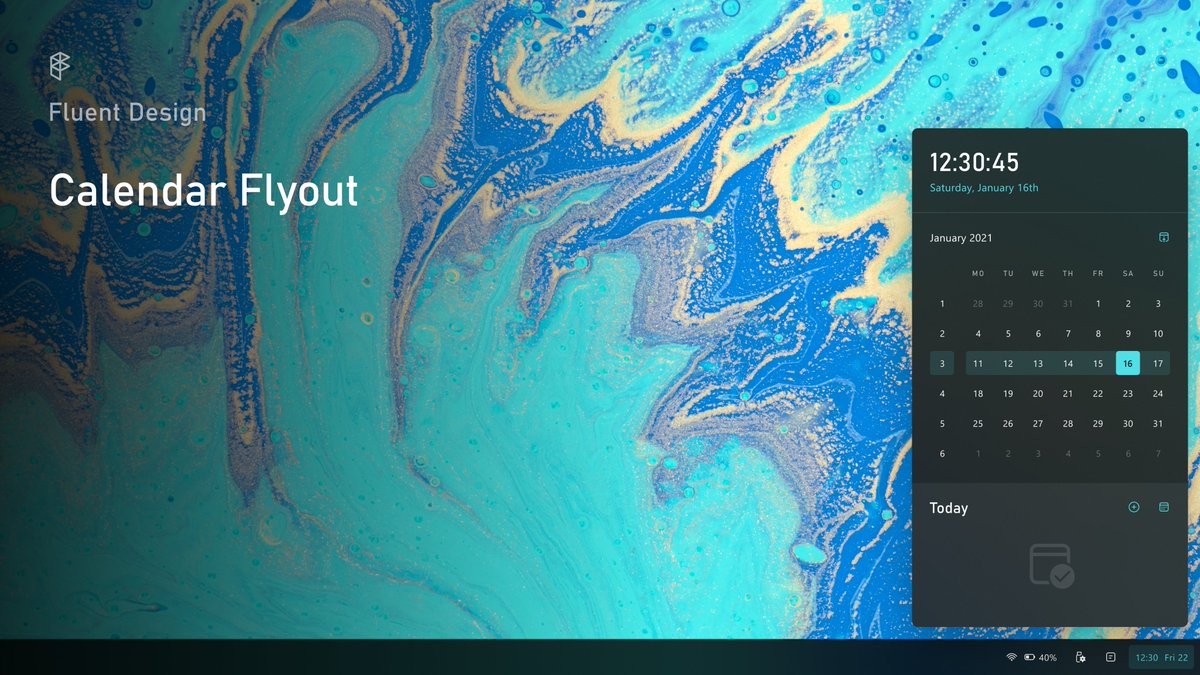
(1/2) Redesigned Calendar flyout.
Added week numbers; although the layout is similar to the current one, it is now coherent to Fluent Design guidelines.
#fluentdesign@MicrosoftDesign
A redesigned Quick Actions experience - a thread.
Quick Actions is now a standalone flyout. Everything is now in one place: from connected devices, to volume and battery settings. To access more settings, just click the chevrons.
#fluentdesign@MicrosoftDesign
@zeealeid@MicrosoftDesign Thank you! I love how this font looks, and as Microsoft is starting to use it a lot more, I decided to use it too for headings 😁