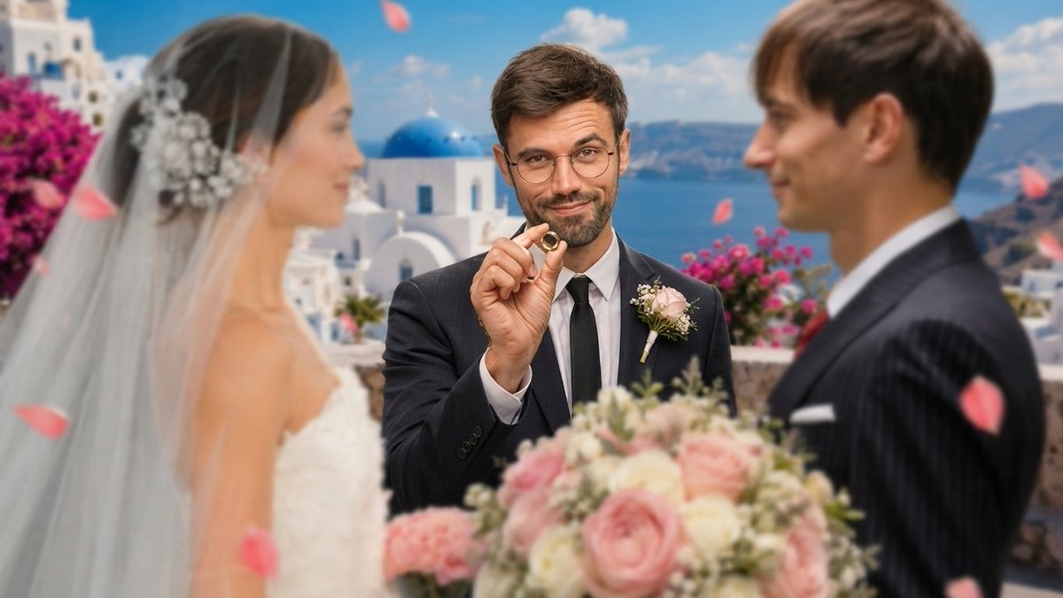
No reference, no source thumbnail — just built this scene from a blank concept:
officiant, ring, Santorini backdrop, petals mid-air.
W or L? Drop your honest feedback below 👇
@Zeviordesign@TechTalkWithJ Makes sense — ideas to refining is probably the sweet spot right now.
Do you take the AI output straight to final export
or run it through Photoshop/Canva after to tighten it up so it doesn't read as AI-generic?
@Roward_design Big lift from the raw shot to the final crowd composite — that's not a quick edit
Start to finish, how long did the full before to after take you?
@IvanEsMejor Retention's strong, so the drop's at the click.
The magnifying glass pulls focus off your face right now.
What's the video's hook in one sentence — that's what should be winning the click, not the prop.
@AwaisQarni001 Big jump in detail without losing the actual likeness, which is usually where upscales fall apart
hat model and settings are you running, and does it hold up on side profiles too?
@twalzehh reads stronger instantly — direct framing pulls the eye first,
B's busier and slower to read.
What ruled out B, client feedback or your own test data?
@Lpzfxx@francoaguiler1@Blesthh Handling the full post on a channel's two most-viewed
videos says they trust you with the high-stakes ones.
What's your usual turnaround on projects like these?
@ZaidThumbnail The sketching it out loading message is somehow more annoying than the actual wait
like its narrating the delay back at you.
Ive had the same moment trying to get a straight answer out of it for design prompts.
Whats your actual workaround when it starts doing that?
@HoussamDesigner The access denied lock screen does more than the money on the wall
it makes the puzzle feel like a real security challenge instead of a treasure hunt.
Fake view count and upload time in the corner sell it as a real upload too.
How long did a recreation like this take you?
@Ramiii_dz Going with the eye one,
the dollar and tiktok icons reflected in it tell a whole story
about what the video covers without needing a single word.
The other three are solid but that one does the most with the least.
Which of the four actually pulled the most clicks?
@Designer_hold Turning four random faces into a matching mugshot lineup is what sells the story
the orange jumpsuits do more narrative work than any text could
The arrow guiding the eye down to the transformation is a nice touch too
How do you usually pick which four faces to feature?
@VizMagnet Skipping number 3 again is a pattern I keep seeing work
it makes people pause just to figure out whats missing before they even process the ai stack part
Curious if that gap trick is something you use often or just for this one been experimenting with something similar myself
@wiljvu Thats a fair correction, youre right that chasing precision on something like an exact time is missing the actual point.
Eyecatching and visually interesting is the real job a thumbnail has to do
What do you usually look at first when judging if something pulls the eye?
One of my recent thumbnail designs 👀
Really happy with how this one turned out, but I’m curious what you guys think.
Would this make you click?
⁉️/10 🤝
@HoussamDesigner The distance sign next to the guy in traditional dress is a strong contrast setup
it turns a simple portrait into a whole location story without needing extra text
feels like the start of a specific narrative rather than just a character shot
What's the video actually about?
@ZaidThumbnail That kind of detail is exactly why the reasoning matters more than the visual alone
all 6 topics fitting without losing clarity is the real skill.
I'm running a similar before and after series myself, would genuinely appreciate your eye on my recent one if you get a chance zaid
@VIDEOMASTER30 The eye closing shut between the two versions is the detail that sells the escalation, its not just more bees,
its a visible consequence
That kind of specific injury detail is what separates
a generic bee thumbnail from a believable one
Which version tested better for you?
@izanamiqqe The color grading is the real variable here,
the first feels more desaturated and tense, the second feels more vivid and adventurous.
Both keep the same danger but tell a different emotional story.
Which one are you leaning toward for the actual upload?
@ZaidThumbnail Sketching it in pencil before adding the GoPro branding and dollar bill texture
locks the composition without getting distracted by color too early.
The bill texture in the final adds real weight to the claim.
How long between the sketch and the final pass?
@JMdiouani40244 The first one leans into mystery with three separate characters and a passport,
the second is more direct with the money and the number 50.
Going with the second, it tells you the stakes immediately instead of making you guess.
What was the actual video about?