@SUPERltdFilm I’d like to get in touch regarding the key art for All My Friends Hate Me but there are no options to contact you privately on your websites or social media channels. 🙃
In four hours, I will share the stage with award-winning movie poster designers Caelin White and @iamyentan at @sxsw Film festival.
https://t.co/zvqIdym3Ug
My first #MoviePoster panel was a hit at #SXSW 2019. The second edition, which was selected for SXSW 2020 before the festival got cancelled, is up on the SXSW #PanelPicker. Vote before 08/26 if you want to see my conversation with three designers at the top of their game.
10,000 Classic Movie Posters Getting Digitized & Put Online by the Harry Ransom Center at UT-Austin.
Free to Browse & Download
https://t.co/eqimyhefqC
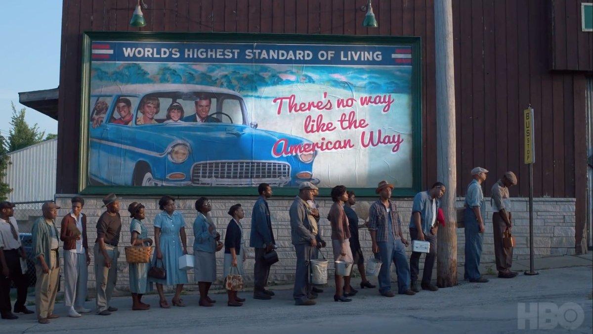
Another lazy set designer creating a typographic anachronism. Just noticed @googlefonts’ Pacifico in the trailer for @LovecraftHBO. It doesn’t look like anything from the 1950s, and there are more than enough period-correct options to choose from. https://t.co/d6wjHpJhu8
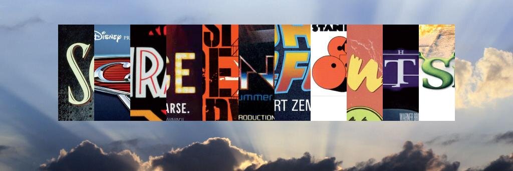
While #ScreenFonts focuses on movie posters (link to latest episode in bio) I occasionally look at the entire typographic palette of a franchise. Here’s my examination of the typography of #StarTrek.
@the_la_agency@TheCommuterFilm The poster for Stuck, however, misses the mark. Using the wrong typeface in the colored circles—DIN is inextricably connected with Europe, specifically Germany—defeats the NYC subway connotation the designer hoped to achieve. #keyart#movieposters#graphicdesign
/end
Motherless Brooklyn/NYC/Standard/Gotham follow-up—the #typography in LA’s #keyart for The Commuter is spot-on. White, bold capitals in colored circles reference the legendary New York subway signage system by Massimo Vignelli. #movieposters#graphicdesign#ScreenFonts
/1
@MotherlessBKLYN@frerejones While—superficially—Avenir, Standard, and Gotham may look similar to each other, on a subconscious level even a casual viewer will “feel” that Avenir is not quite right. Gotham or Standard would have been the perfect fit.
/end
Bear with me while I explain why I am not so happy with the use of the typeface Avenir in the otherwise fine #keyart for @MotherlessBKLYN, and why the overused Standard or Gotham would have been a more appropriate choice. Warning: Rated T for type-geekery. #ScreenFonts
/1
@MotherlessBKLYN@frerejones Standard a.k.a. Akzidenz-Grotesk, on the one hand, is instantly recognizable as the typeface of the New York subway signage. The inspiration for Gotham, on the other hand, was found in the urban lettering of New York. Both are quintessentially New York.
/4