I was talking with a very experienced colleague today about the discomfort of handing off an “imperfect” design.
I said: “The perfect design is the best design that fits perfectly within the budget”.
(Where budget could be $$, time or resources.)
Do I know anyone with recent experience running an eyetracking study?
It would be great to have a quick chat about what the current state of things is.
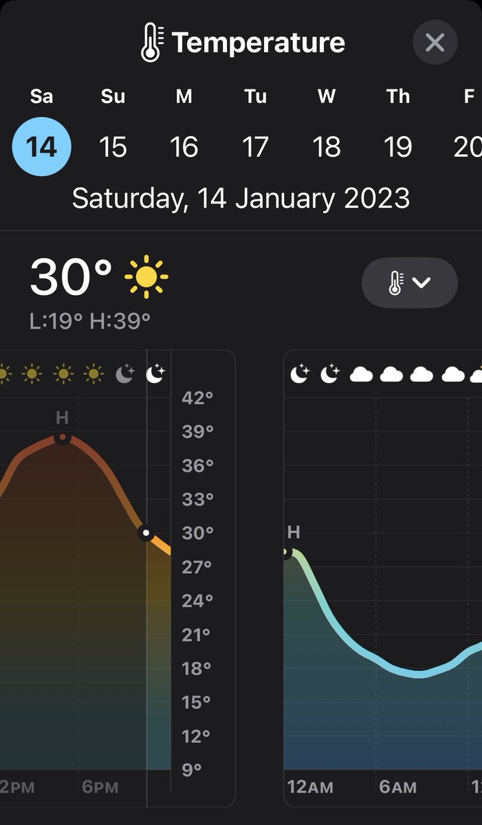
Fun Fact. I guess because the Apple weather app smoothes the line between its temperature predictions for the day, you get an interesting discontinuity between the temperature curve at the end of one day (midnight) and the start of the next?
Great, interactive panel on barriers to UX adoption and on inclusive design at @resmed Sydney today. Added bonus to see @acrapp!
Thanks @rummerged and CK Wong.
Forgot to take a pic.
Brave UI choices.
You don't press on the 'fizziness' icons. You press DOWN on the whole front section until the desired dizziness icon lights up.
There is no indication the front section moves or any other affordance telling you where to push.
In the space of 10 minutes, for one issue, I
- Messaged with developer and project manager on Slack
- Messaged with research team and project manager on Teams
- Messaged with project manager on Whatsapp.
It's everything I wanted from the Information Superhighway!
Just bad copy writing or some carefully chosen weasel words from @NespressAU?
Does this mean 'track my order', or 'send me marketing material later about stuff I ordered'?