Mi esposa empezó a dormir con el celular boca abajo.
Yo tengo 35.
Ella 33.
Nunca fui celoso.
Nunca revisé su teléfono.
Nunca dudé de ella.
Hasta ahora.
Todo empezó hace dos meses.
Sonreía más cuando escribía.
Se iba a otra habitación para contestar llamadas.
Cambiaba de tema cuando le preguntaba.
—¿Todo bien? —le dije una noche.
—Sí, ¿por qué?
Sonrió.
Demasiado rápido.
No insistí.
Quise confiar.
Pero empecé a notar detalles.
Se arreglaba más para ir al trabajo.
Llegaba un poco más tarde.
Y siempre… el celular boca abajo.
No encontré mensajes.
No encontré pruebas.
No encontré nada.
Solo una sensación constante.
Hace una semana no aguanté más.
—¿Hay alguien más? —pregunté directo.
Se quedó en silencio.
No lloró.
No se enojó.
Solo suspiró.
—No es lo que crees —dijo.
Esa frase no ayudó.
—Entonces explícame.
Asintió.
Como si ya lo hubiera pensado antes.
—Ven —me dijo.
Me llevó a la sala.
Se sentó frente a mí.
Puso el celular en la mesa.
Esta vez… boca arriba.
Abrió una conversación.
Era con una mujer.
Leí los mensajes.
“¿Comiste?”
“Recuerda tomar agua.”
“Hoy puedes con esto.”
No entendía.
—¿Quién es? —pregunté.
Su respuesta fue tranquila.
—Mi terapeuta.
Me quedé en silencio.
—He estado yendo a terapia —continuó—. Desde hace meses.
Sentí algo raro en el pecho.
—¿Y por qué no me dijiste?
Bajó la mirada.
—Porque cuando intento hablar contigo… nunca estás realmente.
Quise negar eso.
Quise defenderme.
Pero recordé.
Las cenas en silencio.
Las respuestas cortas.
El “estoy cansado” constante.
—Pensé que había alguien más —dije.
Ella negó despacio.
—Sí hay alguien más… pero soy yo. Intentando no perderme.
No supe qué responder.
Esa noche no discutimos.
Pero algo quedó claro.
Mientras me acostaba entendí algo que nadie te dice:
No todas las distancias en pareja son por traición.
Algunas empiezan cuando uno deja de estar… incluso estando.
Y a veces, cuando decides mirar…
la otra persona ya aprendió a sanar sin ti.
🎟 Info de Preventa y Venta de BTS
VENTA ARMY MEMBERSHIP: Jue, 22 de enero y algunos shows el 23 de enero
Venta General: Sáb, 24 de enero
🎫:https://t.co/0XoBLDZnRZ
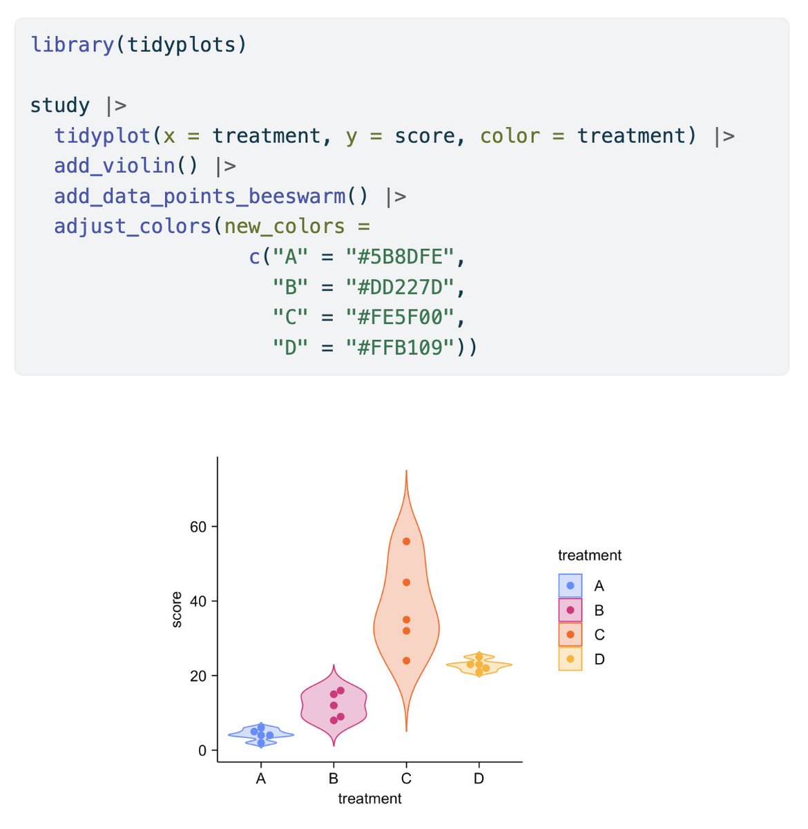
ggplot2 es de las herramientas de visualización de datos más populares, y con un par de líneas extra puedes llegar al siguiente nivel! En este post vemos interactividad en gráficos con {ggiraph}, agregando tooltips, efectos de hover, y más! #Rstats
https://t.co/DUcZvODuBS
Every researcher's nightmare: "Your sample size is too small to detect that effect."
This open-access paper in Frontiers in Medicine solves that problem BEFORE you collect data.
"How to calculate sample size in animal and human studies" by Zhang & Hartmann breaks down:
✓ What is statistical power? (and why 0.8 isn't magic) ✓ How to choose effect size
✓ What to do when you have pilot data
✓ What to do when you have NO pilot data
✓ How to account for dropouts
✓ Actual G*Power screenshots with parameters filled in
The paper includes worked examples for:
- Comparing two proportions
- Comparing two means
- Studies with unequal group sizes
- Studies expecting attrition
The hard truth: Most underpowered studies aren't because researchers are careless. They're because sample size calculation is genuinely confusing and rarely taught well.
This paper treats you like an intelligent person who just needs clear explanation and practical examples.
Read it before you write your next ethics application or grant proposal.
Your future self (and your reviewers) will thank you.
Basic boxplots are often not the best way to visualize your data! They can hide important information, such as the distribution of individual data points or group-specific differences. However, with a few enhancements, boxplots can become powerful tools for uncovering insights and presenting your data effectively.
The attached visual showcases several ways to enhance boxplots. The top left features a basic boxplot with added mean points for extra clarity. The top right overlays jittered raw data points on the boxplots, revealing the underlying data distribution. The bottom left combines boxplots with statistical annotations, displaying pairwise p-values for direct comparisons. Finally, the bottom right uses grouped boxplots, splitting categories by gender to highlight additional layers of insight.
All of these examples were created using ggplot2 and extensions in R. If you’d like to learn how to create customized boxplots like these and other advanced visualizations, join my online course, Data Visualization in R Using ggplot2 & Friends. I’ll teach you step-by-step how to design impactful and polished graphics like these! Learn more by visiting this link: https://t.co/ztlEzoEDWv
#Rpackage #DataVisualization #datascienceeducation #RStats #ggplot2 #DataAnalytics #datasciencetraining #database #tidyverse #pythonprogramming #Python
Evaluation of full-length 16S rRNA amplicon sequencing using Oxford Nanopore Technologies for diversity surveys of understudied microbiomes https://t.co/wPMXR54nL4
🎯 ¿Cuánto es suficiente?
La eterna pregunta cuando vas a diseñar un estudio o experimento:
¿Con 30 muestras basta? ¿Y si pongo 100 para estar seguro? ¿O mejor 300 para que nadie me critique? 🤯
La verdad es que… ni muy pocas ni demasiadas.🧵
#stats#Estadística#DataScience
Nadie nos preparó para este momento que estamos viviendo. Nadie nos enseñó cómo vivir sin Lionel Andrés Messi. Mira lo emocionado que está. Se nos está yendo lo más grande que tenemos y que tuvo el fútbol. Que lo parió.