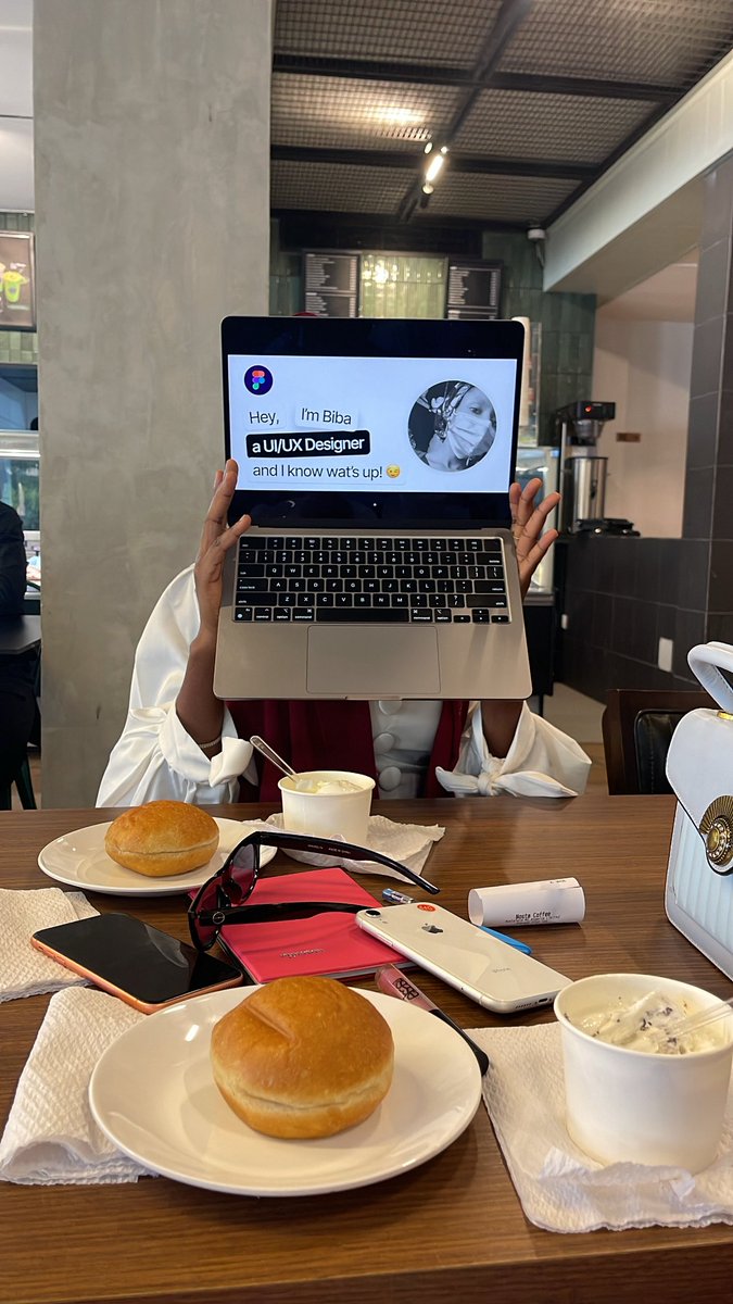
In this my Tech Journey, my biggest constraint is the fact that my laptop shuts down whenever I try to access the camera. I’m filling out a form now and was asked to send a screen recording of any project I’ve worked on and give a walkthrough of my process. And now I can’t!
Jos is full of creative talent, but many designers lack structure, mentorship, and real-world experience.
We built a hands-on UI/UX community focused on real projects and growth.
Applications are open. Limited slots.
Apply: https://t.co/9cUVLHU1QQ
#ColabJos
Today, I did a full on experiment
I used stitch to design a mini website then I uploaded it to my GitHub ( first time doing this btw) and now, I’m trying to host the website on vercel
A very interesting/ enlightening experience for me
i designed a fintech app that streamlines how users send, receive, and manage money by reducing transaction steps and making every action transparent. load in 4k.
I’m seriously crashing out because I’m listening to today’s episode of @ISWISPodcast and I said let me quickly check my voter’s status and tell me why it’s saying “Voter not found”
I’m confused
I’m designing a case study on this design I did last year.
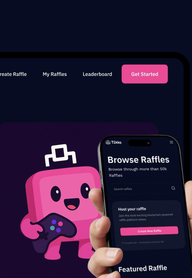
Tikka is a web3 product, a platform where users can come and create raffles or participate in raffle draws, win different prizes while monitoring due processes like ticket sales and how winners are chosen…
I’m designing a case study on this design I did last year.
Tikka is a web3 product, a platform where users can come and create raffles or participate in raffle draws, win different prizes while monitoring due processes like ticket sales and how winners are chosen…
I’m designing a case study on this design I did last year.
Tikka is a web3 product, a platform where users can come and create raffles or participate in raffle draws, win different prizes while monitoring due processes like ticket sales and how winners are chosen…
Two versions of the New User profile page, which would you prefer as a user?
Which would you go with as a designer?
If you could add your reason too, that’ll be great
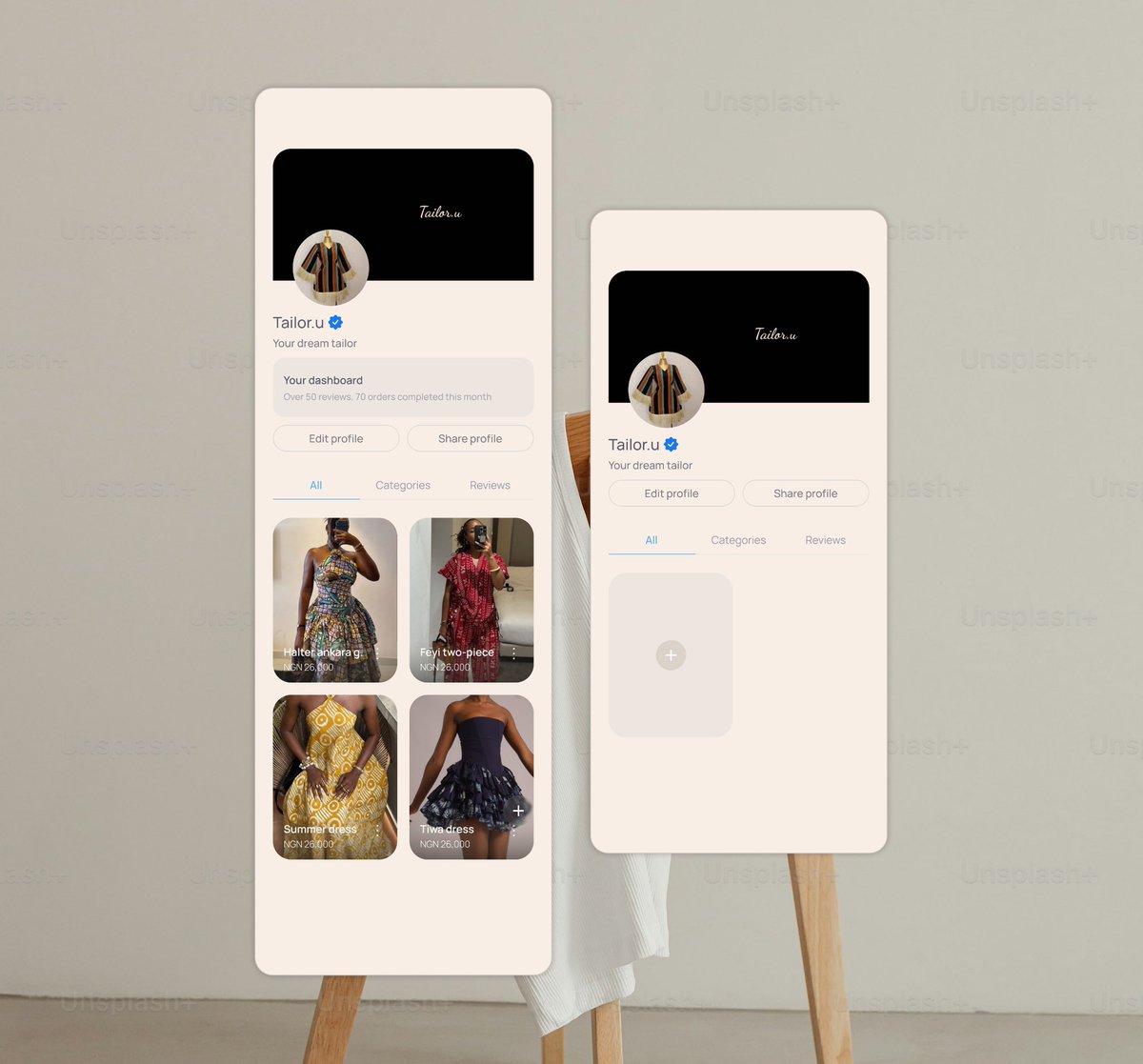
Here is my profile page for the Tailor’s dashboard for Atelia
The add/ upload icon is supposed to be a floating icon, hence its position there. On the other hand is the empty state (for a new user)
Two versions of the New User profile page, which would you prefer as a user?
Which would you go with as a designer?
If you could add your reason too, that’ll be great