If your design team started working the same day you sent the brief, most probably they skipped the most important step.
Most teams skip it because it feels like slowing down. It is actually the fastest way to start.
A founder recently came to us with a detailed technical handoff document for an AI platform. Every module was listed. Every feature was specified. Every user role was defined. It was one of the most thorough briefs we had received.
On the discovery call, their CTO started sharing his screen and walking us through the portal feature by feature. We stopped him and asked: what problem does this product actually solve?
He paused. Then explained it in two sentences. And those two sentences changed how we approached every screen in the project.
The document told us what to build. Understanding the problem told us why. And the why changes everything. It changes which screen gets the most attention. It changes what information sits above the fold. It changes whether the onboarding flow guides or overwhelms.
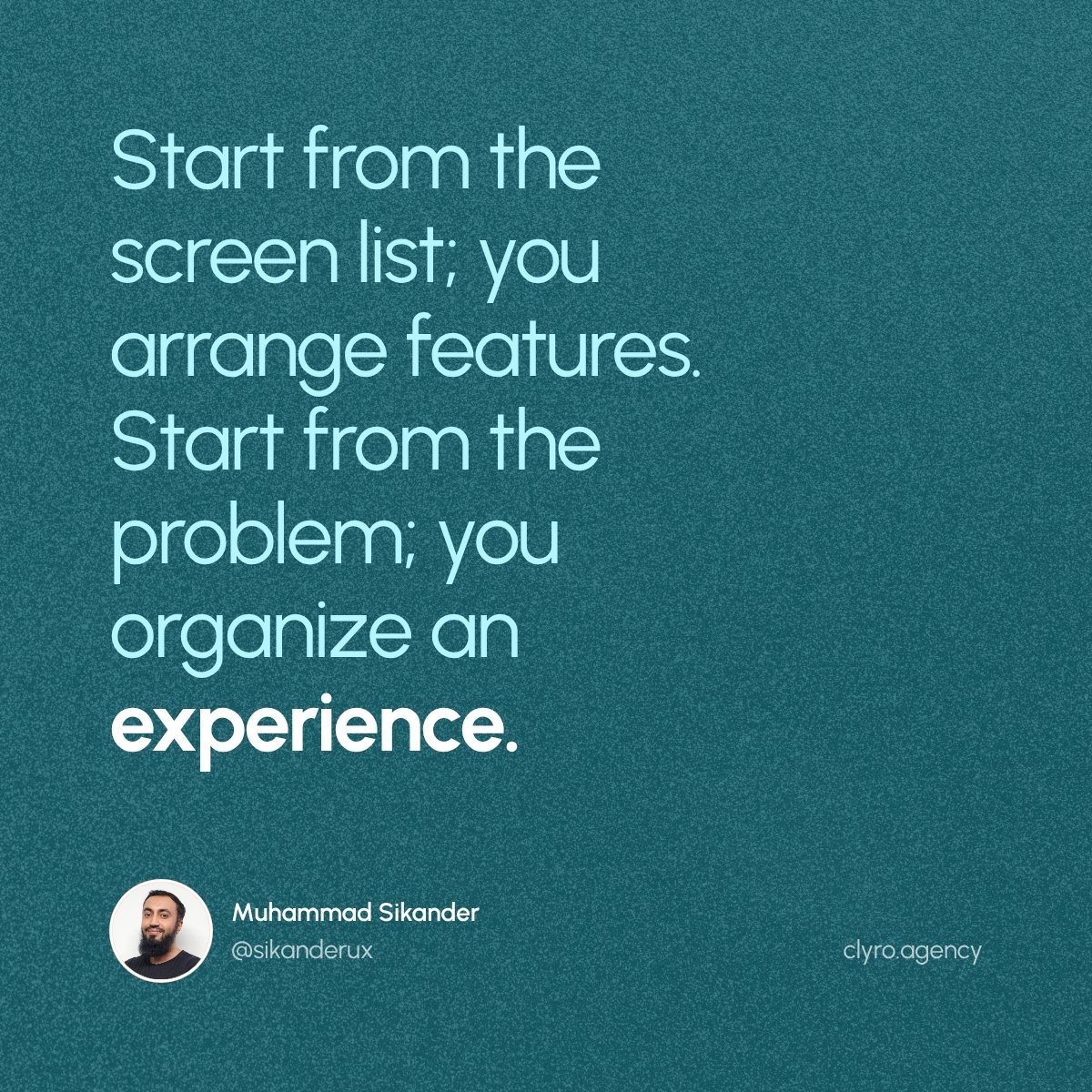
A designer who starts from the screen list will arrange features. A designer who starts from the problem will organize an experience.
Most briefs are detailed about what the product does. Almost none explain why it matters to the person using it. That gap is where bad design decisions start.
Users will not tell you they do not trust your AI. They will just stop using it.
That is the difference between a product people try and a product people rely on.
We recently worked on a health-tech platform where users upload sensitive documents and AI extracts data from them. Lab values, categories, flagged results. The AI does the reading. The user is supposed to trust the output.
But here is the problem. If a user sees a number on screen and has no way to verify where it came from, they are not trusting the product. They are guessing. And when the data is medical, financial, or legal, guessing is not good enough.
So we designed a verification layer. Tap any extracted value and see exactly where the AI read it from in the original document. Three states: highlighted on the source page when possible, a direct snippet when highlighting is not available, and a clear fallback when the source cannot be located.
The founder called this screen the heart of the product. Not the dashboard. Not the summary. The screen where the user can say: yes, I can see that this is correct.
Most AI products skip this entirely. They show the output and ask the user to believe it. That works when the stakes are low. When the stakes are high, belief is not enough. Verification is.
Accuracy without verification is just a claim. And users do not stay loyal to claims.
We made a mistake recently on a website project.
A founder hired us to design their company website. It was important to him. But instead of staying involved, he delegated everything to his project manager. Full decision-making authority.
So we worked with the project manager. Followed the feedback. Designed according to the preferences we were given. Finalized the visual direction. Moved into development.
Then the founder came back.
He looked at the work and did not like the theme. Not the layout, not the structure, not the content. The visual direction itself. The thing that should have been locked with his input from the start.
The design had been approved and was already being built. But the person who approved the theme was not the person whose taste actually mattered.
This was our fault, not his.
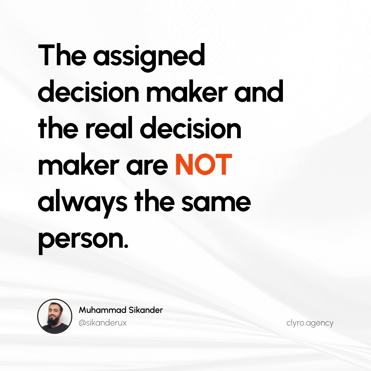
We asked at the start who the decision maker was. We were told it was the project manager. But there is a difference between the assigned decision maker and the real decision maker. On a website that represents the founder's company, the founder is always the real decision maker on how it looks and feels.
We should have insisted on at least one founder review before locking the visual direction. Even when someone else is officially running the project.
Seven years in the industry. 100+ projects. And we still learn lessons like this. The day you stop making mistakes is not the day you got good enough. It is the day you stopped paying attention.
The design was good. The experience of getting it was painful. Most founders have lived this and never figured out why.
Here is why.
We have seen it enough times to know the pattern. A revision cycle that should take one round takes three. A handoff creates more questions than it answers. A screen feels slightly off and nobody can explain why.
When you trace it back, it is almost always the same thing. Someone did not flag a blocker early enough. Someone missed a message. Someone went quiet for a day and the context shifted underneath them. The design skill was fine. The reliability was not.
Founders feel this on the receiving end. They cannot always name it, but they know the feeling. The project is moving, but it feels like it is being pushed, not pulled. Everything takes slightly longer than expected.
This is why we hire differently. We look for designers who communicate before they are asked, flag problems before they grow, and treat responsiveness as part of the craft, not a soft skill. Design ability gets someone in the door. Consistency is what keeps them.
A great portfolio tells you what a team can produce. It tells you nothing about what it feels like to work with them.
@DataInfraxInc Yes. That's exactly what we changed. If a PM is running the project, we get written confirmation from the founder that their approvals are final. If not, founder stays in the loop at every visual checkpoint. Simple fix, expensive lesson.
This is what the inside of a logistics SaaS redesign looks like in Figma.
A logistics platform with multiple user roles. Each role with its own module, its own flows, its own dashboards. Wireframes for every module first, then high fidelity for every screen. Shipment creation, RFQs, consolidation, invoicing, customer management. All organized into named pages so the team and the founder can find anything in seconds.
This is why design systems are not optional on projects like this.
When you have this many screens, this many roles, and this many flows, you cannot design each screen from scratch. Every button, every table, every input, every card has to come from a shared system. Otherwise you end up with modules that look like different products. One role sees one version of a table. Another sees a slightly different one. Nobody planned it that way. It just drifted.
A design system locks the decisions once and applies them everywhere. Change a component, it updates across every module. Add a new flow, it already looks like it belongs.
The zoomed-out Figma file is not just organization. It is the reason a product this complex can ship without falling apart.
One of the best decisions I made last year was joining the gym.
By late 2025, I had gained a lot of body fat. Back pain was building from years of sitting for hours in front of Figma. My eating was terrible. I knew it, but running an 18-person studio always felt like the more urgent thing.
Eventually I stopped ignoring it.
Since then I have lost around 9 kg of fat. Fixed my eating habits. Discovered that my eczema, something I had dealt with for years, disappeared when I cut wheat out of my diet. I did not see that coming.
But the biggest change was mental. After exhausting days of managing projects, reviewing work, and making decisions, the gym became the one hour where none of it exists. Just the weight and the set. That reset carries into the next day.
It is an addiction now. But a healthy one.
Next target: visible abs in three months. Will keep you posted.
We finished a project recently. The founder was happy with the design. The screens, the layout, the visual direction. All of it landed.
But when he shared his feedback, he did not lead with any of that.
The first thing he called out was communication. Daily updates. Quick turnarounds. A recorded walkthrough explaining every design decision so he did not have to guess what he was looking at. When he needed a source file re-exported, it was handled in minutes.
Then he mentioned the results. The service page matched exactly what he had in mind. It was already performing well in production.
Then he said the part that mattered most: he was already planning the next batch of work.
After designing 100+ SaaS products, this pattern keeps repeating. Founders care about three things. Does the design look and feel right. Does it actually perform once it ships. And was the experience of working with you smooth enough to do it again.
Most studios only obsess over the first one. The ones that grow obsess over all three.
Whether you hire designers or you are one, what is the one thing that makes you want to work with someone again?
One of our longest and best working relationships started with a single screen.
A founder came to us with a B2B SaaS product he had built himself. Solid engineering, clean codebase, but the interface felt like what it was: built by a developer, not designed. He did not hand over a big brief. He asked us to redesign one screen so he could see how we think.
We delivered. He saw the approach. Then he asked for another. Then a full dashboard. Then the marketing site. Over the next several weeks, that single screen grew into a partnership across multiple milestones, and the work kept expanding because the output kept earning it.
The part that mattered most was not the size of the engagement. It was that he took our designs and implemented them straight into his live product, page by page. Our work did not sit in a Figma file gathering comments. It shipped.
Not every project starts this way. Many of our best partnerships began with a full scope, a signed agreement, and a clear plan from day one. Both paths work when the intent is right.
But when a founder is unsure, a small first step does something a proposal cannot. It replaces trust on paper with trust built from real output. The founder sees actual work, not a pitch deck. And if the work is good, the relationship finds its own pace.
How a partnership starts matters less than whether the work earns what comes next.
We specialize in complex, high-stakes SaaS. Fintech, medical, logistics. The kind where one screen handles wallets, shipments, settlements, and multi-party integrations all at once.
The worst advice you can give on these products is "make it simple."
You cannot simplify a logistics platform tracking packages across five courier networks in real time. The complexity is the product. Remove it and you remove the reason anyone uses the software. The job is not fewer things on screen. It is making sure a person can move through all of it without hesitation.
But there is a second layer most teams miss entirely. These products do not just need to be usable. They need to feel trustworthy. When a user is trusting your product with money, health data, or their entire operations, the interface is constantly telling them whether that trust is deserved.
How data is organized. How confirmations are handled. How errors are surfaced. Whether the product feels calm when something important is happening, or whether it feels frantic. None of these are features. All of them shape whether a user leans in or pulls back.
In simple products, you can get away with a clean layout and good typography. In complex, high-stakes products, every design decision either builds trust or quietly erodes it. There is no neutral.
After designing 100+ SaaS products, the most common thing we hear from founders is not "we need a redesign." It is "we built it, it works, but we can't figure out why users aren't staying."
That is the real tell that a product was built without design thinking.
When a product is built by engineers or with AI tools, the focus is on making things function. Does the button work. Does the data load. Does the flow complete. And those products do work. But functioning and being understood are two different things.
What is usually missing is not how it looks. It is the layer underneath. The logic of how a user is supposed to move through the product. Which action matters most on each screen. What information a user needs at each step, and what is just noise. Where a new user should feel guided, and where a power user should feel fast.
Without that layer, founders end up with a product where everything technically works but nothing feels obvious. Users sign up, look around, and leave. Not because the product is bad. Because the product never made its own value clear.
A lot of founders think the fix is visual. Better colors, cleaner layout, a more polished look. Those things matter. But the deeper fix is structural. It is deciding what this product is actually asking the user to do, and then organizing every screen around that answer.
Design is not the surface. It is the logic that makes a product feel like it knows what it is doing.
Yesterday I was on a call with a potential client.
Their product is live. Has users. Built by a developer who coded it directly without design.
Now users are confused. The client wants to improve UX but doesn't know how to communicate design changes to the developer without breaking everything.
Classic scenario: product works, but UX is holding it back.
Here's what we're doing:
Step 1: Understand the users and business goals
We'll work with the client to map where users get confused, what's driving churn, and what improvements would actually move metrics.
Step 2: Collaborate with the developer
Not replace them. Understand their constraints. What can be changed easily? What would require rebuilding core systems? Design solutions that work within those limits.
Step 3: Incremental improvements
Not a full redesign. Prioritize changes by impact vs development effort. Ship improvements without breaking what already works.
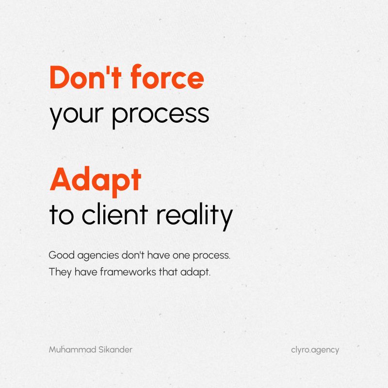
The principle: adapt your process to the client's reality.
Some clients need a full product design from scratch. Others need UX improvements on live systems with existing dev teams.
If you try to force the same process on both, you'll fail.
I sent the client Looms showing our general process, then explained how we'd tailor it to their scenario. Sent another Loom to the developer showing how we'd collaborate without disrupting their workflow.
Good agencies don't have one process. They have frameworks that adapt.
Cookie-cutter doesn't work when every client's situation is different.
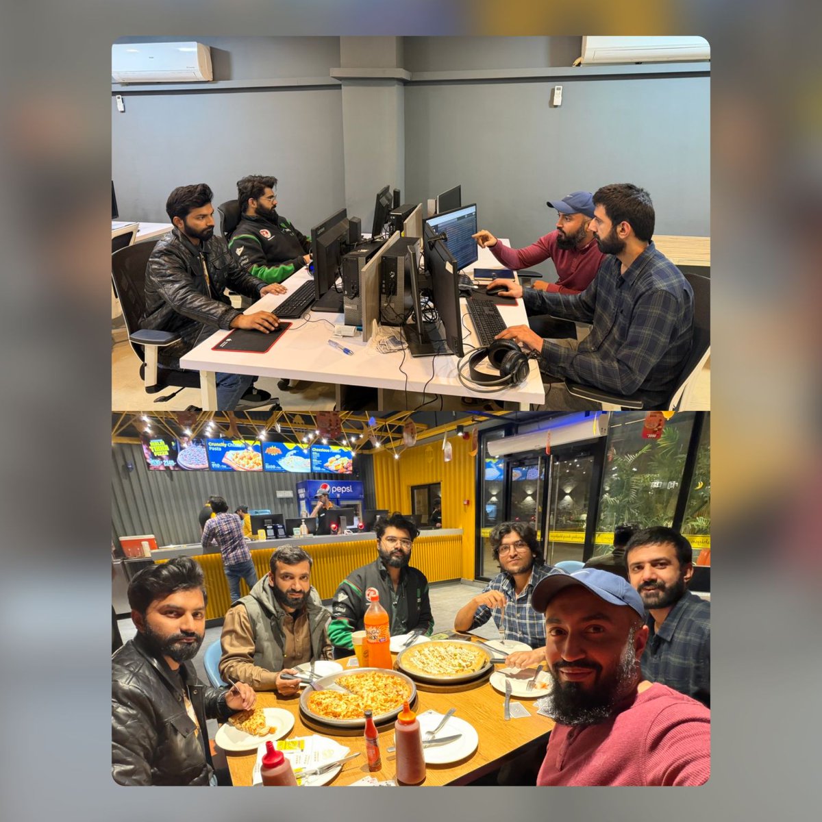
Our CSR team decided to work from the office during Ramadan.
Not because they had to. Because they didn't want to compromise on the quality of client communication.
Most of our team is remote this month, but the CSR team knows their remote setup isn't fully optimized yet. So they chose to stay in the office to maintain the standard our clients expect.
This is a team that takes ownership seriously.
One thing our clients consistently mention: our communication is exceptional. Response times, clarity, follow-through - the CSR team owns that.
Last week, I spent a day with them at the office. We worked through some workflow improvements, had Iftar together, and refined a few handoff processes.
This is what good team culture looks like - people who care enough about the work to make the hard choice, even when it's inconvenient.
Standards aren't enforced. They're chosen.
A client just told me: “I was afraid my product wasn’t providing value fast enough.”
They’d been second-guessing their onboarding because of all the “90-second rule” advice.
Here’s what I told them:
There are two types of onboarding:
Repeat-use onboarding (social media, news apps)
∙ Users do this frequently
∙ Every extra second kills completion
∙ Speed = value
repeat use
∙ Users do this once, use for months
∙ Quality of data collected = quality of experience
∙ Thoroughness = value
Their product is rental property management. Users need to input detailed property info, tenant data, and payment structures.
If they rushed users through without collecting the right information, the platform wouldn’t work for them. That’s worse than a 5-minute setup.
The goal isn’t fast onboarding. It’s confident onboarding.
∙ Do users understand why you’re asking for information?
∙ Is progress clear?
∙ Are errors handled gracefully?
∙ Can they see what they’ll get when done?
After our conversation: “I have a lot more confidence in what I’m bringing to market.”
Don’t let generic startup advice make you second-guess good design decisions.
Context matters.
One-time setup isn’t the same as repeat-use. Design for your actual use case, not someone else’s rules.
Your signup has 9 fields.
Your competitor has 1.
You're losing $18,000/month to that decision.
Here's the math:
• 1,000 monthly visitors
• 40% start signup (400 people)
• 15% complete 9 fields (60 activations)
Your competitor with 1 field:
• Same visitors
• Same 40% start
• 60% complete (240 activations)
That's 180 more activated users per month.
180 customer difference × $100/month subscription = $18K monthly recurring revenue gap.
Over a year, that's $216,000 in recurring revenue you're leaving on the table.
This isn't about making things pretty. It's about removing friction at every step that costs you money.
Every extra field. Every vague button label. Every confusing dashboard. Each one has a price tag.
Good UX isn't a nice-to-have. It's your revenue engine.
We just crossed 30 client reviews on Clutch.
After more than 100 projects, here's what our clients say matters most:
• Not how beautiful the design looks
• How fast users reach activation
• Whether investors take the product seriously
�� If the UX actually drives revenue
We're a UI/UX agency, but we think like product strategists.
Because at the end of the day, design that doesn't move business metrics is just expensive decoration.
Users don’t leave because your app is ugly.
They leave because they don’t trust it.
The moment they hesitate. The moment they doubt. That’s where UX fails.
Where users lose confidence:
• Onboarding asks for calendar/email permissions on step 1
• Dashboard loads with no data, no guidance
• Button says “Submit” instead of what actually happens
• Error message blames the user
• Empty state shows nothing but sadness
• Next step isn’t obvious
These aren’t just design problems. They’re trust problems.
Good UX removes doubt at every decision point.
Bad UX makes users second-guess themselves until they leave.
We don’t just fix what users complain about. We fix where they lose confidence.
Before we touch high-fidelity design, we wireframe the complete product.
Multiple user types. Different permissions for each. Complex workflows.
Milestone 1: Core user flows
Milestone 2: Admin functionality
Milestone 3: Multi-role coordination
This screenshot shows our Figma organization - not the final pixels.
Wireframes force us to answer the hard questions:
• Where do users hesitate?
• Which steps can we eliminate?
• How do we prevent role confusion?
• What’s the fastest path to value?
If the structure doesn’t work in low-fidelity, no amount of visual polish will fix it.
Strategy before aesthetics.