Amazon is a broken mess.
I have done over $50,000,000 on amazon.
They dont care about me as a seller, partner, or person.
I uploaded this design patent
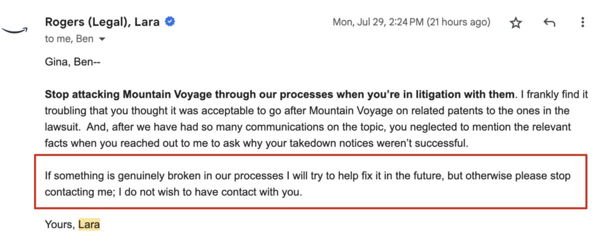
Was told “stop contacting me”
What went wrong inside amazon?
why do they hate small businesses and the law?
A thread:
Eldningsgate - en tråd. Det börjar 6 april när TV4 publicerar att en ny EU-lag förbjuder eldning i trädgårdar i Sverige.
Ingen kollar EU-lagen för att se om det stämmer.
https://t.co/hvFDosDQbj
there are two movies in the 21st century that deserved to be a franchise but never got a sequel
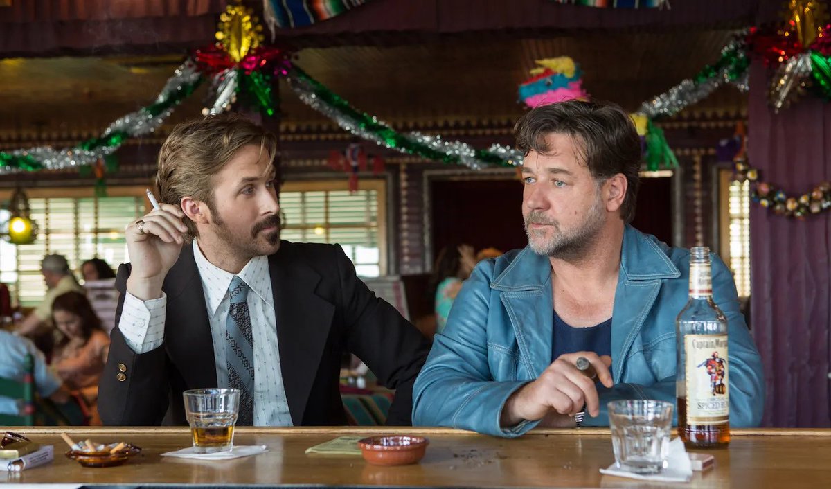
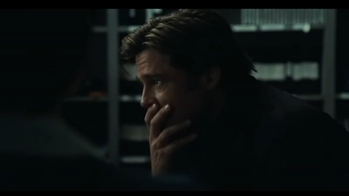
Hollywood's great untapped genre is Russell Crowe Has a Friend
⏲️ As of today, we have about eighteen years to go until the Y2038 problem occurs.
But the Y2038 problem will be giving us headaches long, long before 2038 arrives.
I'd like to tell you a story about this.
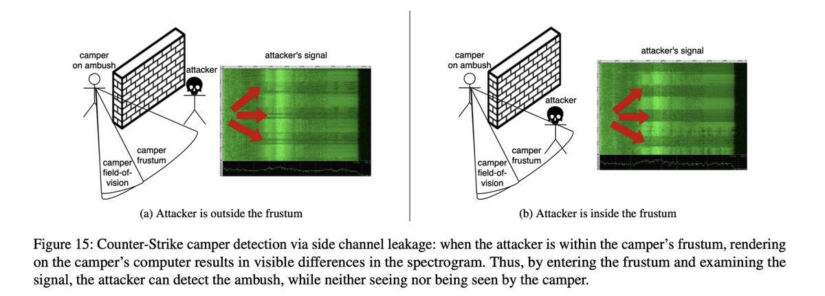
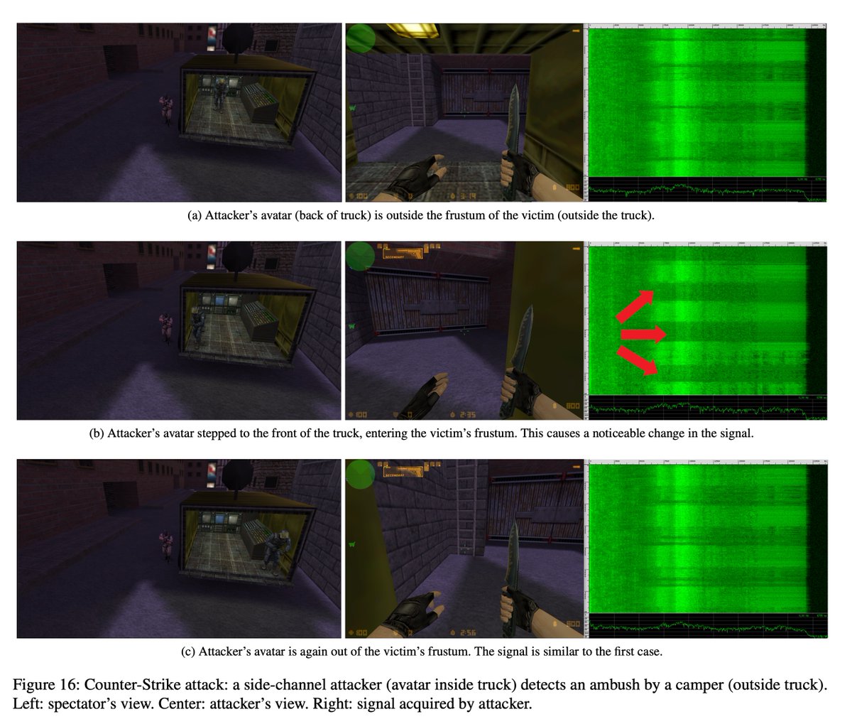
did you know that researchers in 2022 demonstrated that you could process an opponent's microphone, extracting the noise induced by their GPU, and use that noise to know where they were on a Counter-Strike map
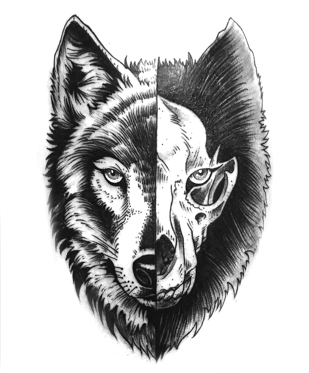
So there’s this one tattoo design that’s pretty popular.
A wolf face on one side and a skull on the other side.
I love this tattoo design because the message behind it is just so unintentionally GREAT....🧵
Billy Beane: Awwww, they're laughing at him.
Peter Brand: And Gollum's about to find out why. Gollum's about to realize that he’s delivered the Ring right into the fires of Mount Doom. He saved Middle-earth and didn't even realize it.
15 years ago, I helped design Google Maps.
I still use it everyday.
Last week, the team dramatically changed the map’s visual design.
I don’t love it.
It feels colder, less accurate and less human.
But more importantly, they missed a key opportunity to simplify and scale.
–––
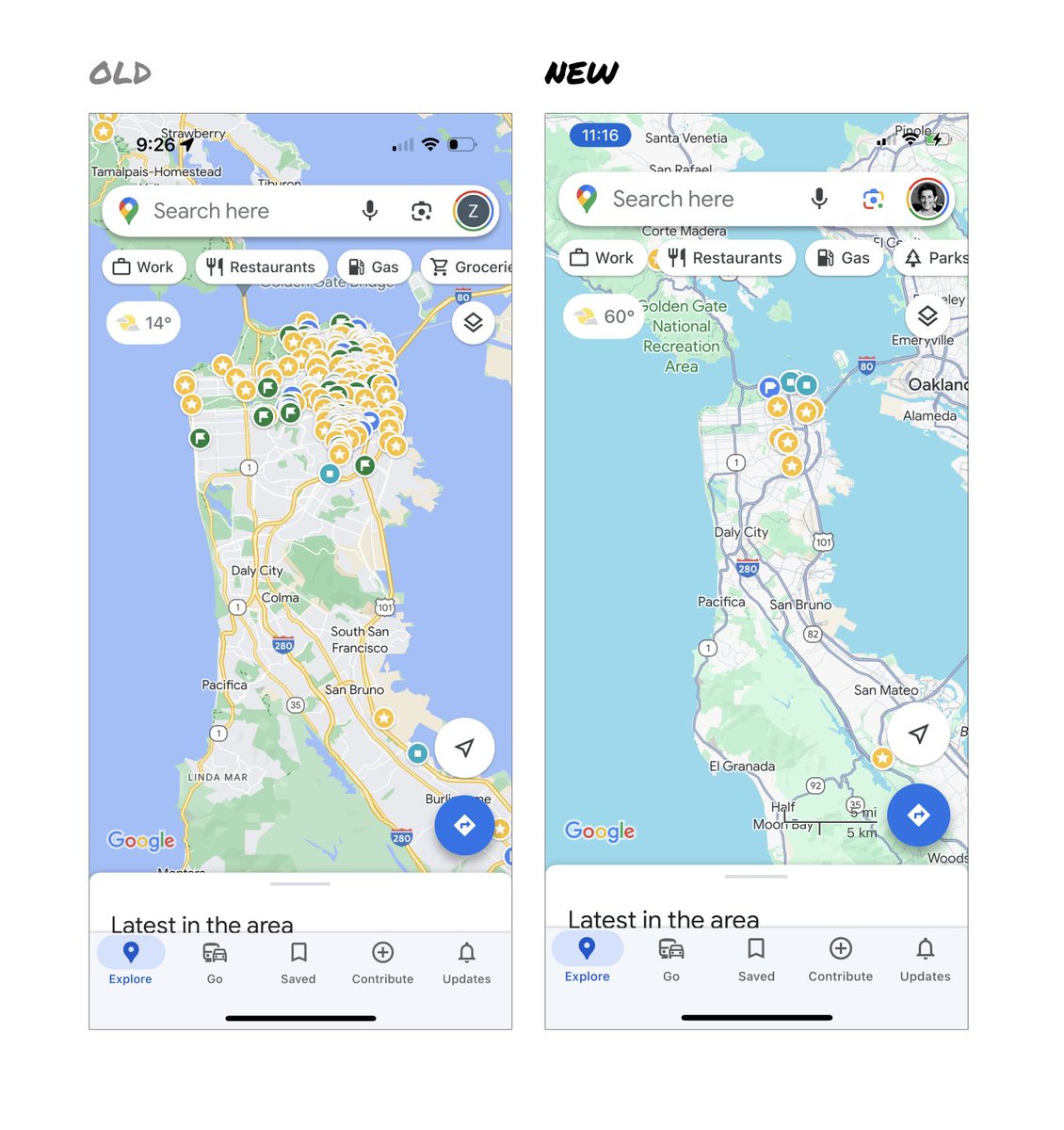
Google Maps has started to widely roll out updated map colors:
- All roads are now gray
- Water changed from blue to teal
- Parks and open spaces are now mint green
It seems the goal was to improve usability and make the maps more readable.
Admittedly, I do think major roads, traffic, and trails stand out more now.
But the colors of water and parks/open spaces blend together.
And to me, the palette feels colder and more computer generated.
But color choices aside…
If the goal was better usability, the team missed a big opportunity:
Google Maps should have cleaned up the crud overlaying the map.
–––
So much stuff has accumulated on top of the map.
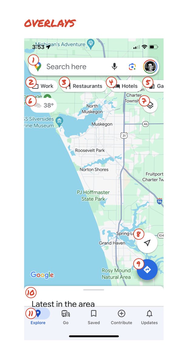
Currently there are ~11 different elements obscuring it:
- Search box
- 8 pills overlayed in 4 rows
- A peeking card for “latest in the area”
- A bottom nav bar
(Personally, I would LOVE to see usage metrics for all these overlays.)
The map should be sacred real estate.
Only things that are highly useful to many people should obscure it.
There should be a very limited number of features that can cover the map view.
And there are multiple ways to add new features without overlaying them directly on the map.
–––
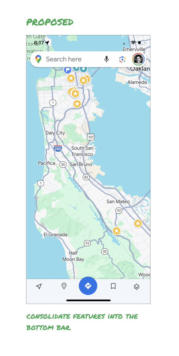
Here’s how it could look:
- Keep the search box
- Keep the bottom bar
- Remove everything else from the map
- Roll the most used features into the bottom bar
- Bury the less used features elsewhere in the app
I assume the search box and directions are top priority and should remain prominent.
My Location and map layers (satellite, traffic, etc.) could move to the bottom bar.
The explore overlays (restaurants, gas, etc.) could live in the bottom bar in “Explore” and open as cards.
The additional space in the bottom bar could be used for Saved, as a “More” option, or could be removed entirely.
There are many variations of how features could be arranged.
But the key points are:
- Dramatically simplify
- Strongly prioritize map visibility
- Bury legacy and low use features
–––
It’s normal for products to accumulate features over time.
But it’s also super important to stay vigilant and continually clean them up.
In many ways, it’s interesting to see history repeating itself.
In 2007, I was 1 of 2 designers on Google Maps.
At that time, Maps had already become a cluttered mess.
We were wedging new features into any space we could find in the UI.
The user experience was suffering and the product was growing increasingly complicated.
We had to rethink the app to be simple and scale for the future.
It seems like it’s time for Google Maps to do this again…
–––
For more on design + tips for early stage founders, follow me on X: @elizlaraki
@petterbristav "Yikes" är rätt ord. Han är i så konstig sits. Hur länge orkar han och Aston (med pappa Stroll) fortsätta med detta? Han sitter ju uppenbarligen i en bil som kan prestera bra, vid bra förutsättningar, och han vill så klart prestera bra men det händer inte alls denna säsong 🤷
If you’re excited by the idea of AI generating an entire movie/tv show/youtube video I think you fundamentally don’t understand why you’ve enjoyed art that you’ve consumed and you’re a dumb little nerd and I hate you
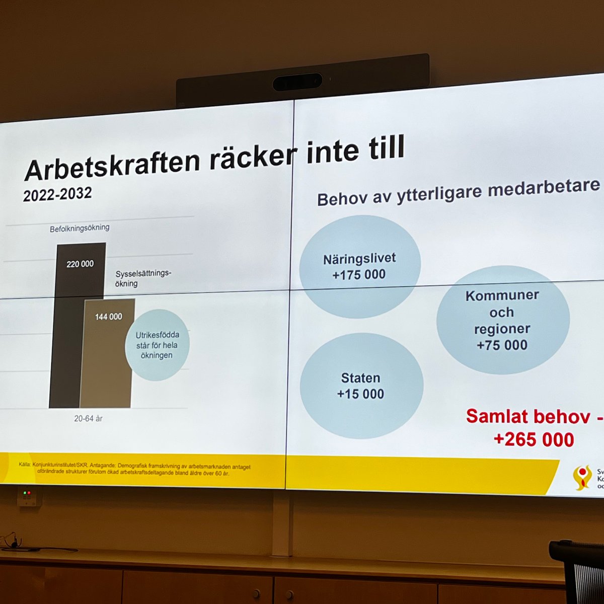
Hej. Idag skall vi prata lite om den här bilden. Det är SKR tillsammans med Svenskt Näringsliv samt en grej som heter Statens Arbetsgivarverk som slagit sina påsar ihop och räknat på sitt gemensamma anställningsbehov fram t o m 2032. Det här är årets läskigaste bild. Tråd obvs.
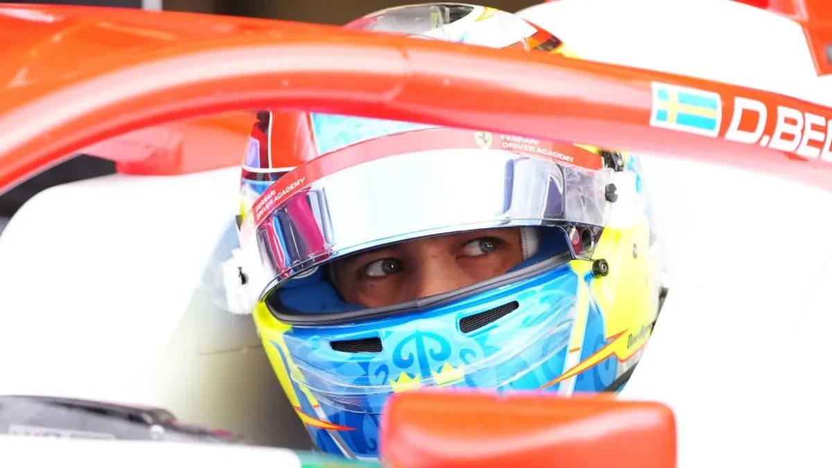
🏁Dino Beganovic kvalar tvåa på Red Bull Ring
▪️Dino var snabbast efter den första rundan av varv men han kunde inte matcha Paul Aron och Gregoire Saucy i slutet av kvalet. Aron fick sedan sitt varv struket och Dino flyttades därmed upp till andra plats
#F3#AustrianGP