https://t.co/ZCQ8O9NZzf
I would recommend this video as it dives into why visual marketing works. In the video Kamil talks about different concepts brands use in visual marketing to make people grow emotional attachments to their brand.
#PrettyandEducated is a movement by BraidsByLuna to support women in higher ed! #su2412 This post exemplifies the repetition, contrast, and rule of thirds.
@ArleyDepGEN2412 I agree, the contrast between the colors definitely made my eyes dart to the post and question what it was. The alignment also worked well at grasping the audience’s attention to the center and creating a great campaign #su2412#winningisntforeveryone
@JacksonBus65960 this is a great take! the concept of friendship further being exemplified through names on the bottle was a great concept and let the audience be apart of the campaign! #su2412#shareacoke
I agree this campaign is successful. The slogan is simple, making it easily engrained into peoples head.
Nike is also very consistent is showing this campaign through photgraphing athleticism, always exemplifying great composition to intrigue viewers #su2412#JustDoIt
Nike’s “Just Do It” campaign is one of the most successful marketing campaigns of all time. Both the image and slogan are so simple, it makes it all the more memorable to the audience. This campaign made Nike a global name, resonating with athletes and civilians alike. #su2412
@ryansu31686988 this is a great choice for a campaign! I remember when everybody felt cool for having their name on a coke bottle! Im sure the popularity of coke peaked with this game changer #cocacola#soda#su2412
@anayaj4ck i love this campaign so much, Snickers has always been so consistent and up to date with this campaign. Anytime I think of snickers I think of the slogan as well, great choice! #snickers#chocolate#su2412
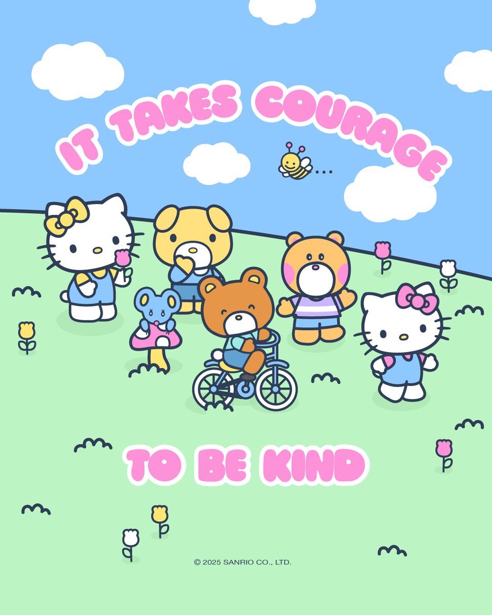
“Hello Kindess” Campaign is a wonderful message to spead positvity and successful as “kindness” has become a staple meaning of hello kitty as she has gained popularity overtime. My favorite visual element is the rule of odds used to balance and unify the characters. #su2412
I incorporated the rule of thirds by captuing the tallest tree on the left side of the picture. This allowed for the tree to not be the main focus, rather the entirety of the pic itself. #su2412
@ArleyDepGEN2412 i love the icons used to correlate to the topic at hand. I recently started getting into stocks and investing so this was really helpful for me! #su2412