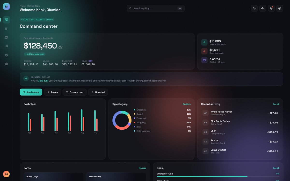
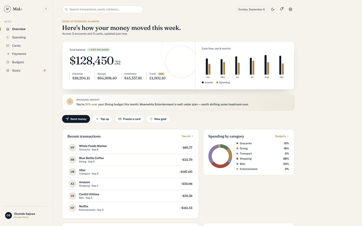
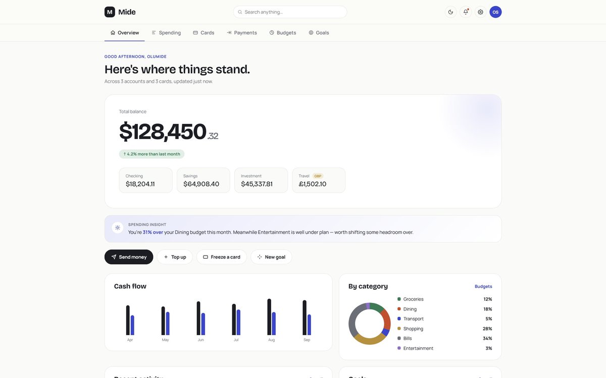
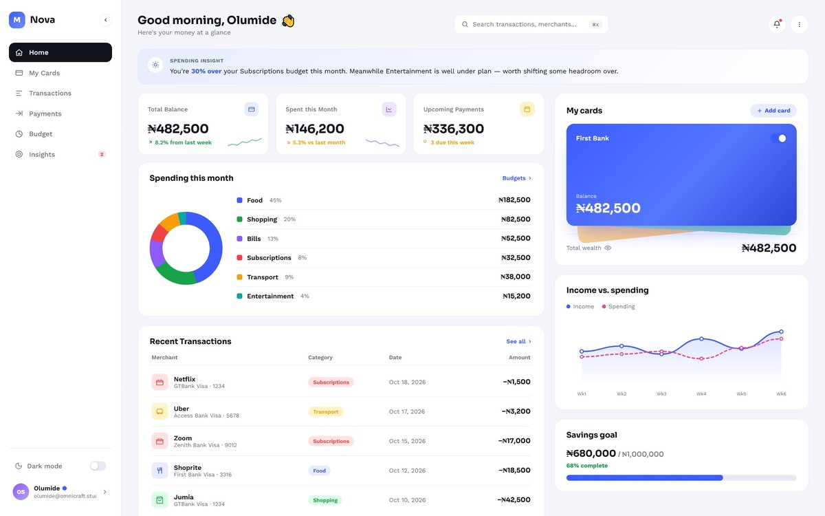
I explored 4 different directions for the same financial dashboard.
Same product. Different approaches to hierarchy, information density and visual language.
Which one would you choose and why?
I’ve been thinking more about how designers grow beyond making screens look good.
Understanding product strategy, prioritisation and the decisions behind a product changes how you design.
Good design starts long before the pixels.
@thedennisobaro1 I’m 8 weeks into a real product build and still doing research, UX, frontend & backend. AI speeds execution, but thinking, iteration and trade-offs still take time. Speed ≠ no work
The longer I work in design, the less interested I am in making things look impressive before they make sense.
Good design is not decoration.
It is clarity, structure and the ability to make the right thing easier to understand.
That lesson still guides how I work.
Before design begins, I want to know what is still unclear.
This is a short look at the OmniCraft onboarding flow asking what is missing, what the first version needs and what should be clarified early.
Better questions now. Fewer assumptions later.
I’m building an onboarding system for OmniCraft Studios.
It turns scattered messages and incomplete documents into a clearer project direction before design or development begins.
Still refining it, but this is exactly the kind of problem I like solving.
Most creativeare projects do not begin with a proper brief.
They begin with scattered WhatsApp messages, voice notes, screenshots and half-formed ideas.
I started building a system that turns those conversations into clear, structured project requirements.
I’ll share more soon.
Every identity reaches a point where it stops being a design file and starts becoming part of a business.
Seeing the PoseCraft identity applied to real products was the best part of the project.