Module update. Version 1.3.
Added a new component for creating tables. Minor improvements. We also made a minimal redesign of the site. Check it out!
#moduleupdate#designsystem#figma
Module update. Version 1.2.
Added new components: accordion, card, multiselect. New variants of button, overflow menu, date picker. Minor improvements.
Check email to get updated files.
#moduleupdate#designsystem#figma
Module update. Version 1.1.
Minor fixes and improvements. More detailed tutorial. Added new components: number input and overflow menu.
Check email to get updated files.
#moduleupdate#designsystem#figma
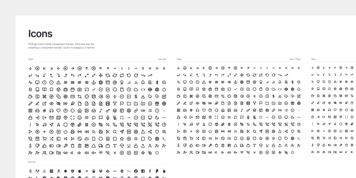
Module provides a universal icon pack. Prepared with different stroke widths to fit each component size.
Free icons by @colebemis#icons#designsystem#figma
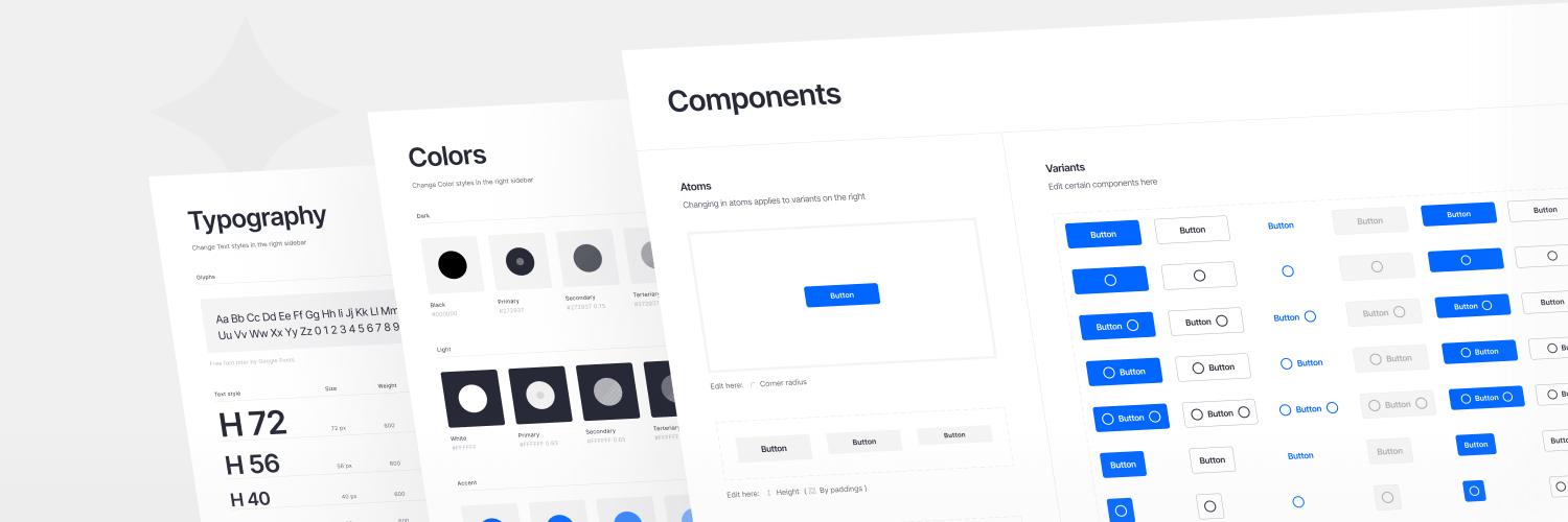
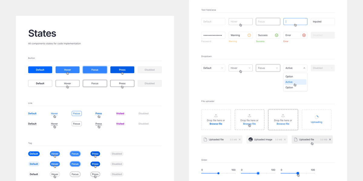
We don’t make extra components for an attractive large number. All interactive states are presented separately for the developers.
#components#designsystem#figma
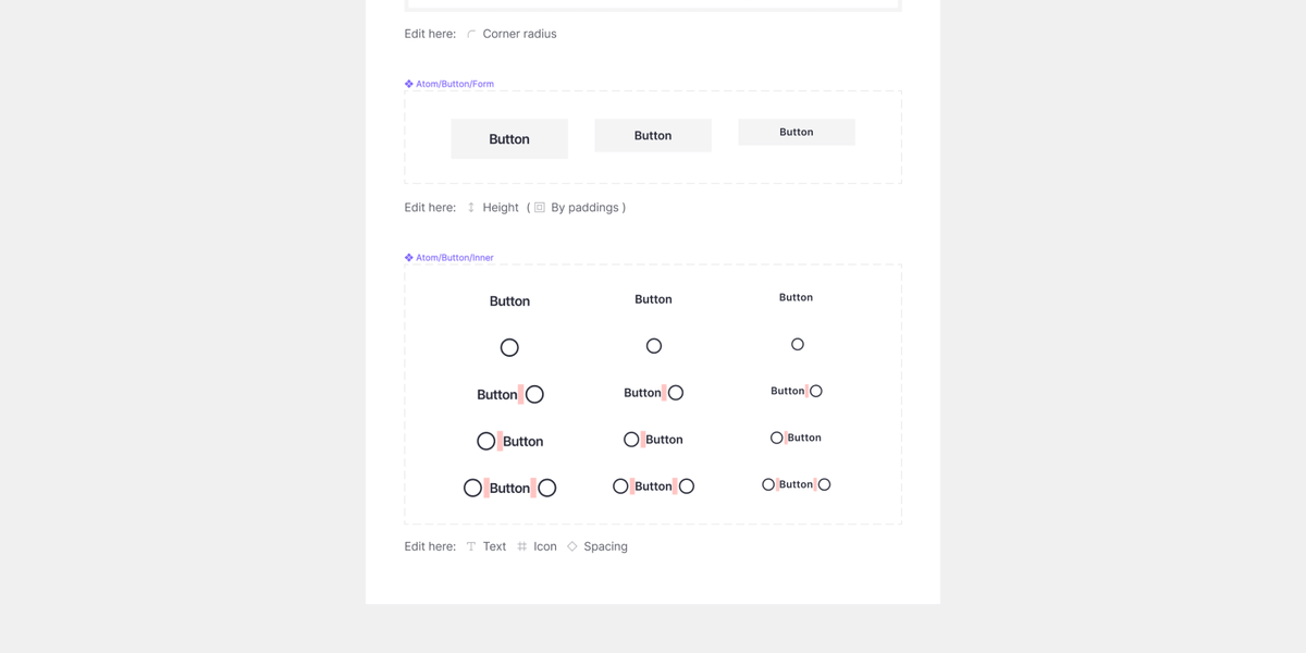
Just 4 mouse clicks to major restyle all buttons.
We made a thoughtful structure of each component. Let's look at the button. You can edit the corner radius and main color in one place. Changes apply to all component variants.
#components#designsystem#figma
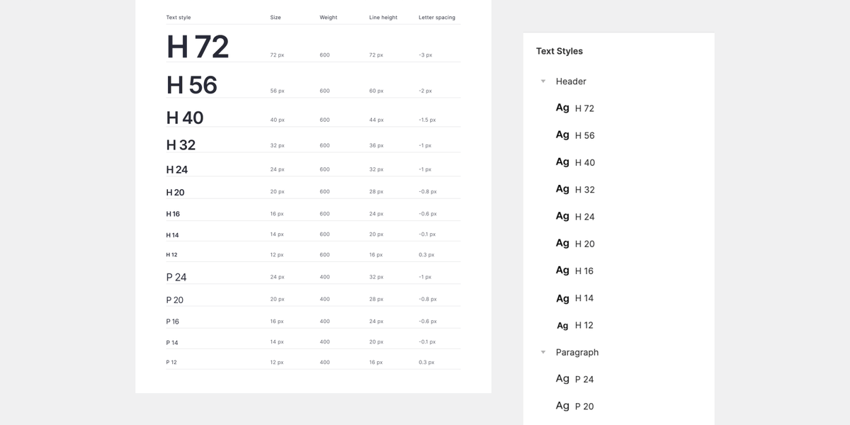
Typography.
Simple text style structure. Just two groups: bold headers and regular paragraphs. Neat settings of each parameter. Line heights apply to the 4px baseline grid. Also, free Google font is used.
#typography#designsystem#figma
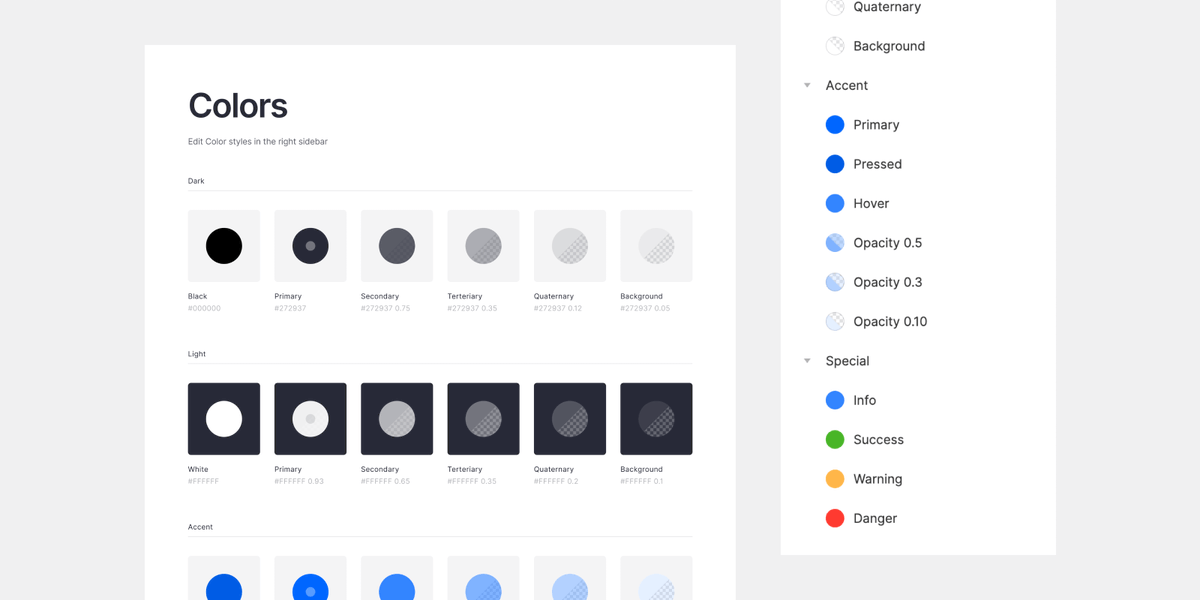
Colors.
Module contains the only color styles you will use. No tons of shades of each rainbow color. Secondary colors are created with transparency to fit any colored background.
#colors#designsystem#figma
Module! We created a design system for Figma.
Intuitive in use without excess components. Easily customizable with atomic structure. Thoughtful build with auto layout. Made with love in many details.
Explore: https://t.co/EccYXuaEcc
Coupon: launch10
#designsystem#figma


