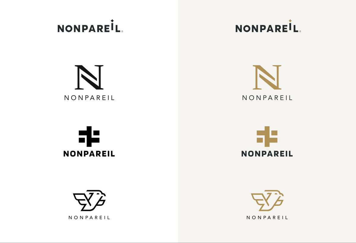
Four directions. One vision.
Each explored a different take on what “No Equal” could look like.
The client chose Option 1 — understated, timeless, confident.
I secretly love Option 4, but clients often know what speaks to their brand best.
#LogoDesign#BrandIdentity #CreativeProcess
Creating a timeless identity isn’t about chasing trends.
It’s about distilling — finding that core essence that will still feel right decades from now.
For NONPAREIL, the process was about proportion, rhythm, and confidence in simplicity.
#DesignThinking#VisualIdentity #MinimalDesign
Introducing NONPAREIL — a name that means “no equal.”
A timeless identity built on confidence, clarity, and restraint.
The goal: create something that feels inevitable.
#BrandDesign#LogoReveal#IdentityDesign
Sometimes your favorite concept doesn’t get picked.
And that’s perfectly okay.
I loved Option 4 for its quiet boldness, but collaboration isn’t about ego, it’s about alignment.
At the end of the day, the best identity is the one that feels true.
#DesignCommunity#ClientWork #BrandDesign
Every design process leaves behind hidden gems.
My personal favorite from the NONPAREIL project, wasn’t chosen — but it still deserves a home.
It’s now available for purchase/licensing.
If you’re building a brand that stands for confidence, modernity, and quiet strength — this might be the one.
DM or email me for details.
#LogoDesign #BrandIdentity #AvailableDesign #DesignForSale
Barter represents exchange and value creation. The design draws from the idea of modular finance — symbolized through geometric blocks, grids, and gradients that mirror blockchain technology and financial ecosystems.
#WIP#Barter#BrandDesign
Just launched BizIcons (A Business Essential Pack)
✅ Consistent design system
✅ SVG + PNG formats ✅ 9 essential categories
Perfect for dashboards, presentations, and apps.
Grab them: https://t.co/9VYzQOreSz
#IconPack#BusinessDesign#DesignAssets