📣The new call for cooperation projects is OPEN!
Let's foster cooperation between organisations in the field of #culture!
Give your artistic work an international dimension within the Europe.
What are you waiting for?
Take a look at the call and see if you are eligible
Society says this is “normal:”
• Borrowing $200,000 for a worthless degree
• Working 9-5 for 45 years, earning $47k/yr
• Sitting in traffic for 2 hours every day
• Taking 1 vacation per year
Only to retire at 70 being too tired to enjoy life.
You were meant for more.
15 years ago, I helped design Google Maps.
I still use it everyday.
Last week, the team dramatically changed the map’s visual design.
I don’t love it.
It feels colder, less accurate and less human.
But more importantly, they missed a key opportunity to simplify and scale.
–––
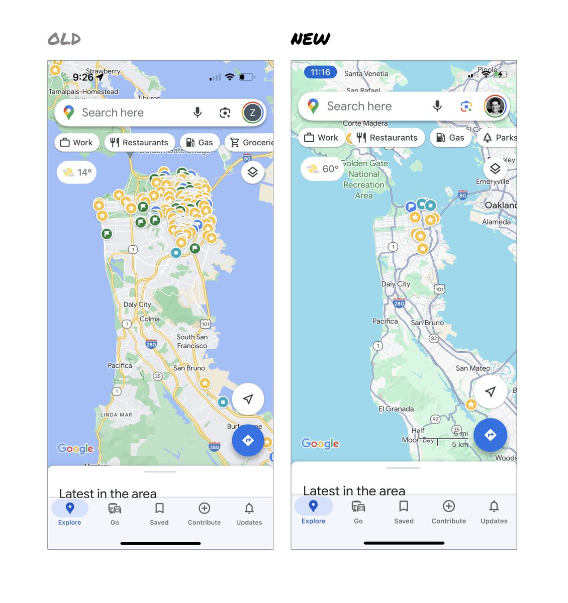
Google Maps has started to widely roll out updated map colors:
- All roads are now gray
- Water changed from blue to teal
- Parks and open spaces are now mint green
It seems the goal was to improve usability and make the maps more readable.
Admittedly, I do think major roads, traffic, and trails stand out more now.
But the colors of water and parks/open spaces blend together.
And to me, the palette feels colder and more computer generated.
But color choices aside…
If the goal was better usability, the team missed a big opportunity:
Google Maps should have cleaned up the crud overlaying the map.
–––
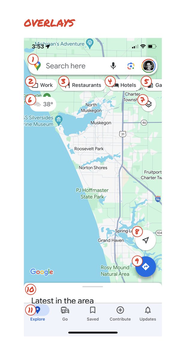
So much stuff has accumulated on top of the map.
Currently there are ~11 different elements obscuring it:
- Search box
- 8 pills overlayed in 4 rows
- A peeking card for “latest in the area”
- A bottom nav bar
(Personally, I would LOVE to see usage metrics for all these overlays.)
The map should be sacred real estate.
Only things that are highly useful to many people should obscure it.
There should be a very limited number of features that can cover the map view.
And there are multiple ways to add new features without overlaying them directly on the map.
–––
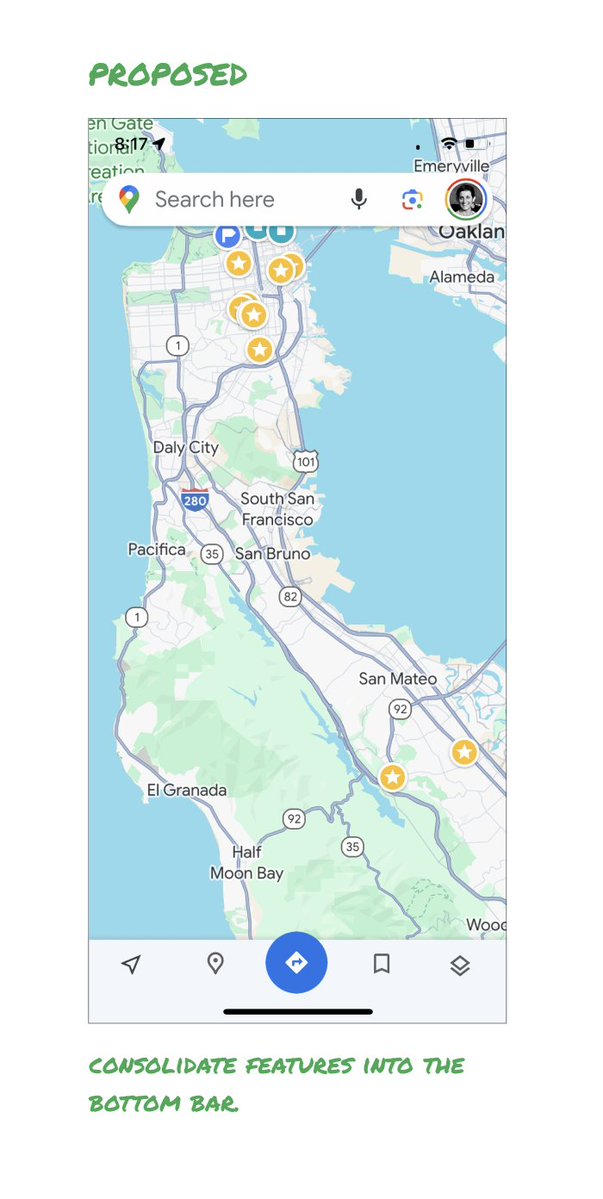
Here’s how it could look:
- Keep the search box
- Keep the bottom bar
- Remove everything else from the map
- Roll the most used features into the bottom bar
- Bury the less used features elsewhere in the app
I assume the search box and directions are top priority and should remain prominent.
My Location and map layers (satellite, traffic, etc.) could move to the bottom bar.
The explore overlays (restaurants, gas, etc.) could live in the bottom bar in “Explore” and open as cards.
The additional space in the bottom bar could be used for Saved, as a “More” option, or could be removed entirely.
There are many variations of how features could be arranged.
But the key points are:
- Dramatically simplify
- Strongly prioritize map visibility
- Bury legacy and low use features
–––
It’s normal for products to accumulate features over time.
But it’s also super important to stay vigilant and continually clean them up.
In many ways, it’s interesting to see history repeating itself.
In 2007, I was 1 of 2 designers on Google Maps.
At that time, Maps had already become a cluttered mess.
We were wedging new features into any space we could find in the UI.
The user experience was suffering and the product was growing increasingly complicated.
We had to rethink the app to be simple and scale for the future.
It seems like it’s time for Google Maps to do this again…
–––
For more on design + tips for early stage founders, follow me on X: @elizlaraki
The Digital Employee Experience (DEX) is our perceived end-to-end experience, as we interact with – and are enabled by – technology.
We’re all experiencing the same tools, systems, and processes, yet perceiving them differently.
Some of the best intranet success stories I’ve seen 👀
Launches or design refreshes with a strong brand story behind them.
But it’s not the corporate brand.
It may incorporate elements, though not at the expense of creating a clear identity for the intranet.
Digital Employee Experience (DEX) 👇
How we live and feel all our interactions as employees.
Through the digital tools, systems, and processes provided by the organisation.
All too often intranet content is lacking relevance to me as an individual.
Cleansed of emotion.
Devoid of any personable elements.
With no human story to tell.
Quick win to level up your internal comms 👇
Feature stories that give a snapshot of an employee’s work.
And activities outside of work.
Write them in the first person.
Even better, empower employees to write and use their own words.
🖼️ The imagery that we choose is a powerful component in our internal communications.
It helps establish the dynamic and shapes the perception of a message.
🚨 Stop playing it so safe!
The intranet drives the user experience that we’re giving our employees on a daily basis.
The central tool we have for disseminating information and collaboration.
In large global organisations, that means to 10's if not 100's of thousands of employees.
Frightening! 😱
As a senior leader, it’s my responsibility to take the reins and drive impactful communication myself.
I need to put myself out there.
I need, and want, to be visible.
Otherwise, I’m not leading.
We can do better. We can fix our b😴ring intranets.
If our aspirations are high enough.
If we’re ambitious enough.
Look to create connection.
Transcend corporate-speak and marketing tactics.
Human-centred content will bring the intranet to life.