22+ image prompts.
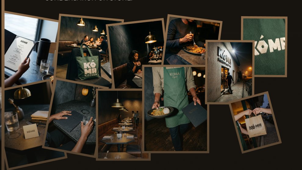
Each one scene-specific, reference-matched, built from the world document. Flash scenes. Available light scenes. Staff in motion. The brand object on a chair, restaurant alive behind it.
Then generated with AI, as a creative direction tool, not a shortcut.
This is the difference between a logo and a brand.
A logo is a mark.
A brand is a world.
You know it's finished when you can describe exactly what it smells like when you walk through the door.
KOMA, Brand Identity & Creative Direction
The anti-AI layer was the most important part.
Not as prohibitions, But as positive descriptions of real imperfection: A water ring on the stone table.
A napkin placed asymmetrically.
A subject caught mid-blink, not mid-smile.
Weight distributed unevenly in a seated body.
Nigerian food has always had culture, history, and depth.
The visual identity of most Nigerian food brands hasn't caught up.
Koma was built around one premise: what if it did.
Before any mockup, I wrote a World Document.
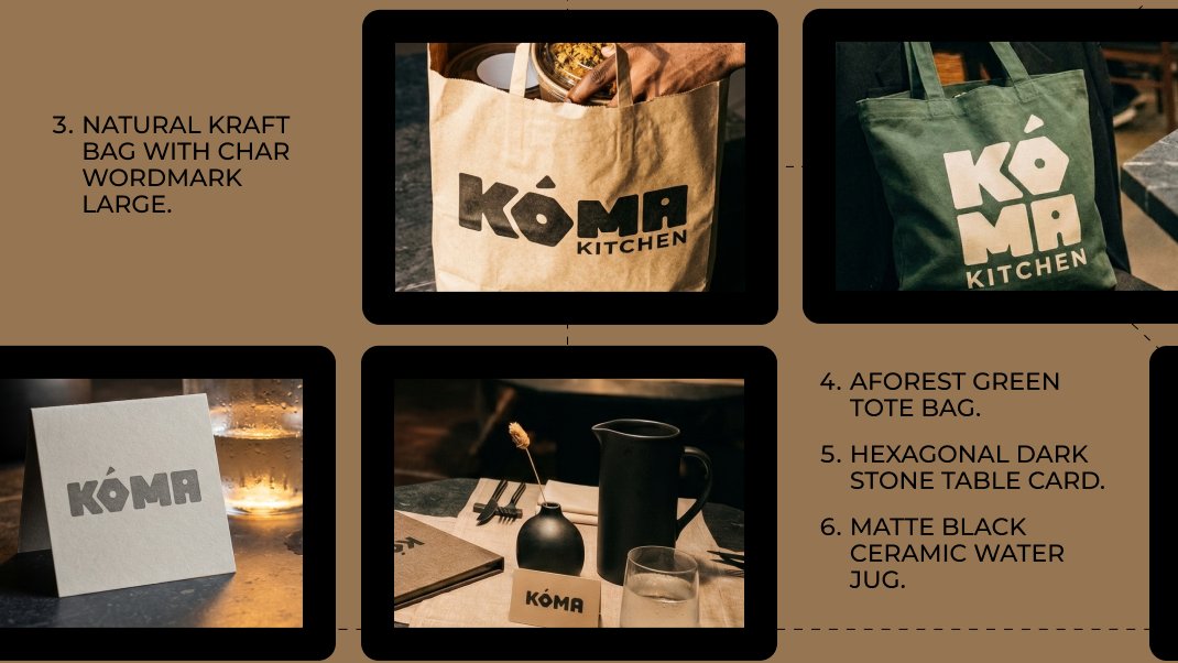
Every physical property of the restaurant defined in exact language: wall texture, floor material, table shape, pendant light temperature, leather banquette patina, staff uniform down to the embroidery thread.
Then I built the photography system.
Two lighting modes: available light for dining scenes, direct flash for staff and exterior.
Three focal lengths: 35mm for environment, 50mm for human behavior, macro for brand touchpoint details.
Every prompt had rules.
This is the difference between a logo and a brand.
A logo is a mark.
A brand is a world.
You know it's finished when you can describe exactly what it smells like when you walk through the door.
KOMA, Brand Identity & Creative Direction
22+ image prompts.
Each one scene-specific, reference-matched, built from the world document. Flash scenes. Available light scenes. Staff in motion. The brand object on a chair, restaurant alive behind it.
Then generated with AI, as a creative direction tool, not a shortcut.