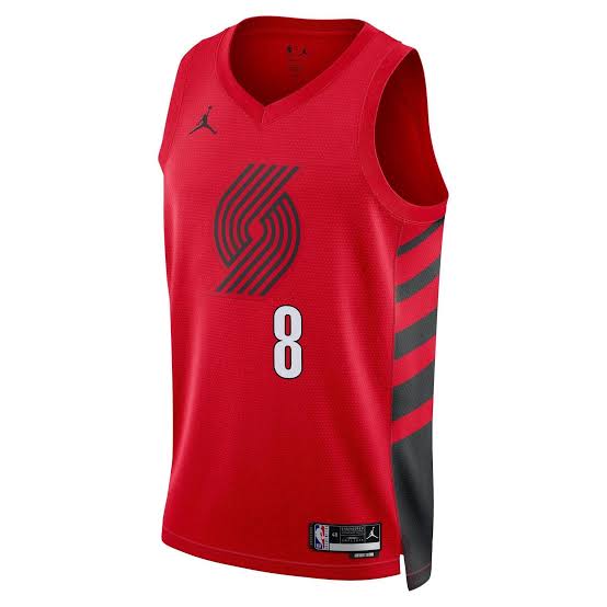
@ToreyJonesYT Removing the gray was a good move to me, especially since they dropped it from the logo. Looks like the sash is bigger as well. Should be a cleaner look but I do agree that style is becoming oversaturated.
@ToreyJonesYT you don't think this change draws the eye more to the sash? Bad is a strong word. This set is iconic, without or without the trim. My unqualified thoughts anyway. Just happy they didn't touch the sash.
@fentrocity@503Blazerfans Monochrome pinwheel, given it's meant to represent two teams on the court, isn't the right choice to me. This would look better with a black and white logo and the rest monotone
@fentrocity@503Blazerfans They're not as bad as these imo. This lacks pop and piping, either on collar, arms or even logo would add a layer. The sash and lettering are more prominent without the piping imo
@503Blazerfans But knowing Nike I'm glad it was nothing seismic lol. The only thing that would have made it a win Vs a not lose for me is adding the drop lettering.
@503Blazerfans Jrue, Deni, Tou, Grant and Clingan. The returning 4 with Simons were a +34.8 netrtg last year. Simons shooting and gravity may have been a large factor but I want to give it a chance with Jrue. Also+9nrtg with Scoot but much worse D
@bobby_amen@shaesharpeshow Agreed. And as nice as the team is in July, I don't know if we'll still be saying the same thing in December, the west is beyond loaded again.