How I approach every new SaaS screen:
1. Ask "what decision does the user need to make here?"
2. Remove everything that doesn't help that decision
3. Make the primary action impossible to miss
4. Design the empty state before the full state
5. Check if a new user would understand it in 5 seconds
Most designers start with layout.
I start with the question.
The layout follows the answer.
It's time to bring Haptics to the web 🫨
Create custom tactile patterns with strengths + durations for your web interactions.
Make your app feel as good as it looks ✨
→ https://t.co/DGz9Eu6nto
A lot of people think UX is the things we produce.
Wireframes.
User flows.
Personas.
Making things “easy to use.”
Those are not UX.
Those are outputs.
UX actually happens before any of that.
It’s the thinking that answers questions like:
💭 Why does this even exist?
💭 Who is this really for?
💭 What problem are we solving, not just what feature are we building?
💭 When and where will someone use this?
💭 And what happens if it doesn’t work?
That’s where the real work is.
A UX designer isn’t just arranging screens.
They’re constantly switching hats.
Sometimes you’re thinking like a psychologist, trying to understand behavior.
Sometimes like a detective, piecing together signals from users.
Sometimes like a product strategist, weighing trade-offs.
Sometimes like a business person, thinking about goals and constraints.
And yes, sometimes like a designer.
The screens come later.
The thinking comes first.
That’s UX to me.
i’ve realized that keeping up 100% with new AI tools/models has become almost impossible. the pace is too fast and the breakthroughs hide in tiny details that never get announced.
one prompt works today and fails tomorrow. the only people who actually understand where things are heading are the ones inside the tools every day, chasing the micro-patterns until they turn into instinct.
and the founders who treat these tools like second nature are the most dangerous people in the game right now, because they can move quicker, iterate faster, and spot opportunities before anyone else even knows they exist.
live in the tools.
good things will happen.
Published today: A new (or rather, old) approach to typography on the web.
Typography is too often reduced to a tidy set of tokens and ratios. But no formula is universal. Different context demands different systems.
We designed a type system that feels precise to the eye, not just in code.
Link below!
@alterego_io guys, please #caption#subtitle your content. there are people who would, ironically enough, like to access the video. this doesn't appear to be difficult for you. thx.
You cannot ask a designer to design and have many meetings during the week.
We need time to deep think, process and explore. Especially with product design.
A simple 30 minute meeting is actually an extra 1-2 hours of wasted potential design time.
Why? Because we’re so lost in our heads thinking through a million solutions, we have to stop designing 30 minutes before, during the meeting, then it takes at least 30 minutes to try to get back into the mental spot and resolve the million solutions to get back to where we left off.
Design is deep thinking and every meeting interrupts that.
It’s one of the biggest challenges designers have when leading a product.
Remember, your 30 minute meeting is actually almost 2 hours of lost design time. Make it worth it.
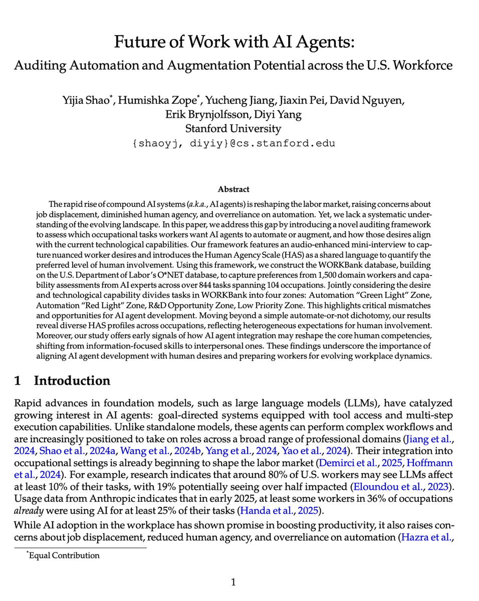
BREAKING: Stanford just surveyed 1,500 workers and AI experts about which jobs AI will actually replace and automate.
Turns out, we've been building AI for all the WRONG jobs.
Here's what they discovered:
(hint: the "AI takeover" is happening backwards)