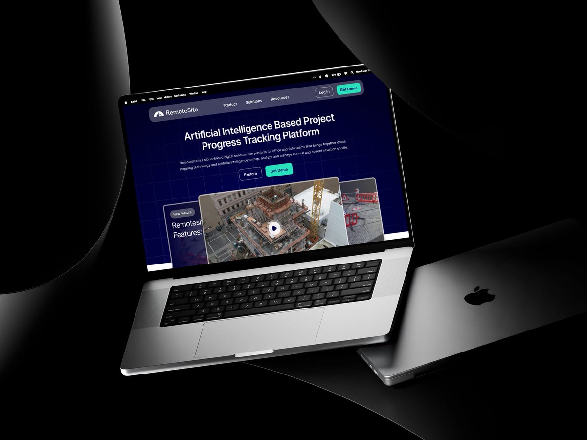
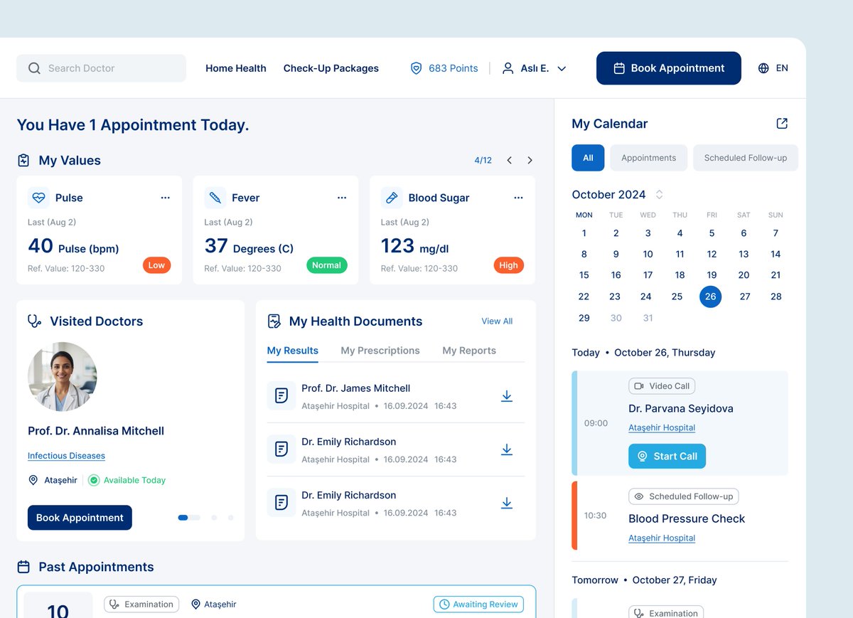
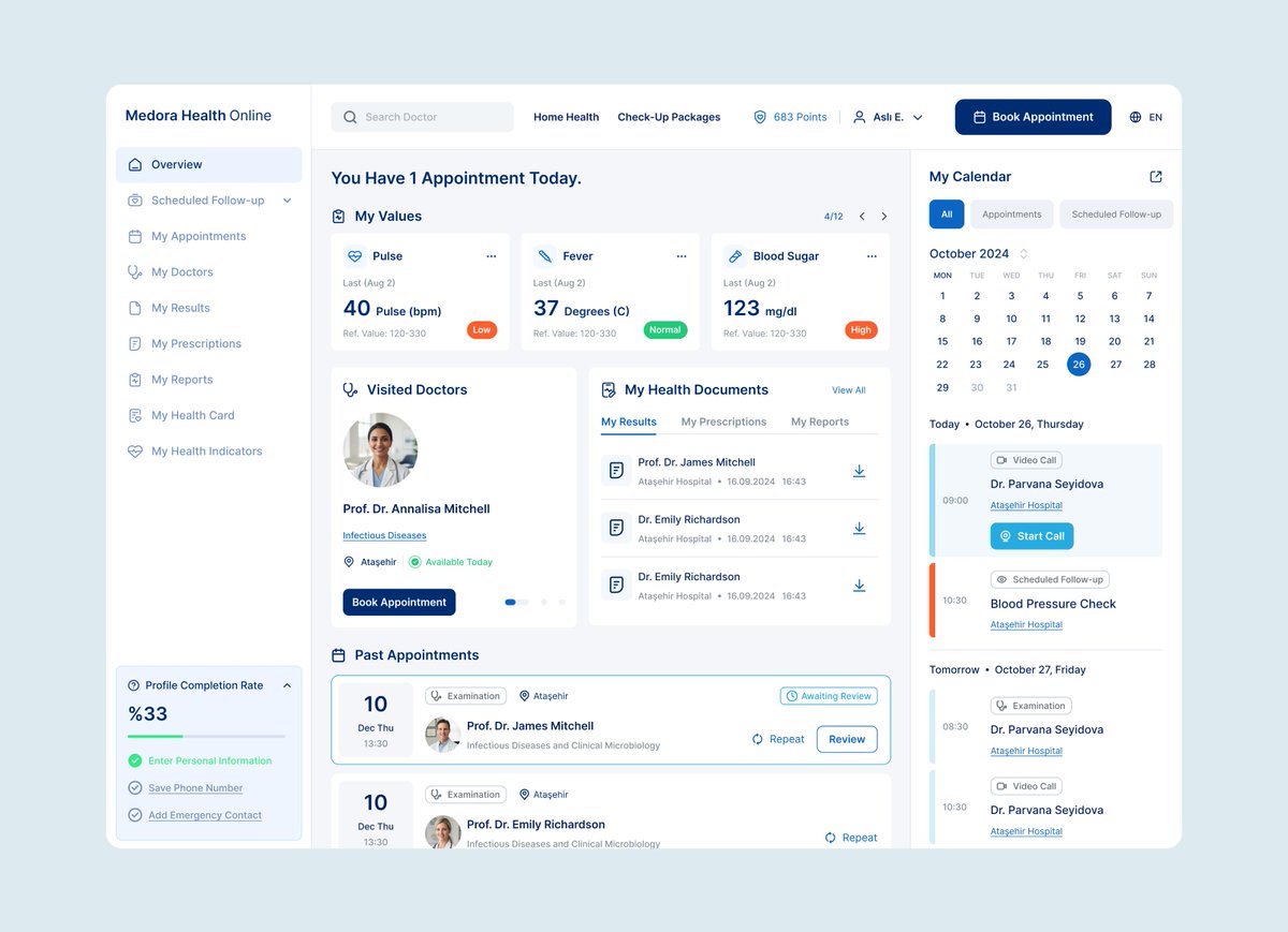
Startups still finding their first users. Enterprises long past that point.
Different stakes, same rule: become as good as the problem you're solving.
This is what we do. Meet Magik.
👉🏻 https://t.co/O13PtdktOm
Magik 🤝 JupiterOne
JupiterOne is a cybersecurity unicorn. Their platform gives security teams full visibility into every cyber asset across their cloud environment; mapping relationships, closing compliance gaps, and prioritizing risk, all from one place.
In 3 months, we redesigned the entire platform from scratch, including the design system. Built it end-to-end with Claude, including a custom Figma skill to work directly with the system we built. Tracked implementation together with their dev teams to make sure it shipped the way it was designed.
The real challenge: cybersecurity is a data-heavy field, and color isn't decorative there. Red, green, and orange already mean error, warning, and success to the people using it.
JupiterOne's brand language leans green, but a product can't follow brand color 1:1 when the industry has already claimed that color for something else.
We stretched it; mostly neutral across the interface, JupiterOne green reserved for AI-powered features specifically. Every component, tables to graphs, built from scratch; including custom charts for things like AI Attack Surface Management.
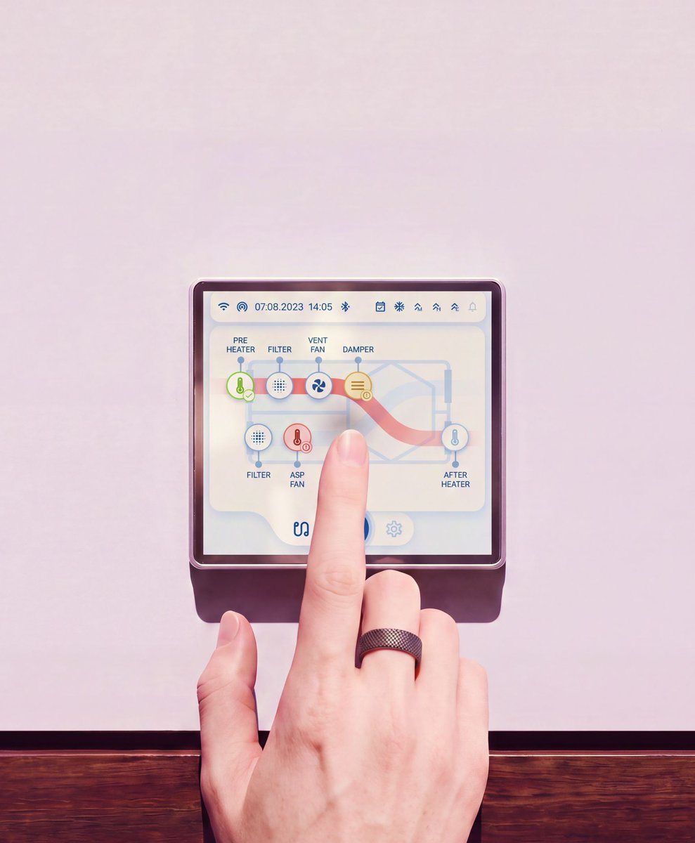
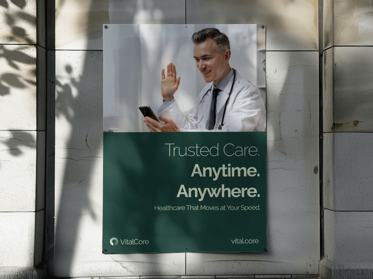
An HVAC (heating, ventilation and air conditioning) company reached out to us. Their hardware held its own against competitors. Their software didn't.
The ask was simple to state, harder to execute: make the digital experience match the hardware. Users needed to monitor every unit, adjust settings, and troubleshoot issues without piecing it together across disconnected screens.
So we rebuilt the control panel from the ground up: one place to monitor every unit, control it, and troubleshoot when something's off; instead of switching between screens to figure out what's wrong.
I used to work on one product, full time. Loved it. Still, staring at the same screens every day for months started wearing on me.
So i started freelancing. That's when i realized what i actually loved is not one product, but meeting different people, different problems, different industries. Every project taught me something the last one didn't.
My first client was someone I reached out to and pitched directly. Small project, not high-ticket. But it worked, and it was the proof I needed that this could be more than a phase.
That client is part of why i kept going. Eventually that became https://t.co/Rgj9YLDFqE
Since then i've worked with people building genuinely brilliant products, across industries i never expected to learn this much about.Sstill looking to meet more.
if you're building something and need a design partner who actually cares about the outcome, let's meet.
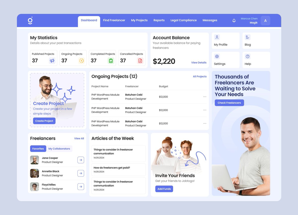
Before we touched a single screen, we re-evaluated what their dashboard should actually tell someone in the first five seconds.
The old version led with an illustration telling you to "gain new experiences with every new project," a grid of icons that didn't match their labels, and an ongoing projects table buried under all of it.
We rebuilt the hierarchy; letting favorites, articles, invites take a back seat instead of competing for attention.
Also aimed to fit the whole picture on an average laptop screen, no scrolling required, so the moment you land on the dashboard, you already know what's going on.
See Before/After below 👇🏻
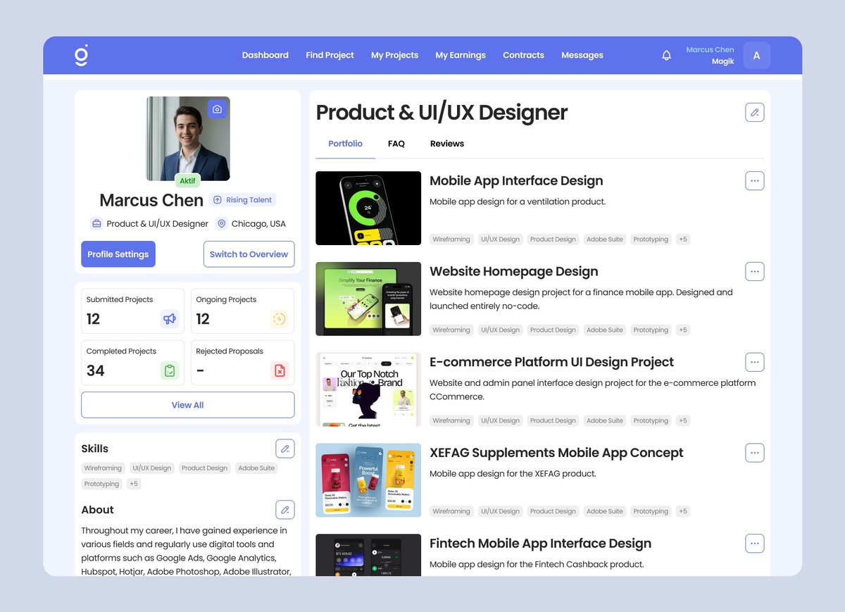
Jobtogo isn't just a job board. It's the operating system for both sides of a freelance deal.
Companies get matching, contracts, tracking, invoicing, and payments in one dashboard. Freelancers get a place to find work, bid, negotiate, and get paid — even without a company to bill through.
Designing for two very different users, in one product, was the real problem. Here's where we landed.