SupplyUI is a collection of published iOS app screenshots from the apps you love, and those you haven't heard of. Specially supplied for your daily inspiration.
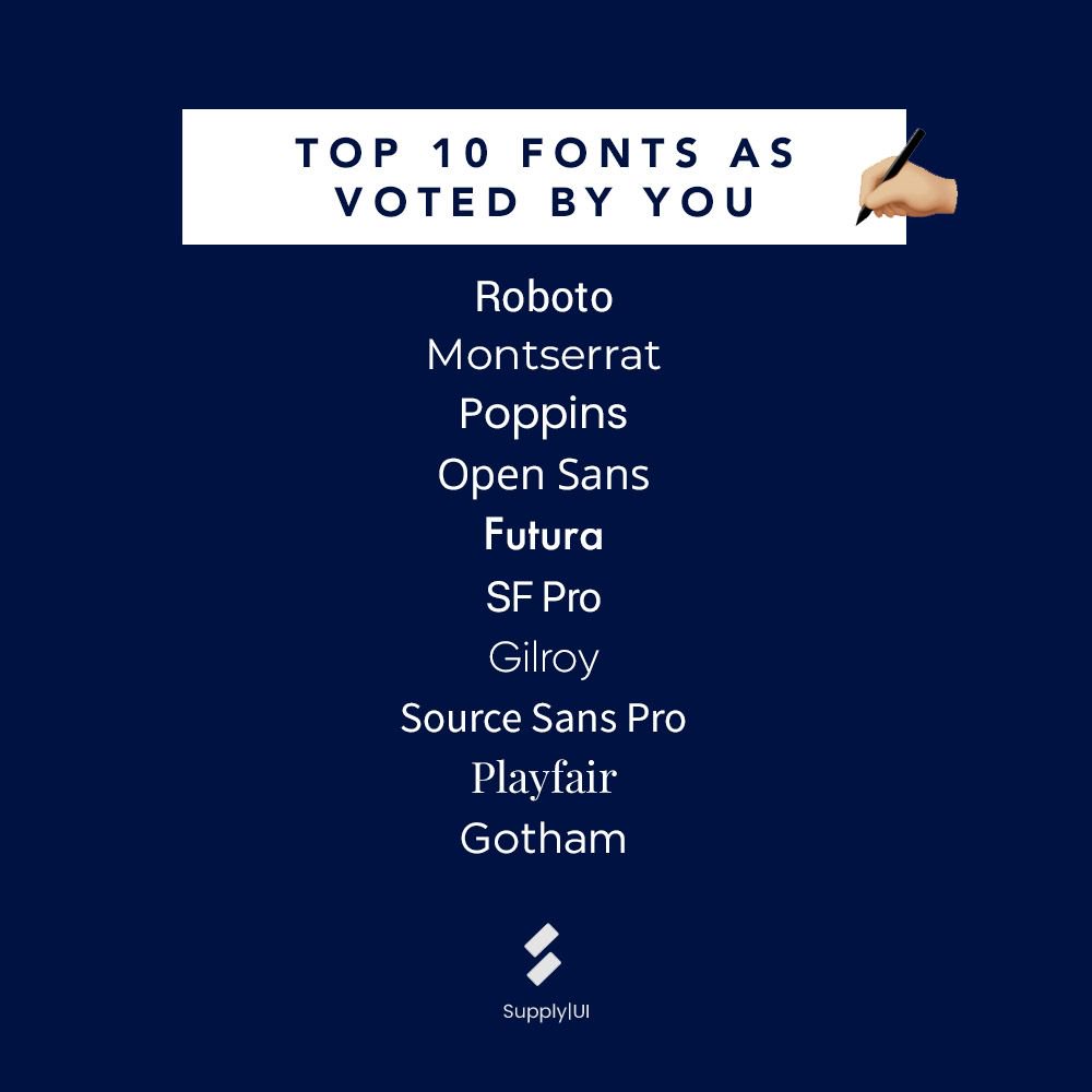
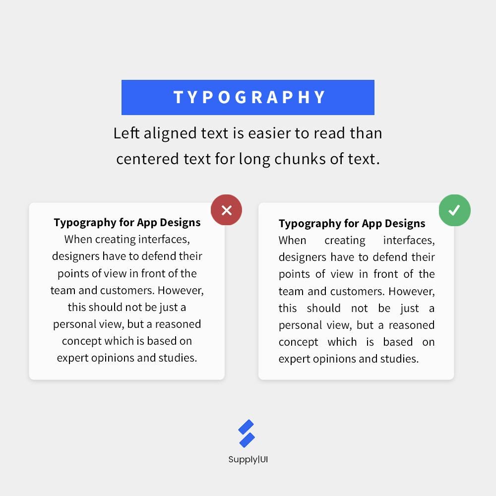
Styling text is not just about choosing the best font type. You will also need to adjust the font weight and color according to the importance of the information presented. Create a focal point in your design by making your primary information pop.
#ui#ux#uiux#uidesign
Unhappy users may make the loudest noise but listen to them as much as possible. They provide such valuable feedback that you can use to improve ideas, functionalities and more! Always keep an open mind.
#ui#ux#uiux#uidesign#uxdesign#designinspiration#designthinking
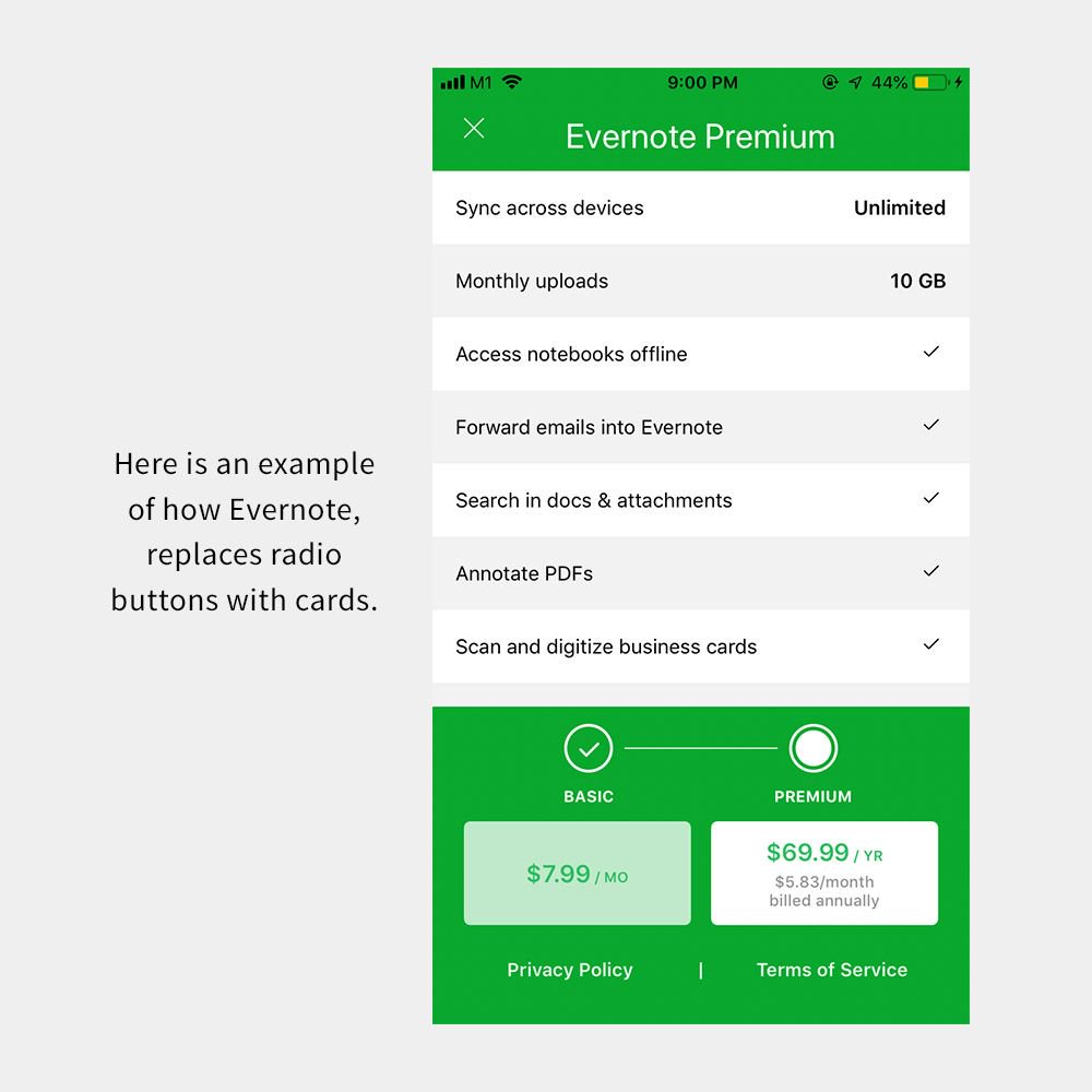
An example of how you can present radio buttons instead of the traditional list style. Selectable cards are also great for mobile and accessibility. However, do note that not all radio buttons can be redesigned into cards.
#ui#ux#uiux#uidesign#uxdesign
White space is integral in cleaning up designs and giving each element a little space to breathe. 🌬Swipe to see how Anchor achieves that effect and congratulations to them on getting acquired by Spotify!
#ui#ux#uiux#uidesign#uxdesign#interactiondesign#uiinspiration
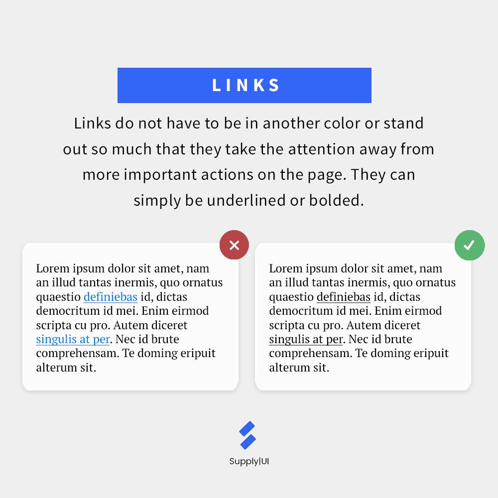
When links are in their 'standard' design (blue and underlined), they might take away attention from other important words or actions in the page. Try emphasizing links in a more subtle way by either underlining or bolding it.
#uidesign#uxdesign#uiinspiration#mobiledesign
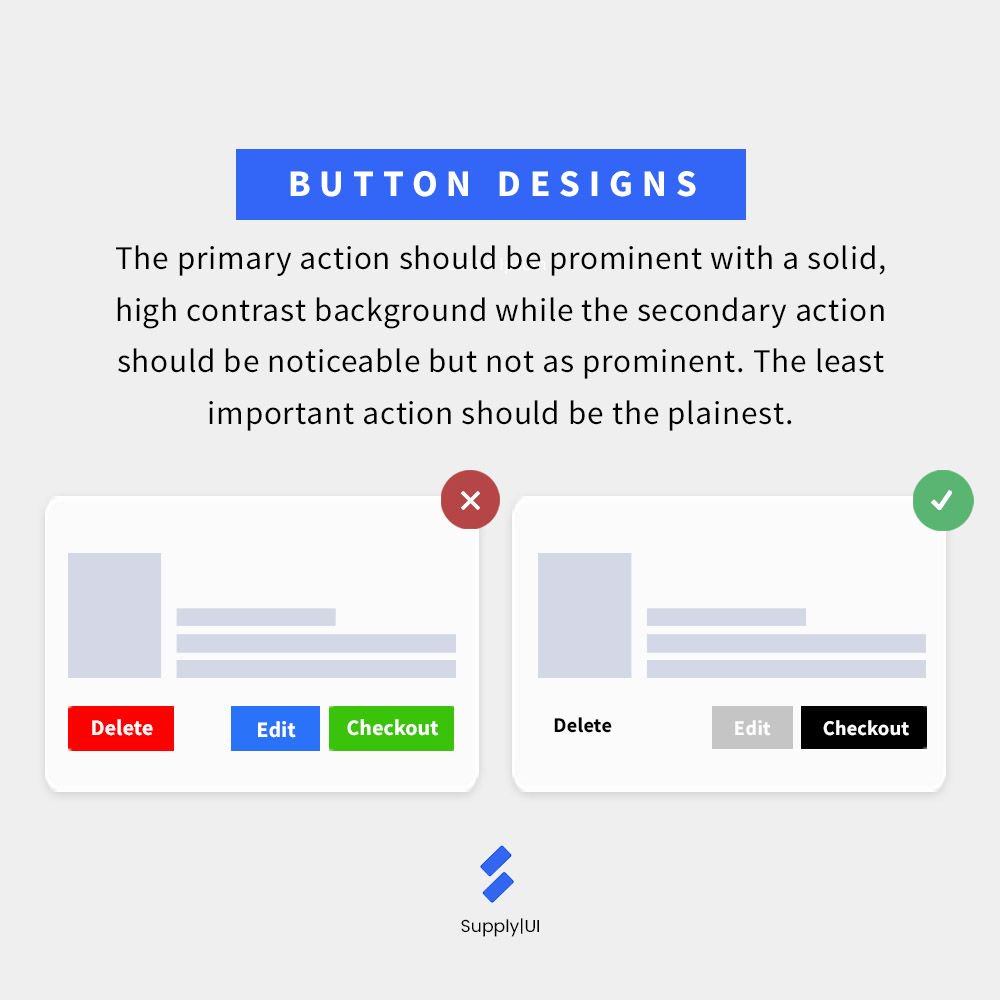
When designing buttons, it is important to rank them according to their significance. The most important action should stand out while the least important action should be easy to find but not obvious.
#ui#ux#uiux#designinspiration#designthinking