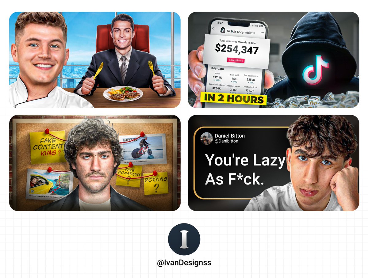
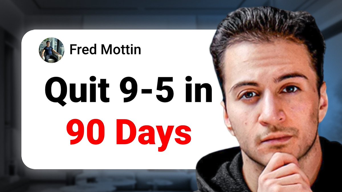
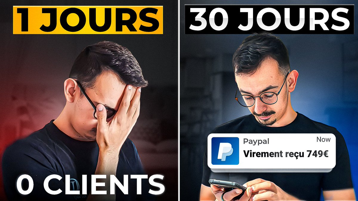
Before/After Thumbnail
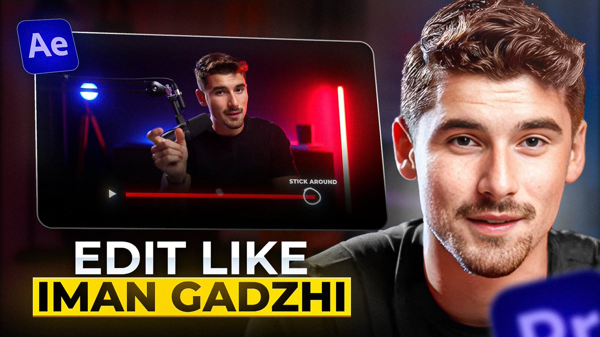
Title: I Built the Free Version of Iman Gadzhi's $1,995 System (So You Don't Have To Pay It)
What do you think? Feedbacks are appreciated
@kaify_co It's unsubstantiated to claim that you have created the style without having justified it in your post. How can I even believe it? I think it may be better if you had some proof instead of a screenshot of a paypal transaction with no context for why it matters.
@theJosephBlaze While you can identify an Iphone quite easily from it's design, but still it makes it a little harder. Most people don't about a new camera, they care about the new product of Apple, MrWhoseTheBoss's thumbnail has that, it clearly shows that it's a Apple phone.
@shaheerkreates@HoussamDesigner "completely?" I don't think so, the lighting and the details can make the face looks different, I do find that AI always leaves a signature behind, when it upscales images, there is something that just feels ai-ish. But still it doesn't count as a "completely" "different" person.
@MohackerFtw And simplicity is always better. if you had changed the background and text colors, the thumbnail would have more colors, making it harder to stand out. However, since the color isn't too bright, it doesn't distract the viewer's eye from the main focus, which is the horse.
@MohackerFtw The first thing to note is that the horse really stands out against the background and the text, which are white and black. The text creates a curiosity gap that encourages viewers to click.