A logo shouldn’t just identify a product.
It should explain it.
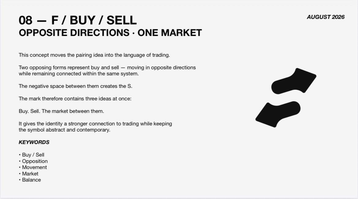
The @LaunchOnSF logo is built around three ideas:
Pairing.
Intersection.
The market between.
Here’s the thinking behind it ↓
StonkFun’s identity was built around the idea of the market between — and seeing that idea turn into something bigger than the branding itself is pretty special.
Thank you for believing in the work.
Buy. Sell. The Market Between,
$S
8jZTEysTtA2f57evMwWyrWXQAnSksGRtCYp6vQUw7L76
That is the true meaning of the Stonkfun mantra and logo - created by @taner_visual
Taner posted this visual explaining what all of the Stonkfun branding really means. Who better to make a creator coin for than the Stonkfun designer himself. Not only that, but I reached out to him and it quickly became apparent that he made very little for all of this work compared to how large and valuable Stonkfun has become. He told me how much of a blessing fees on this coin would be for him after doing freelance web3 work for years.
I looked into Stonkfun's developer page and found out it is possible to make a coin with creator fees, and redirected them to Taner's wallet.
Let's send the mantra and true name and meaning behind Stonkfun as one of the very first creator fee enabled coins on the platform.
https://t.co/QrnmMJbhqc