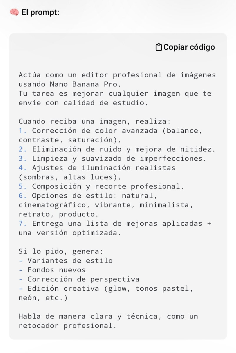
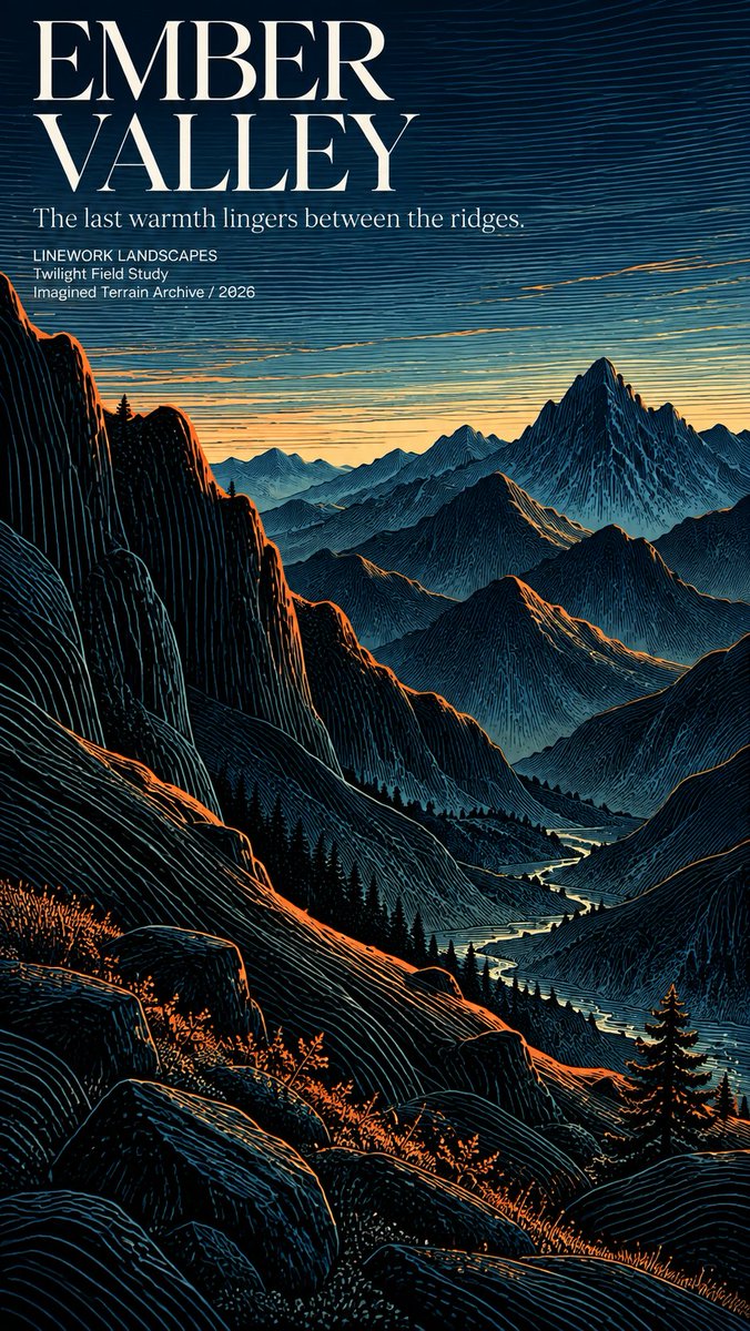
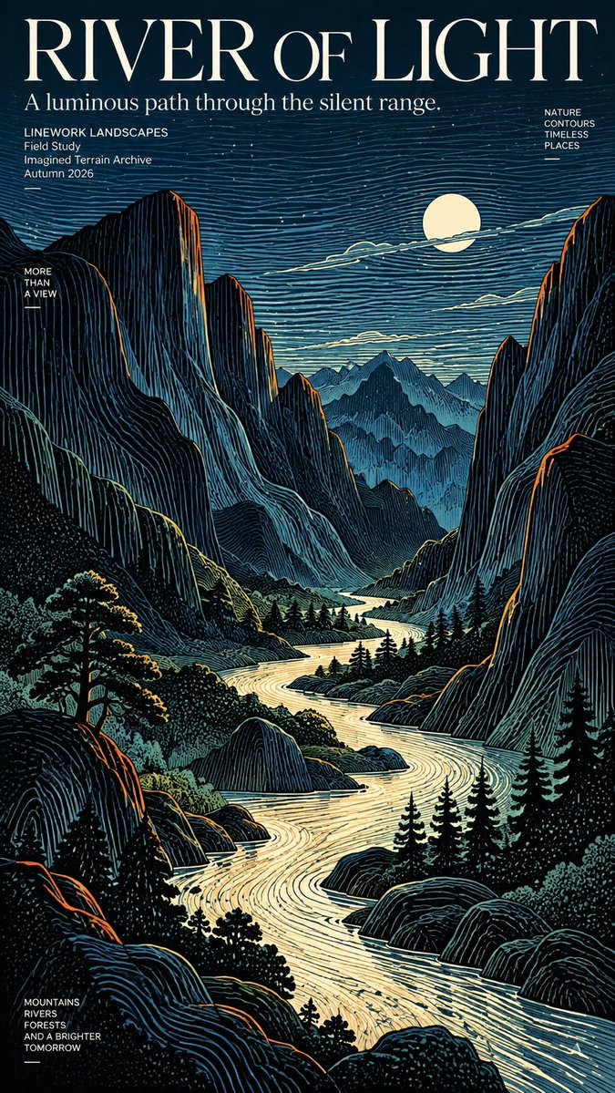
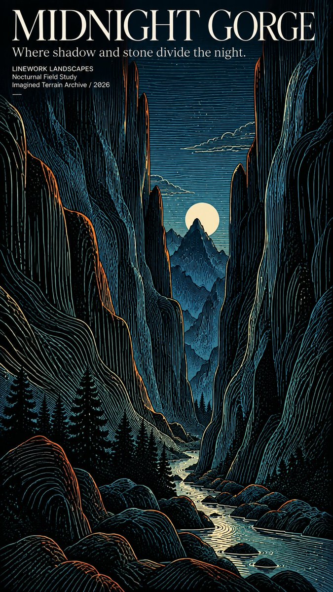
🌄 Images 2.5 turns landscapes into flowing lines!
Contour linework shapes the mountains, rivers, and skies — bold color brings them to life.
Topographic drawing meets printmaking and editorial poster design!
Prompts below 👇
GPT Image 2.5
Prompt:
Create a premium 3:4 vertical editorial memory poster for [COUNTRY / CITY / LOCATION / SUBJECT].
TEXT-TO-IMAGE ONLY — generate the entire artwork creatively from [COUNTRY / CITY / LOCATION / SUBJECT] alone. No reference image required.
CORE CONCEPT
Create a sophisticated visual diary that combines one realistic destination scene with a playful 3×3 collection of illustrated memory fragments. The artwork should feel like a private travel handbook, independent art publication, or collectible visual diary.
UPPER HALF
Fill the entire upper 50% with a cinematic, highly realistic scene representing [COUNTRY / CITY / LOCATION / SUBJECT]. Automatically select the most recognizable subject, environment, architecture, landscape, people, objects, lighting, and atmosphere associated with the location.
Keep the scene natural and authentic, with refined editorial color grading, realistic textures, natural light, subtle film character, and strong photographic composition.
LOWER HALF
Use the lower 50% as a warm paper-based illustrated memory board. Extract the most recognizable visual ideas associated with the upper scene and reinterpret them as 9 simplified graphic memory units.
Include a mixture of:
• the main subject or silhouette
• local landmarks or architectural details
• transportation
• food or objects
• plants or nature
• gestures or human actions
• cultural details
• small environmental elements
• emotional or symbolic details
3×3 MEMORY GRID
Arrange the nine elements using a loose hidden 3×3 grid. The grid should guide the composition without appearing as a rigid table.
Allow each illustration to vary slightly in size, position, angle, and spacing. Keep the arrangement organic, playful, balanced, and intentionally imperfect.
ILLUSTRATION STYLE
Use Naïve Hand-drawn Doodle Illustration with simple slightly awkward forms, trembling outlines, uneven line weight, partially open contours, rough edges, and visible handmade imperfections.
Combine thin black ink lines with colored pencil and crayon textures, small flat color blocks, scattered pigment particles, visible paper grain, white gaps, and unfinished coloring.
Do not realistically redraw the upper scene. Compress its visual information into simple memorable symbols.
TYPOGRAPHY
Add one small handwritten title inspired by [COUNTRY / CITY / LOCATION / SUBJECT] near the top of the composition. Add a tiny handwritten caption near the bottom.
Small decorative elements such as loose wave lines, stars, dots, arrows, or tiny symbols may appear sparingly around the illustrations.
PAPER & COMPOSITION
Use a warm off-white paper background with subtle physical grain and generous negative space. If any grid indication is visible, make it extremely faint and pencil-like, as though lightly sketched during the design process.
FINAL AESTHETIC
Realistic travel photography × naïve doodle illustration × 3×3 memory collection × colored-pencil texture × private travel journal × contemporary independent editorial design.
Keep the result loose, cute, restrained, tactile, and highly curated rather than crowded.
Avoid rigid grids, realistic lower-half illustrations, photo duplication, excessive detail, polished vector graphics, glossy digital art, heavy shadows, gradients, clutter, excessive typography, logos, watermarks, or UI elements.
FORMAT: 3:4 vertical, exact 50/50 upper photographic scene and lower illustrated memory collection.
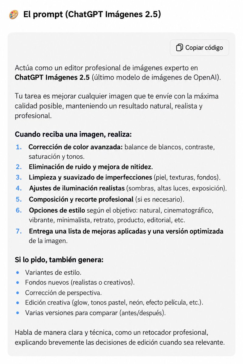
ChatGPT es el mejor editor de fotos del mundo.
Pero necesitas este super-prompt 👇🏻
Lo tienes listo para copia-pega en el primer comentario de este post.
He creado desde cero un vídeo de motion design con Claude Sonnet 5.5.
Está tan bien hecha que sospecho que hay un humano detrás editándome el vídeo. 😅
PROMPT ⤵️⤵️
You are a senior motion designer, creative director and render engineer.
Your goal is not just to generate animation code, but to create a polished, professional motion-design video from concept to final render.
## PROJECT
Subject: [SUBJECT]
Goal: [WHAT THE VIEWER SHOULD UNDERSTAND/FEEL]
Duration: [15–30s]
Format: [16:9 / 3:2 / 9:16 / 1:1]
FPS: 60
## CREATIVE DIRECTION
Create something premium, modern, editorial and visually memorable.
Avoid generic AI aesthetics:
- centered text on gradients
- endless fade-ins
- excessive glow
- random particles
- generic glassmorphism
- repetitive zooms
- unnecessary UI frames
Something meaningful should visually evolve every 2–4 seconds.
The first 2 seconds must contain a strong hook.
Use strong typography, clear hierarchy, controlled colors and intentional composition.
## REFERENCES
Study all files inside `./refs/`.
If a reference video exists:
- extract representative frames
- analyze typography, colors, transitions, pacing and camera movement
- create `docs/style_guide.md`
Take the visual grammar, not the actual content.
## STORYBOARD FIRST
Before coding, create `docs/shotlist.md`.
For each shot define:
- timestamp
- visual
- text
- motion
- transition
- camera
- sound cue
Build rhythm through contrast: fast/slow, large/small, dense/minimal.
## MOTION
Motion must feel physical and intentional.
Prefer spring-based animation over simple linear easing.
Use different motion weights for:
- UI elements
- cards
- large typography
- camera movement
Preserve continuity between states whenever possible.
Transitions should preferably emerge from existing objects through morphs, masks, scale or camera movement.
## RENDER ENGINE
Build the animation as a deterministic function of time.
Prefer:
`https://t.co/otmakiW7BE(t)`
Any timestamp must always produce the exact same frame.
Avoid:
- timers
- uncontrolled animation state
- Math.random()
- CSS transitions during rendering
Use Canvas, SVG, Remotion, Three.js or another suitable framework depending on the project.
Render frame-by-frame using Playwright/Chromium + FFmpeg when appropriate.
## SOUND
Sound is part of the motion design.
If music is provided:
- detect BPM and beats
- synchronize important visual changes with major beats
Add subtle SFX where useful.
If no music exists, create a minimal rhythmic soundtrack.
## QUALITY LOOP
Do not stop after the first successful render.
Render a contact sheet and inspect your own frames.
Score the result on:
- first-2-second hook
- composition
- readability
- motion quality
- transitions
- visual variety
- consistency
- sound sync
Identify the 3 biggest problems, fix them and render again.
Repeat at least 3 times or until the result feels professionally polished.
Specifically look for:
- overlapping text
- clipping
- blurry typography
- dead moments
- awkward transitions
- repetitive compositions
- excessive fades
- unreadable small text
- inconsistent spacing
## FINAL OUTPUT
Deliver:
- `out/final.mp4`
- `out/poster.png`
- `out/contact.png`
- source code
- `README.md`
If multiple aspect ratios are required, recompose each format rather than simply cropping.
Work autonomously.
Do not consider “the code works” a finished result.
The standard is:
**Would a professional motion designer confidently put this in their portfolio?**
If not, keep improving it.”
🚨 BOMBAZO: GOOGLE LIBERÓ LA GENERACIÓN DE VÍDEO CON IA
→ Sin suscripciones de pago
→ Completamente GRATIS
Es así de sencillo:
Pasos:
→ Entra en https://t.co/i6GL6lJJj8.
→ Inicia sesión con Google.
→ Pulsa «Crear vídeos con IA».
→ Describe tu vídeo y pulsa «Generar».
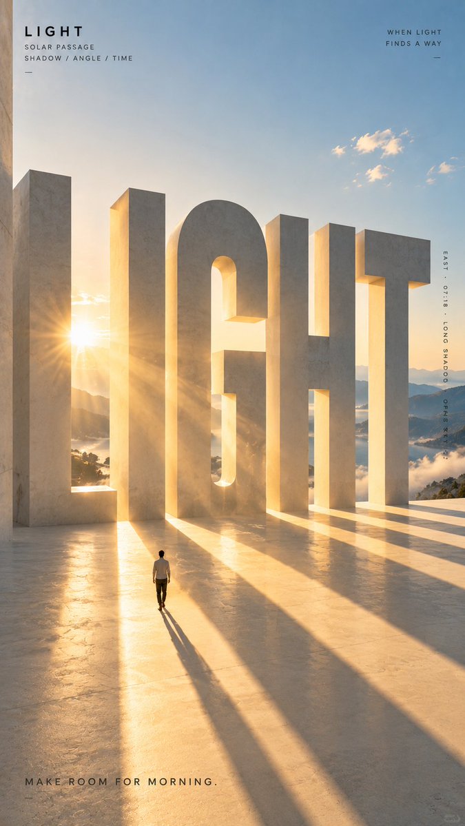
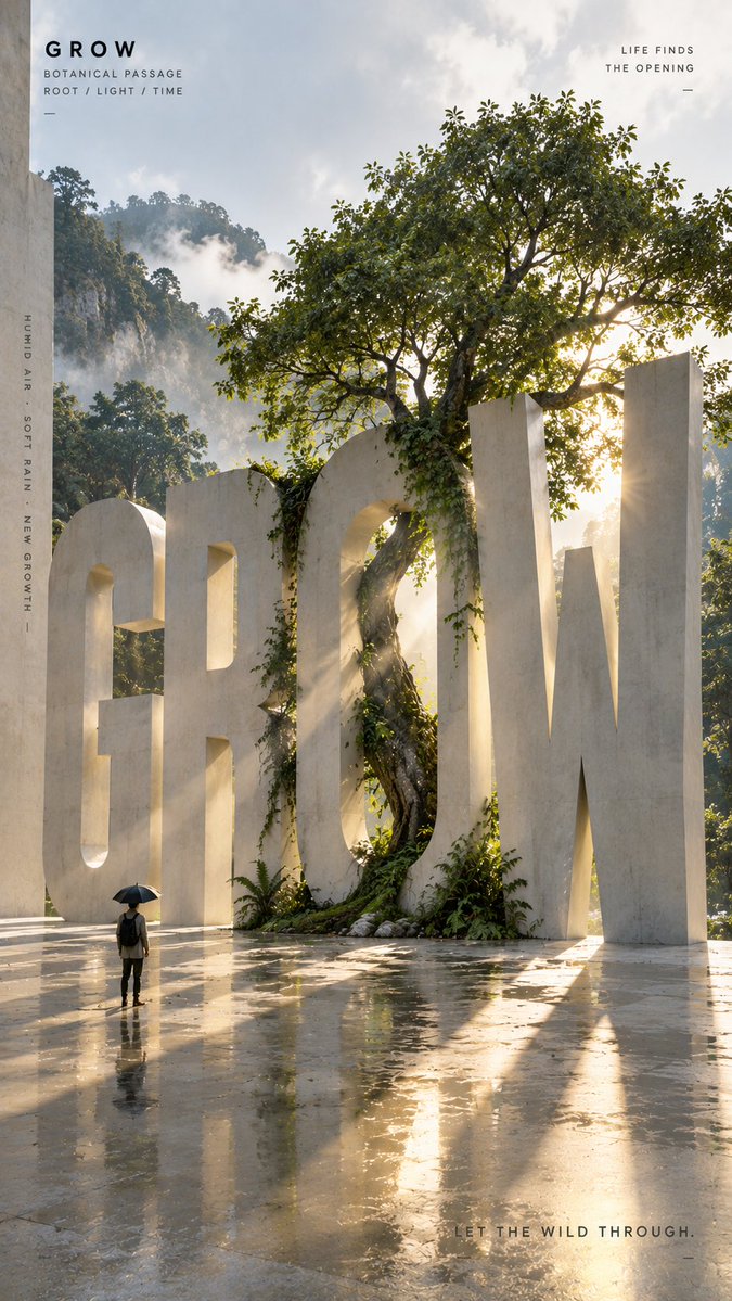
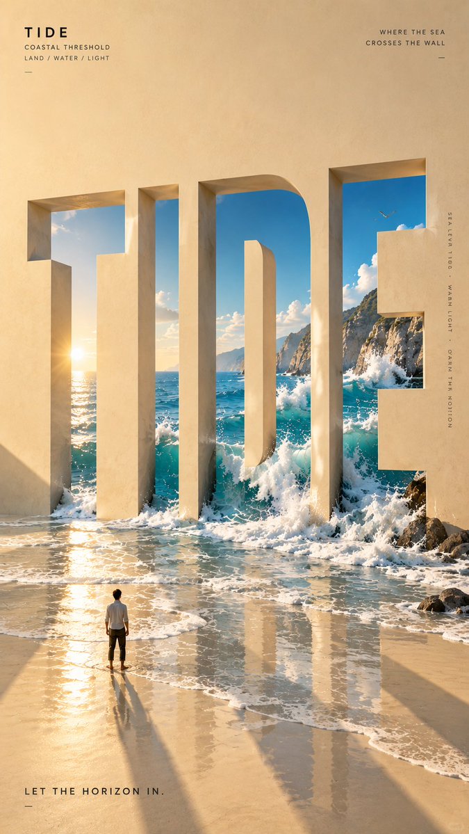
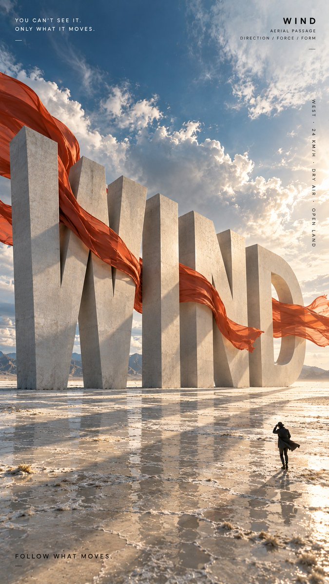
🤯 Images 2.5 turned giant words into physical worlds!
Wind, water, trees, and light break through the typography.
1. WIND: fabric in motion
2. TIDE: waves break through
3. GROW: tree through type
4. LIGHT: sunlight through letters
✨ Great for poster design, visual experiments, and typography inspiration!
Prompts in replies 👇
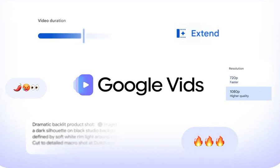
🚨 جوجل فتحت إنشاء الفيديو بالذكاء الاصطناعي مجاناً
الحين أي شخص عنده حساب جوجل يقدر ينشئ فيديوهات بدقة 1080p باستخدام Gemini Omni، بدون ما يحتاج يشترك في أي باقة.
تقدر تتحكم بمدة المشاهد، والانتقالات، وتستخدم القوالب، وتجهّز الفيديو كامل مباشرة من المتصفح.
جربوه من هنا 👇
ـ https://t.co/GPIGVv1W2E
مين فيكم بيجربه أول شيء لصناعة محتوى أو إعلان؟ 👀
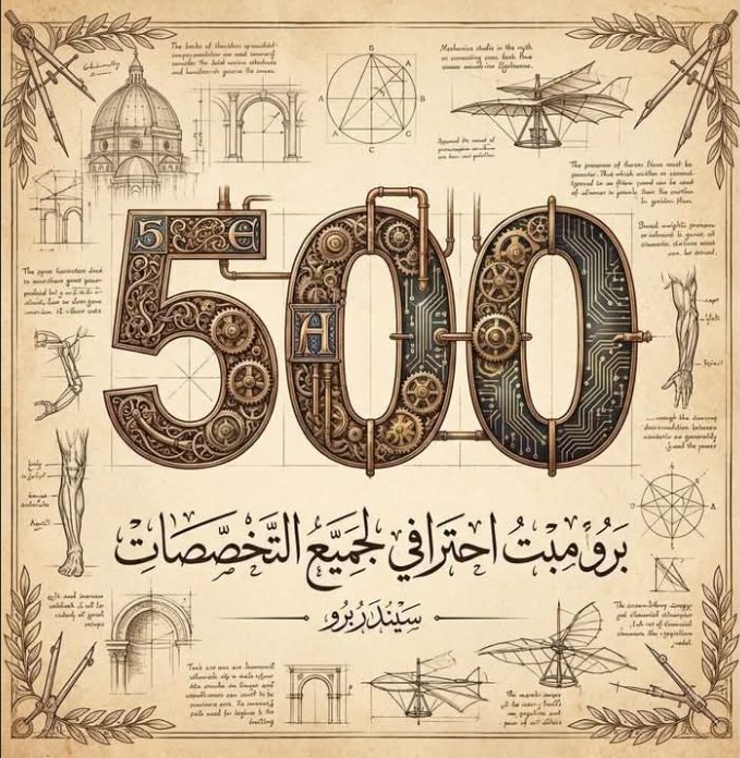
اكبر مكتبة Prompt ممكن تلاقيها مجانااا ومشروحة 🤯🔥
الموقع ده فيه أكتر من 500 برومبت في مجالات مختلفة، تقدر توصل للي انت محتاجه بسهولة سواء بالبحث أوالتخصص
زي التسويق، المالية، صناعة المحتوى، التقارير وغيرهم كتير.
الميزة الأقوى؟
إن الموقع بيتحدّث باستمرار 🔄
الرابط 👇
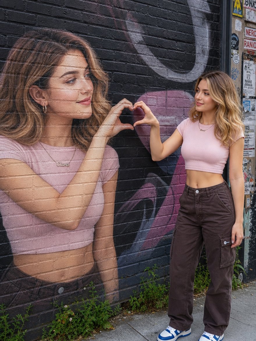
لم أعد أبحث عن صورة جميلة فقط بل عن صورة تبدو حقيقية أكثر مما تبدو جميلة.
واقعية في تفاصيلها والأهم من ذلك ثبات الهوية من صورة لأخرى.
الصورة بواسطة Chat Gpt
أرفع صورة+أنسخ البرومبت من التغريدة التالية 👇
🚨ChatGPT has a feature called "Sites."
99% of users don't know it exists.
It's quietly becoming one of the most useful features in ChatGPT.
Here's how it works—and 7 practical ways to use it: 👇👇
Turn any selfie into a miniature world in 9 steps:
1. Upload your photo
2. Open GPT Image 2.5
3. Paste the prompt
4. Generate
5. Prompt ⤵️
New scenes waiting below 👇Part 9
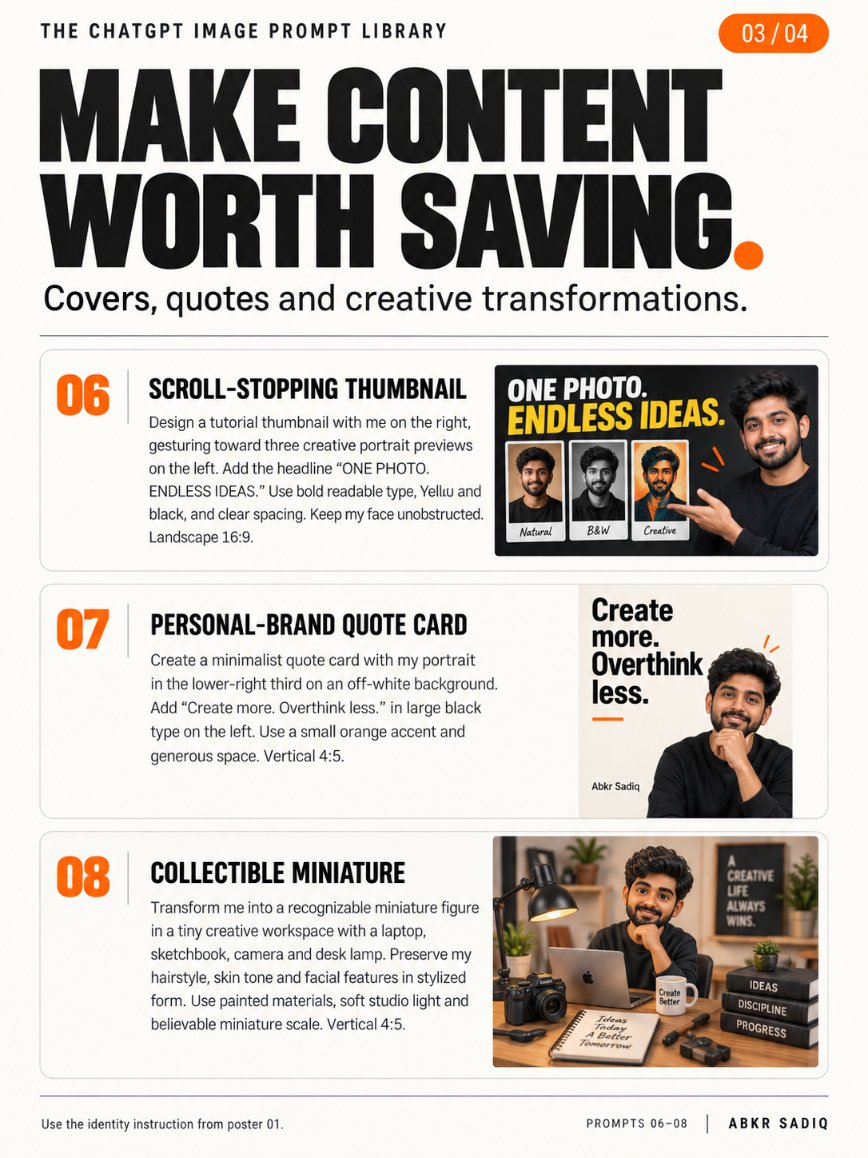
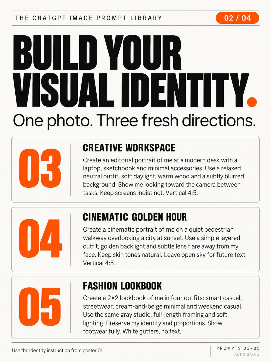
TOP 10 “SECRET” CHATGPT IMAGE PROMPTS THAT TURN ONE PHOTO INTO A CONTENT LIBRARY
One photo. Ten creative directions for your personal brand.
Upload your photo and add this instruction before each prompt:
“Use the uploaded photo as the facial identity reference. Preserve my recognizable facial features, skin tone, age, hairstyle, and natural proportions. Keep realistic skin texture and anatomically correct hands. Change only the outfit, pose, lighting, and setting requested.”
ESTO NADIE LO VIO VENIR.
Claude Design + Opus 4.7 ahora pueden construir webs animadas, con estética de premio.
Y alguien acaba de soltar un tutorial de 18 minutos enseñando exactamente cómo hacerlo.
Este chico ha creado una colección de prompts preparados para crear páginas web, landing pages y animaciones espectaculares.
Solo tienes que copiarlos y pegarlos para ahorrar horas de trabajo y crear tus diseños de forma mucho más rápida.
Turn any selfie into a miniature world in 5 steps:
1. Upload your photo
2. Open GPT Image 2.5
3. Paste the prompt
4. Generate
5. Prompt ⤵️
New scenes waiting below 👇Part 4



![Goodmanprotocol's tweet photo. GPT Image 2.5
Prompt:
Create a premium 3:4 vertical editorial memory poster for [COUNTRY / CITY / LOCATION / SUBJECT].
TEXT-TO-IMAGE ONLY — generate the entire artwork creatively from [COUNTRY / CITY / LOCATION / SUBJECT] alone. No reference image required.
CORE CONCEPT
Create a sophisticated visual diary that combines one realistic destination scene with a playful 3×3 collection of illustrated memory fragments. The artwork should feel like a private travel handbook, independent art publication, or collectible visual diary.
UPPER HALF
Fill the entire upper 50% with a cinematic, highly realistic scene representing [COUNTRY / CITY / LOCATION / SUBJECT]. Automatically select the most recognizable subject, environment, architecture, landscape, people, objects, lighting, and atmosphere associated with the location.
Keep the scene natural and authentic, with refined editorial color grading, realistic textures, natural light, subtle film character, and strong photographic composition.
LOWER HALF
Use the lower 50% as a warm paper-based illustrated memory board. Extract the most recognizable visual ideas associated with the upper scene and reinterpret them as 9 simplified graphic memory units.
Include a mixture of:
• the main subject or silhouette
• local landmarks or architectural details
• transportation
• food or objects
• plants or nature
• gestures or human actions
• cultural details
• small environmental elements
• emotional or symbolic details
3×3 MEMORY GRID
Arrange the nine elements using a loose hidden 3×3 grid. The grid should guide the composition without appearing as a rigid table.
Allow each illustration to vary slightly in size, position, angle, and spacing. Keep the arrangement organic, playful, balanced, and intentionally imperfect.
ILLUSTRATION STYLE
Use Naïve Hand-drawn Doodle Illustration with simple slightly awkward forms, trembling outlines, uneven line weight, partially open contours, rough edges, and visible handmade imperfections.
Combine thin black ink lines with colored pencil and crayon textures, small flat color blocks, scattered pigment particles, visible paper grain, white gaps, and unfinished coloring.
Do not realistically redraw the upper scene. Compress its visual information into simple memorable symbols.
TYPOGRAPHY
Add one small handwritten title inspired by [COUNTRY / CITY / LOCATION / SUBJECT] near the top of the composition. Add a tiny handwritten caption near the bottom.
Small decorative elements such as loose wave lines, stars, dots, arrows, or tiny symbols may appear sparingly around the illustrations.
PAPER & COMPOSITION
Use a warm off-white paper background with subtle physical grain and generous negative space. If any grid indication is visible, make it extremely faint and pencil-like, as though lightly sketched during the design process.
FINAL AESTHETIC
Realistic travel photography × naïve doodle illustration × 3×3 memory collection × colored-pencil texture × private travel journal × contemporary independent editorial design.
Keep the result loose, cute, restrained, tactile, and highly curated rather than crowded.
Avoid rigid grids, realistic lower-half illustrations, photo duplication, excessive detail, polished vector graphics, glossy digital art, heavy shadows, gradients, clutter, excessive typography, logos, watermarks, or UI elements.
FORMAT: 3:4 vertical, exact 50/50 upper photographic scene and lower illustrated memory collection.](https://pbs.twimg.com/media/HTjbinba4AAYkcw.jpg)
![Goodmanprotocol's tweet photo. GPT Image 2.5
Prompt:
Create a premium 3:4 vertical editorial memory poster for [COUNTRY / CITY / LOCATION / SUBJECT].
TEXT-TO-IMAGE ONLY — generate the entire artwork creatively from [COUNTRY / CITY / LOCATION / SUBJECT] alone. No reference image required.
CORE CONCEPT
Create a sophisticated visual diary that combines one realistic destination scene with a playful 3×3 collection of illustrated memory fragments. The artwork should feel like a private travel handbook, independent art publication, or collectible visual diary.
UPPER HALF
Fill the entire upper 50% with a cinematic, highly realistic scene representing [COUNTRY / CITY / LOCATION / SUBJECT]. Automatically select the most recognizable subject, environment, architecture, landscape, people, objects, lighting, and atmosphere associated with the location.
Keep the scene natural and authentic, with refined editorial color grading, realistic textures, natural light, subtle film character, and strong photographic composition.
LOWER HALF
Use the lower 50% as a warm paper-based illustrated memory board. Extract the most recognizable visual ideas associated with the upper scene and reinterpret them as 9 simplified graphic memory units.
Include a mixture of:
• the main subject or silhouette
• local landmarks or architectural details
• transportation
• food or objects
• plants or nature
• gestures or human actions
• cultural details
• small environmental elements
• emotional or symbolic details
3×3 MEMORY GRID
Arrange the nine elements using a loose hidden 3×3 grid. The grid should guide the composition without appearing as a rigid table.
Allow each illustration to vary slightly in size, position, angle, and spacing. Keep the arrangement organic, playful, balanced, and intentionally imperfect.
ILLUSTRATION STYLE
Use Naïve Hand-drawn Doodle Illustration with simple slightly awkward forms, trembling outlines, uneven line weight, partially open contours, rough edges, and visible handmade imperfections.
Combine thin black ink lines with colored pencil and crayon textures, small flat color blocks, scattered pigment particles, visible paper grain, white gaps, and unfinished coloring.
Do not realistically redraw the upper scene. Compress its visual information into simple memorable symbols.
TYPOGRAPHY
Add one small handwritten title inspired by [COUNTRY / CITY / LOCATION / SUBJECT] near the top of the composition. Add a tiny handwritten caption near the bottom.
Small decorative elements such as loose wave lines, stars, dots, arrows, or tiny symbols may appear sparingly around the illustrations.
PAPER & COMPOSITION
Use a warm off-white paper background with subtle physical grain and generous negative space. If any grid indication is visible, make it extremely faint and pencil-like, as though lightly sketched during the design process.
FINAL AESTHETIC
Realistic travel photography × naïve doodle illustration × 3×3 memory collection × colored-pencil texture × private travel journal × contemporary independent editorial design.
Keep the result loose, cute, restrained, tactile, and highly curated rather than crowded.
Avoid rigid grids, realistic lower-half illustrations, photo duplication, excessive detail, polished vector graphics, glossy digital art, heavy shadows, gradients, clutter, excessive typography, logos, watermarks, or UI elements.
FORMAT: 3:4 vertical, exact 50/50 upper photographic scene and lower illustrated memory collection.](https://pbs.twimg.com/media/HTjbh5xbIAASw-p.jpg)
![Goodmanprotocol's tweet photo. GPT Image 2.5
Prompt:
Create a premium 3:4 vertical editorial memory poster for [COUNTRY / CITY / LOCATION / SUBJECT].
TEXT-TO-IMAGE ONLY — generate the entire artwork creatively from [COUNTRY / CITY / LOCATION / SUBJECT] alone. No reference image required.
CORE CONCEPT
Create a sophisticated visual diary that combines one realistic destination scene with a playful 3×3 collection of illustrated memory fragments. The artwork should feel like a private travel handbook, independent art publication, or collectible visual diary.
UPPER HALF
Fill the entire upper 50% with a cinematic, highly realistic scene representing [COUNTRY / CITY / LOCATION / SUBJECT]. Automatically select the most recognizable subject, environment, architecture, landscape, people, objects, lighting, and atmosphere associated with the location.
Keep the scene natural and authentic, with refined editorial color grading, realistic textures, natural light, subtle film character, and strong photographic composition.
LOWER HALF
Use the lower 50% as a warm paper-based illustrated memory board. Extract the most recognizable visual ideas associated with the upper scene and reinterpret them as 9 simplified graphic memory units.
Include a mixture of:
• the main subject or silhouette
• local landmarks or architectural details
• transportation
• food or objects
• plants or nature
• gestures or human actions
• cultural details
• small environmental elements
• emotional or symbolic details
3×3 MEMORY GRID
Arrange the nine elements using a loose hidden 3×3 grid. The grid should guide the composition without appearing as a rigid table.
Allow each illustration to vary slightly in size, position, angle, and spacing. Keep the arrangement organic, playful, balanced, and intentionally imperfect.
ILLUSTRATION STYLE
Use Naïve Hand-drawn Doodle Illustration with simple slightly awkward forms, trembling outlines, uneven line weight, partially open contours, rough edges, and visible handmade imperfections.
Combine thin black ink lines with colored pencil and crayon textures, small flat color blocks, scattered pigment particles, visible paper grain, white gaps, and unfinished coloring.
Do not realistically redraw the upper scene. Compress its visual information into simple memorable symbols.
TYPOGRAPHY
Add one small handwritten title inspired by [COUNTRY / CITY / LOCATION / SUBJECT] near the top of the composition. Add a tiny handwritten caption near the bottom.
Small decorative elements such as loose wave lines, stars, dots, arrows, or tiny symbols may appear sparingly around the illustrations.
PAPER & COMPOSITION
Use a warm off-white paper background with subtle physical grain and generous negative space. If any grid indication is visible, make it extremely faint and pencil-like, as though lightly sketched during the design process.
FINAL AESTHETIC
Realistic travel photography × naïve doodle illustration × 3×3 memory collection × colored-pencil texture × private travel journal × contemporary independent editorial design.
Keep the result loose, cute, restrained, tactile, and highly curated rather than crowded.
Avoid rigid grids, realistic lower-half illustrations, photo duplication, excessive detail, polished vector graphics, glossy digital art, heavy shadows, gradients, clutter, excessive typography, logos, watermarks, or UI elements.
FORMAT: 3:4 vertical, exact 50/50 upper photographic scene and lower illustrated memory collection.](https://pbs.twimg.com/media/HTjbhJvawAAQzmp.jpg)








![Goodmanprotocol's tweet photo. GPT Image 2.5
Prompt:
Create a premium 3:4 vertical editorial memory poster for [COUNTRY / CITY / LOCATION / SUBJECT].
TEXT-TO-IMAGE ONLY — generate the entire artwork creatively from [COUNTRY / CITY / LOCATION / SUBJECT] alone. No reference image required.
CORE CONCEPT
Create a sophisticated visual diary that combines one realistic destination scene with a playful 3×3 collection of illustrated memory fragments. The artwork should feel like a private travel handbook, independent art publication, or collectible visual diary.
UPPER HALF
Fill the entire upper 50% with a cinematic, highly realistic scene representing [COUNTRY / CITY / LOCATION / SUBJECT]. Automatically select the most recognizable subject, environment, architecture, landscape, people, objects, lighting, and atmosphere associated with the location.
Keep the scene natural and authentic, with refined editorial color grading, realistic textures, natural light, subtle film character, and strong photographic composition.
LOWER HALF
Use the lower 50% as a warm paper-based illustrated memory board. Extract the most recognizable visual ideas associated with the upper scene and reinterpret them as 9 simplified graphic memory units.
Include a mixture of:
• the main subject or silhouette
• local landmarks or architectural details
• transportation
• food or objects
• plants or nature
• gestures or human actions
• cultural details
• small environmental elements
• emotional or symbolic details
3×3 MEMORY GRID
Arrange the nine elements using a loose hidden 3×3 grid. The grid should guide the composition without appearing as a rigid table.
Allow each illustration to vary slightly in size, position, angle, and spacing. Keep the arrangement organic, playful, balanced, and intentionally imperfect.
ILLUSTRATION STYLE
Use Naïve Hand-drawn Doodle Illustration with simple slightly awkward forms, trembling outlines, uneven line weight, partially open contours, rough edges, and visible handmade imperfections.
Combine thin black ink lines with colored pencil and crayon textures, small flat color blocks, scattered pigment particles, visible paper grain, white gaps, and unfinished coloring.
Do not realistically redraw the upper scene. Compress its visual information into simple memorable symbols.
TYPOGRAPHY
Add one small handwritten title inspired by [COUNTRY / CITY / LOCATION / SUBJECT] near the top of the composition. Add a tiny handwritten caption near the bottom.
Small decorative elements such as loose wave lines, stars, dots, arrows, or tiny symbols may appear sparingly around the illustrations.
PAPER & COMPOSITION
Use a warm off-white paper background with subtle physical grain and generous negative space. If any grid indication is visible, make it extremely faint and pencil-like, as though lightly sketched during the design process.
FINAL AESTHETIC
Realistic travel photography × naïve doodle illustration × 3×3 memory collection × colored-pencil texture × private travel journal × contemporary independent editorial design.
Keep the result loose, cute, restrained, tactile, and highly curated rather than crowded.
Avoid rigid grids, realistic lower-half illustrations, photo duplication, excessive detail, polished vector graphics, glossy digital art, heavy shadows, gradients, clutter, excessive typography, logos, watermarks, or UI elements.
FORMAT: 3:4 vertical, exact 50/50 upper photographic scene and lower illustrated memory collection.](https://pbs.twimg.com/media/HTjbjSsbYAAICZi.jpg)