Frontend Developer | AI Automation Engineer | Individuals, small & large business support | N8n, Zapier & Make | Boosting productivity for teams and individual
Decided to grow my Twitter this year So here is a reintroduction…
Nurudeen here, aka TechieNuru 👋 I’m a software developer (mainly frontend) & AI Automation Engineer. I’ll share projects, real progress updates, and mistakes. If that sounds useful, follow along or say hi. 📷🤝
Your hard work is about to pay off!
3,000+ paid jobs are waiting, but there’s one step left: the Skilladder Assessment.
This is your access point to placements, stipends & mentorship. Complete yours today: https://t.co/vbXJaTNrd7
#3MTT#Skilladder
Want to break into tech?
We have 3,000+ paid roles across 1,000+ verified organisations waiting for you, with a ₦150,000 monthly stipend for a full year.
To claim your spot: Go to https://t.co/gNQ5FB27T2 to get started.
Day 10 of reading Refactoring #UI
1 thing I learnt today:
Just because a button is dangerous doesn’t mean it shld dominate the screen.
If “Delete” isn’t d main action, it shldn’t get d most attention. UI is really abt guiding users toward d right action first
#learningInPublic
Day 9 of reading Refactoring #UI .
Today I learnt that not everything should fight for attention.
Bold text & solid icons can feel too heavy together, so one of them should be softer.
& if something feels too faint, make it thicker, not darker.
#learningInPublic
For beginners in automation, you can start with zapier.
Here is a training that takes you from in beginner to expert in zapier
https://t.co/XeYTVqV8xs
This training can change your Q2🫠🫠
Another day, another free resource!!!
This is a beginner to Expert N8N course .
https://t.co/xQkxo5rvud
Re-share to your timeline, someone might need it to succeed in Q2
See you in the winners circle 🫶❤️
Example: A projects page with the title “Manage your projects” and the project list. The list matters more, not the title. So the title should act like a label, not compete.
Ask yourself, what should the user focus on?
Day 8/48 of reading Refactoring UI: We often follow this rule. H1 big, H2 smaller. Simple, but wrong for UI. Not everything should follow document structure visually. Design based on importance, not HTML tags.
If yes, remove it. If not, combine it. So “Stock: 12” becomes “12 left in stock”. If labels are needed, make them lighter and smaller.
Only emphasize labels when users are scanning for them.
What do you focus on more, label or value?
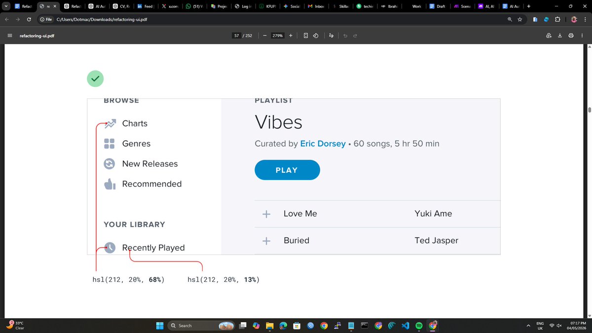
Day 7/48 of reading Refactoring UI: Labelling everything: Name, Email, Price, Stock feels clear, but makes everything look equal. No hierarchy.
Before designing, ask one question. Can the user understand this without a label?
If elements are competing, reduce one. Remove background, soften color, lower contrast. Example: on navbar, make inactive nav links lighter so the active one is clear. The important one stands out naturally.
Have you also read this book? Share your what you learnt
Day 6/48 of reading Refactoring UI: If everything is loud on a page/section, nothing stands out. I used to keep increasing emphasis on one element to solve that. More color, more weight. Sometimes the best way to emphasize is to make everything else quieter. 👇
Another thing: grey text works on white, not on colored backgrounds. It looks dull. Match the hue, adjust lightness. It keeps clarity without losing style.
Have you been doing this wrong too?
Day 5/48 of learning Refactoring UI: Design is not about making things look good. It is about showing what matters first. Focus on hierarchy. Use boldness and color, not just size. Stick to 3 colors: dark for main, grey for secondary, light grey for less important.
@ultimate_kombo Dominating Atletico Madrid for 70+ minutes with a man down ended the debate. Bro was still playing highline with a man down
Flick is Him 🫡