@ashvinmelwani I feel like Claude is better at writing and creativity. It can produce output that feels as close to human as possible.
While Manus is a robust machine that can analyze and research with precision and provide very accurate results, it lacks that "human" element in its writing.
The space under your Add to Cart button is for reducing friction.
Use it to show:
•Free shipping
•Free returns
•Lifetime guarantee
It makes clicking the button feel safer.
And that’s what increases conversions.
High AOV is great – until the price scares people off.
Position your installment messaging right next to the price.
It reframes the cost –
making it feel less painful to pay, and easier to convert.
@adriantheboz Most brands don’t upsell or cross-sell to their visitors.
They don’t show other products throughout the customer journey.
Therefore, they don’t get to increase their AOV. :)
Bundling should boost AOV.
But most brands make it hard to buy the bundle.
Casper doesn’t.
One click adds the full set. No checkboxes. No popups.
→ Bundles aren’t the main product
→ If there’s friction, people skip
Fixing this lifted AOV most of the time in our tests.
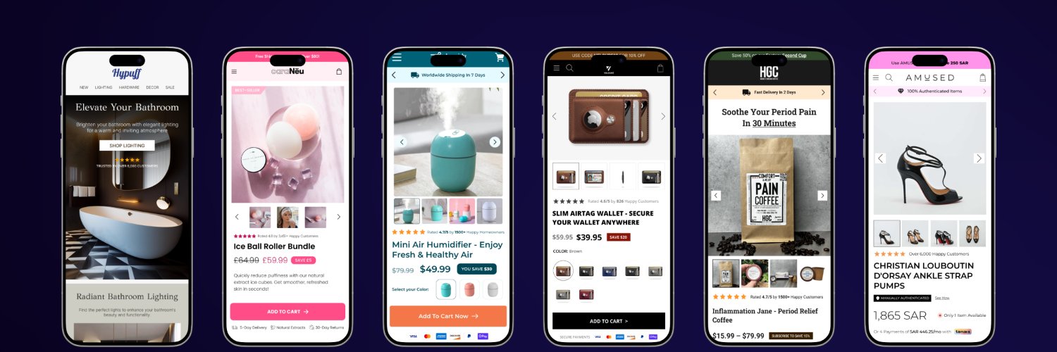
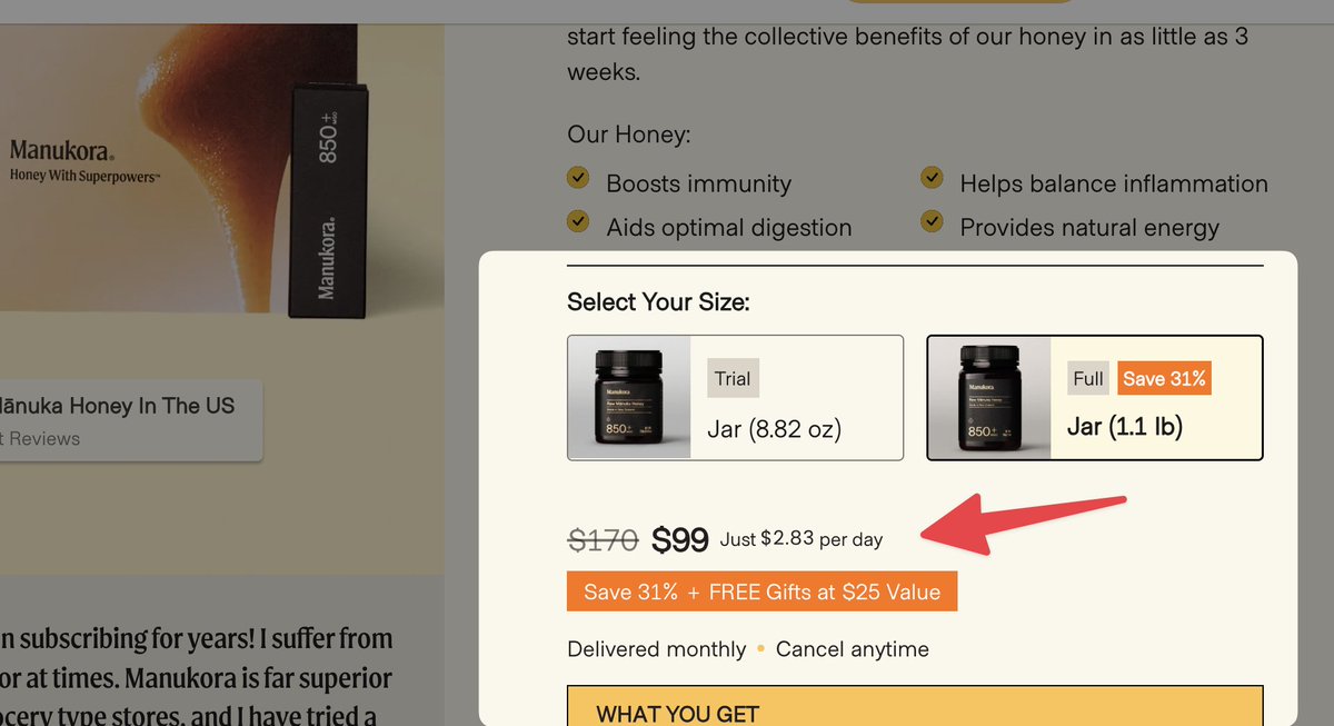
Most brands only show price.
Smart brands show price per day.
Manukora offers 2 options:
– Trial: cheaper upfront
– Full: costs more total, but less per day
Result?
Customers feel like the expensive option is actually cheaper.
That’s how you boost AOV without pressure.
Most brands waste the most valuable real estate on their site:
The homepage banner.
Here’s how a 9-figure store used it right—
They made one thing crystal clear above the fold:
The current offer, and why it matters now.
Clarity + urgency = more conversions.
$202K in added profit—powered by a new PDP design 🚀
BFCM was approaching but Oreylo’s Facebook ads weren’t converting.
That is until @teodorecom's team at Seven Ecom revamped their product pages using Instant, unlocking $202K in added profit and a 14.23% boost in profitability!
Want to see how they did it? Read the full case study: https://t.co/9mnPeyqL9v