I really appreciate how they started using color in 2022 to reflect the city. Will be interesting to see how they continue this system in the years to come.
@zro__g@Giants@SmashMcCaff @BMooreCreativ @bgundell@SammySilv I thought that might be the case when I saw the fans!
Love the idea of building that connection between the players and the fans.
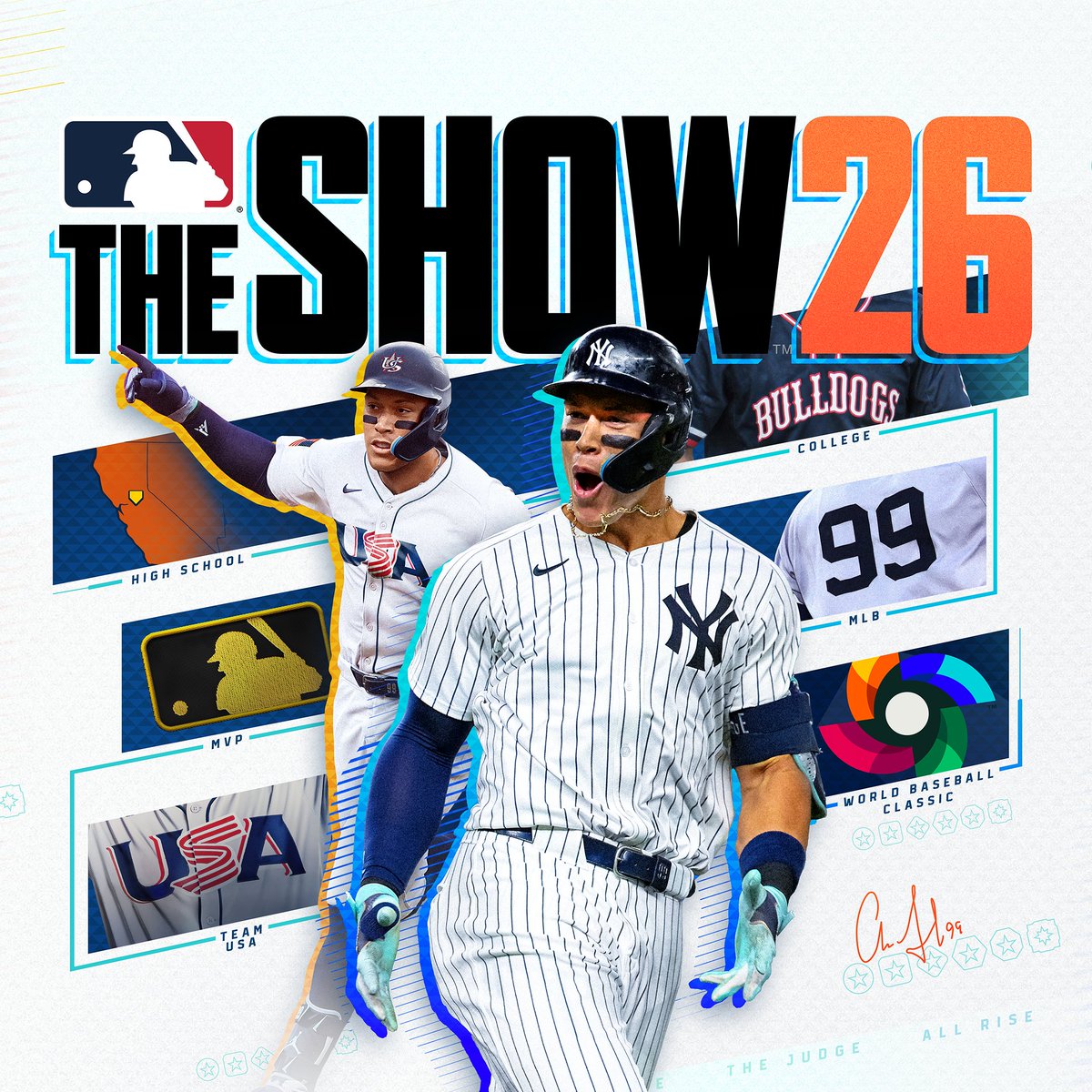
@PhanaticPhan20 This is a valid point. The decline of people purchasing the physical edition has probably contributed to this.
Also, their art and design resources may have shifted from release cover art to season campaigns materials.
No disrespect to anyone who worked on this cover art, this is a fine design.
BUT, does it feel like we've lowered the bar when it comes to sports video game covers lately?
From Fresno State to The Show. You can now start your MLB The Show 26 Road To The Show journey just like Aaron and write your own history like never before. @thejudge44 😉
Learn more: https://t.co/UR8ALaXHJG
@SesoHQ That Logitech controller ad is one of my favorite pieces I've seen in awhile.
Do you have a link to all of these moodboards you create? Would be a goldmine.
@fvckeIonmusk Exactly. It feels like the studios completely gave up on these covers having a "wow factor" and instead are just creating these to check off a box.
@THEDavidMarcus I agree, The Show has definitely went with a more simplistic approach, aside from 23-25. But they still focused on great lighting, color grading, and photo selection. They didn't focus on any of that this year.
2K has had some of the best covers, but also some of the worst lol