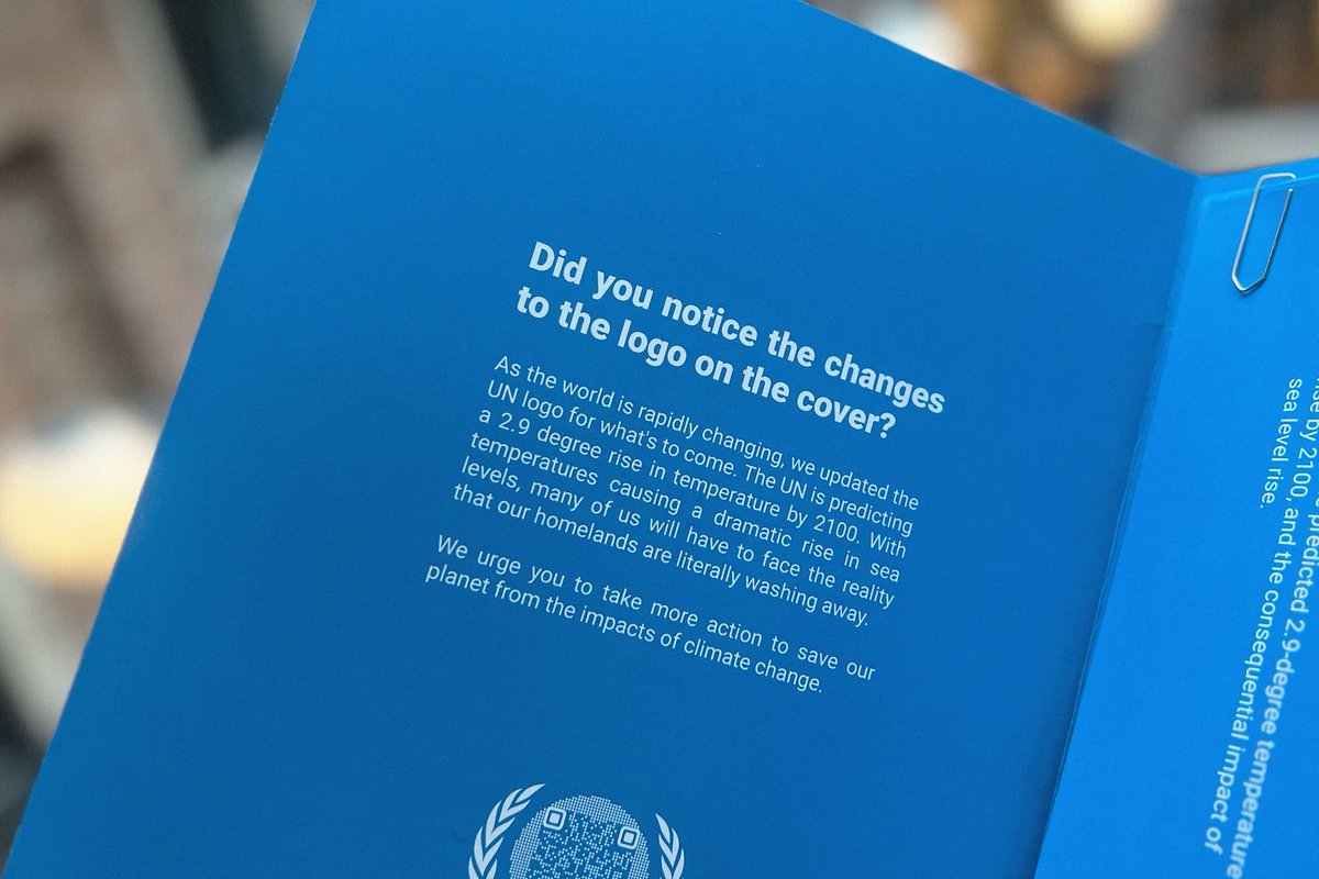
The iconic symbol of a world united is now literally drowning in a lack thereof. Let's stand together and demand more action from #COP28 Sign our petition on https://t.co/3tl1EVVGF5
Designers update the UN logo to reflect rising sea levels
“The UN logo has remained unchanged for 78 years, but the world hasn’t”, says designers at the communications agency Publicis Norway. https://t.co/ZAGc5OukNt
la ONU ha remodelado su logo en base a las proyecciones futuras sobre las consecuencias del aumento del nivel del mar en base a la idea de la agencia Publicis Norway 😳
El logo de la organización, que se caracteriza por un mapa del mundo rodeado por una corona de ramas de olivo, ha sido repensado según las proyecciones anunciadas sobre el aumento del nivel del mar🤪
Concretamente, las costas de los continentes han sido reducidas y remodeladas, mientras que algunos países han sido definitivamente eliminados del mapa, como las Maldivas y gran parte de las Bahamas😂
@marcvidal La ONU no ha remodelado su logo.
La agencia Publicis Norway nada tiene que ver con la ONU.
Por favor seamos serios y no difundamos bulos.
https://t.co/9wBJwvISeJ
Designers update the UN logo to reflect rising sea levels: “The UN logo has remained unchanged for 78 years, but the world hasn’t”, says designers at the communications agency Publicis Norway https://t.co/GQJ5NDvXOC
Designers update the UN logo to reflect rising sea levels
“The #UN logo has remained unchanged for 78 years, but the world hasn’t”, says designers at the communications agency Publicis #Norway.
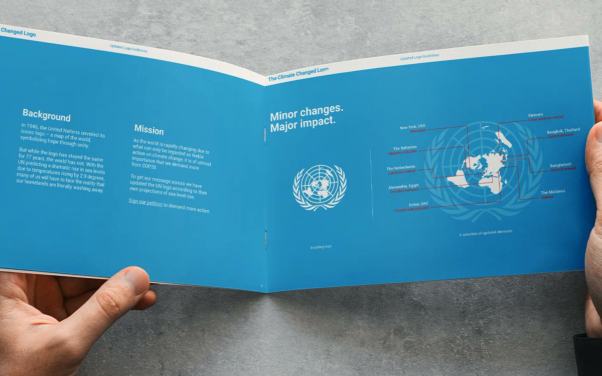
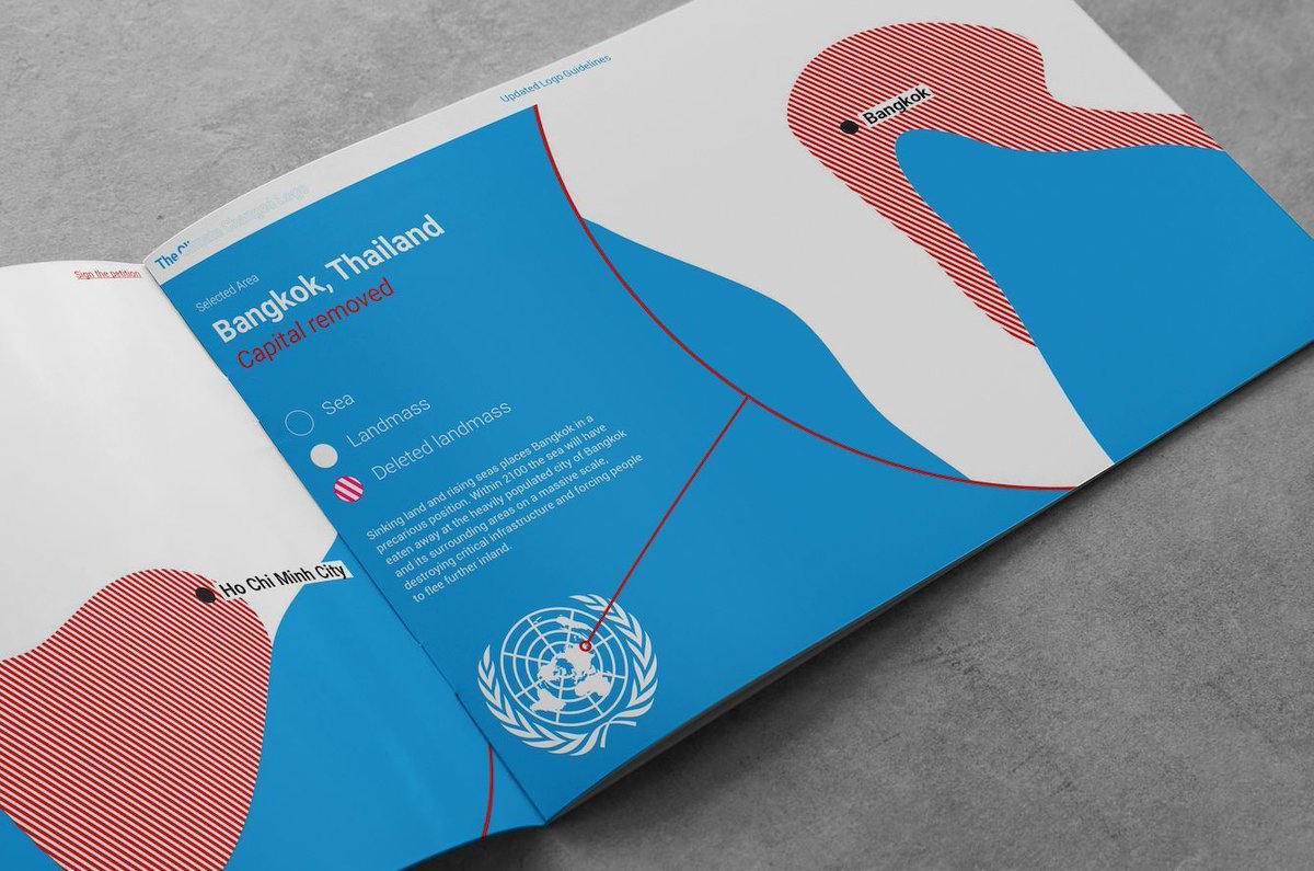
Publicis Norway’s logo shows the #Maldives removed – as the flattest country in the world, rising sea levels could “effectively eradicate” the country from the map, says a release.
The coastline has also been erased in the Bay of #Bengal, where about 20 million people will be displaced due to rising sea levels by 2050. The logo also shows massive reduction to The #Bahamas and #Alexandria and the #Nile Delta in Egypt.
The #Netherlands land mass is halved, with sea levels predicted to rise two metres on the #Dutch coastline by 2100.
#ClimateCatastrophe #ClimateChange
https://t.co/fdRfK1YZqy
Publicis Noruega "ha actualizado" el logotipo de la ONU para reclamar mayor acción climática a los políticos.
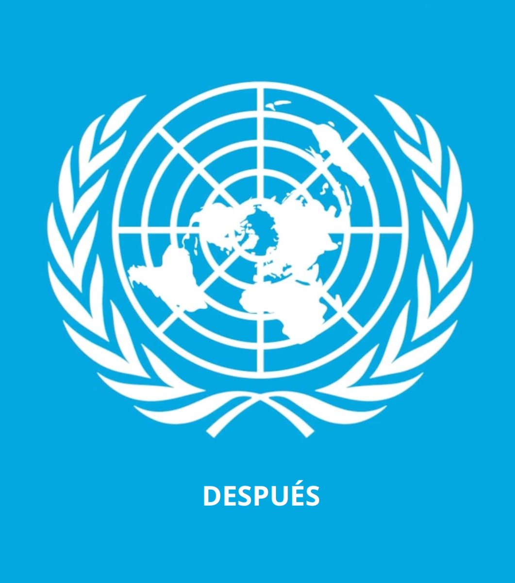
La nueva imagen reflejan la pérdida de masa continental a consecuencia del aumento de 2,9 grados en la temperatura para 2100.
|| Más info 👉🏽 https://t.co/g9xCiZR6HH
Based on @unitednations predictions of climate change, we belive it’s time to do a logo update to reflect the future of our nations 🇺🇳
Read more about the devastating changes on https://t.co/GVm9pCGM9m
Today on Brand New (Linked): The “Climate Changed Logo” is an initiative from Publicis Norway that illustrates how countries and places may disappear or become uninhabitable due to rising sea levels by modifying the map within the United Nations’ logo. https://t.co/QMLy3MUxC2
@ClimateCentral@itsnicethat Thanks @ClimateCentral, the precision in this logo update wouldn't have been possible without your websites. All changes to the logo have been thoroughly cross-checked against your systems. So, a thousand thanks!
Den ikoniska FN-logotypen har fått en uppdatering som ska illustrera konsekvenserna av klimatförändringarna. Bakom initiativet ligger kreatörer på Publicis Norge.
https://t.co/yU837m8LdR
The iconic symbol of a world united is now literally drowning in a lack thereof. Let's stand together and demand more action from #COP28 Sign our petition on https://t.co/3tl1EVVGF5